by Eric Fortune
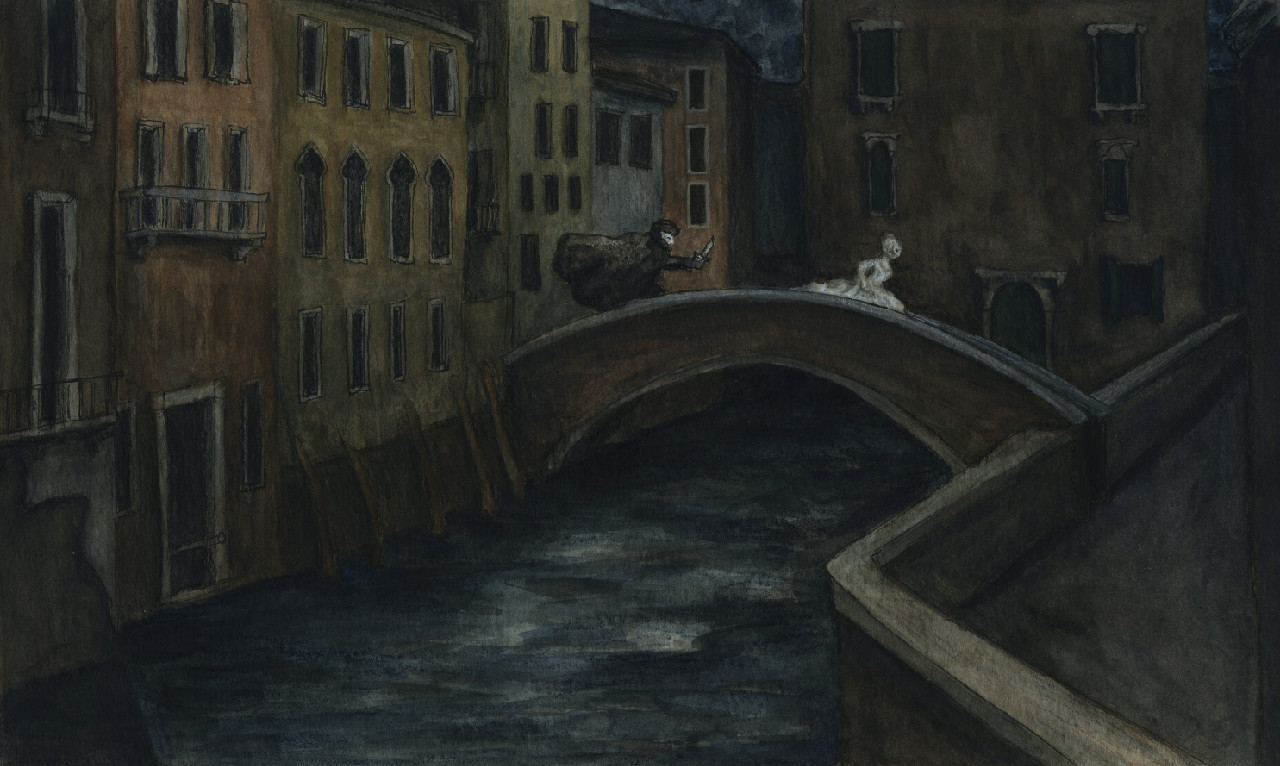
For today’s post I have chosen one of the images submitted for critique. I’ll try my best to give some constructive feedback.
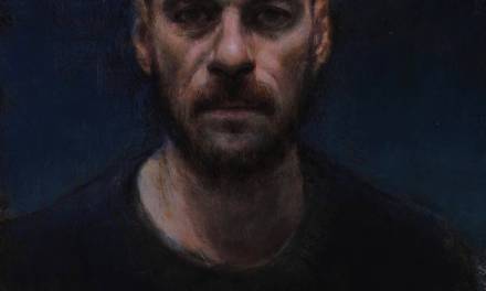
What first struck me about the submission is that it seemed a bit lacking in general. I felt it needed more atmosphere, more character, more props, and perhaps a little more focus.
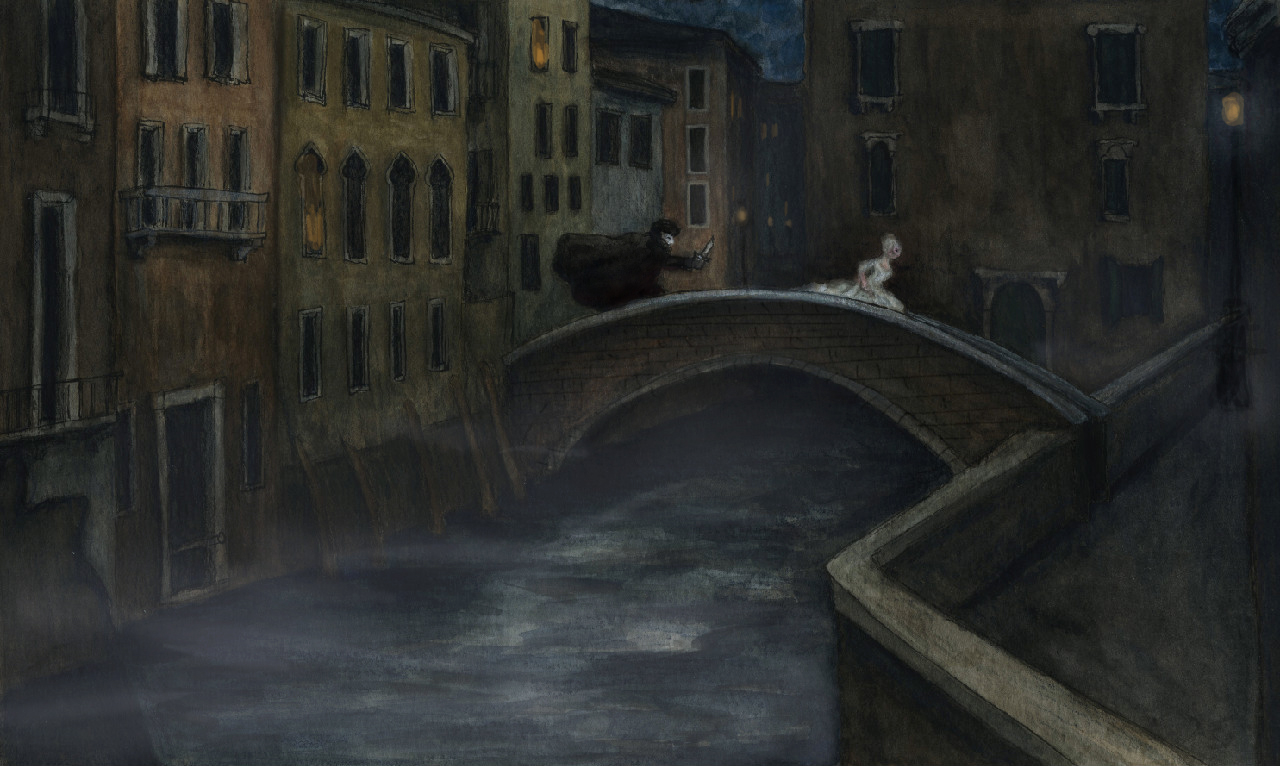
The first thing I did was add a little fog. Not necessary, but it seemed appropriate and added a bit of mood. The fog also toned down some of the middle and foreground. It gave the piece a little extra atmospheric perspective which will also assist in focusing on our main characters.
Next I added a little life to the piece with some street lamps and perhaps a few people burning some midnight oil. Staggering the lamps back the middle of the piece also adds to the depth.
This piece has a lot of pattern in it with all the windows portrayed. However, there’s also great opportunity for some brick patterns here as well that hasn’t been taken advantage of. Pattern on pattern on pattern can become overwhelming. But it can also be subtle and nuanced. In this particular instance I think a little brick pattern can help bring a variety or texture into the piece.
Because of the spotty pattern our main characters don’t seem to be getting the attention they deserve. I darkened the protagonist(I’m assuming he was minding his own business when this lady in white forced him to defend himself yes? …..I jest;) I darkened the stalker to give him more weight and to help separate him from the background. For the female I gave her a make over by adding some fleshy tones to her fleshy areas. I also darkened the background behind her to help her to stand out a bit more as well. It’s perhaps too subtle but I used some reddish hues around the female as well. Adding a little more of a dark color instead of just using black out of the tube is a good way to introduce more color and to enrich your piece. Lastly, I also added a little blue into the sky.
Some other things to consider. This is a looser piece and all the different variations and style of line work etc. gives it character. However, you’ll want to mind your perspective on some of the windows. Some are heading off to a vanishing point in the sky instead of towards the horizon line. Secondly, the bridge doesn’t seem to be connecting to anything on the left side. It appears to be a dead end. Make sure the piece structurally makes sense. Lastly, you may want to do the piece a little larger so that you can give a little extra care and attention to your main characters. And as always, make sure you have appropriate reference where needed whether it’s figurative or environmental.
Hope this helps.

I guess my picture didn't make it 🙁 ahh well
This is helpful. The original picture was well done, but the touch-ups added a depth to the picture. Very cool.
very helpful blog! thanks
This is a wonderful piece. Lovely colours and feel. The walkway on the right could also have profited from having 'something' more, but its good as it is.
Eric: Your suggestions are great. At first it looks like a piece of fine art, but with the suggestions added the drama is heightened, strenghtening the appeal to fantasy art lovers as well. Really nice!
Byran, I've read that critiques are going to be posted throughout the weekend, so don't lose hope (I'm not! I pray that I'll get roasted to death with my picture).
If I could add one more thing; the perspective of the wall on the lower-right corner could polish up as well.
Thanks so much for your suggestions…I was so surprised to see that you had picked my piece! The changes definitely add more drama, which it needed.
I was a little unsure about submitting it since it's not a classic scifi/fantasy illustration, but Im so glad I did!