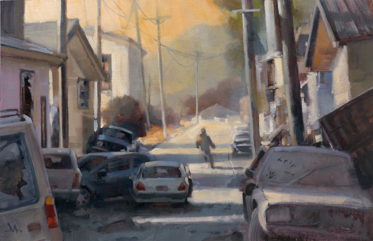
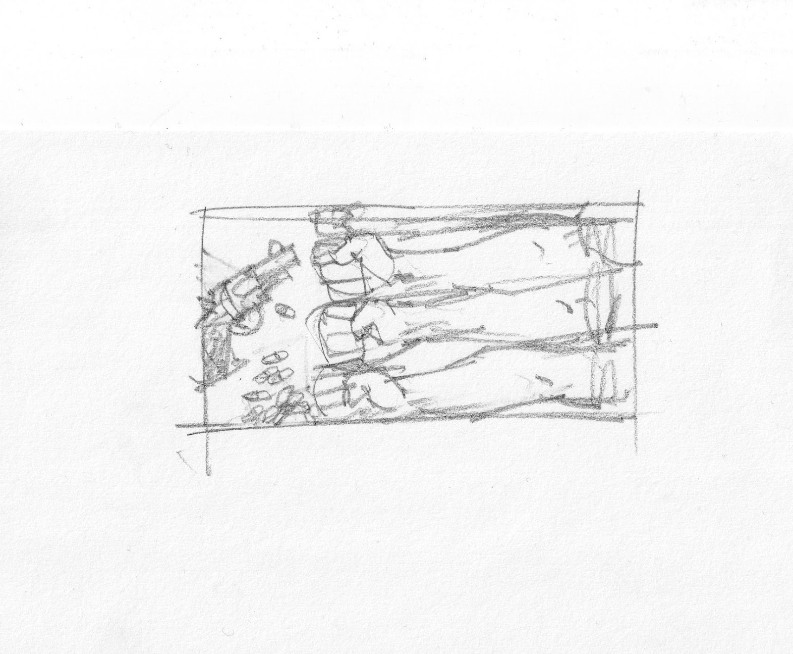
There’s another way to make successful thumbnails that can lead to a final sketch.
Get right to the research first. Instead of exploring small thumbnails on the page, searching for the right image design, there are times where I know that the assignment demands a clearer knowledge of the setting before an idea takes hold.
I read this short story for Tor.com, a follow-up for a previous story, “Dress Your Marines in White,” by Emmy Laybourne. I toyed with a short-lived idea that might connect with my illustration for the first story, based on a set of men’s arms.
But I had a clearer idea that I needed to know & show the environment for the piece. The mood needed to be established instantly.
The story is post-apocalyptic. I quickly rejected that early approach after researching, at length, war-torn cities, destroyed cities, hurricane, tornado, and earthquake damaged city streets. There is only a brief scene where the main character is outdoors, but it gives the tale a sense of place and I wanted the reader to feel that.
I gathered abandoned cars, some parked, some wrecked, some neglected. I used the status of the cars to reflect the status of the story. I researched shots of broken buildings, street scenes, and abandoned towns. I put all of these images up on my computer and freehanded a large scale thumbnail as the main sketch.
With that much information, I only needed to hit it one time. Most times, you have to create your own luck.
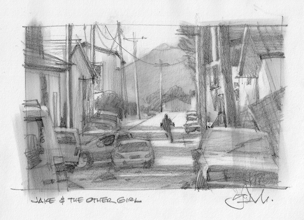
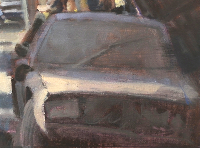
But the challenge after getting the idea was to pull it off. It must read fast and it must feel factual. Rendering cars is not so fun, but discovering and simplifying their shapes to read quickly was very gratifying. But I had to show more than just shiny cars parked. I wanted some to feel like they had just been abandoned, while others had been there for some time.
Again, getting the value correct meant the difference here. Capturing that feeling meant I had to forget what it felt like, and pay more attention to exactly what it looked like. By doing that, I managed to capture the feeling of a dust covered car.
Not so intuitive. I had to study and mix the difference in value range to get shiny vs dusty. I wasn’t surprised to find out how much I learned from this painting about simplifying detail.
As painters, we must sometimes compartmentalize our feelings to actually capture those same feelings in the image. We start with the impression of feeling, reverse-engineer it methodically through observation and application that then re-communicates the feeling we were after originally.
Using contrast was another way of projecting that feeling. I decided to have someone leave a cryptic message on the windshield, like a “wash me” note. The difference between the soft values of the dusty windshield and the crisp, hand drawn letters brought this across. To get that affect, I had to pay attention to exactly what value would be revealed if someone had haphazardly wiped away some dirt.
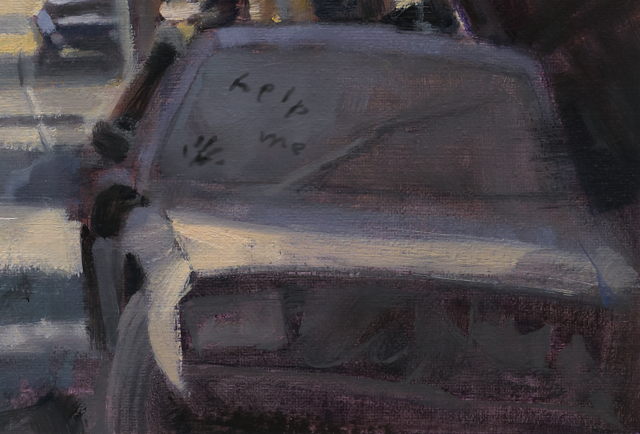
I could’ve added that passage after the oil was dry, but instead, I painted it digitally. This allowed me to give the art director, Irene Gallo, the choice to keep it or not.
This is yet another way in which digital is informing my analog painting development.

Really great Greg. And if I ever have to paint a dusty car I am going to steal yours. As dusty goes it really is beautiful.
So cool Greg! Thanks again for showing us your process. For me, the “abandoned car” setting feels much more believable as a post-apocalyptic scene than say, zombie ravaged, rubble-buried cities. I've been in places that feel a lot like this, so I think it helps the viewer identify more with the scene, not less. And the dust on the windshield is genius. It gives the scene that little thread of humanity and story that it needs to feel alive.
-Will