-By Ron Lemen
I write this blog post while here at the 9th
annual Illuxcon in Allentown Pennsylvania.
It is an amazing show in a great museum with a wonderful permanent
collection; all this diversity in amazing art at once can be overwhelming but
at the same time energizing to the artist, both amateur and professional alike.
annual Illuxcon in Allentown Pennsylvania.
It is an amazing show in a great museum with a wonderful permanent
collection; all this diversity in amazing art at once can be overwhelming but
at the same time energizing to the artist, both amateur and professional alike.
I was surprised to find out that a big part of this
convention includes students showing their portfolios to all the professionals
here in hopes of making connections, getting feedback and possibly getting
work. This post is a response to a commonly
repeated question I have heard at least a dozen times already from students
showing their portfolios to the professionals here. The question that keeps coming up is “how do
you paint flesh tones?” This is not a new question exclusive to this show;
I hear it all the time with students or would be artists everywhere.
Before I start this breakdown, I can’t emphasize enough how
important it is for any artist to start their training traditionally. I might sound like some old art codger here
grumpily chewing on the fat of another generation shift in the arts, but I am
not. Mixing colors traditionally from
physical paint helps solve so many problems with where color comes from and how
to control color tones and color shifts from those mixtures. If you just buy the tubes of paint just to
practice mixing them without painting anything I would still recommend doing
so. It is time well spent and the
knowledge you will gain from the physical act of mixing is invaluable to say
the least.
So I made this bucket list and included a few images as examples
to help illustrate some of the concepts.
Here are a few things to consider:
to help illustrate some of the concepts.
Here are a few things to consider:
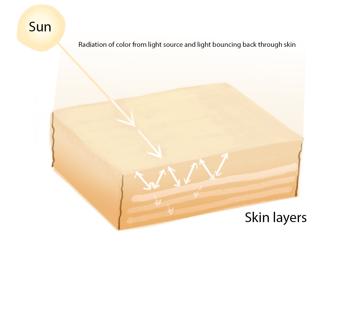
-Flesh is translucent-light passes through it and internally
illuminates it to a certain extent depending upon the power of the light
source. As an example, a part of what we
see when we look at a model under a spot light is surface illumination and the
other is the slightly internally lit flesh depending upon the powerfulness of
the light source.
illuminates it to a certain extent depending upon the power of the light
source. As an example, a part of what we
see when we look at a model under a spot light is surface illumination and the
other is the slightly internally lit flesh depending upon the powerfulness of
the light source.
-There is local color, the color localized to each object;
in this case we are concerned with the local color of flesh. Flesh has a range of hues from yellowish to
very dark, almost blue – purple in hue.
But no flesh is identifiably a straight hue, red, orange, green,
etc. They are all muddy versions of the
root hues.
in this case we are concerned with the local color of flesh. Flesh has a range of hues from yellowish to
very dark, almost blue – purple in hue.
But no flesh is identifiably a straight hue, red, orange, green,
etc. They are all muddy versions of the
root hues.
-There is the color of the primary light source that mixes
an additional hue to the surface colors distorting them towards a temperature
bias complementing the light source, warmer lights a warmer mixture, cooler
lights a cooler mixture.
an additional hue to the surface colors distorting them towards a temperature
bias complementing the light source, warmer lights a warmer mixture, cooler
lights a cooler mixture.
-In most cases, there is indirect lighting or the ambient
light that fills the spaces that the direct spotlight does not influence. If
the sun is the primary light source then the sky is the indirect light
source. In most universities and
ateliers, the spotlight is the direct light source while the fluorescent
overheads and the light coming through the windows from the sky are the
indirect light source(s). In contrast,
north light studios are primarily lit directly from the sky (cool temperature)
and the indirect light source is warm.
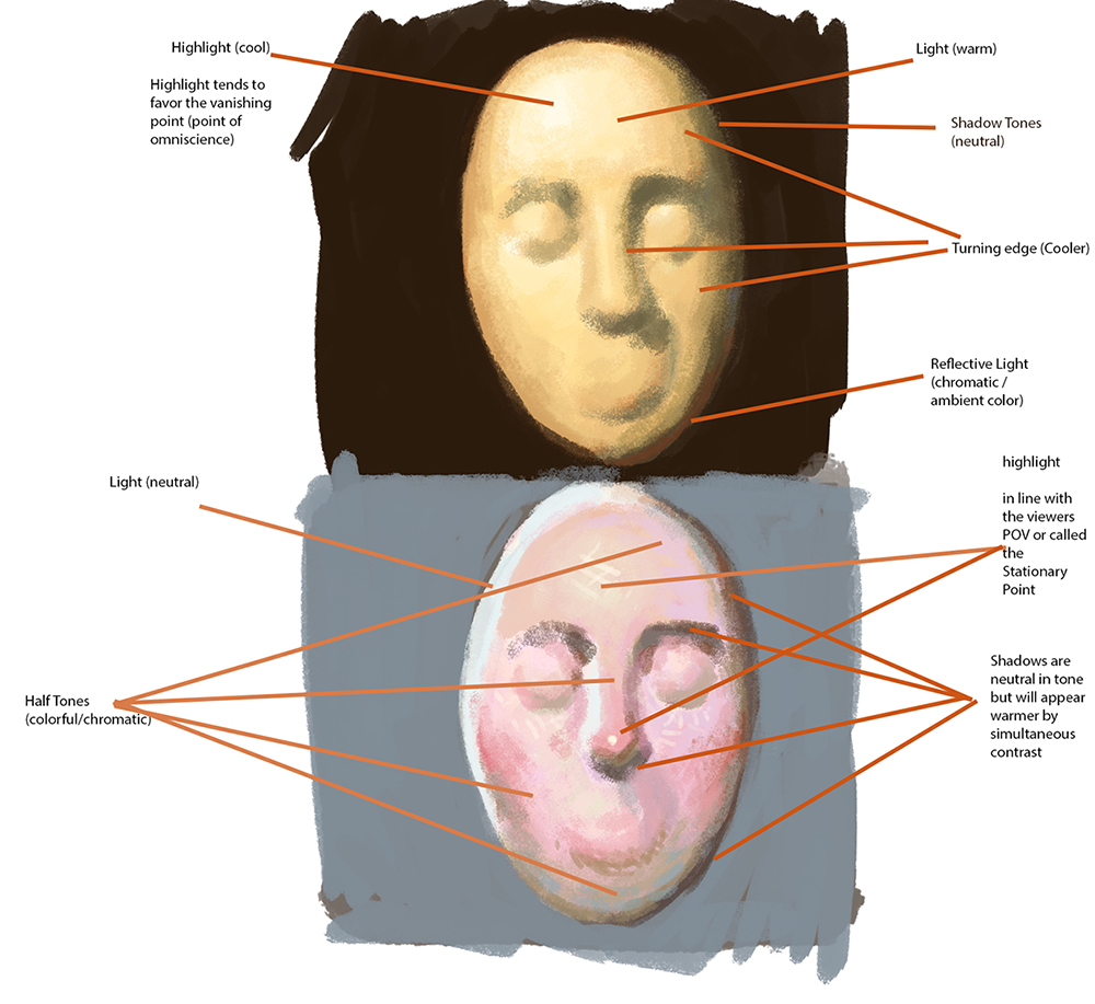
-All forms turn, therefore not all of the surface of an
object will be directly lit. In addition
to the shadow side there are the turning surfaces between the direct light
source and the shadows. These planes that are not perpendicular to the
light are called oblique planes. The
direct light hitting these surfaces drops off in its directness as the surfaces
turn away from the primary light source and start taking on the influence of
the indirect light source.

-Whatever the temperature of the direct light source the
indirect light source will be the temperature opposite.
indirect light source will be the temperature opposite.
There are several ways to think about painting flesh. There are a few formulas that stem from the
old masters and I have two of those examples here, classical and romantic
lighting. Classical lighting was the
typical approach to lighting a painting until around the mid 1800’s. Classical lighting was based upon a single
powerful light source. Caravaggio is a
perfect example of this lighting scheme.
This type of painting required layers upon layers of scumbling and
glazing colors to achieve the brilliant light and the magnificent lifelike quality
of rendering. The palette of colors
available at this time were not as vibrant as we have now so to keep the hues
colorful they needed to be applied in their pure state (glazing), unadulterated
by mixtures with other hues. Most of the
flesh tones were not so colorful as they were tonally correct to how flesh
looks and feels. Color was most
chromatic within the reflected lights in the shadows tones, drapery, etc.
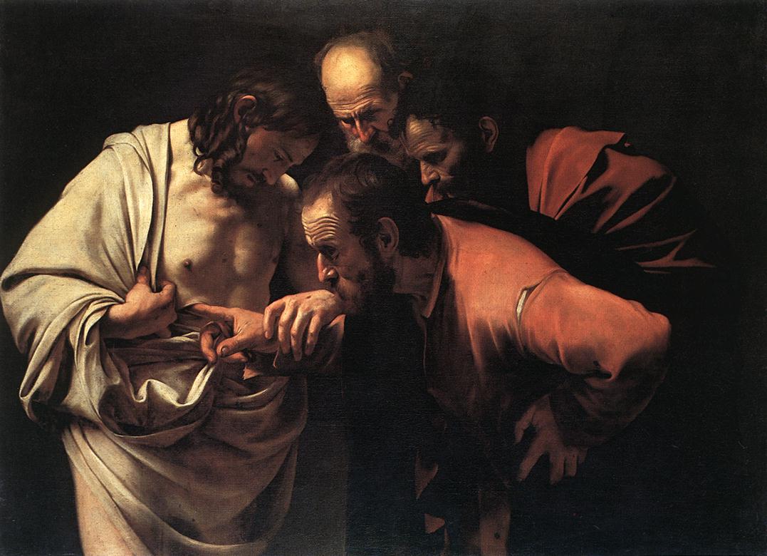
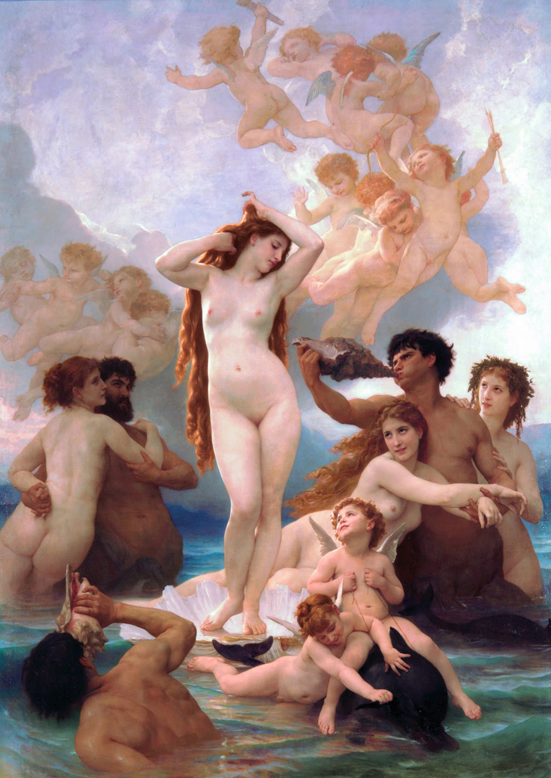
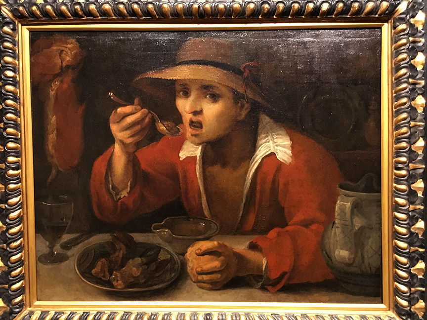
These are examples of both Classical and Romantic Lighting.
During the mid 1800’s new colors and brighter hues were
invented and at this time the kind of painting also shifted away from the high
contrast lighting to a flatter less harsh look called romantic lighting. This lighting scheme allowed for the hues to
exist to a greater extent throughout the surfaces of the flesh tones. In addition the light planes and the shadow
planes were neutralized and reduced in contrast. Delacroix has been claimed to have started this shift in color/lighting but I think Bouguereau took the technique and just ran with it.
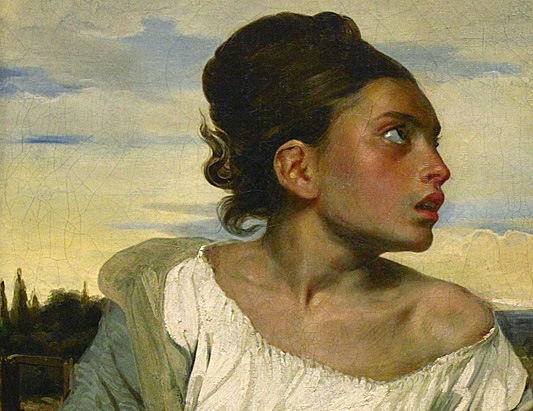
Delacroix
Bouguereau
We see another big shift in color schemes in the mid 1900’s
with illustration. I refer to this
period of color as the color recipe era.
Illustrators were competing to have their magazine covers seen, pulp
novels were huge and the only way to get a product to stand out was to engineer
a crafty color scheme that would feel unique against the rest of the covers. During this time the color wheel was invented
as a tool for concocting these recipes (Munsell’s color sphere and color
wheel). Monochromatic, analogous, complementary, split complementary, triadic, quadratic,
and tetradic schemes were invented and color has never been the same
since.
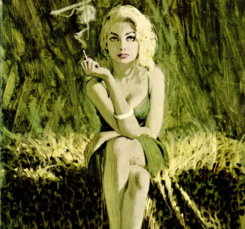
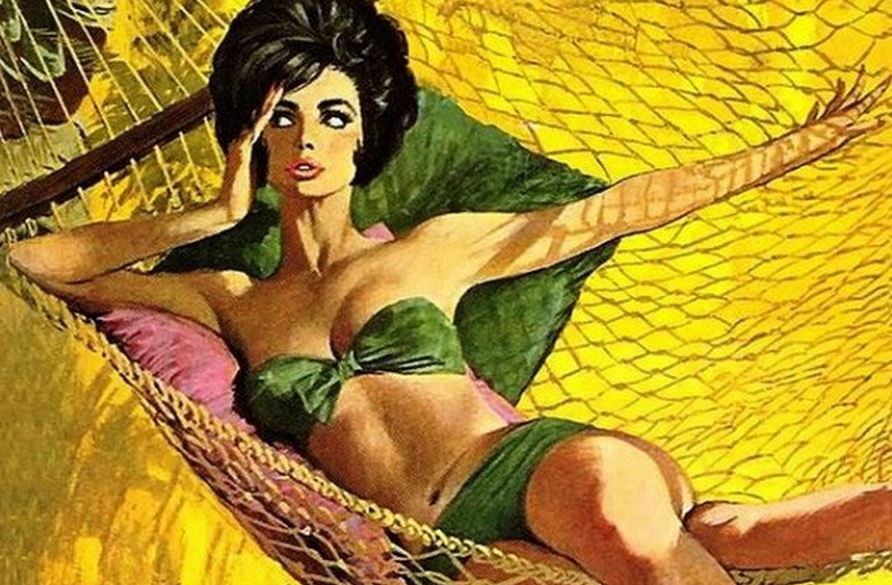
Robert McGinnis One of the most prolific colorists in illustration
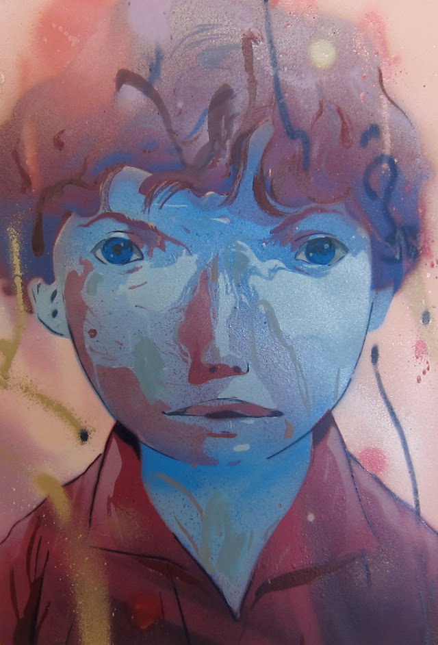
I include this Andrew Hem painting in this color recipe section because e is definitely doing something very different with the figure and the colors he chooses to use to represent his flesh tones.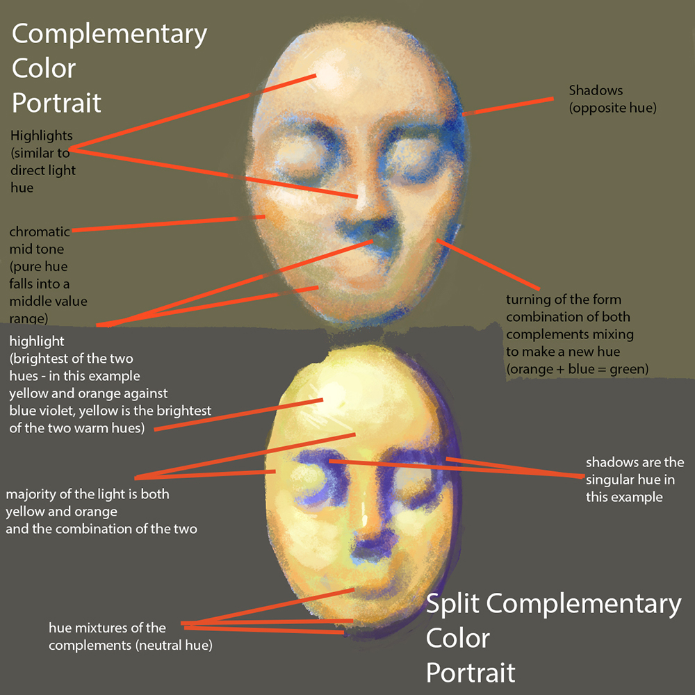

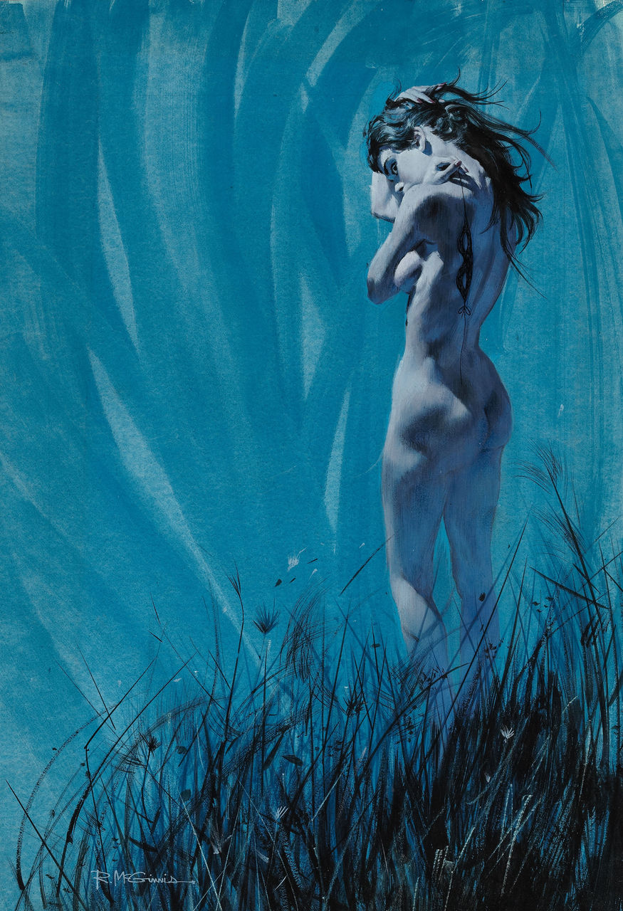
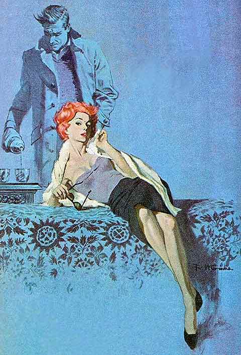
Here are a few of the endless color recipes and a way they are built.
So, heading back to the original question asked, “how to
paint flesh color” the first objective in your own art is to determine how you
are going to use light to tell your story. Are you going to use normal lighting or
staged lighting, or are you going to use the color wheel and find a range of
colors as a recipe to paint your picture?
This will determine how realistic you will need to depict the flesh in
your piece. The more realistic the piece
the more work that goes into making every surface change feel correct.
The next thing to consider is the palette you intend to work
with. If you are working digitally this
is almost more important because there is no basic palette to begin the
painting, the programs you use have every available option ever conceived and
if you do not understand color theory then there is no starting point to cull
down the colors required to make an image work.
As you first learn to paint flesh a really good basic palette would be
the primary palette, consisting or red, yellow, blue, along with black and
white as shade and tinting tools respectively.
To give more options to the range of flesh tones in the lights and
shadows create the primary palette with a warm and cool version of each hue to
work with. Having the options of
different temperatures per each hue gives you a greater chance of making
convincing light and shade tones.
And then finally there is the act of color mixing which I
will explain in the next article. I will
show how to set up the palette and a way of mixing colors for direct painting
that I learned from my mentor Sebastian Capella and later from my years
studying the Reilly method.
will explain in the next article. I will
show how to set up the palette and a way of mixing colors for direct painting
that I learned from my mentor Sebastian Capella and later from my years
studying the Reilly method.
0
0
1
1234
7037
my art room
58
16
8255
14.0
Normal
0
false
false
false
EN-US
JA
X-NONE
/* Style Definitions */
table.MsoNormalTable
{mso-style-name:”Table Normal”;
mso-tstyle-rowband-size:0;
mso-tstyle-colband-size:0;
mso-style-noshow:yes;
mso-style-priority:99;
mso-style-parent:””;
mso-padding-alt:0in 5.4pt 0in 5.4pt;
mso-para-margin:0in;
mso-para-margin-bottom:.0001pt;
mso-pagination:widow-orphan;
font-size:10.0pt;
font-family:Cambria;}
Whenever you get the chance, visit the works of art in your
local museum or in a museum wherever you travel. It is so important to study what has come
before you; all the answers are there in every canvas including how the paint
is applied and in what order it is applied to the surface. This detective work will help you understand
how to create your own canvases. For now
I leave you with a few amazing examples of some fantastic paintings with
unbelievable flesh tones from the permanent collection here in the Pennsylvania
Art Museum. I learned a ton looking at
these canvases and helped me to better understand how the old masters used to
layer color to achieve the look and feel of their work. But that’s for another article.
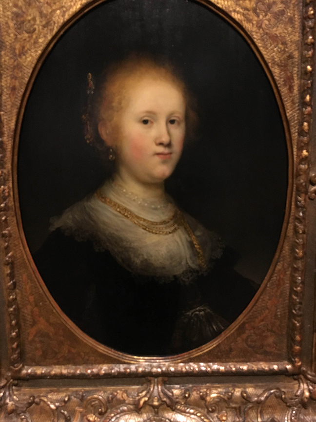
This is a painting after Rembrandt or attributed to his studio.
This beautiful Carracci really shows the extend of scumbling and glazing. You can literally see the dozens of layers on the canvas. This was one of my favorite learning moments in the museum.

Franz Hals
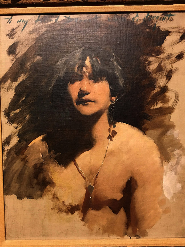
John Singer Sargent

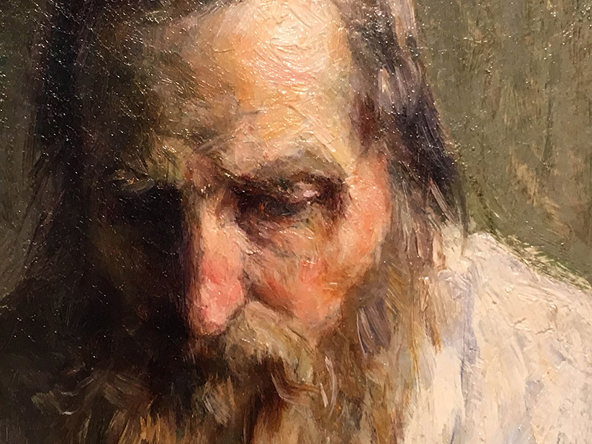
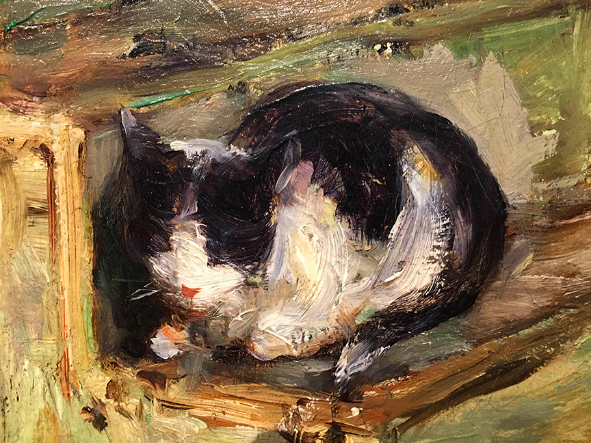
This Henry Mosler is amazing, and to show you how absolutely deceptive photography and art can be, check out these two close ups below. Yeah, wow, right?


A great post. I have ony seen discussions of a portrait/flesh palette in terms of the classical and romantic palettes. The others you brought up were a revelation. I'd seen them before in paintings, but not appreciated what they actually were doing. Thank you so much. I look forward to the next posts in this series.
thank you.
Awesome, Ron. Really covers a lot, and well.
I really notice the similarities in that particular John Sargent painting, and Jeff Jones' work. Wonderful.
I really notice the similarities in that particular John Sargent painting, and Jeff Jones' work. Wonderful.