Today I am going to show a step by step of a magic card artwork. The artwork is a bit of a stray from the traditional magic card. It was for a board game version of Magic called “Arena of the Planewalkers“.
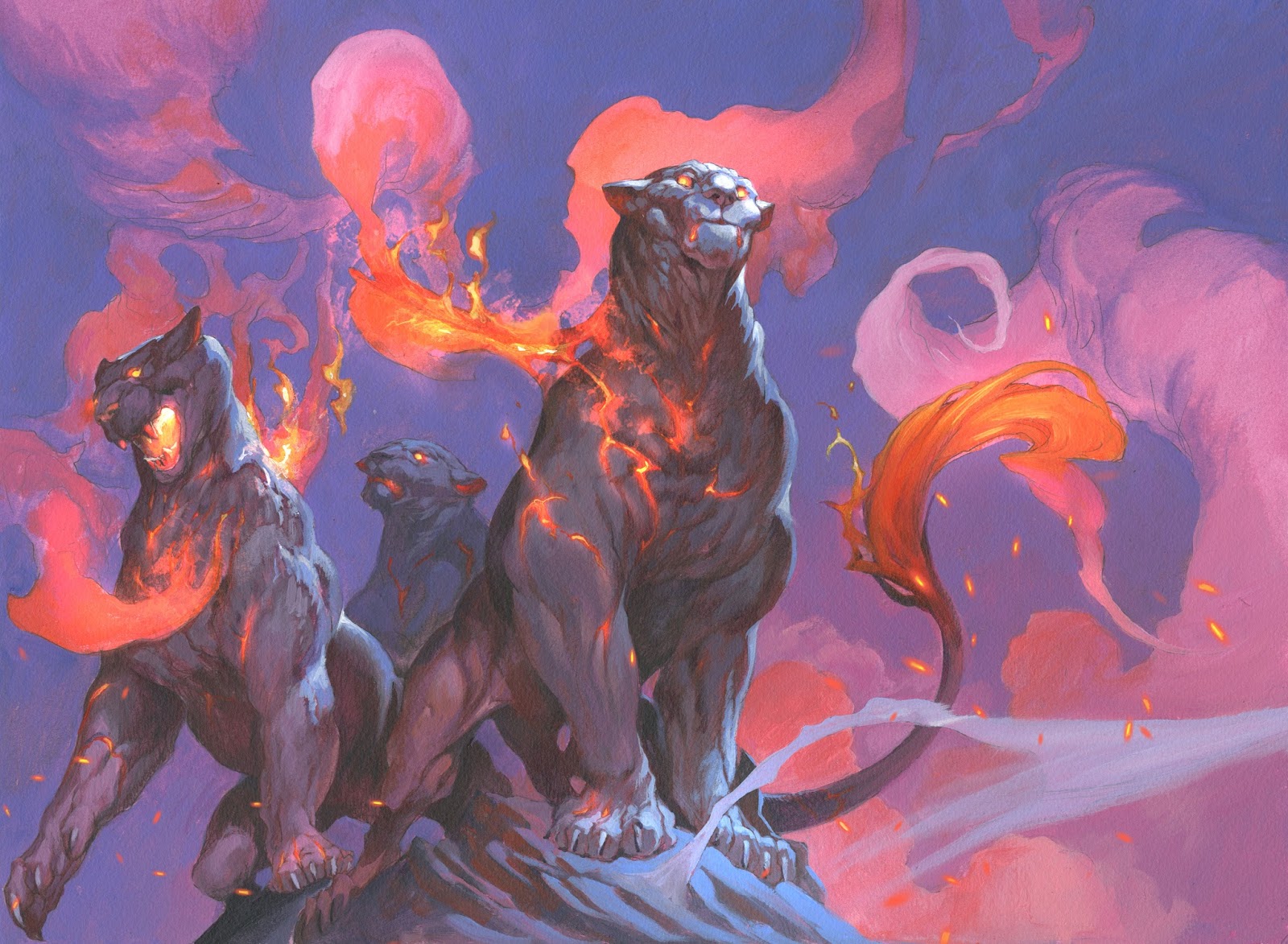
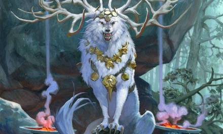
The assignment asked for 3 fire/lava cats, one leader and 2 subordinate. The background should be misty and not revealing an actual place. In an assignment like this there is not a lot to play with. In practical we are just talking about a figure portrait or representation, and every kind of story-line or action would feel out of place. So I sketched up the 3 lions as being powerfull and royal.Something like a Lion King illustration. The feedback asked for the bodies to be black lava rock. After the layout we found out that the way I placed the three lions the image was too wide and I ended up shifting them around and also changing them into Panthers, because it would fit the black bodies better.
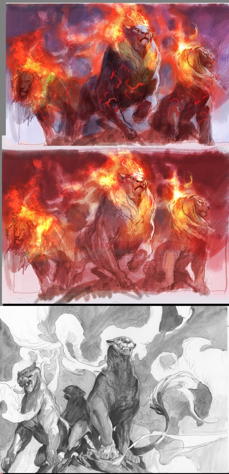
As usually I transfer them to a board, and ink them in pen. If I do not ink it, I will be unable to see the lines I so carefully drew as soon as the first layer or 2 goes over the painting. I have had a tendency lately to go very thick with the paint right away, so I always keep a copy of the black line next to me so that I am able to see what I did in case I over paint details. In this specific painting I tried something different: Since the background should be simple – almost only made up by shifting colors – and didn´t have any visible shapes, I decided to do it all in washes. Also I new the figures would be dark on light so I did not mask them out as I am used to. The darker paint would cover the washes. So I dived right in, washing it all in pink. With my airbrush I sprayed the areas of flames with water, where I new the orange needed to be clear, and rubbed the pink off right away. With some thicker bluish and purple paint I started cutting out the background working into the twirls of smoke. In the end I added the orange and faded it into the pink areas of the smoke. What I really like about this way of painting is that the background seems light and graphic. The less layers and strokes the easier it seems. When I started on the figures I washed them over with a dark reddish brown and almost accidentally covered all the inked lines. I had only 3 cat silhouettes to paint on. But with the copy of the black line I was able to direct the brushstrokes and slowly I added bluish grey to shape the muscles. The face I chiselled out using the white rim light. I really like it when you use a somewhat warm base color and then goes to shape it out in a colder color. It adds a lot to the 3d effect. when I use so strong color and the temperature contrast as in this picture I think it is important not to over due it. I knew I wanted the main cats face to be the centre of interest. So I maxed out on contrast in the face making the rim light the brightest here. Also I pulled some of the warm of the smoke up behind the face so that the blue/white would have a higher contrast to be silhouetted against. lastly I tried to desaturate the rim light the further I went away from the face. The second cat got lesser rim light saturation and the one further back has almost no contrast. it is a matter of directing the eye. i think of it as this: The less I add to the less important areas the more important it looks where I go for full throttle.
I was really happy with the image and turned it in. We ended up changing the cats to being almost full on flames. almost yellow in the end to fit with another monster from the game, but this here is the version I like best.

Awesome one Jesper. Any chance of showing the other version that's full of flames?
Really nice work.