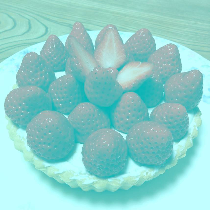
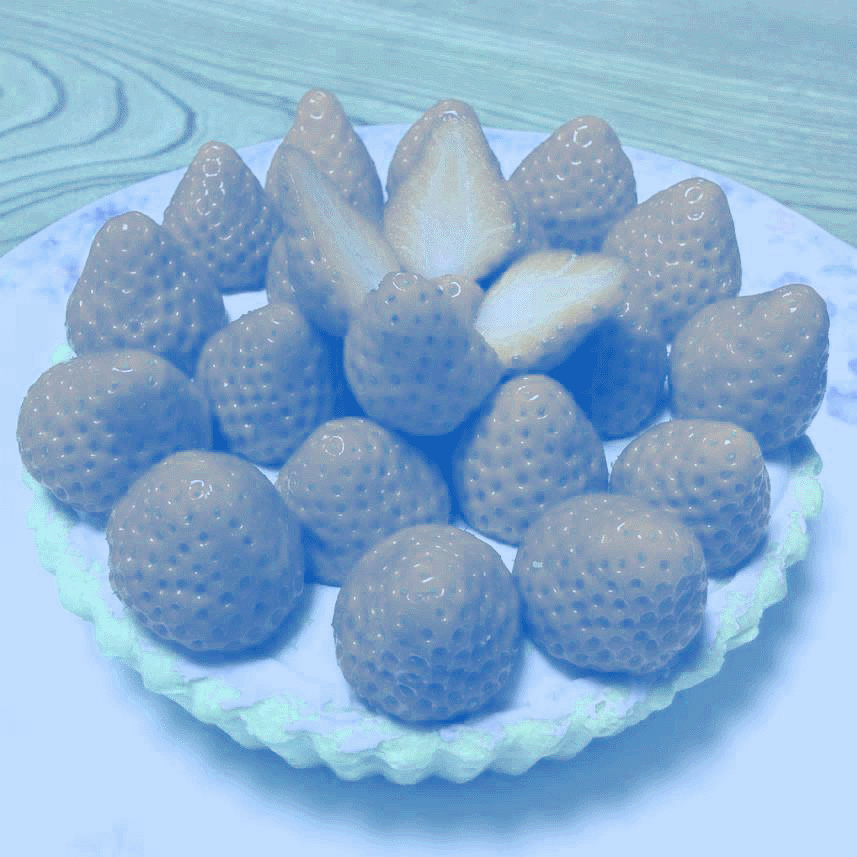
There as an article that I recently came across (you can read it here) that was really fascinating. Dan Dos Santos sent it to me as well and I thought I would write a quick post about it. It shows a plate of strawberries (keep reading, that isn’t the fascinating part :)).

The contrast has been reduced and the shadow color is shifted to green. The strawberries look, as you would expect, red. But when you examine the image closer with the eye dropper tool, you soon see that there is no red. It seems impossible. The entire image is in fact made of greens of various saturations.
The article concludes that the reason we see the strawberries as red is due to “color constancy”. The article quotes Bevel Conway, and expert on visual perception from the National Eye Institute:
Conway said this illusion is also helped out by the fact that we recognize the objects as strawberries, which we very strongly associate with the color red, so our brain is already wired to be looking for those pigments
I think that color constancy is legitimate, and it might add to our perception in this image, but I don’t think it fully explains what is happening. I believe it is because of a different phenomenon. That is that when a gray is placed next to a color of higher saturation and similar hue and value, that gray will take on the appearance of the complementary color.
The reason the strawberries look red is because they are actually less saturated greens next to higher saturated greens and so they start to look like the complement of green. Let’s take a closer look at the image and the palette.
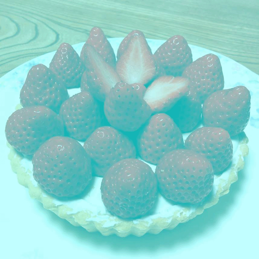
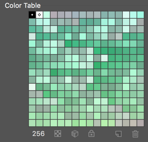
I reduced the image down to 256 colors to simplify the colors and get cleaner color samples. It looks the same at this point:
Here is what the palette (below) looks like for the above image. It is arranged according to hue. The top rows being a little cooler and warming as it gets to the bottom rows. Look at how the grays fluctuate in color temperature according to how much saturation there is.
*if you take the palette in to photoshop, there are a couple pixels in the palette that are outliers

Here is a crop of the image with colors swatches picked out. Note how in the close up the “red” is still perceived even though you can’t really tell that strawberries are the subject.
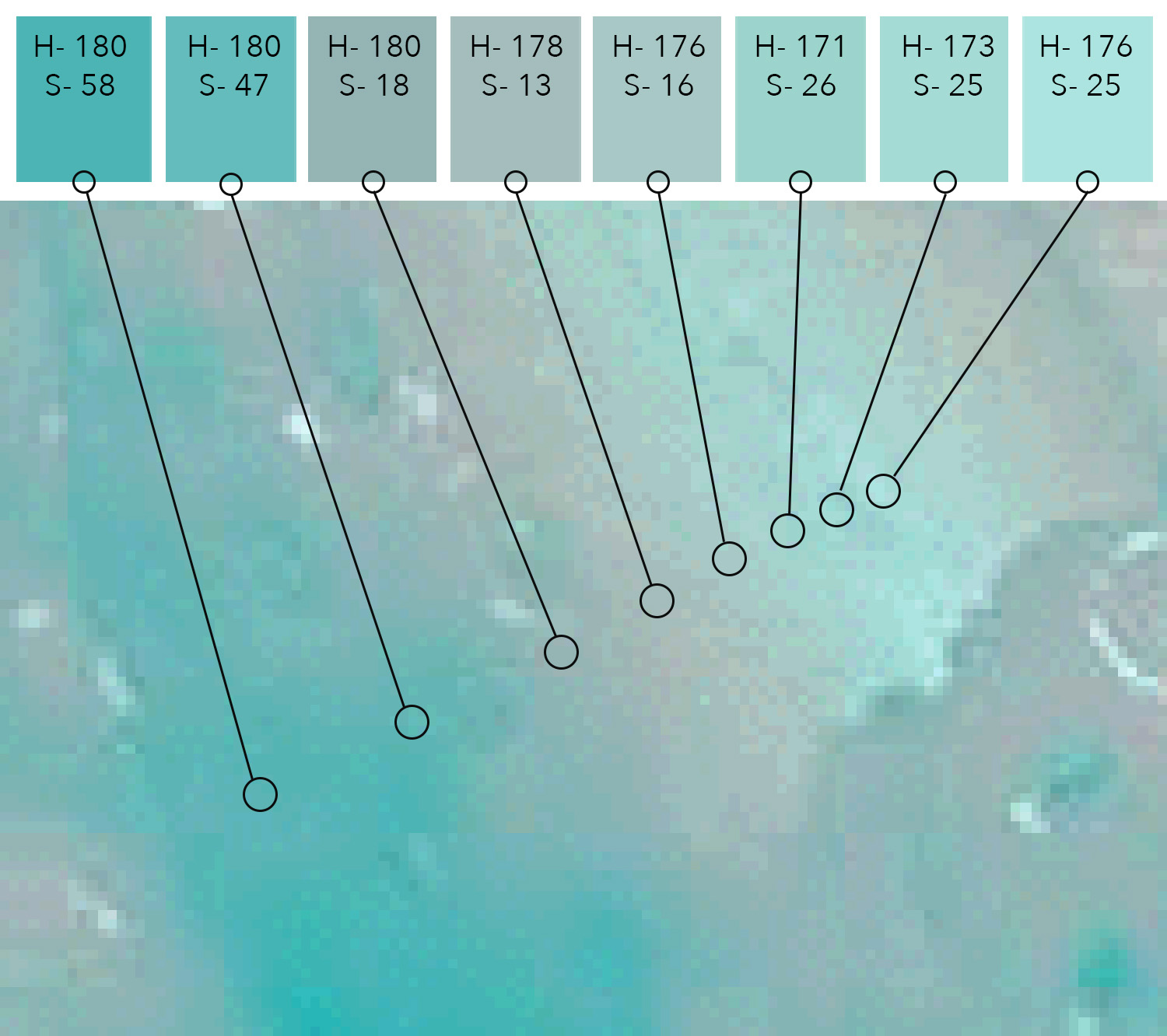
The swatches across the top of the image correspond to the pixel at the center of the circle. Look at how the colors that are more blue or green are higher in saturation. As the color starts to appear more red, the hue shifts a tiny amount (still blue/green), but the saturation drops off significantly and the gray looks more and more red. The most “red” color, the one 4th from the left is actually the least saturated color in the crop with a saturation of just 13%.
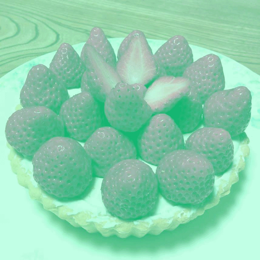
If we shift the colors more yellow/green, the strawberries start to look purple/magenta:
Here is the 256 color palette for the image above.
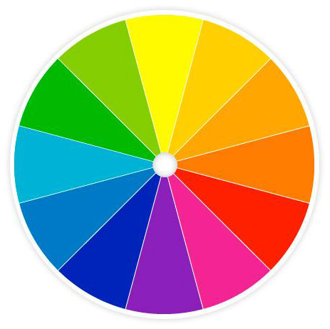
This corresponds to the traditional color wheel showing complements across from each other
Here is the image shifted more towards blue. The strawberries now look distinctly orange. If color constancy were the only principle in effect, we should still see red strawberries, because we know they are red, but in fact they look orange, reflecting the complement of blue.

I have written about this in a previous post if you want to see this in action with some paintings:
I look forward to hearing your thoughts. Thanks!
**update
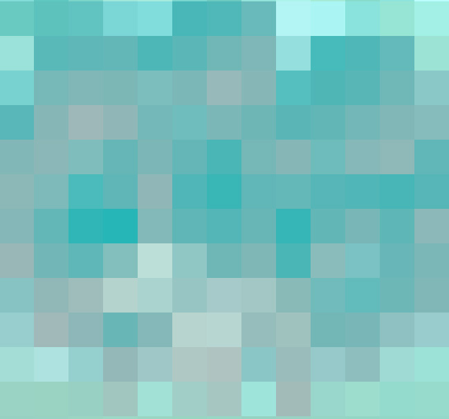
I created a new image to remove some of the recognizable elements and just focus on the effect. Here the image has been run through the mosaic filter, rotated and cropped. I did this to remove any perception of strawberries. If you take the image into PS and check the value range of the “strawberries” you will see that there is very little change in value, just saturation. This is important to get the effect.


Awesome post! Believe you are correct in not taking 'color constancy' as the only factor, although it probably does play some role in it, too. It most probably comes down to a neutral tone taking on the appearance of the complimentary hue of the color next to it. What a fascinating world of vision and color we live in!!!
(It irks me having to write 'color' instead of 'colour' 😉
We had a similar exercise in art college, to introduce us to this idea. We were asked to paint a blue square on a piece of paper, but were only given white, black yellow and red paints. A grey square surrounded by yellow/orange was the way to do it.
You're right in that colour constancy has a part to play, but I think the use of greys and complimentary colours is having far more impact.
I kept thinking about this while this was going around on facebook, but I do think color constancy is what is happening, and what you've described is just an element of color constancy (although an important element to recognize, as artists).
Conway doesn't attribute our perception of them being red as because we know strawberries to be red, she only adds that on at the end as an aside. It is because we see a perceptibly 3D object, with shadows, midtones, and highlights, and the overall color bias of the lighting, and interpret it as red…whether those were strawberries or pineapples. In this situation, greys next to saturated greens do appear reddish, but greys next to greens outside the context of realism do not appear red. Just looking at the color tables you have, the grey boxes do not appear red just for being in the company of saturated greens. Our brains interpret as soon as we start to perceive a resemblance to reality.
Sarah, thank you for the response! I was hoping there would be some good dialogue. Here is a quote from the article from Conway: “Conway also indicated that because we know strawberries are red, our brain is ready to pair them with that color.”
The phenomenon I am describing doesn't depend on it being perceived as 3D. Nor does Color constancy. Color constancy does relate the the bias of the lighting though. That is the basis of another post I wrote on Color Harmony.
I added another image in response to your post (see at the end of the post above). I have taken the original image, cropped it and rotated it to remove a sense of realism and identity. It also doesn't appear 3D anymore, but mostly flat. The pixels still look red.
The reason that the grays don't look red in the palettes I posted is because unfortunately Photoshop arranges the palette by hue, not value, so we lose the juxtaposition of similar values and that is a critical part of the effect. You can see this in the original image. If you take the photo into Photoshop and sample the shadow and light side of the strawberries, they are within 1-2% of the same value. The change is in the saturation. This is a key part of the effect.
Additionally, the other images speak to the effect. When the color bias is shifted to another hue, the grays take on the appearance of the compliment. More blue = grays appear more orange. More yellow green = reds appear more magenta.
Let me know what you think.
Thanks for giving it a read Mark. That sounds like a cool exercise!
Thanks Nicolay. Sorry about 'colour'. Bear with us colonials and next time I travel to the UK, I will be sure to say “schedule” the right way. 😉
Very cool article! This reminds me of that phenomenon where you stare at a highly saturated simple shape (a square, for example) for a minute or two and then look at a blank, white paper and you can usually see a ghost of the square but in it's complimentary color.
Your color wheel is flawed. It should have cyan opposite red, green opposite magenta and blue opposite yellow. That is, in fact what your altered photos show. The color wheel you are using has been used since the days of Isaac Newton, who made the first color wheel. Unfortunately, he failed to note the existence of magenta, which threw his balance out. Your samples show the reality.
*complement. Not the same thing.
Ah yes! Thank you. I will make that correction.
My advice for painters as far as takeaway is to let this strawberry image burn into your brains that no human being alive has the ability to ascertain color (or value) in the absolute sense, because there is no evolutionary benefit to this. In fact it'd be a big problem if we saw this way. We need to see red (=yummy berry that just happens to be in some blue environment right now) and not what a spectrometer (or color picker) would measure, which is grays and blues (what the heck is that thing?). The why's are interesting, but it seems we get so caught up in the explanation that many artists still miss the point, which is that you can't judge color in isolation, and you really can't measure this principle quickly or accurately enough for it to be meaningful in picture making. You must put a color on the canvas (or screen) see what it LOOKS like, then ADJUST it. The challenge for a painter would be, I've got this blue green colorization going (maybe from colored light, or being under water, or whatever), and now I need to add a berry that looks red in that context – what color do I use? Who knows? I can tell you a really saturated red will look 'too red', but that's about it. Could be a pure gray, could even be a bluish gray. Painters need to know that a) they can't just color absolutely because this principle does not exist in human vision, and b) changes in saturation typically result in an apparent change in HUE as well, especially for colors in (what we call) the warm area of the spectrum. Again, the how and why of that is interesting, but perhaps a distraction.
You're exactly right.
James Gurney is able to achieve the effect with gamut masking. I admit I have not been able to completely wrap my mind around it but the results are impressive.
http://gurneyjourney.blogspot.com/2011/09/part-1-gamut-masking-method.html?m=1
Damn…, Color is so tricky
This was such an insightful article, Howard! I enjoyed every bit of it 🙂 Cannot wait to make some experimental studies regarding ‘grey matter’ 🙂
thank you for the article