-By Ron Lemen
Norman Rockwell
Hello again, it is Spectrum time. Most of you readers will likely be attending
so the reading will be light. When my
day to post falls upon an event as such, I will leave you with a definition or
description of some interesting and often times neglected art concepts that either have little explanation to help define them, or that the meaning is often times confused by the “ill-informed” books, magazine articles and instructors.
Today’s topic involves paints that are used towards opaque
representational art.
representational art.
White and black are “color adjusters” and not colors. THIS RULE COMES FROM THE REPRESENTATIONAL ART
WORLD.
WORLD.
*If you are a designer, you might consider white and black
to be a part of a color family, simple and graphic.
to be a part of a color family, simple and graphic.
When getting down to basics as a painter, white, gray (white
and black mixed), and black are tint, tone, and shade agents respectively for
the colors on your palette.
and black mixed), and black are tint, tone, and shade agents respectively for
the colors on your palette.
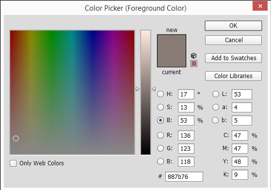
The HSB color-sliders in Photoshop are a great technical
example to show how white and black affect the colors we mix them with.
example to show how white and black affect the colors we mix them with.

There are specialty colors or novelty colors made by all
companies like Black Olive, or Buff White but should be avoided when learning
how to paint with pigments that have a proven history of success.
companies like Black Olive, or Buff White but should be avoided when learning
how to paint with pigments that have a proven history of success.

A few common mistakes with White and Black:
-Thinking you shouldn’t use black as a hue on your palette
as is often prescribed for some strange reason by many art instructors.
as is often prescribed for some strange reason by many art instructors.
-Attempting to paint a full value picture without using
white or black to paint it. While it is
true that you can use any paints that are light as a tinting pigment, if they
are of a specific hue, the new mixture will be a combination of these two hues
and not just a lighter version of what you may need.
white or black to paint it. While it is
true that you can use any paints that are light as a tinting pigment, if they
are of a specific hue, the new mixture will be a combination of these two hues
and not just a lighter version of what you may need.
-Mixing in too much white thinking that it will help lighten
the color.
the color.
-Mixing too much black into a mixture thinking that it will
just become a blacker version of the color you are using at the time.
just become a blacker version of the color you are using at the time.
-Using black as a color and painting without mixing anything
with it will cause the black areas to feel disconnected with the rest of the
painting.
with it will cause the black areas to feel disconnected with the rest of the
painting.
-Painting with White to lighten a color to show that it is
lit. Yes, this can be incorrect. Light is associated with temperature,
temperature is associated with color. All light has a coloration to it, never purely
white, therefore when altering a hue to give it the feeling of being lit by
said light source the white alone cannot be used, and should rarely be used on
its own. Mix a hue into it that
resembles the temperature of the light source and the color will feel more correct
to the influence of the light source.
-Starting a canvas with light value colors or whites on a
light to white surface. Because the
white matches the surface it might be forgotten that it was painted down, and
the next layer of hue added with be drastically altered by the hidden white
painted on the surface.
light to white surface. Because the
white matches the surface it might be forgotten that it was painted down, and
the next layer of hue added with be drastically altered by the hidden white
painted on the surface.
-Using any ole white or black to work with without the
understanding that there are specialty whites and blacks and there are novelty
whites and blacks, and then there are useful tried and true white and blacks
that are considered benchmark standards in our painting industry. Here are a few pigments worth investing in:
understanding that there are specialty whites and blacks and there are novelty
whites and blacks, and then there are useful tried and true white and blacks
that are considered benchmark standards in our painting industry. Here are a few pigments worth investing in:
White Pigments
Titanium White – The most opaque pigment on the market is
the ubiquitous mixing white across the pigment boards. Very Powerful and you do not need very much
to tint a hue.
the ubiquitous mixing white across the pigment boards. Very Powerful and you do not need very much
to tint a hue.
Zinc White – semi to
very transparent, useful for mixing subtle colors and for glazing
very transparent, useful for mixing subtle colors and for glazing
Cremintz White – slightly transparent, less than Titanium
and More than zinc
and More than zinc
Lead White – One of the first good white paints that builds
up very opaquely but when thinned is a very good turbid pigment usually
favoring the cool temperatures/hues
up very opaquely but when thinned is a very good turbid pigment usually
favoring the cool temperatures/hues
Flake White – Semi Transparent, usually not made with real
lead these days but has similar characteristics including its temperature and
stiffness
lead these days but has similar characteristics including its temperature and
stiffness
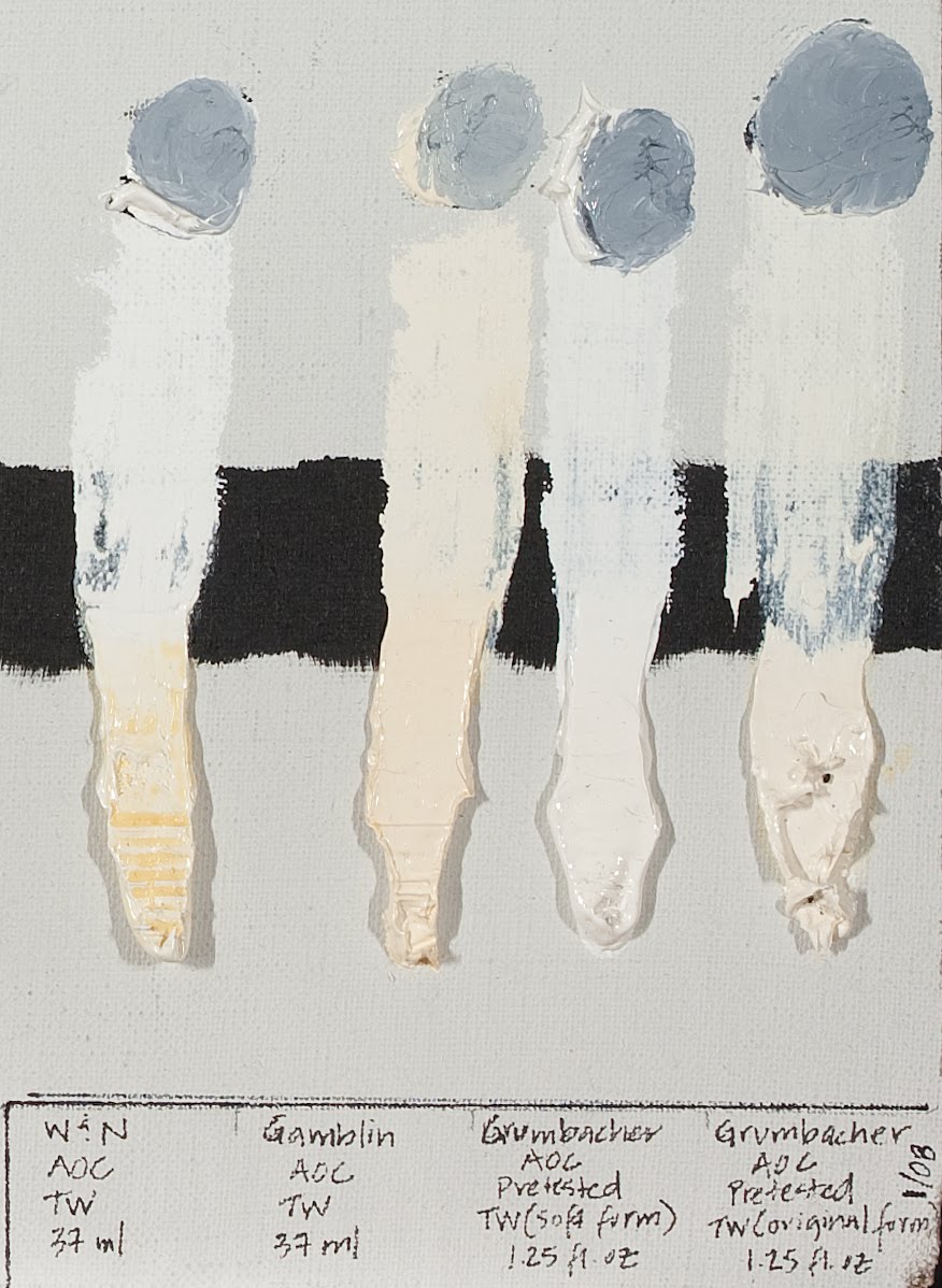
pulled from a white pigment test found
on a blog by Jonathan Linton
Black Pigments
Ivory Black – semi-transparent to transparent depending upon
the brand. Unmixed it is warm, add white
to it and it cools off to a very chromatic blue direction
the brand. Unmixed it is warm, add white
to it and it cools off to a very chromatic blue direction
Lamp Black – Very transparent and the bluest of the black pigment family, very
slow drying
Vine Black – or drop black is inferior by design, very blue in its body hue,
and fugitive, semi to very transparent- not worth using most of the time but
worth listing since most brands still sell it
Bone Black – just another name for Ivory Black but used by
several companies
several companies
Mars Black – dense and opaque, the warmest of the black
pigments, dries very fast
pigments, dries very fast
Blue Black – typically mixed using Ivory Black and Ultramarine
Blue and is semi-transparent, good blue blacks are made with Cobalt blue, more
neutral in the hue, and are very transparent
Blue and is semi-transparent, good blue blacks are made with Cobalt blue, more
neutral in the hue, and are very transparent
Enjoy the weekend,
And
now back to our regularly scheduled programming.
now back to our regularly scheduled programming.


Thanks for the clarification! White … it takes little of it to lighten another color, but it also takes very little of another color to contaminate white.
I have been trying to paint traditional recently, using the Zorn Palette in gouache. I haven't been able to wrap my head around mixing colours though, and I wonder how the rules under “A few common mistakes” apply to that particular palette (specifically rules 3, 4, and 6). Wouldn't white and black be the only way to change the value, or am I forgetting to take the temperature of the resulting mixture into account?
I didn't attend, but loved this post. Kinda makes it OK to not go.