 |
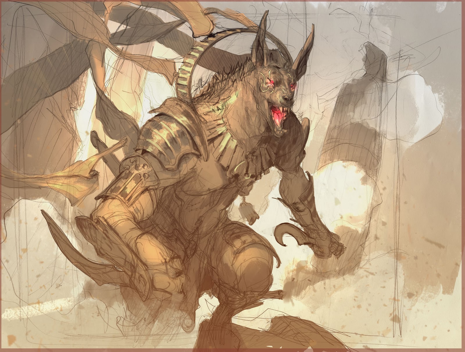
| Pencil sketch with values and a bit of color to explain the light. |
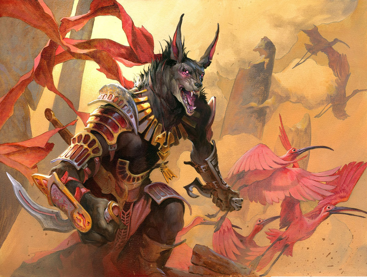
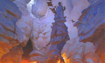
This illustration is a for Magic the Gathering of the set called Hour of Devastation. It is a Jackal warrior wielding small knives in an aggressive pose. A simple art description. Therefore I decided to make a simple portrait solution. The sketch I submitted asked only for one small change namely the collar that would look too much like a feature from another character in the same set. But I really liked the ribbons that was attached to the collar so I kept those just hanging from somewhere on his back. I like the ribbons because they add life and movement to an else static pose. When I transferred it to the board for painting i felt it looked empty, so I decided to add even more movement in this case – yet again – by adding a flock of birds. Those egrets are also a very clear reference to Egypt, the main inspiration for this magic set, so it would help the scene I thought. Also I like how they are taking off as if they are fleeing from something: The Hour of Devastation.
|
|
| greytones on watercolor board |

When I look at the sketch now I am annoyed that I did not keep the lower leg in silhouette as in the sketch. For some reason ,that I cannot explain now, I added cloth there and covered up that little negative space. It is not helping at all. In the sketch the leg looks like he is stepping up on a rock and that the other legs disappears down and is stretched out under him. In the final, most of that is lost and the weight and movement is not as good. I am pretty sure my idea was that the battle mist and smoke and fog would hide it all and that I wanted to focus in on his torso and face, but it did not all turn out that way.
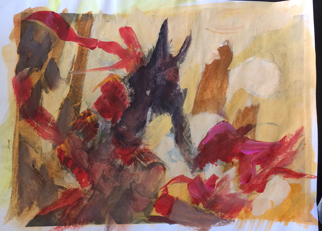 |
| Color comp |
Anyways; after I get an approval I take the sketch to a watercolor board and ink it all in waterproof ink and then adds grey tone value in black acrylic. This way my first washes are only acting as tonal to the drawing underneath and I can work more loose and random. I use lots of water to block in the local colors and to create happy mistakes and texture that I can use further in the painting process. I take a photocopy and do a color rough. This was kind of an easy choice. I knew I had a black skinned figure so I might as well put him against he light to have a clear silhouette. He was going to be a black silhouette anyway. It meant that my background would be lighter than the figure. It is all a very warm picture; lots of yellow and red. If everything is too warm you have nothing pulling the other direction, so I added some grey for a neutral color and a bluish to the top of his head as a reflection of sky color high above him.


I know they're points of secondary interest, but those egrets are great! Love that extra bit of detail.
I agree with the previous comment! The egrets are a secondary point of interest, but dude, they are awesome. Very nice post, Jesper.
Kind Regards.