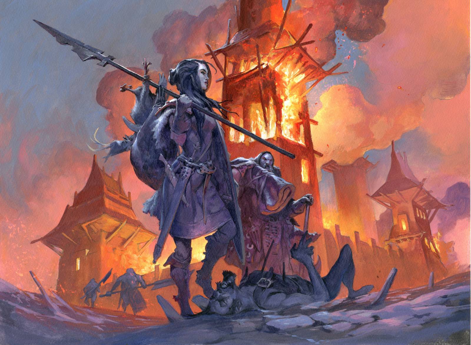
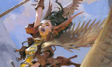
This piece of artwork is yet another magic card illustration. The card is an old card but for a new set it needed an updated illustration. I knew about the old card and knew what the card did and how it worked with the rules so I was very clear in how I wanted to show it.
In order to explain my choices I need to get a bit technical and game specific. The card does 2 things: It either destroys a land or an artifact. It is not to far fetched to say that a plundering party of barbarians, like my ancestors, would do either or both. The art description called for a raiding party having sacked a mountain village, the city still burning, raiders on the way out of the ruin.
To be honest I am not much of a landscape artist. My interest is figures and the background is always secondary to me. But in this painting it needed to be a slight bit different: I was not portraying a specific raider plundering or a specific action of plundering like torching, hacking refugees or rounding up thralls. So I tried to sketch something that was a little less focused on the figures and more about the burning village. 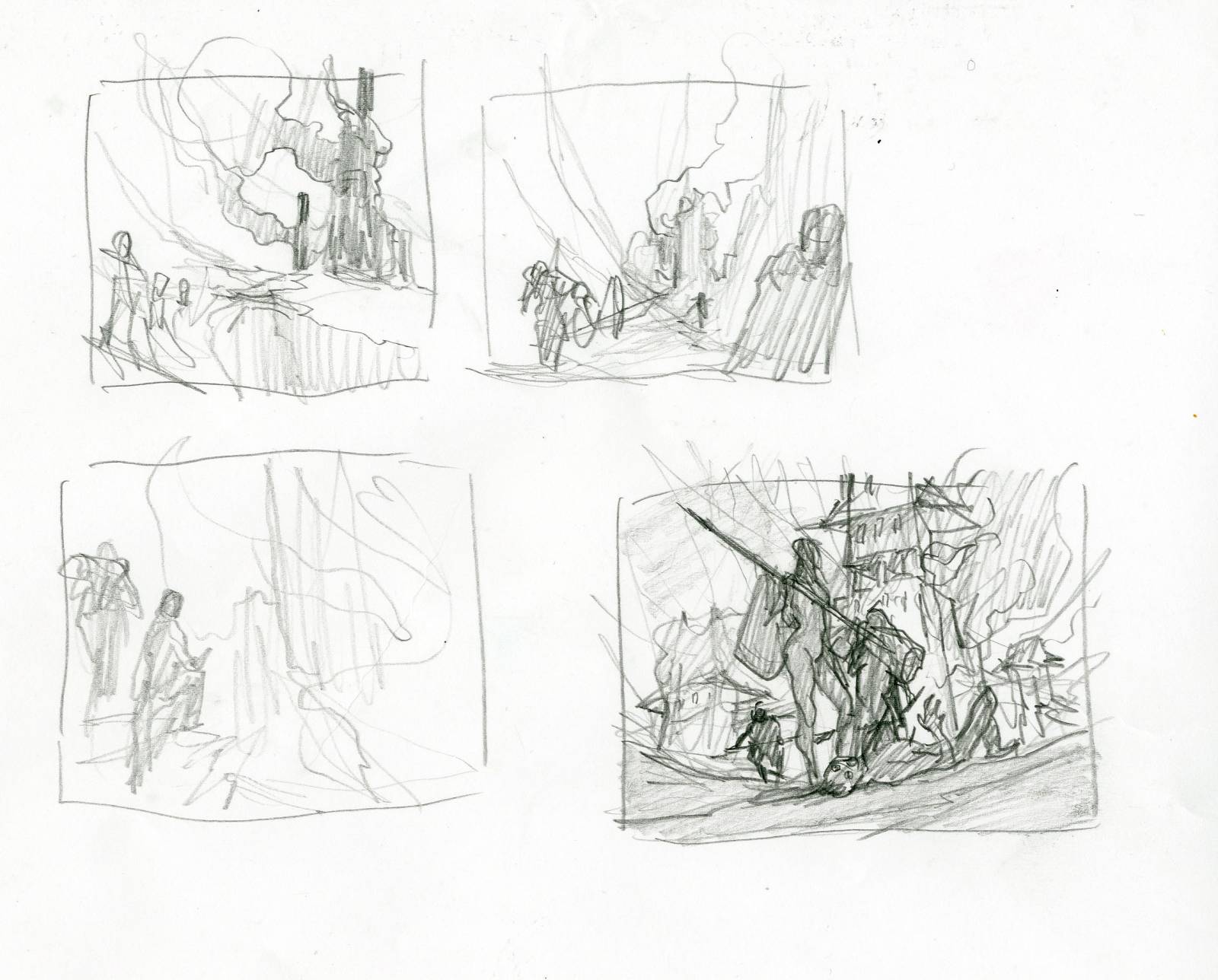
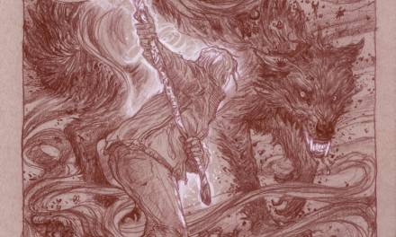
If you look at the sketches you see how fast I abandoned the less figure heavy thumbs to dive straight at the thing I told myself wouldn’t work: A figure based centred composition with the figures in focus and the village as a background. It was all I said I wouldn’t but I really liked the composition and figured that if I wanted it to work I would have to put the burning village in focus and let the figures be silhouetted against the sea of flames. I added some fast values to the thumbs and send it off to my art director hoping she would see the possibilities in this idea.
Gladly I got the green light to go on, and I started sketching the figures. In the main female raider I tried to use the twisted pose that the sketch had. I wanted her to look female in silhouette but not sexy or anything. Just feminine and badass. The resting foot on the dead villager worked fine for that. 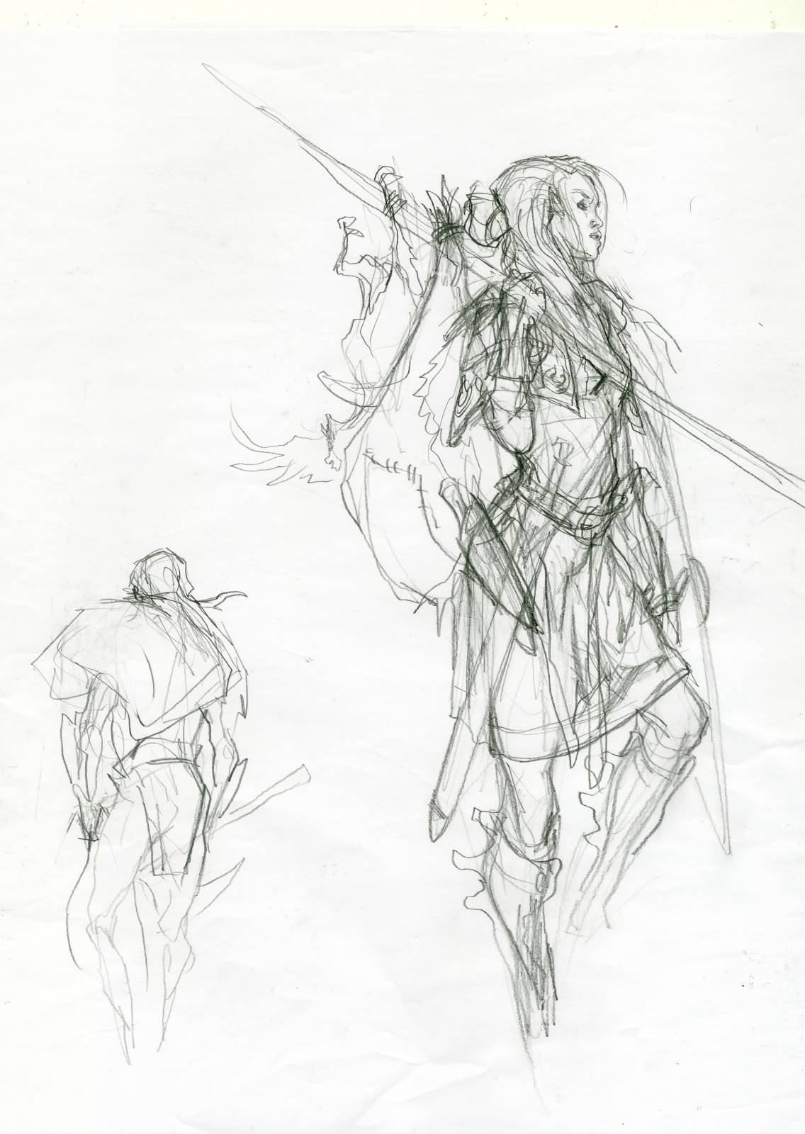 In the sketch I had her face more turned away from us looking toward the village, but I turned it so that I could show her face more. I wanted it to be an anchor point even of not a focus point. For the other guy I just needed him to hold something that showed that they we bringing out goods from the burning village. The dead guy needed to be as much a silhouette as possible. All the elements I drew together on a watercolour board and inked it up and started painting. I do not have a colour rough or anything since I figured I did not need that with only 2 different colours. I decided from the beginning that it should be a bluish/purple foreground with the city burning in orange. 2 best color contrasts in the world to me.
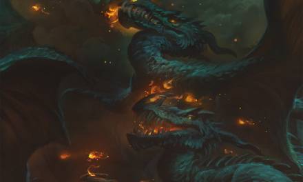
The hardest part of this was to paint fire. I always pick out some reference to have next to me. In this case I used a burning house photo. But from having reference of a suburbia house on fire to actually painting it onto a fantasy village takes a great deal of abstraction. In the end it is all about painting roughly and trying to make sense of some of the lucky strokes. I quickly found out that the roof of the main tower needed a cold light like from a moon to give it a contrast. I think if I stay too much within the same family of colours it becomes flat, so I always try to find a way, either realistically or just made up, to show a temperature contrast. Things just looks more clear with the maximum contrast next to it.
When I started on the figures I right away used the same moonlight to make the skin tones pop and to add shape to the dark figures: For them to not seem to flat I put a sort of reflected light coming from the ground up into the surfaces pointing downwards. At that stage I try to think of the figures as if they were made up by rough Lego bricks. It makes it easier for me to decide where to put the reflected light. The orange I used subtly in order not to fight the top down moon light. I always try to make one light source prominent and the other secondary. Or it will look like a disco light dancing scene.
I added a few sparks and dusts digitally and it was done. I am quite happy how it turned out. It is not a figure painting even if it has a great central figure. It looks like a scene rather than a figure portrait. and it bears the trademark of my strong colour palette.
Nothing in this painting has its local colour. It is all either burned out by moon light or flames.

Great post Jesper, I always enjoy seeing your process.
Great post Jesper, I always enjoy seeing your process.
Cheers for the post, and great painting. I would love to hear more about seeing the figures as being made from Lego blocks…
Thanks Jesper, wonderful execution!
Thanks for the beautiful article