These ‘short take’ posts will address common factors within an art career. You’ll recognize these concerns as you’ve probably encountered many already. You may be used to hearing them from a well-worn perspective, but you’ll find my approach, based on a long career of discovery, failure, and success, is not standard. As you progress through your career, you’ll find your own solutions to share, for certainly anything produced in the creative field is not usually a mundane, methodical process.
In my SmArtSchool classes I discuss at length the effort of laying down paint and how that paint projects ideas and stimulates the audience. How the pigment goes down and the way it appears most would call ‘technique,’ but how is as important as where and why.
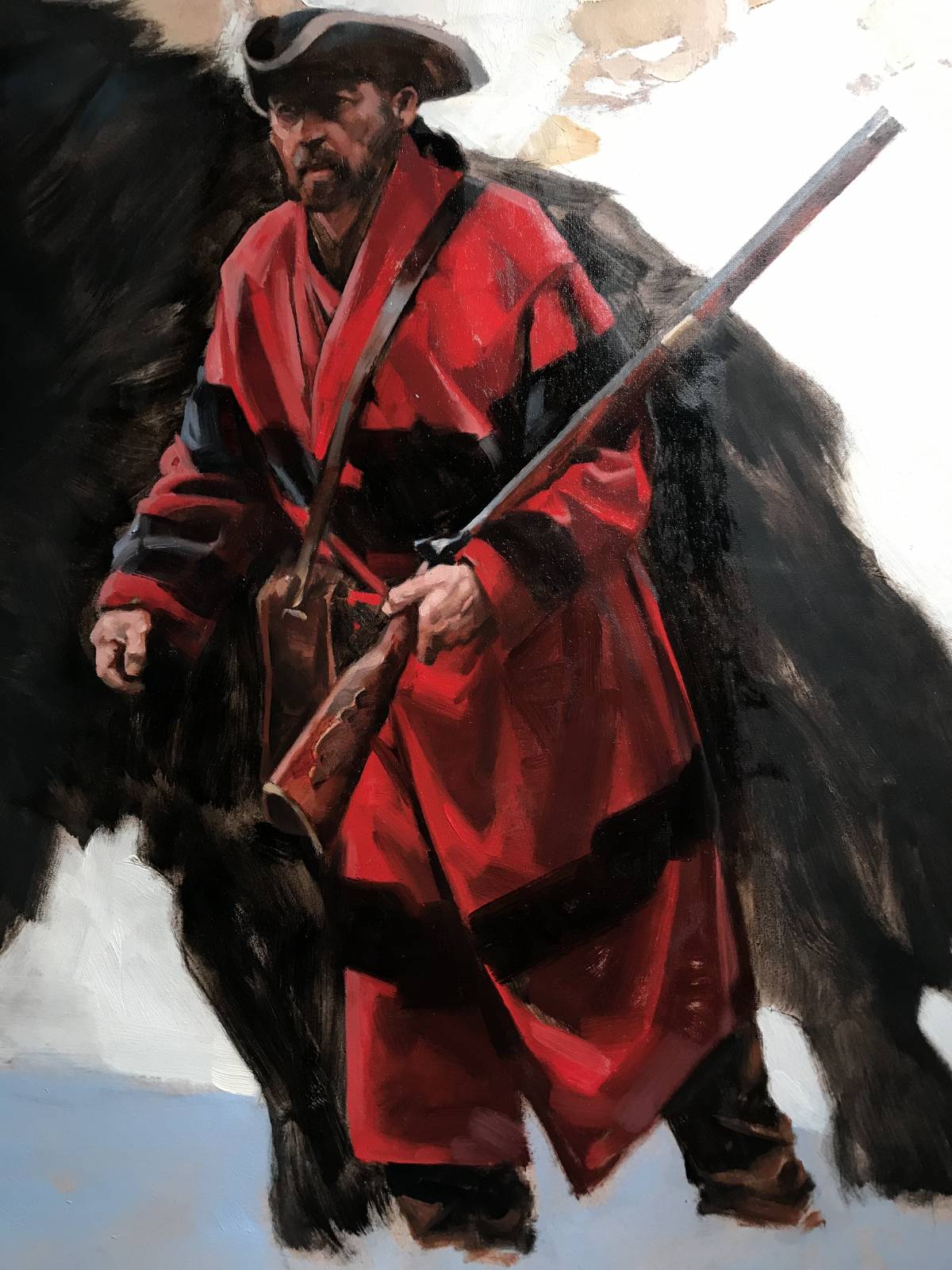
Detail is a natural desire for most painters and is certainly a viable and inspiring aspect of expression. How much detail is necessary to describe realism is the question.
I’ve spent most of my career painting loosely, describing detail in as few marks as possible. Deciding how much to describe is where most of the effort is. Reducing form to its basic planes takes simplifying those forms. This takes much observation and concentrated study.
When you take away detail such as wrinkles, lines, hair, surface factors, etc, you’re left with describing basic forms. To get those forms one must capture the value of it first. Capturing correct value can imply detail, but coupling value with shape will give you enough information to specifically describe an object. (Even when painting a detailed piece, one starts with broad shapes and refines from there.)
You can lose complex detail to gain definition by using value and shape alone. In this painting-in-progress, the hands were created by simply thinking of value and shape. If I nail both, I have a hand. Color is secondary.
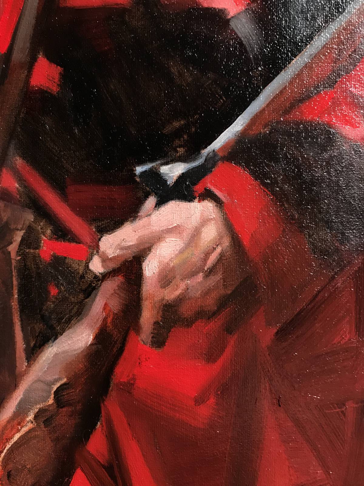
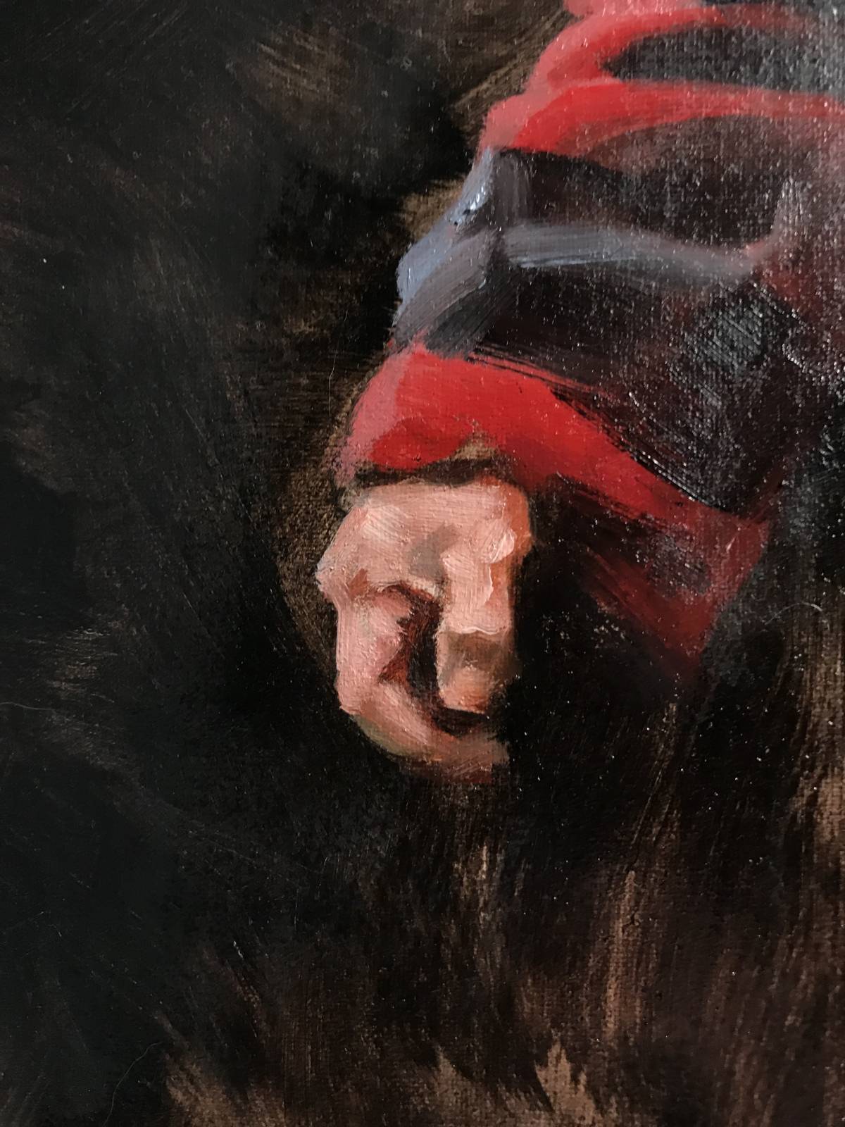
Deciding what to leave out depends on the overall concept of what you are trying to capture or communicate. But one way to understand that is to notice what values commingle. Which values are the same between or amongst elements. Then let them blend.
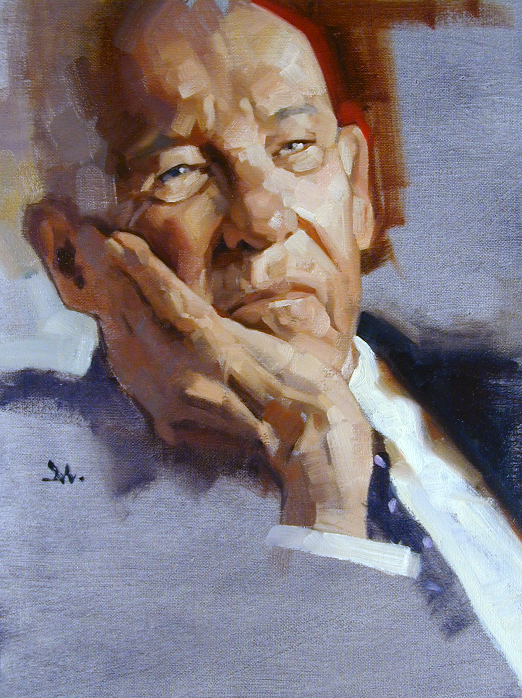
Notice in this portrait of Peter Drucker that the fingers are not defined by detail, but merely by value and shape alone. A couple dark strokes delineate enough to allow the viewer to understand it’s a hand. This also helps put the emphasis back on the face.
When values blend, you are forced to see elements as merely shape and value, not the detail of the object. That’s enough to give the impression of reality.


Recent Comments