Todays post is about my favourite painting. I know I might say that a lot, but to be honest it is true every time. Thing is; my favourites changes over and over. The reason it changes is because I paint new ones all the time, And I try to challenge myself and push my limits or push what i can do as a painter. I am not pushing that hard, but even small improvements means a lot when you add the years together.
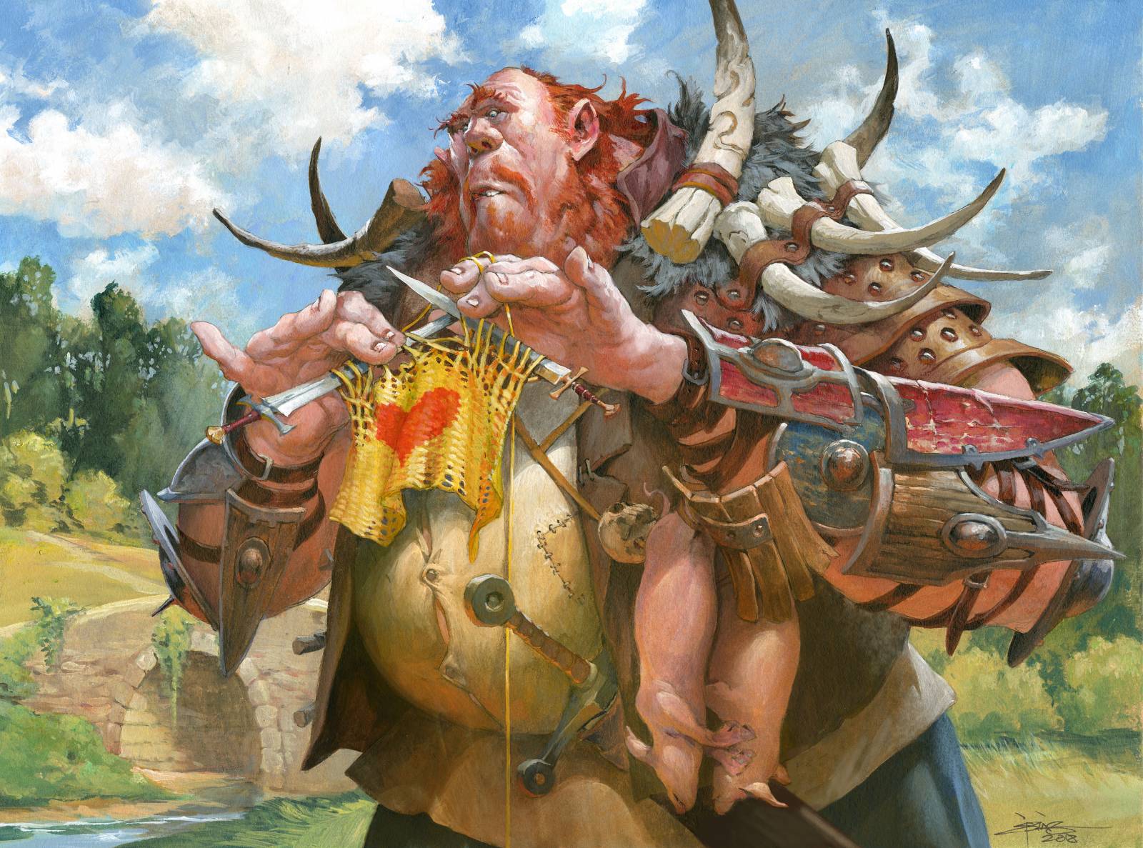
This painting is called Pacifism. It is an update-illustration for an old magic card, that has had lots of different versions one time. My version had this take on it: “Its a Giant Warrior, who has had a spell caste on him that makes him non agressive. So passive that he has taking up knitting instead of head bashing. But he uses swords for knitting and not sticks.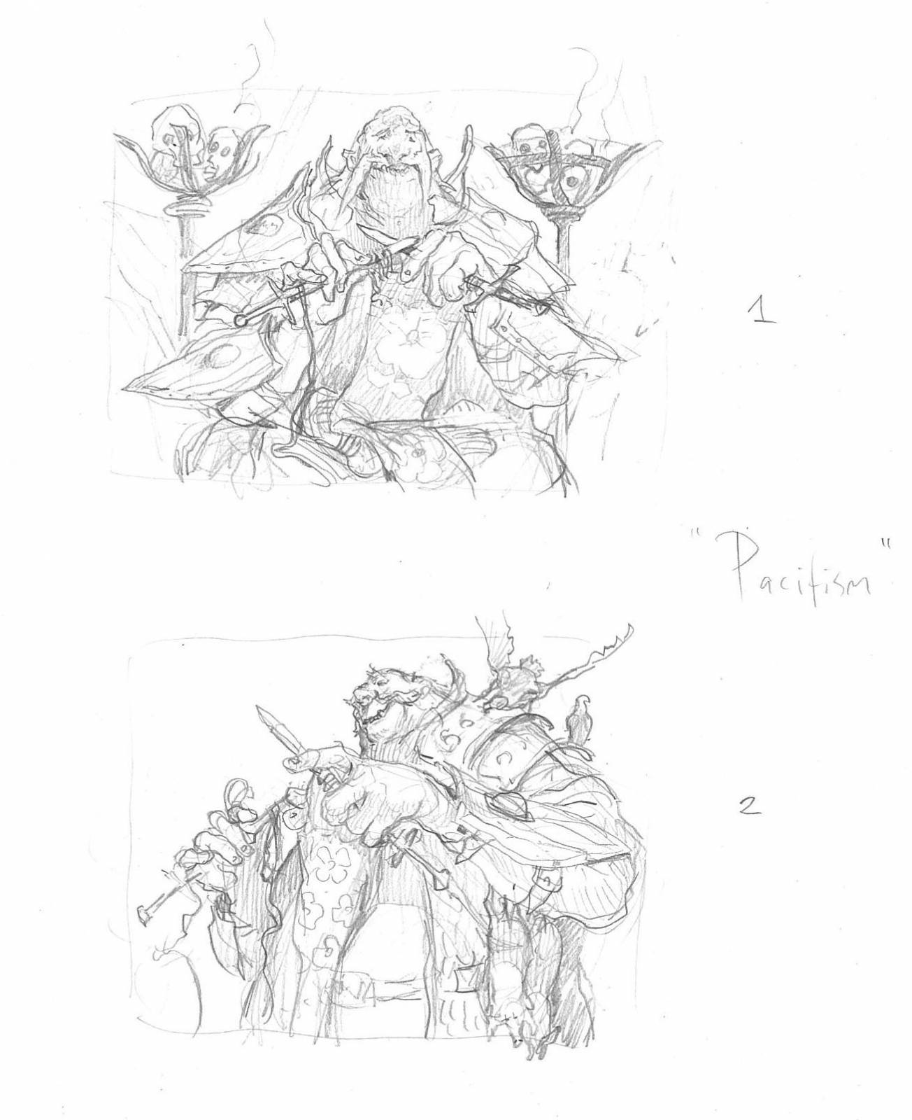
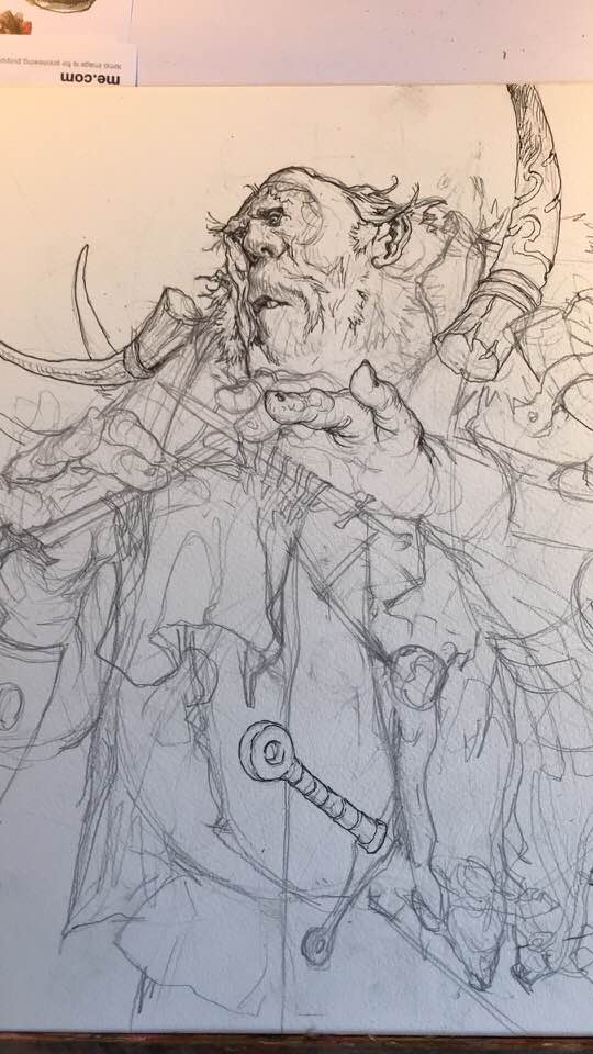
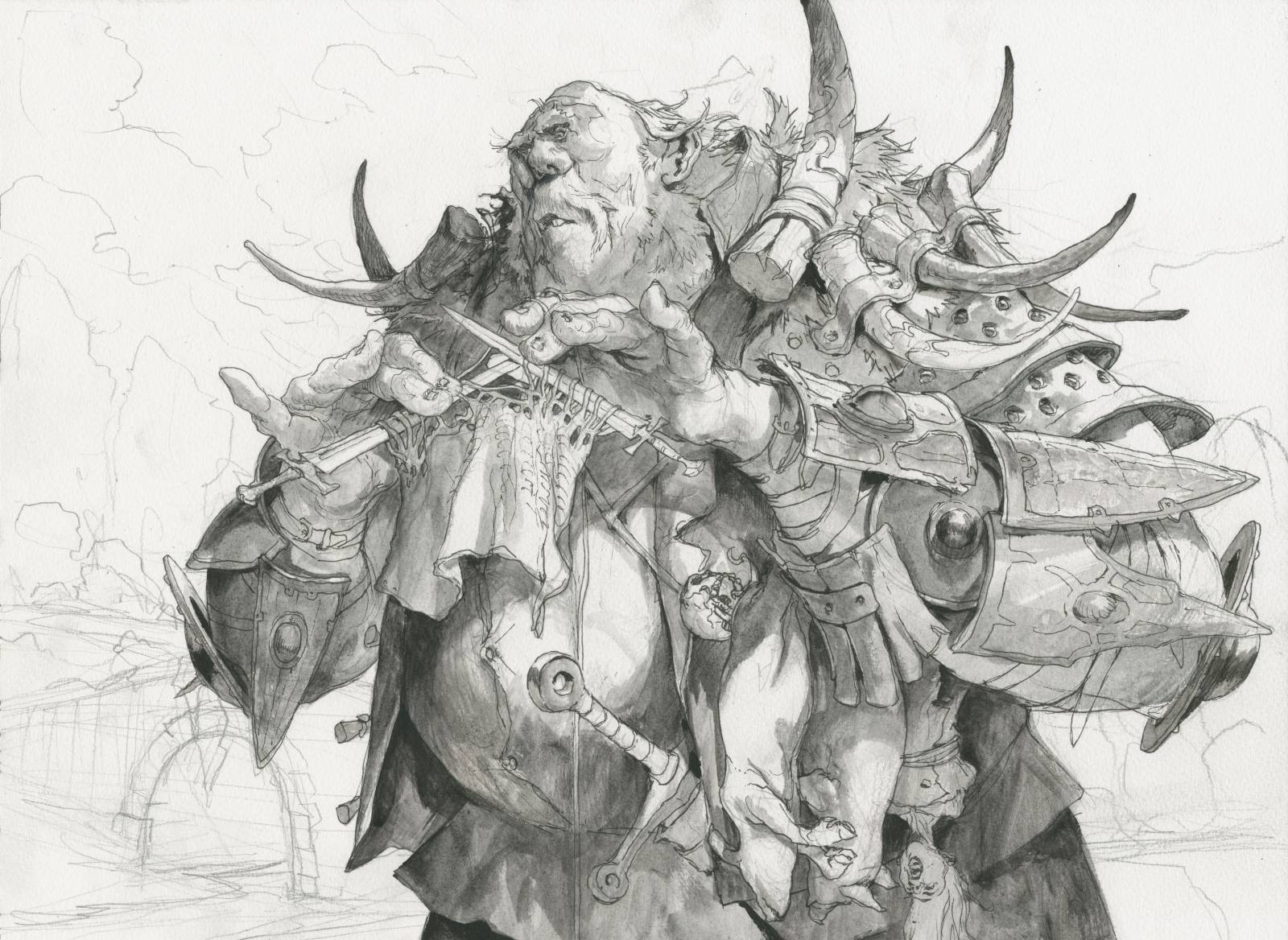
I sketched 2 thumbs. One with the giant sitting at home knitting and one where ehe was standing outside knitting but with a lower angle to make him seem bigger. Taylor Ingvarsson, my artdirector on this card chose the bottom one.
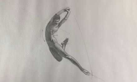
I started sketching the figure and used most of a full day not getting anywhere. The character and teh gesture of the pose didn’t seem right and did not have the goofy feeling I was aiming at. 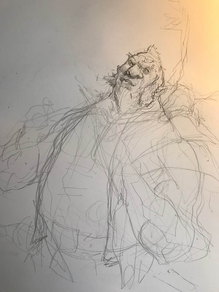 I took my sketches around the studio and one of the guys Christian Højgaard suggested: “Why don’t you let his fingers point, as if they are too big and fat to be able to hold the small swords? That way it is easier to see that he is having difficulty knitting.” Once again Christian gave me juts the right advice. That little gesture tell, was all I needed. I turned my mirror so that I could see my hands and took a couple of brushes and started posing until I had it. Then I did the sketch in five minutes. The sucking in of the underlip and the front teeth just showing was all from my own goofy face in a mirror.
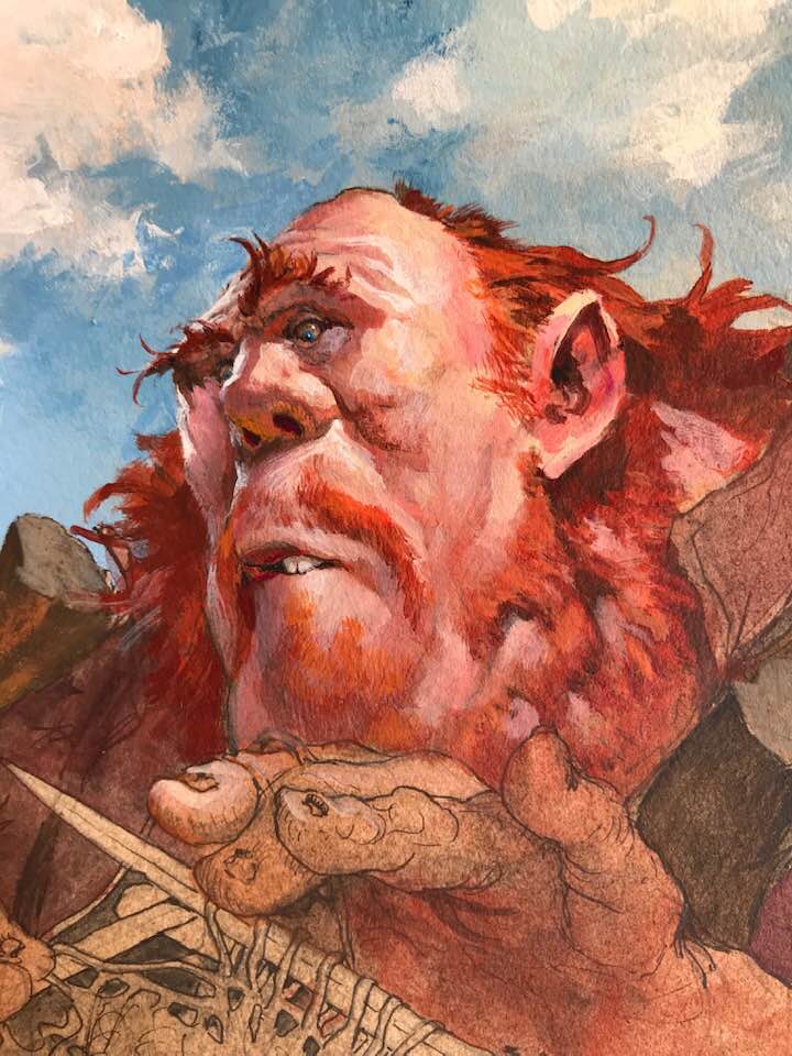
After I had the pose right, I started adding all the details.in order for him to look enormous I gave him armguards of human shields from enemies concurred. And the tusk at his shoulders could be either mammoth or dragon rips. I have always loved the whole idea of giants. They look humanoid, almost as a man turned 5 times bigger. But they couldn’t care less about teh small people. Smashing houses and eating lifestock and so on seem to be the passtime. I gave him a handfull of dead pigs in the belt acting as a lunch snack for later. Something he picked up from the last farm house he destroyed. They act as a scale element too, same as the shields.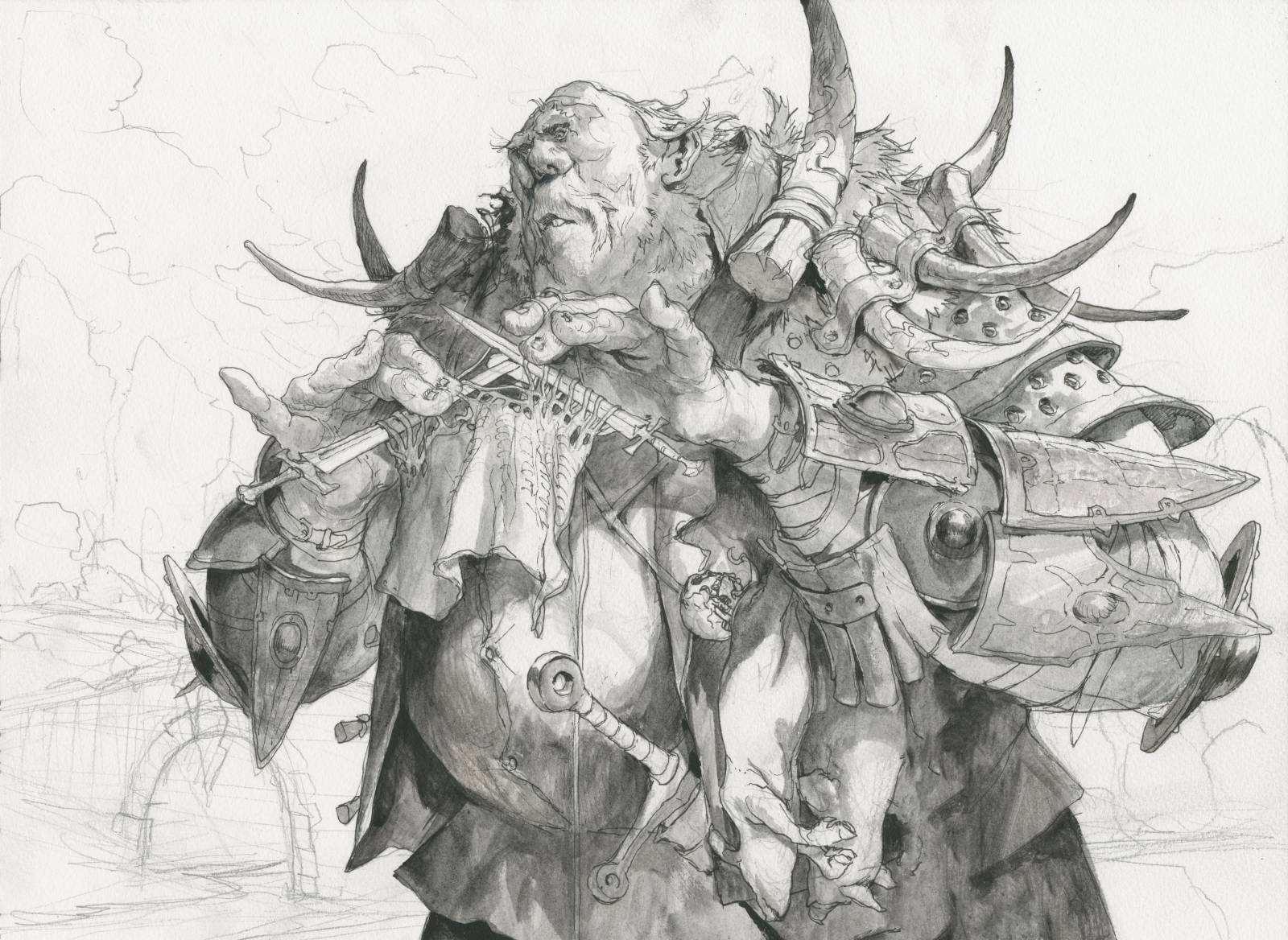
As I always do, I inked the drawing up on a watercolour board and created a bunch of greytones using black acrylics. The black and white version of my painting acts as an underpainting that I am able to see through the first 3 to four layers of acrylics. If I only sketched it up in pencil I would loose the drawing in the first wash.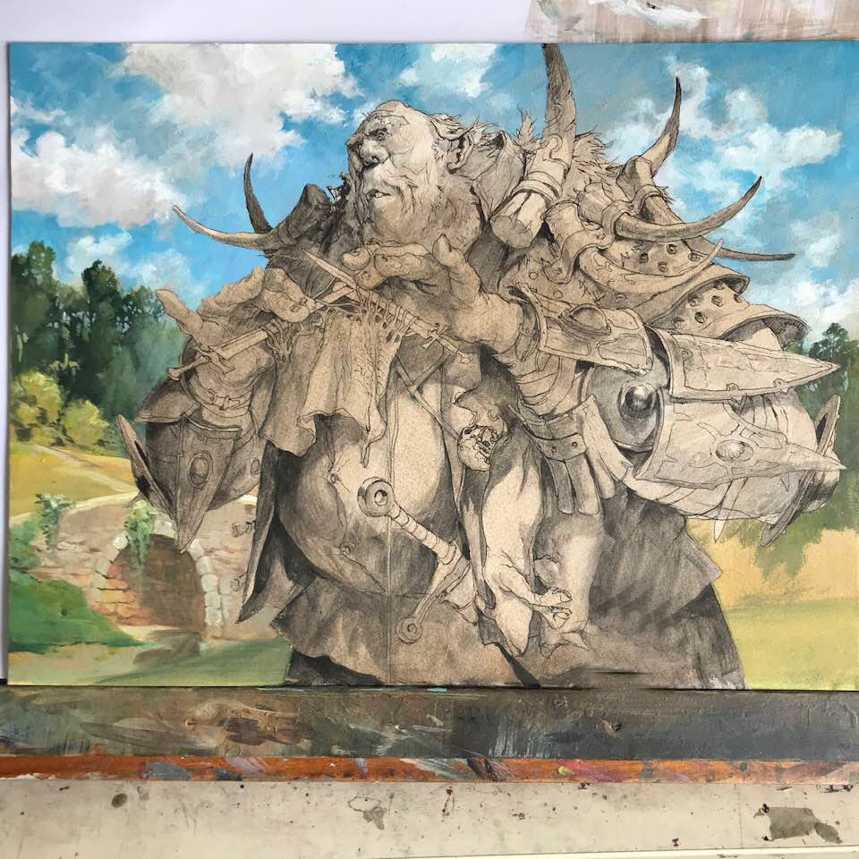
In this painting I wanted to push for something bright and colorfull. I wanted to do the scene looking like just another happy day on fantasy land. The sky is blue and the clouds are puffy and happy looking: I really enjoy painting the clouds. I tried to relax my mind while painting them and just let the brush do the work. First I painted the blue and cut around the white areas. Then adding the brown greyish shadow part and then again going over the highlights of the clouds, picking out the shapes that my random strokes had created. i us an airbrush with water in it to mist the painting surface so I can keep pushing the paint around for longer. And it helps in creating the more subtle fading effects. Before painting the background I had the shoes figure masked out with airbrush frisket film. So that I could work more freely in the background.
The painting process is like this: I start with a wash off the base color. for his skintone i started with a reddish brown, the darker part of his skin, and then slowly work myself up towards the highlight. The grey underpants with a bas color wash on top usually create the darkest areas of the painting so what I am doing is painting all the areas that is not in shadows. Actually when you look at the black and white version and think of the first layer being a wash that tones the black and the middle tone of grey, then it almost feels like 75% of the painting is done after that first wash of colors. But, it’s the adding of the last 25%, the light and all the details that take the longest.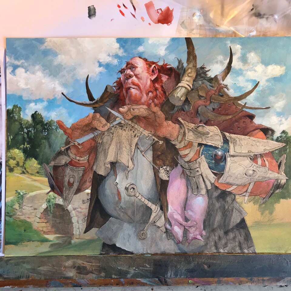
I really did everything I could in this giant painting to keep the colts slight and bright. I thought of everything in the shadow being lit by an orange bounce light from the ground. I kept the direct light very white and the bounce light very orange. That in the end is what i think succeed best for me in this one and is why it’s my current favourite. I aimed for a huge bounce light effect and did it.
the fact that I like the gesture and the narrative helps too of cause.

Hell Yeah!! Wonderful detailed description, and awesome Work.
Thank you so much for sharing. It is a wonderful work and you are a great inspiration!