As an Art Director, I get a lot of questions about why certain artists get hired over others. Theoretically there’s a ton of different ways any given project can go and — assuming an equivalent level of skill — a bunch of different artists who could create a piece of art for a project. In my case, since I’m the Creative Director at Orbit Books, artists are really interested to know how I choose an artist for any given book cover. Now, first order of business is, as I’ve written about this before, I don’t just choose an artist. The ultimate choice is up to our publisher. But, to an extent, I do control the choices the editor & publisher pick from. It would be great if I could just choose artists I like, or artists I know are easy to work with, or even artists that are nice people. But my personal preferences aren’t really what it’s about at all.
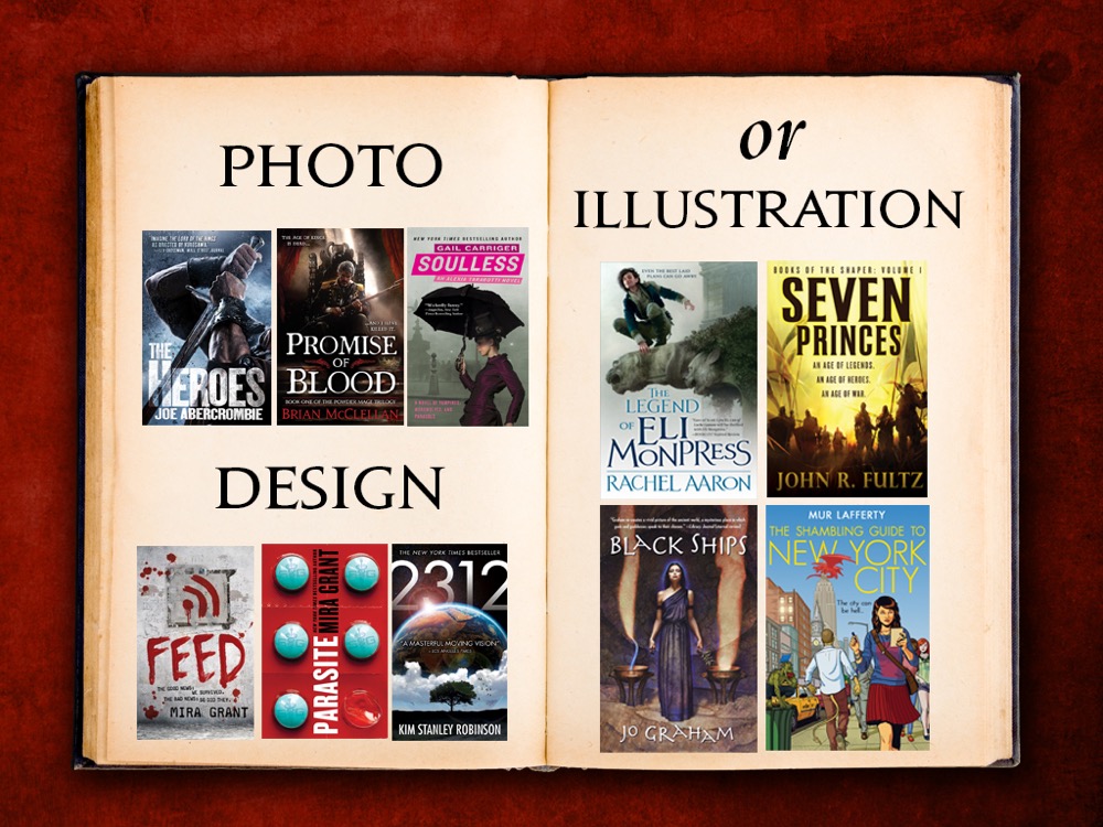
I’ve already talked before about how we decide whether a book cover is going to be illustration-based, photography-based, or design/type-based. Go check that article out.
Back? Ok, good. Now let’s assume we’re talking about an illustration-based cover. How do I choose what artists to pitch for any given job? Well, it all comes down to the target audience. The target audience for a given genre (Fantasy, Science Fiction, Horror, Thriller, etc.) or subgenre (Space Opera, Epic Fantasy, Historical Fantasy, Steampunk, etc.) follows style trends specific to that audience at that point in time. And simultaneously that audience is also looking for genre checkpoints. Genre Checkpoints are tropes, or recognizable content on a cover that repeats frequently on covers throughout the same genre.

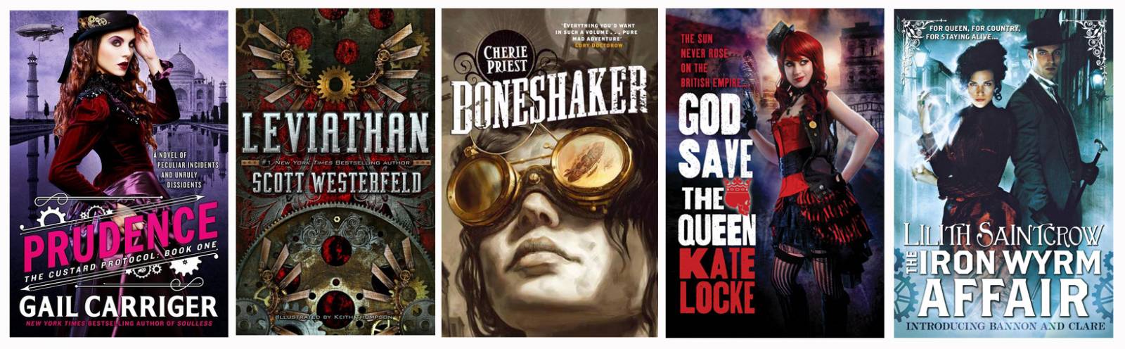
So, as you can see above, Science Fiction & Fantasy is the category, Fantasy is the genre, Historical Fantasy is a subgenre, and Steampunk is an even more specific subgenre of that. And the genre checkpoints of steampunk are clockwork parts, gears, victorian clothes, airships, octopuses, etc.
You can do this for any subgenre: Space Opera? Big spaceships and planets. Epic Fantasy? Big Swords/Weapons, House Insignia, Crowns. Cyber Punk? Digital typefaces, lime green, pixelation. Adventure Fantasy? Guys in hoods and cloaks. You get the idea. As an artist it’s a really good idea to understand the genre checkpoints for the areas you want to be hired in.
Style is a little easier to explain. A style is the way the artist makes an illustration that makes it uniquely their voice. We’ve talked about style before and will again, and let’s leave that for other posts for now. You know what it is when you see it. Dan Dos Santos has a very realistic, tightly rendered style. Greg Manchess has a very loose, abstract painterly style. Scott Fischer has a more graphic, graffiti influenced style.
To have a successful book cover that not only looks good, but one that connects with its target audience, you have to take into account the content of the book AND the style trends that the audience for that book respond to. If the content is very straight-forward you can get really creative with the style, and try to depict the same trope in a new fresh way.
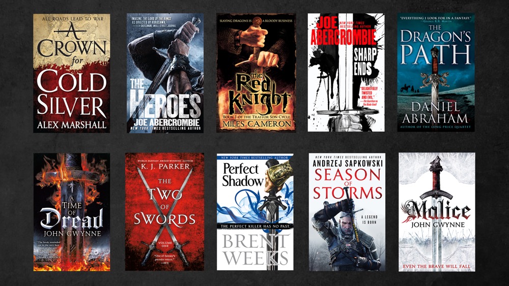
Here’s a ton of ways you can depict “a big-ass sword”:
Here’s a ton of ways you can depict “spaceships”:
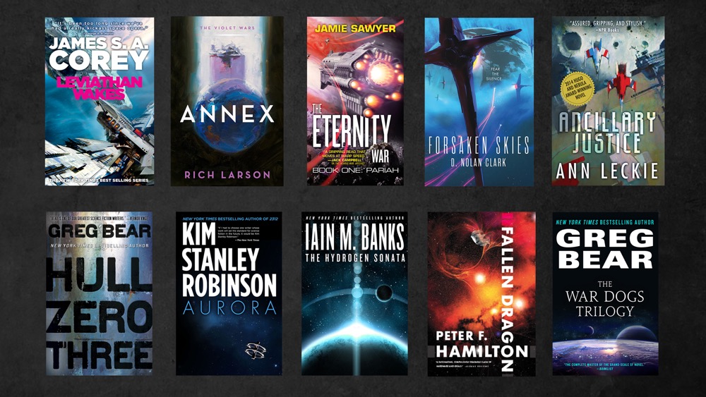
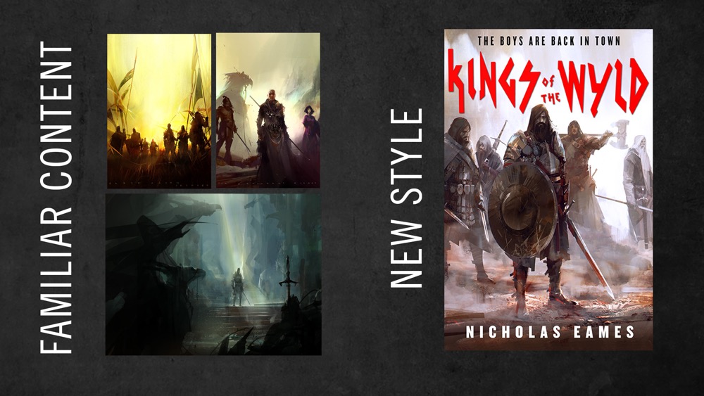
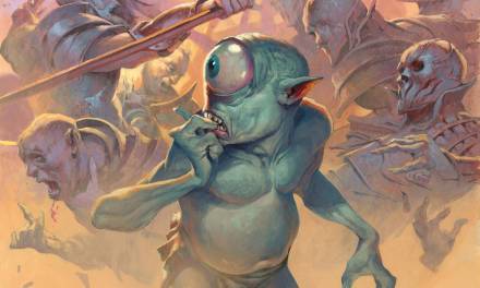
All the covers in each group pretty much had the same cover brief, and the difference is how the artist or designer interpreted it in their style. But all the genre checkpoints are there. When the content is very recognizable — aka genre checkpoints are going to be obvious — then you look for an artist who has a very strong style to interpret those tropes in a new fresh way. For example, Richard Anderson is used very heavily on SFF book covers the past few years because he has a very strong unique style, and applying that style to subject matter we’ve seen over and over again makes it feel fresh. When I was picking artists for The Kings of the Wyld (a book about a band of medieval mercenaries) cover below, I knew it was going to be a group of guys in armor with swords. I knew Richard’s style would make that feel fresh.
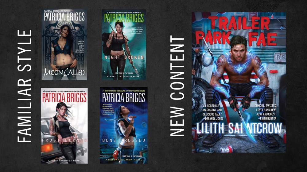
However the opposite case was true when I was thinking of artists for Trailer Park Fae. In the urban fantasy genre the cover character is almost always female. When I was given a urban fantasy with a male main character, I knew that was going to be an extra step for the target audience to take to recognize that the book was something they wanted, so I picked an artist (Dan Dos Santos) who’s style was so well known in the urban fantasy genre that it would attract the right target audience no matter what content he painted. Furthermore, if you really dig into subgenres and target audiences, you know that Dan’s style is so popular in urban fantasy is because that subgenre has a massive crossover with romance genre fans. And romance genre fans are used to very realistic, tightly-rendered paintings and photo shoots. So Dan’s style is perfect. If I hired Richard Anderson to do an urban fantasy cover, the audience would have a really hard time recognizing the book as an urban fantasy. I would only consider it if the cover was absolutely chock full of genre checkpoints (hot girl, tattoos, etc) that the target audience couldn’t ignore.
So first you figure out the target audience. Then you figure out what the content of the book is, and what genre checkpoints you’re going to be able to play with on the cover. If there are strong checkpoints, bordering on trope level then you look for artists that will bring a fresh look to expected content. If you don’t have clear genre checkpoints then you go for an artist whose style is very attractive/on trend/recognizable with the target audience.
From the artist side of things: you should know the genre checkpoints of the fields you work in, and want to work in. This is not just applicable to book covers, but all kinds of jobs. Obviously I’m using examples from SFF because I have examples at the ready, but I could pull up a ton of examples in kids books, YA books, Nonfiction books, etc. And it’s not just about books. Movie posters, editorial illustrations, etc. all know their target audiences and trends and genre checkpoints. Every Art Director on earth is constantly balancing the line of being recognizeable enough to sell vs. new enough to feel fresh and interesting. Some companies stay on the safe side and double down — they’ll hire a recognizable style and apply it to all the expected genre checkpoints, but most of us like to be a little more forward-thinking or else we (and our products) get really stale.
All industries have to consider and appeal to target audiences. Advertising, Publishing, Gaming, Film, Packaging — literally every commercial job has a specific target audience and that audience has genre checkpoints and style trends. Do you have a style that is on trend in a certain genre or demographic audience? Then you can be freer with the content/checkpoints. Is your style completely fresh and maybe even a stretch for that audience? Then you’d better nail down the genre checkpoints for that audience. It’s completely fine to ask an AD why you were considered for the job, what the target audience is, what other media they might be consuming. They know why they pitched you and the answer will help you do your job even better. Remember that your Art Director should be able to help you talk that through, and discuss what their target audience is looking for. And trust me, they’ll be very impressed that you are thinking so strategically. It’s rare to see an artist thinking bigger picture like that, and it’s obvious which ones those are in book covers, because they’re so busy they are never without work offers. Showing that you’re thinking about what problems the AD has and needs to solve beyond your primary lane is catnip to us. That’s when commissions really become collaborations and that’s when you get hired again and again.

Love how your posts are always so thorough 🙂