Picture making has a deep tool chest that can be a little bit intimidating to one wanting to make art or improve their skills within their specific craft. Many of these tools are more specific to physical subject matter. These are the tools we see used to advertise the arts more often than not, since they reap insta-gratification/results for all to see and find impressive.
The tools that make little sense to the masses are the ones that shape the pictures into award winning images, made up moments we all remember forever. It is hard to sell these tools when the results are subtle, slight, but significant to the pictorial outcome. With results like these it’s no wonder they get little play on the social media food chain.
Composition is a little confusing at times, especially with not as much literature to support it as say, perspective or figure drawing, but it is the most significant part of our learning. The study of composition should have a school dedicated to it alone, a finishing school focused on the visual language. The focus of the curriculum would be clear visual communication in any medium, utilizing the academic training that was hammered into the student. Repin academy is one such school, but even it has its limitations that could be vastly improved. But I digress…
If we were to whittle down composition to bare components of importance, three particular tools stand out. Each of these tools has many built in components that we can often mistake for tools, and many ties to other important tools, inseparable from them, yet, categorically different.
Three tools every artist should have in the back of their mind when developing any visual idea are contrast, harmony, and attraction. These three tools used together will help you organize your visual composition without the need for referencing the subject matter before hand; these are universal tools for visual design.
Contrast is a huge component in art, the list of contrasts outweighs all the other design principles combined. Contrasts include the contrast of: light/dark, small/big, warm/cool, angular/curvy, black/white, chromatic/gray, and many, many more. We do it without knowing we are just by the dark marks we place on the light page; without it we can’t see what we are doing.
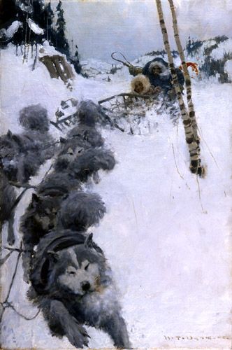
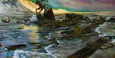
Harvey Dunn uses dark and light to contrast the characters from the snow.
Pictorially, it sets up the graphic design equation and how to handle the harmonies and the attraction towards the focal point. While we might think of contrast as simply black and white, it is much more complex when it comes to the number of possibilities we have to use it in visual communication.
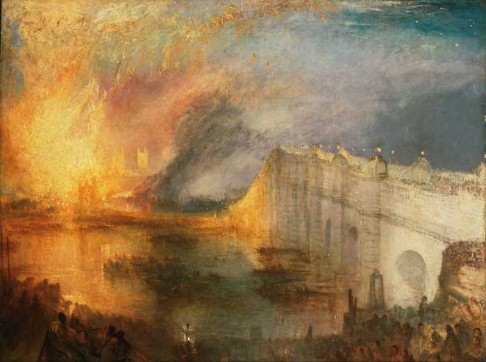
Turner uses color, shape, edge, transparency and opacity, direct vs. layered painting as contrasts in this scene, as in many of his canvases. Turner was limited with the range of color he had available at the time, so he had to be clever with his materials to depict the depth and color changes he could capture.
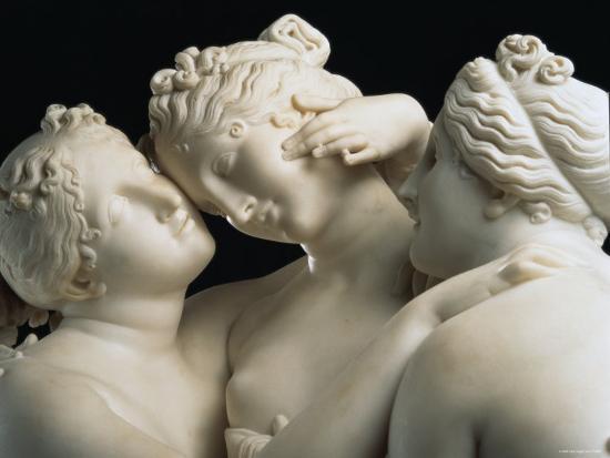
Harmony is the adhesion between all the objects, elements, colors, edges, characters, logos, or anything else tied to the pictorial boundaries. Harmony is the metaphoric glue that tightly secures the pieces together as a whole. Like in a song, harmony the combination of simultaneous visual “notes” to produce chords (larger concepts) and chord progressions (contrasts, attraction) having a pleasing effect.
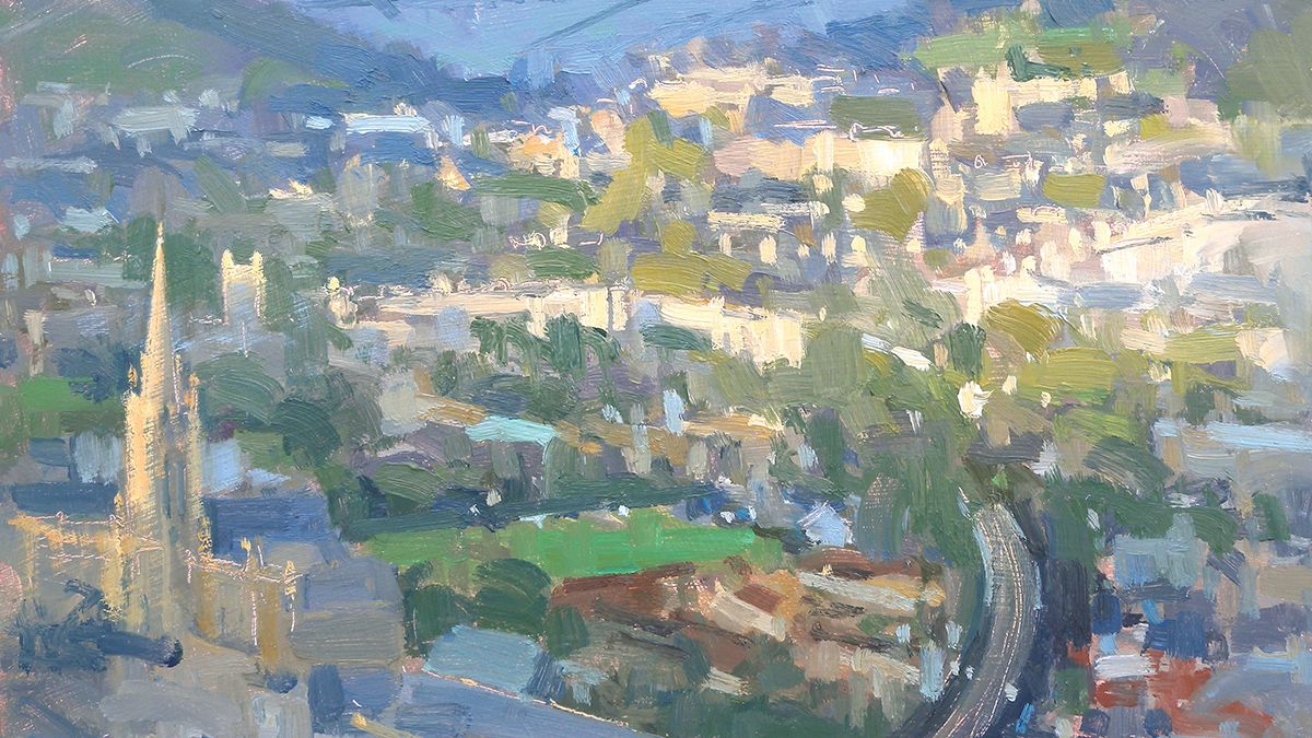
Here is a palette of harmonious colors painted in this landscape painting by Valerie Pirlot.
It is easy to get overwhelmed with all the “stuff” we might have to add to an image to make it feel finished. We might freak out on subject matter we have never looked at before and now have to illustrate. When we design the thumbnails, harmony can help edit the space down to the essential and expose only what is important to the moment.
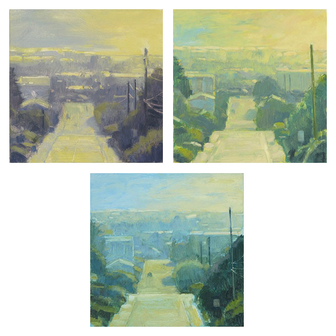
Three fantastic examples of harmonious color studies by Mitchell Albala.
Attraction is how the elements pull you towards the focus however weak or strong they may be. Attraction is hiding in plain sight, nestled between the contrasts, and embracing the harmonies. Attraction helps us with technical decisions when it comes time to render the image where we can shave time away from the rendering process and cut corners on everything that might have to be rendered up to completion.
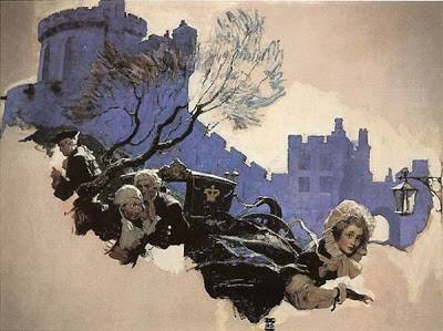
Here is a great example of attraction by Dean Cornwell. All the shapes, (implied)lead lines, line of action, gradient sweeps lead to the poor girl in lower right hand corner.
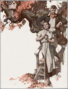
Master of the vignette, Dean Cornwell had a way with design, every line shape and color sweeping you to the female in the foreground.
Harmony and attraction help control contrast, cultivate it into smart decisions that can lead to visual innovations in your personal dialect. There is really no way to speak of one of these tools without speaking of the others with it. They are inseparable, and what I find as a core set of tools to help lay down the foundation for anything visual.
These tools help us bend the otherwise objective or perceivably rigid art rules we learned in school, they give us permission to break a rule when and where needed for the benefit of the message, statement, or concept. They also show us what tools are needed to successfully solve a visual problem, or make it stronger.
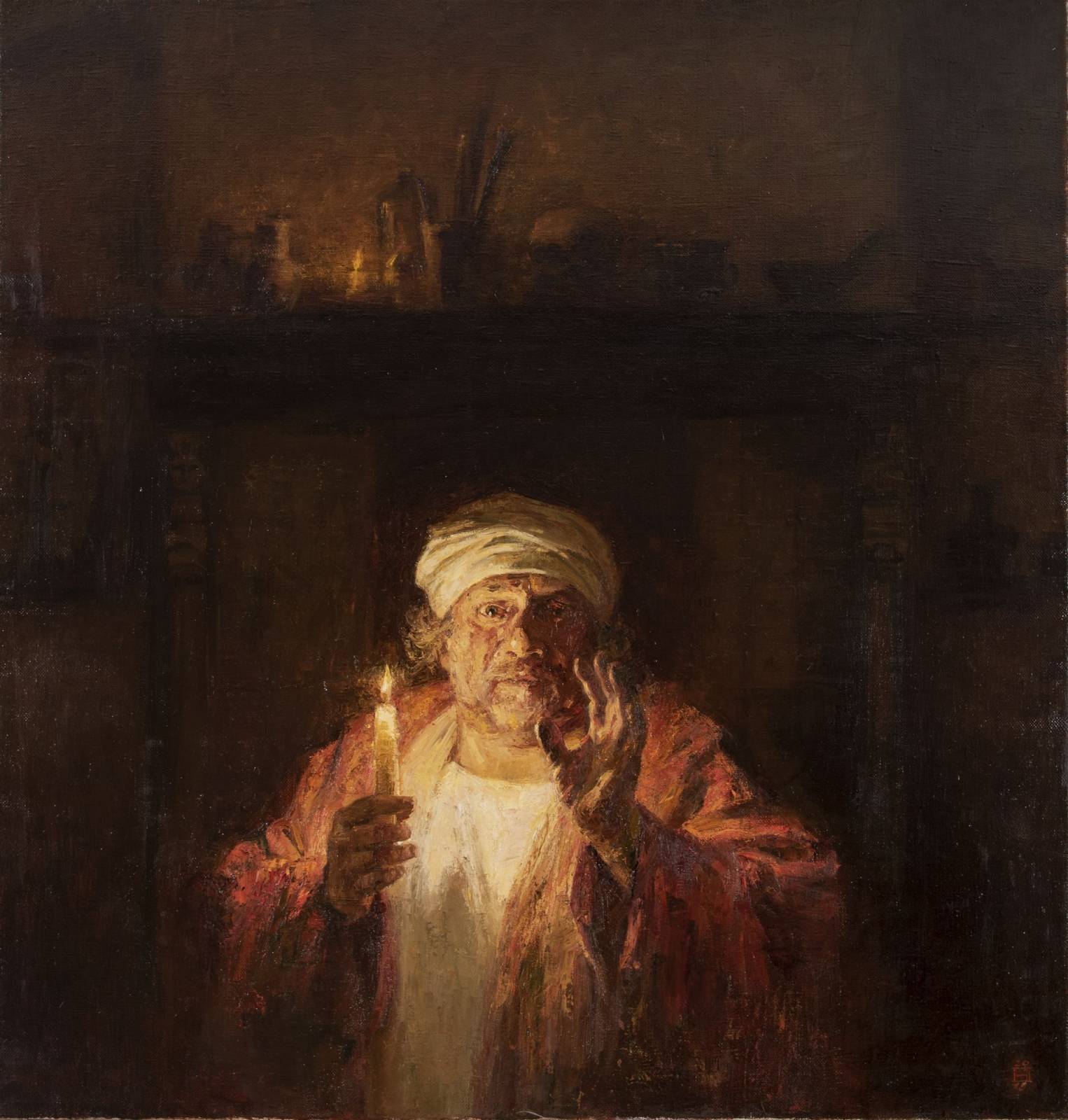
Rembrandt at work building upon fantastic harmony, contrast and attraction in this painting Towards Eternity.
I will go over each of these as separate topics every other week for the next three postings. If I tried to do each justice in this post it would be a TL;DR , as I’ve done before. I hope these posts find you well and help you achieve something in your work that you have been searching for. Stay safe, stay smarter, and thank you for reading.


Great post! Loved the artworks and the way they were used as examples to convey the subject matter.
Composition is something I always think about, but am never sure if I’m doing it right. A school based on it would be great! Looking forward to reading more on these tools. Also, I’m pretty sure there are no TL;DR posts. They’re always fun and super informative.
Nice article! Thanks for sharing.
Thanks so much for the enlighentment brought in each of your posts Ron. What a great instructor.
Excellent breakdown of the elements that make a good illustration so compelling. Enjoyed the visual supportive work. A great variety of images. Thanks Ron for another thoughtful lesson