by Arnie Fenner
This post is inspired by Greg’s previous entry about the expressiveness of handwriting and using it to help form an identity. Taking it one step further, hand-lettering, calligraphy, and type manipulation can be great ways to capture some attention in the marketplace.
Boring, clunky, inappropriate, or badly designed title treatments can kill a book cover—and doncha know that every time a vaguely-fantasy-flavored typeface is introduced, everybody and their brother slaps it on whatever they’re doing (Papyrus is a recent example of a way-over-used face). Alphabets with alternate swash caps and lowercase letters are deadly in the hands of an amateur designer or art director.
When Greg’s painting got the nod as the cover for Spectrum 17 it seemed to call for something special; we turned to a good friend who happens to be one of the country’s leading calligraphers, Rick Cusick (who, unfortunately, doesn’t have a website—though his significant other and fellow artist Jill Bell does). Rick explored several options before hitting on a direction that clicked: the result, I think, shows how expressive hand-lettering, when matched to an equally expressive painting, can make for a compelling book jacket. Or movie poster. Or advertising spread.
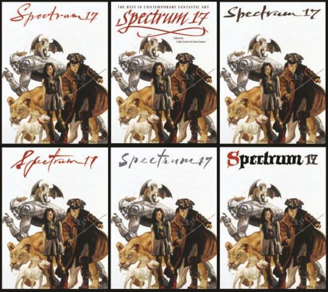 Above: Some of Rick’s initial approaches to the title treatment for Spectrum 17. The last was inspired by J.C. Leyendecker’s lettering style.
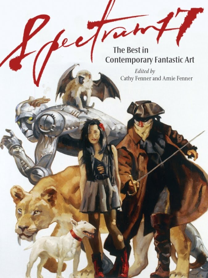 Above: The finished cover.
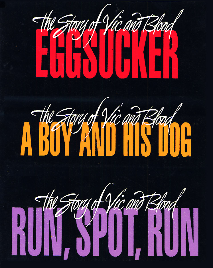 Above: From time to time in my career I’ve done hand-lettering for various logos and title treatments. I’ve done a lot of work for Harlan Ellison through the years and, lemme tell you, he keeps me on my toes. Happily so.
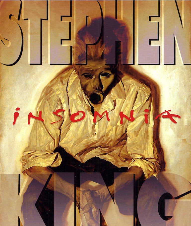 Above: I designed the cover for the limited edition of Stephen King’s novel and incorporated hand-lettering and manipulated type: having a painting by the incomparable Phil Hale to work with made my job way too easy.
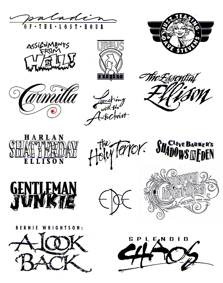
Above: Various hand-lettered titles, logos, and misc. I’ve done through the years.


I was so excited to see the hand-written calligraphy in this edition. Beautiful choice and very nicely executed. Overall brilliant idea with such a fantastic cover. Killer type samples too. 😀
papryus? now its bleeding cowboys
nice hand lettering !!
Damn, Arnie.
You always surprise me.
Those are -really- nice!
Yeah, who knew Arnie? Maybe you're more than just a pretty face.