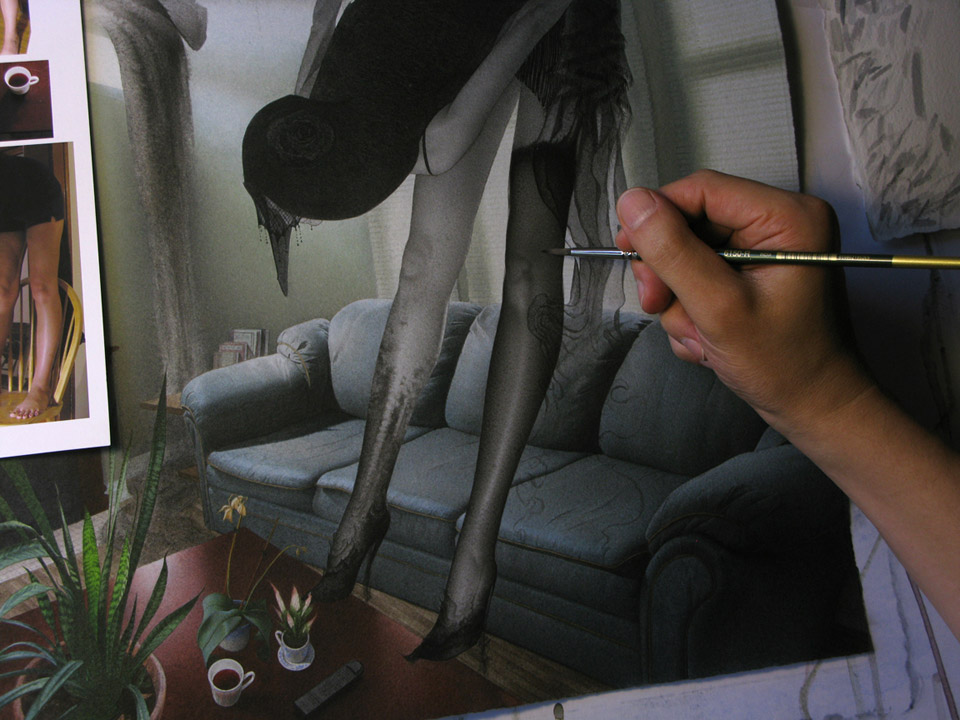
It’s been awhile since I’ve posted a breakdown of one of my paintings. So hopefully this will be of use to anyone new to Muddy Colors or to my work and process. As quick overview I’m basically using watered down acrylics on watercolor paper with fairly traditional watercolor technique like wet on wet, scumbling, and dry brushing to produce my finished paintings.
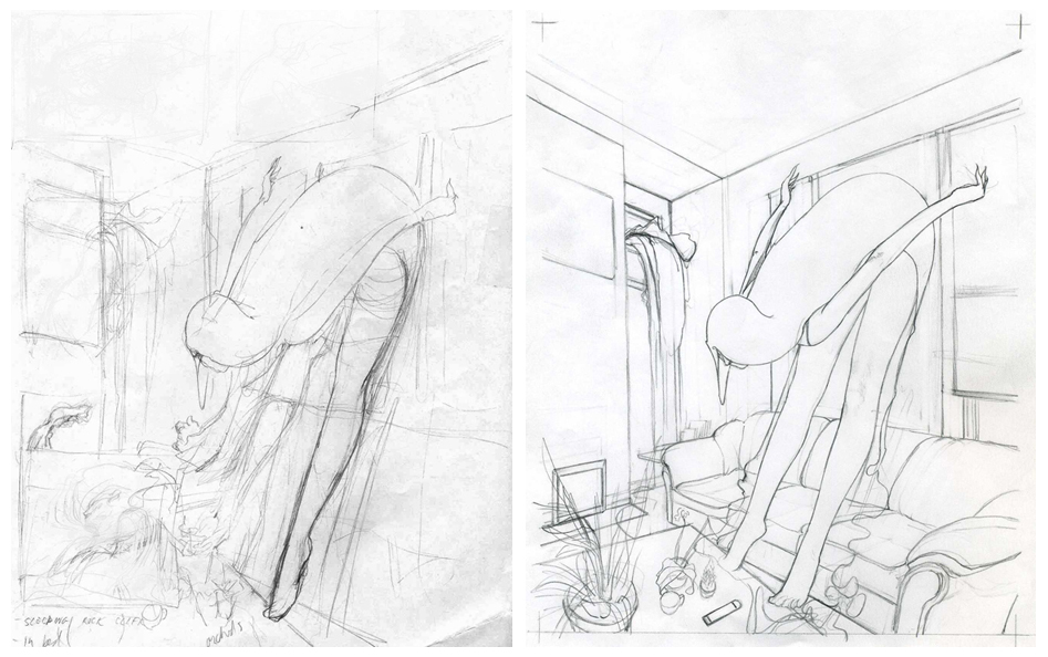
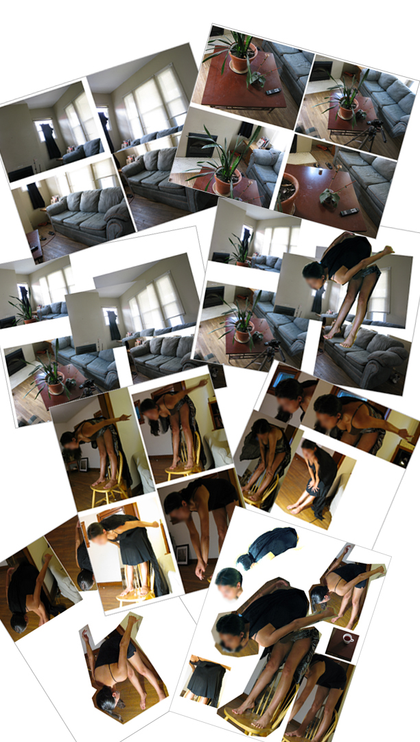
Here’s my original concept sketch which is overlapping a few other thumbnails. In the beginning ideas for the new piece were very elusive. I feel like I spent four or five fairly stressful days pulling my hair out(beard hairs obviously) trying to come with a decent concept. This isn’t always an easy task and sometimes made worse with looming deadlines. But obviously concept is one of the most important aspects for a piece of art in my opinion. The drawing on the right was done with the help of photo reference for the figure and as much of the background as possible in order to come up with a cohesive look and a certain amount of realism. Cue photo reference.
Ideally, I would’ve liked to take photo reference of my model actually in the environment that I’ll be using in order to have information like reflective light, edge relationships, cast shadows, and other interactions between figure and the surroundings. Of course when working on surreal or fantasy based imagery this is rarely an option.
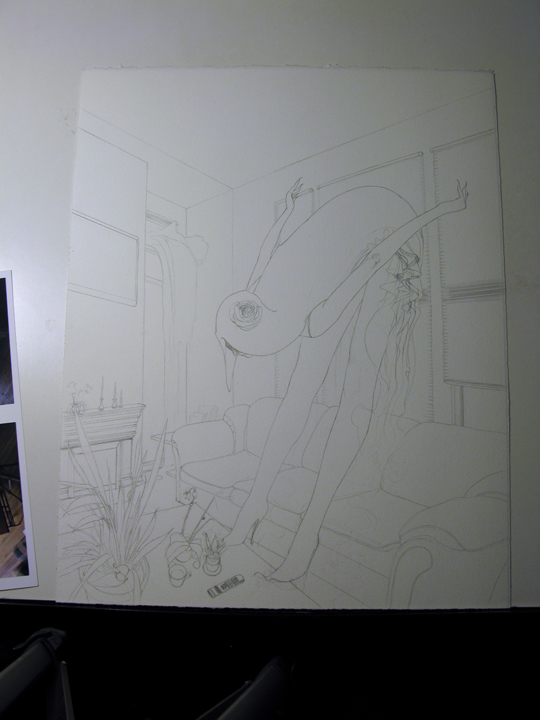
Here’s is the final drawing transferred onto the watercolor paper. I have to make sure the drawing is just how I want it before laying my first wash of paint down as it seals the painting permanently. Throughout the process I also try to be flexible enough to allow for spontaneous things to happen while working. Here some ruffly accent appeared on the dress. I did a little research on flapper dresses from the 1920’s and refined the dress a bit more as well as adding an additional accent in the figures hair.
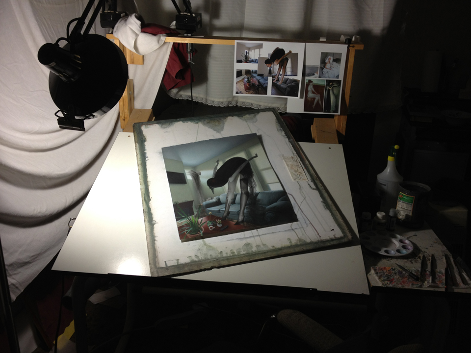
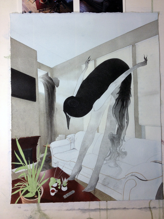
Here I begin laying down some paint in thin washes. While the paint was still wet I used a paper towel to lift out some of the pigment in areas that I plan on keeping bright, for instance the windows. I’m also trying to establish some darks right off the bat for value reference. What seems dark enough in the beginning of a painting usually requires even more darkening before it’s finished.
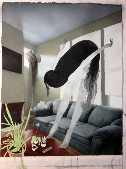
Here you can see a shift in temperature on the background walls. For the most part I work transparently, constantly building up value and color. In a case like this I have to mix some semi-opaque washes and slowly work the areas in the direction of color and value that I want to go. I also decided to add a veil at this point which I had been on the line about using or not.
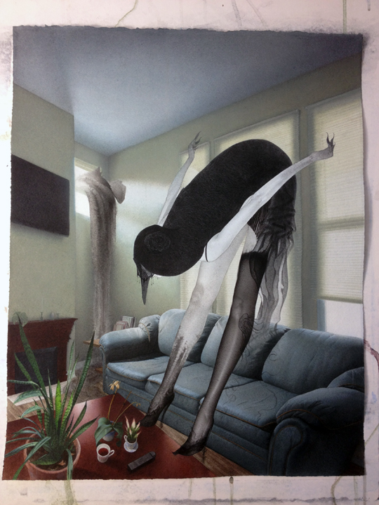
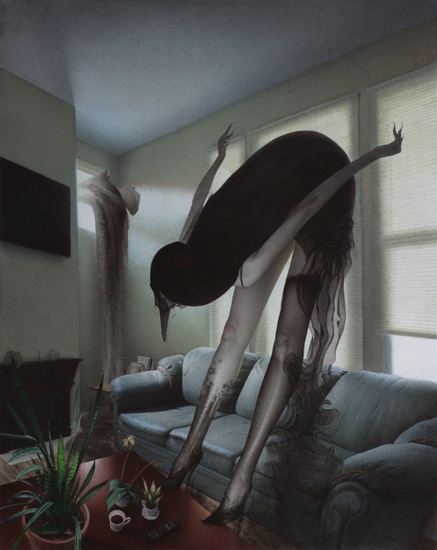
And here’s the final. As always, if I was unclear about anything or skipped over something you are interested in, let me know and I’ll try to address it for you.









This is such a fantastic piece in the way you executed it and the concept.
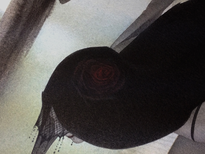
One thing I noticed was that the flower in her hair isn't really visible in the final. Was this a design choice?
Stunning.
Amanda- Thanks, I decided to make the rose more subtle by having the outer most petals darker and splayed out and transitioning to a more tightly wrapped and chromatic center. It's even more difficult to see on a small scale. I will post up a detail so you can get a better sense of what's happening there.
Ah alright, I see. Great, I would love to see it! 🙂
You know I posted a comment here days ago and it's gone. Maybe I used too many swear words.
Anyway, beautiful Eric. Is that your couch? Looks comfy if not too stylish.
Sorry Bill, there were some technical things and it had to be reposted. The couch is aight. I could def use a new set;)
Yeah, that was my bad. I posted it early by accident, and had to delete the entire post (including your comment) in order to reschedule it. Sorry about that.
Good thing I got plenty o' them there words in my head.
Seriously I bow to you every time I think about this Muddy Colors undertaking.
Omfg, I cant belive my eyes, the level of realism is increadible, this is what rly makes this painting look twisted and unreal-as if one enters the room and is stunned by the sight of a ghost. Great job!
Did you use some kind of masking fluid or something for the plant on the desk? How did you get it to be nice and crisp?