 |
|
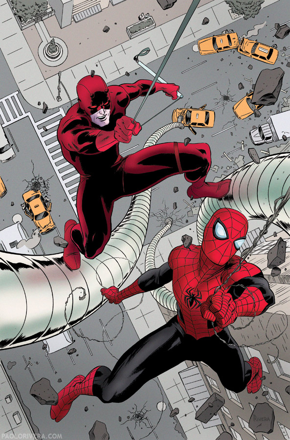
Daredevil #22 Cover. 2012.
Ink(ed by Joe Rivera) on Marvel board, 11 × 17.25″. |
I’m afraid I didn’t have time this weekend to finish my lengthy treatise on reference, so I hope this long-promised video will be some consolation. The cover to Daredevil #22 (final version pictured above) is a good example of my approach to a typical comic book cover. I’ve detailed all the major steps in a previous post (along with the accompanying Wacky Reference), but those are static images that leave out where the real work happens. Penciling and inking take a great deal of time, but they are merely rendering — the execution of a plan that was formed at an earlier, more important stage.
This is a bare bones, 11-minute video with no sound or editing, but I hope it can reveal some insights into how I work. At 20X speed, it represents over 3 hours work, all done on a Cintiq 12WX and later printed out on board to refine by traditional means. (The video is not complete, as my iCal records indicate about 5.5 hours in total.)
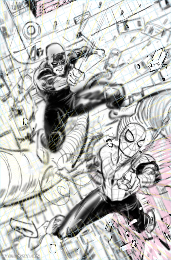
It’s a pretty straight forward time lapse, but there are 3 things that I’d like to point out as you watch. First, I use reference of my own hand to facilitate the drawing process. This photo is taken on the fly using Photo Booth on my iMac. It’s as easy as using a mirror, but with more options. Second, I employ a digital perspective template of my own design for the background. It’s extremely useful, but has a steep learning curve — I plan on releasing it to the public later this year. Lastly, toward the end of the video, you can see that I had trouble with Daredevil’s legs as he’s scaling Stilt-Man’s serpentine legs. The cover as a whole went pretty smoothly, but it took me a long time to find a pose for him that didn’t look totally awkward to me. Spidey, on the other hand, was a breeze — characters who are flying/falling are always easier to draw since they don’t have to interact with any other entities.
What you see below is the final digital sketch before moving on to the next stage. Printing this out in cyan, magenta, and yellow allows the automatic removal of the perspective guidelines and digital sketch in Photoshop, while leaving my pencils intact. This is sent to my Dad, Joe Rivera, who inks over a blue-line print of my pencils. Finally, I color his inks in Photoshop (a subject for a future post). It’s a lot of stages, but I find that a divide-and-conquer strategy makes the task much less daunting, especially under tight deadlines.
 |
| Digital Composite |


You just blew my mind with your perspective system! Using smart objects as 3D planes… who would've thought. The possibilities are endless. Many thanks for all your great posts!
Hey Paolo, Seeing your perspective system in use is awesome. Can't wait for you to release it. any ETA on release date?
Plus watching your draw/sketch is very cool too.
Forgot to mention I really liked seeing you flip the art back and forth to make sure the flow and balance was right. And man those DD legs you had to fight them to get them where they belonged. The end result looks effortless as always, nice to see how much effort went into making it look that way.
This is great! What are you using to record? Is it a free program by chance?
Cristi: Thanks! You nailed it — the secret is smart objects, and what I've shown here is really just the beginning of what's possible with them.
Matt: Thanks! No ETA just yet. The template is ready to go (I use it, after all) but the explanation is going to require a heavily produced video. Might do an instructional comic too. Either way, my goal is before the end of the year. And yes, I often flip back and forth to get a fresh look at my own art.
Dan: I used iShowU, a $20 program that was recommended to me by Mike Furth of The Comic Archive. And the whole thing was put together in iMovie.
Yeah, I noticed the iMovie title background (I use the same one for the MC book review vids). Been looking for a good screen recorder for a while now. Thanks!
Yes, I noticed as well. No prob!
Paolo, this video is fantastic! It was like I was in the 5th grade all over again, but this time “How to Draw Comics The Marvel Way” was coming alive right before my eyes.
Love your style man, and thank you for sharing!
Thanks! Quite the compliment — I love that book with all my soul.
I love the movie tells the story of courage, honesty as well as spiderman. cool