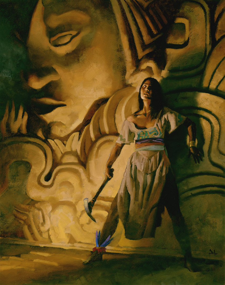
After years of painting book covers, and loving every part of that aspect of illustration, I’ve collected a few thoughts to keep in mind when working to give a book the best possible cover to attract a buyer.
My job as the cover artist is to fascinate the potential buyer. To draw them in, and keep them there.
There are many ‘don’ts’ on this list, but just as many ‘do’s’. Always strive for the best work you’ve ever done for a cover. It pays off in more work, and a reputation you can bank.
1. Entice the buyer.
Your job as the cover artist is to get the potential buyer to pick up the book. Once it’s in their hands, the writer takes over. But you have to support the writer with your imagery. Be authentic to the story, but do not over-complicate things. The writer has enough on their plate. You can help by keeping it intriguing.
2. Set a mood
.
Setting a mood for the book is better than explaining what’s in the book. Again, show, don’t tell. Stay away from complex images that try to explain what the book is all about. That’s the writer’s job. You set the mood for the characters to live in. You introduce the world they inhabit. That’s far and away more interesting.
3. Do not describe a scene
.
You will not be able to get inside a reader’s head. Again, the writer does that. As the artist, you’ll only be showing a scene the way you, as a visual story-teller, will see it.
You are more advanced than the writer at showing imagery. Your picture is not an excuse for a lack of 1000 words. Language is limited. What the writer describes in words is never quite enough to complete the image. That’s why the writing has such power. Writers allow us to complete the image in our minds. You, the artist, must be able to do both: give information while allowing the viewer to finish it in their heads…and do it very well.
I have yet to find a writer who has the graphic depth and experience to design fictional clothes with appropriate color balance, or design architecture, spaceships, or lighting. The artist must interpret and finesse the author’s impressions.
Everyone pictures a scene differently, especially the writer. We all interpret what they mean. You will never get it exactly right. If a writer says you’ve nailed it, then smile and say thanks. You just got lucky.
4. Do not reveal or solve a mystery
.
If you get a mystery or thriller cover assignment to illustrate, then no matter what: do not reveal the mystery on the cover. Don’t even hint at the answer as you will kill the reveal. And that’s what the reader pays for. The reveal. Keep it as mysterious on the outside as on the inside. The writer will love you for that.
5. Graphic interest.
Keep it simple. Repeat: keep it simple. You cannot get the reader to understand some subtle, psychological attitude without destroying the impact of a striking, simple cover. Simplicity stays compelling. Complexity confuses at first, and when understood, loses graphic impact.
6. Strong figures
.
Every figure on a cover must be visually pleasing. No, I don’t mean sexually appealing. I mean that the viewer must instantly feel that the figure is ‘right.’ Even if it’s distorted, the figure must feel good to the viewer. Balance is appealing.
7. Do not paint the turning point of the story.
Do they show the best part of a film in a movie poster? (ok….don’t answer that–Hollywood is remarkable at destroying fabulous moments by putting them in the dang trailer….and we never forget we’ve seen it…) Do you buy a book hoping to understand it by looking at the cover? Do you want the turning points pictured on the cover before you’ve let the writer have a chance to build toward that special moment?
Story is process. Do not take a writer’s power from them (or let the ignorant writer demand that you do). They know how to tell the tale in sequence. Don’t destroy their labor.
Besides that, turning points of story are usually dull without set-up. And visually boring.
8. Set up the world that the writer makes exciting
.
Create a setting where the characters can live, or contrive a visual conflict between characters within the setting that can enhance the mood of the story, and cause a potential buyer to be curious. Curiosity sells books. Mysteries-promised-to-be-solved sells books.
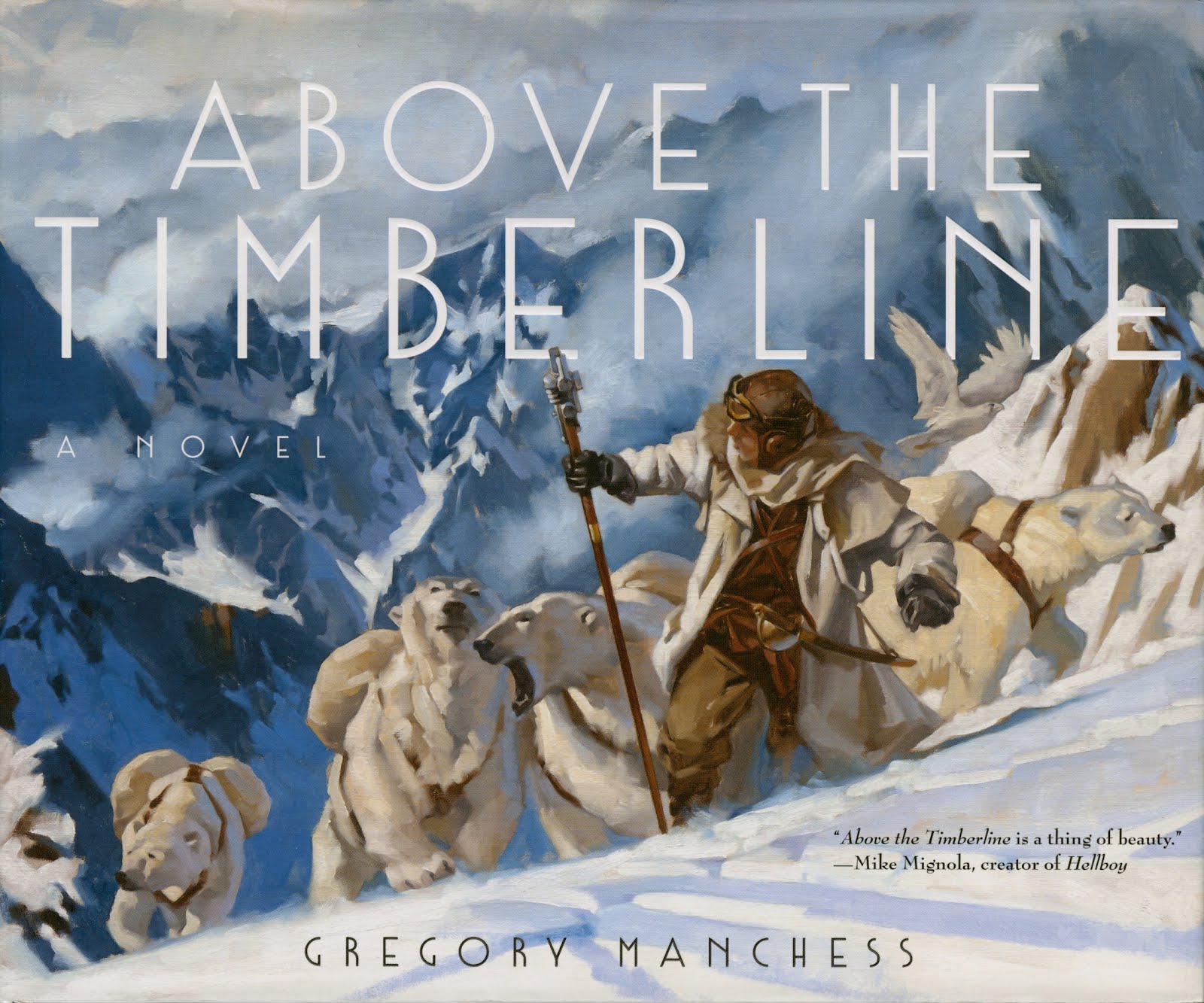
NC Wyeth was particularly excellent at building a painting from the material involved. It was not necessarily something directly out of the book, but it always gave a fresh perspective that drove interest back to the story.
9. Keep the reader returning to the book.
You do this by making the imagery simple and direct enough to create a sense of questioning, of curiosity, that entices the reader back to the story. A good, solid cover can cause a reader that’s slogging through a long book to come back over and over again. The writer will love you for that. Or should anyway. An aware publisher/art director/author won’t ask you to explain everything in one scene.
10. The cover is not a short film.
Some art directors and many publishers will tell you how much stuff happens in a scene that they want you to put on the cover. It’s ridiculously complicated. It’s enough to flesh out a small animation.
YOU HAVE BARELY ONE SECOND to capture the imagination of the potential buyer. It’s like looking at a website. Images load too long? They click away.
Paintings do not have enough time to explain this conflict: that she loves him, but she can’t tell him because that would ruin their friendship, since he’s already married, but his wife is terminally ill, and waiting for him won’t work because he’s on his way across the sea to fight in the…..
Nope, I don’t think so.
Bang: two people in a garden setting, she’s holding his hands within hers. We only know what we see. Later the writer brings us to this point, through set-up, and when we look at the cover again, as the reader, we understand what it’s about. Then it has staying power. Impact.
To repeat: it should not be the turning point. Let the writer have that glory.
11. Both artist and author work in tandem.
Let the writer have their day in the sun. It started with them. You are there to make them shine. You are there to allow the publisher the easiest path possible to multiple sales.
“They pick it up because of the cover. They put it down because of the author,” is an old saying, but I prefer to think of it this way: “They pick it up because of the artist, they keep it because of the author.”
The artist is the author’s wing-man. You’ve got their six.


Great advice, thanks! These types of sets of condensed advice distilled from years of experience are invaluable.
Amazing post Greg! Loads of information I would second, third and fourth, from setting up a world from the writer to 'you have less than 1 second' to capture an audience with a cover. These issues not only apply to cover art, but to illustration in general where you have to 'compete' with thousands of other images in the marketplace, from advertising, to magazine covers to game products, etc…
Thanks for spending the time to clarify these important design concepts.
Another amazing list of hints, and that's what I love this site for.
And just for fun – I should point out that almost every cover by Josh Kirby is violation of almost every rule you've described, doesn't it? 😉
Great post Greg 🙂
Thanks for the hints, great advice as usual on Muddy Colors 🙂
Excellent advice.
Great post, thanks for sharing!
You cheated. I'll let it go because you are just so cool.
Wow, now that is a useful list for an illustrator just starting out. Thanks!
James Gardner
Thanks, Donato! Glad to hear I have your veteran cover artist support. I figure you could add a few as well! One day, I may have to write a part 2 to this one…..
Hey Bill! Thanks! uh….what was the cheat?
G
This is a great list, Greg! Once you read through it, it all seems like common sense, but until you get that book cover project and have to figure out how to make the cover that 2-second interest-grabber, it might as well be another language.
Not quite so, Kitsune…these points are good for developing paintings that will fill your portfolio first, especially if you want to do cover work.
Many artists clutter their compositions with too much detail. By simplifying and following some of the above, you stand out from the rest. Honestly, the common sense amongst many artists, who are supposed to be thinking above common sense, figure more is more. The more stuff, the better.
When you build images that counter that, you immediately stand out.
Take your first thought on any idea or composition, then ask why you pictured it so fast. Because it's the common sensical approach. It makes obvious sense, and it's not bad. But start taking steps beyond that idea to push it, and also counter the obvious. In other words push your ideas to reveal more with less.
As with anything, it takes time to understand one's own working methods. The idea that things come naturally without effort is flawed. Art-making takes tons of practice and focus.
As you go along, if you maintain your awareness, things get clearer.
I have said, repeatedly, over the years – the COVER makes me purchase the book! I don't even open it up! I just buy it, go home, and read it.
The cover sells the book!
It's easy to get something across with a list of 11 but almost impossible with just 10 points.
I am reading some fantasy novels right now and i have this problem with evry one of them -the covers are super general. You see some guys fighting but they are not the ones from the story neither is the scene a moment of the novel nor even their weapons are the legendery ones,essential to the story. I am like wtf every time i look at the covers+ they are poorly pained…and this comes from a great and skilled illustrator whos name i wont mention. One never knows…
Greg, great post. This comes at an invaluable time when I think covers are where I want to direct my focus. That part of illustration just seems perfect- longer deadlines, the interest of designing around type, etc. Thanks so much.
Gollorr….I hear you. Sometimes, it just doesn't come together. I'll refer you (or them!) back to No. 1: “…Be authentic to the story.” Many times, this is also lost by the publisher.
Thanks all! They're not hard and fast 'rules,' just general guides to think about while you produce images for books. I'm pretty sure I've not been able to nail every one of them in one book cover.
G
Thank you for such a great post Greg! You're doing my job for me!
Great stuff Greg. Thanks.
You're so cool Greg Manchess!
As both an illustrator, and writer, I love you for this post.
These tips shine with your insight and experience. Many of them would apply to movie posters, too.
A couple of questions: What are your thoughts about the fate of the painting after it has served its function as a cover? Do you ever crop off the empty top of a composition before framing? What do you title the painting? Do you use the book's title (which is often kind of random) or do you make up your own title? When you're doing the painting, do you think about the image as something that will live its life apart from its function as the book's marketing image?
Ooh! Great questions, James. I'd love to hear Greg's response to them, as well as -yours-!
I expect it varies greatly from artist to artist, but as for me:
1. For me, function comes first, but it's always nice if you get a good piece of 'fine art' out of it in the end. I think I'm perhaps a little odd though, in that more often than not, my love for the painting is due to my love of the product it is selling. I collect a lot of art, and much of it is packaging art from pop-culture stuff I loved as a kid. I treat my own work much the same. One of favorite pieces is my 'Serenity' cover, because, well, I love 'Serenity'. I think that is one of the greatest joys if being a commercial illustrator… We don't need to distinguish between the two!
2. Usually, no. I like the space, and actually find that the solidity of the composition is usually dependent on it. Though I have on one occasion chopped off so much of a piece, that a vertical painting became a horizontal painting!
3. It's almost always the title (It helps me remember what it was for), unless the title is REALLY dumb… then I change it.
4. Always! Sadly, the two goals are not always mutually accomplishable. But when they are, it's magic to me.
Sometimes it's negligence, sometimes it's not. They are covers I do a FULL YEAR before the story is written. The artist just may not have the info he needs.
“(chews gum) Well, it's one longer, isn't it? It's not ten. You see, most blokes, you know, will be listing at ten. You're at ten here, all the way up, all the way up, all the way up, you're at ten on your list. Where can you go from there? Where?”
Lol
A COUPLE questions? Hah! Thanks, James!
Good point about the movie posters….I may have to do a list on that one, too….other than, “No. 1: Don't Work For The Movie People.” : )
When I started putting oil paintings in my portfolio it was with the intention that they look like pieces that could go on the wall. At least, that was what I tried for. It didn't always work, but when it did, it worked very well. I try to see the work as something that would interest a viewer no matter where they came across it, and possibly want to live around it.
I've cropped some off the top, or in other cases, off the bottom when the type was low on the cover. Like Dan, I'm not against that space, but I'm also not against cutting. Depends on the over-all feel of the painting. If I put in extra space at the top, I make it a valuable part of the composition, like say, a dramatic cloudscape.
I usually use the book's title, as again, it helps me remember. But many times it's easier to rename a piece so that it's easy to remember AND can have a life of its own. Especially if the painting is nice, but the assignment was not so.
I always think that the painting will live after the assignment, and this is important to have in mind as that will help simplify the image and become it's own reward, without the book, or whatever. But in illustration, the assignment comes first, so I have to balance between the two endeavors. Not as hard as it sounds I don't think. It allows me to make good decisions for the client as well. Especially when they are looking for a classy piece. Then I know that making it too over-the-top can kill that graphic interest and destroy its holding power.
Thanks again, James!
Greg
What a great post, and the comments are interesting and constructive as well.
This is good advice Greg. I'm a book designer and you're right in saying how some publishers and authors feel that an entire scene need to be on the cover. Simplicity is the ultimate sophistication – Da Vinci. Simple, but hard for some to do.
Thank you! Going to share a link to this post 🙂
Don't know if you will see this. I have a question! I'm working on my first cover art illustration ever! My concept is a fairly textured, albeit simple, water color. What I'm worried about is when text is applied for the actual publishing, that it won't match the painting itself. Is it a faux pas to create the title within the painting itself?
Thank you
Lovely painting.