I struggle with the cold hard fact that at the end of all things, I am a black and white guy. I love it. It’s never once led me to believe there is some limit to it, nor even the hint that there ever will be. The ability to wow in black and white is for me far more impressive than to engender the same response with color much in the same way that a rocket ship built by NASA isn’t necessarily as impressive as an Apollo Booster built by some guy named Rupert in his garage workshop. It’s the limitations of black and white that are it’s most essential strengths. This is not to say there’s anything at all wrong with color, and that there is no citation where either approach is perfect 100% of the time. These things are situational. I do in fact do color work all the time. comics, book covers, children’s picture books… But if given the choice in a perfect world, I’d probably prefer black and white. Simply put, I think and see more tonally than I do in color. So full disclosure: I’m based towards tonal work more than color. But even so the world loves it’s color, and I confess I do as well.
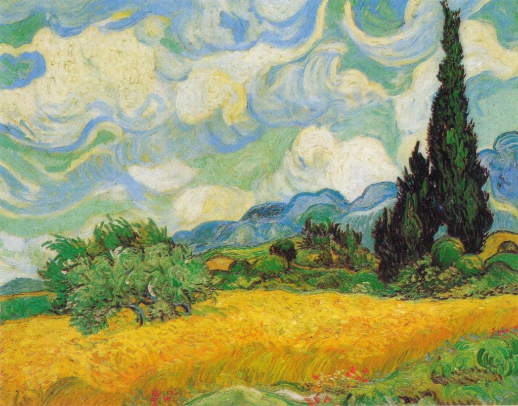 |
| Vincent Van Gogh |
As much as I cheerlead for black and white there is nothing to require it to be seen as a missive against color. Color is emotion. In comics this is more true than almost anywhere, though it’s rarely utilized as it should and could be. Mostly books and comics are in color because we have culturally trained ourselves to value color over it’s lack. Something in black and white is just waiting to be colored. Black and White has become the underwear to color’s ball gown. Color has a place and a merit all its own and has earned its dominance to a certain degree in art, but I think our cultural bigotry against black and white stems more from our being trained by the technology advances of film and tv rather than from within the realm of art where black and white work has been knocking our socks off for centuries, and as an artist I think it’s deeply important we recognize this and don’t let it get in the way of seeing why color can also be a distraction. Personally I love color work as most or all of us do. Though I am not a color person myself, but rather a tonalist. It doesn’t come as natural to me as it does to say, Scott Morse, or Dave Stewart or NC Wyeth for that matter. I have to work at it, to invent the wheel of color every time I take it on, because I think terms of tonal values more than color. Full disclosure. Nevertheless this doesn’t mean there isn’t an actual benefit to thinking tonally. Here’s why:
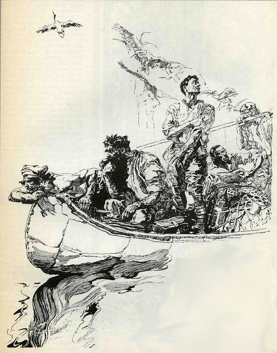 |
| Joseph Clement Coll |
Looking at art is a basic act of perception. We see a thing, we then ascribe to this thing attributes and reductions to understand and change what we’re looking at. Our perception is a predator’s perception, so it’s based around the notion of reduction rather than expansion (predators pick out of the myriad of forest, the prey it seeks, whereas prey animals take in all the world in order to spot and avoid the hunter). We even go further as to hang upon this thing we are seeing with our own emotional and localized levels of meaning like the way we hang clothes on an empty coat hanger. Working in black and white removes the automatic triggers of emotional meaning and then as a result, encourages us bring our own more. We come to rather than it comes to us. Black and white work is more work for us to do as viewers. It is more definitionally obvious as a thing and avoids the trickery of it being real. A perfectly executed color painting creates a world, and a reality, a black and white one can too, but it doesn’t wear its reality on it’s sleeve int he same way. It’s more interpretive and less directed. This is what the old cinematographers are talking about when the lament the advent of sound- that it provided a crutch for lazy storytelling to lean and become the norm when they were in the throes of revolutionizing the way stories could be told in pictures. It’s not that sound is inherently bad, it’s just such a directly easy entry it takes away the need to work as hard at telling a story in pictures. This is essentially my point when I call out artists to look at and make black and white work that is more than just prep or prelim to a “finished” color piece, but a value in and of itself. You can get away with a less effective authentic image of that scream because the red carries a lot of the weight. Do it in black and white and you as the artist have to work harder to make your scream really SCREAM, but in the end the work put into that piece makes the piece better. If you decide to add color after to bring it further, you’re doing so on a solid foundation, but here’s the trick of it: you don’t have to.
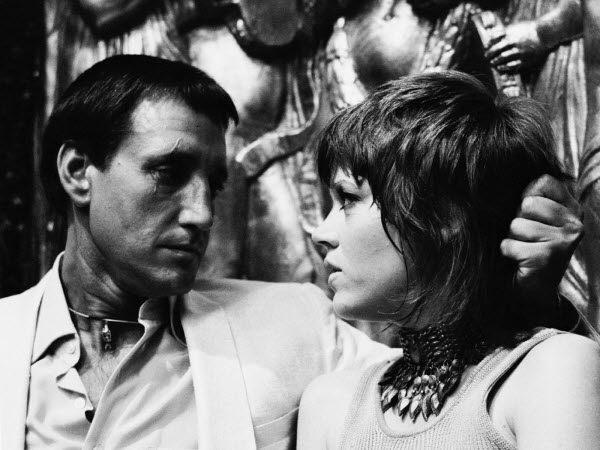 |
| Still from KLUTE as Roy Scheider gets creepily tender/threatening with Jane Fonda. |
One of the oldest refrains of cinematographers is the lament against the arrival of sound in film when it came. “If only we’d had another ten years, we’d have really changed the face of cinematic storytelling…” opines Caleb Deschanel as evidence of what could have been. This isn’t because there’s something evil or turgid about talkies, but the advent of synchronized sound in film marked removal of an obstacle that had created a visual narrative language entirely unique to itself and largely un explored… that took generations to recover. You no longer had to tell a story with pictures or expressive actions by the players, or tonal variances, framing, etc… Now you could stand in a room and blurt it all out. This is why so many of the earliest talkies are dreadfully boring to watch. It’s as if the surrendered entirely the need to tell a story by showing one, and instead stood there wooden repeating scripted dialogue until the curtain fell. Suddenly films were staged static sets with people yammering away and we lost something we were only just starting to build. Not every assumed layer to how our art is seen, heard or felt, or how our stories are told, are intrinsic to their mediums. Stripping the color from, say, KLUTE, and watching it in black and white actually surprises you with how much it was filmed to be a tonal noir- a reality lost by the assumption of color draped upon it.
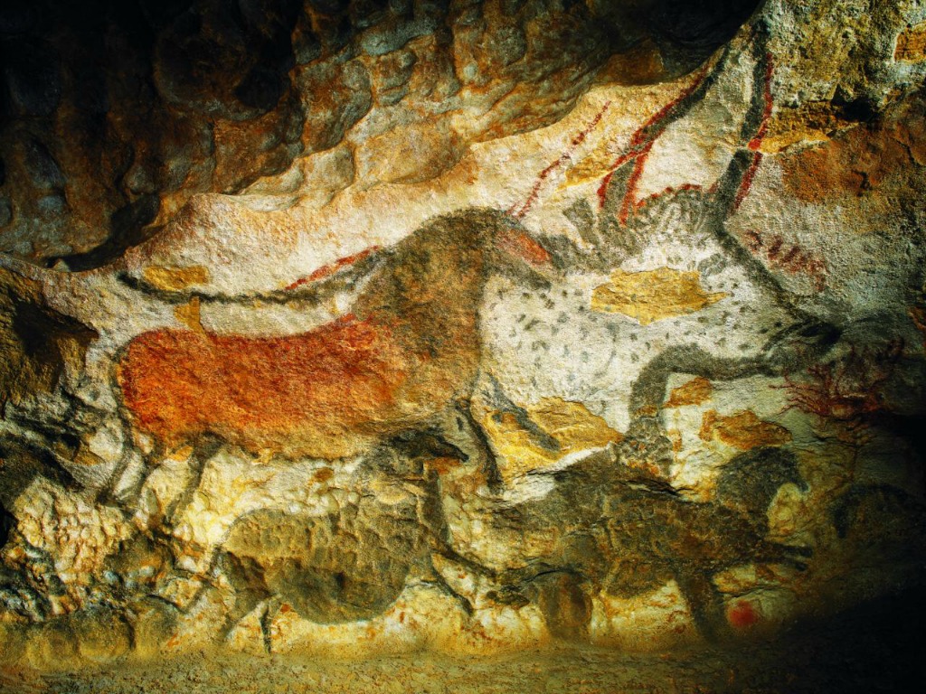 |
| The cave paintings in Lascaux, France |
Art and storytelling didn’t have a technological revolution moment like this with regards to color, but the lament against sound in film speaks to the same basic issues. I suppose to arrival color film and even more acutely, color tv screens could be called to this, but in art, we’ve been playing with color since we began scribbling art on cave walls, and so our relationship with color has been eternal. There’s a deep long history of examples of strength of color and that of black and white work. A Van Gogh HAS to be in color because that’s what all his work is all about. You lose a great deal by seeing his work in black and white not because there’s anything wrong with black and white but because the entire point of Vincent’s art is the powerful storm clouds of color he utilizes and a direct line to his anguished emotions and sense of infinitely outward beauty and light. Goya’s bullfighting etchings, for example, are the exact opposite. They are entirely of and about the forms and tones and light and shadow of the piece. Color would just crude drapery hiding his lines and forms. Egon Schiele is more a draftsman than a painter and as such it’s his drawings that thunder the table more than his paintings. I far prefer Ingres drawings to his paintings. And so on and so forth…
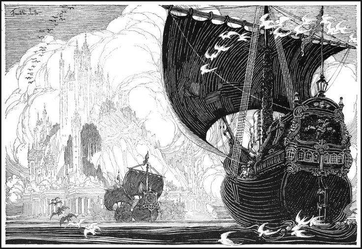 |
| Franklin Booth |
That doesn’t mean color doesn’t carry a deficit, and further, doesn’t mean we have a great deal to learn by removing it from our tool chest as creatives. In fact I’d go as far to say that removing color from your work is an essential revolution in any artist’s development. It reveals the naked truth and strengths/weaknesses of your piece. Aside from just simply applying a new perspective to it the same way holding it up to a mirror does, it removes the distracting layers of color and shows whether or not, at its most simplest edge, how strong your values are. This to me is where I love black and work the most: it is entirely honest and naked. To convince a reader to respond emotionally to a piece that lacks the push button emotional crutches color carries inherently is an impressive achievement. To break dance well is awesome, to do so with just one leg is something more. I don’t ever want to read Lone Wolf and Cub in color. There’s no need to gild that lily.
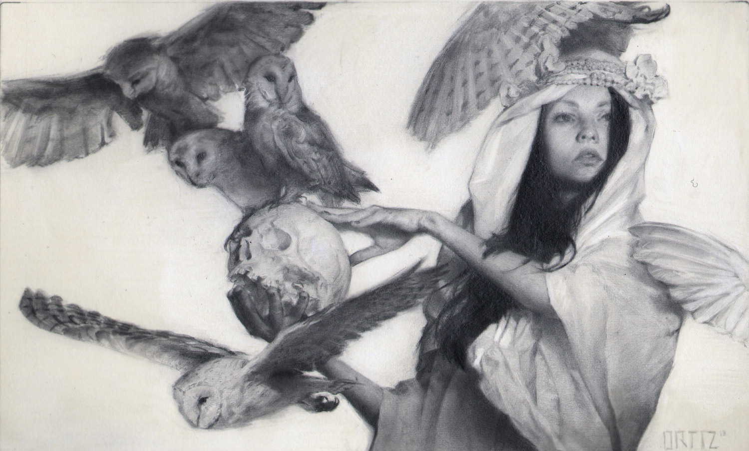 |
| Karla Ortiz |



I'm definitely a B&W guy too ! The fact that people massively prefers color just depresses me …
P.
I've come to realize I may also be a “black and white guy”…errr gal. Inktober is my favorite time of year, and I think it's because I just adore drawing and creating in simple grayscale values. *shrug* Great post!
Thanks, yeah it is deeply alluring and swiftly very gratifying as a way to work. Plus it's so inherently compositional when you think in terms of value. Always the best place to start from and often exactly where you should leave it.
I completely understand your point of view Greg :).
Iersonaly the love of black and white pictures came from games workshop army books:
https://s-media-cache-ak0.pinimg.com/originals/1f/eb/a9/1feba96070174b816f87262488b6ac8b.jpg
Take a look at this epic scene fellow artists!
The epicness of these artworks combined with the impact of black and white carved a deep love for this type of pictures inside my artist soul :).
I also have the same feeling about sculpture, some sculptures and especially 3D models are less interesting once put in color i think (but this is a different topic as in 3d modeling color is often used to strenghen the volume).
To finish i suggest everyone here to take a look at that marvelous game called LIMBO, if you love black and white this is THE game to play!
Anyway you did a great post Greg and it's always a pleasure to read you :).
Johan.
Limbo is brilliant. Utterly. Glad you liked the post!
Hi Greg, loved the post and your work in general finally got my copy of The Lost Boy and enjoyed it immensely-is there a sequel in the works? Also a bit of history trivia- for the first years of sound movies the noisy cameras had to be placeed in large soundproof boxes so as not to interfere with the sound recording- a natural consequence of this was less camera movement and a resulting more static look to the films until technology advances freed the cameras.
I'm totally a black and white comic guy, by which I mean what's on the page is either black or white in an Alex Toth/Mike Mignola/Jaime Hernandez way. There is a beautiful sparkle to a really well-designed black and white comic page which is lost with the addition of color, no matter how well colored, and of course there are many gorgeously colored pages in the medium's history. In speaking about this with a friend who grew up next door to the great “Archie” artist Harry Lucey, my friend observed that Harry maintained “If it doesn't work in black and white, it won't work in color.” I found confirmation of this in making black and white copies of my color work to see where the values need tweaking, which has always resulted in a stronger piece.
Black and white trains a person to focus on composition and lighting. If it's not working in black and white, an image will not work well in color. No matter how pretty the colors, it'll be a weaker image than it would be if it worked well in grey scale. A lot of people just don't get that.
One of my number one articles on MC! Thank you Greg! I personally wouldn't even go as far as you did in your article and mystify it – don't get me wrong it is indeed a valid point – because I just simply like black & white imagery more. In fact I'm obsessed with it. But what is strange not only creating it, but unintentionally when I go through a portfolio I'm going to enlarge the B&W image. Why? I don't know. You cannot call Love on it's name. It's more dramatic. More atmospheric. And the list goes on and on. Great article!