-By Ron Lemen
Doin’ Lines Part 2 fell victim to the now mysterious digital digestive system that is eating more of my projects these days than I really wish it would. So out of frustration I decided to leave lines for the moment instead of backtracking again. Thanks Obama.
When I talk about color I want to make a few distinctions. With this blog filled with illustrators I do not intend to change your approach to how you currently work, nor am I out to discredit anything mentioned on the subject by anyone else either, albeit I could rant for days and years about so many bad books and blogs written on the subject.
But I do want to start this with a bit of feather ruffling by saying that color is not subjective. (Cringes nervously!) Nor is it difficult to learn….
(Dives off the stage!-covers up!-and waits for the fruit and veggie volley to end…)
Okay, now let me explain what I mean! By learning a scientific-like approach to seeing, and not the standard traditional “dependent on a “Magic Palette”” or “my favorite artist’s palette” but learn to use a few tools to help adjust our eyes to seeing on a more sensitive level then color is much less difficult to break down and copy or better still, to INVENT!
So now let me counter point what I am saying above and below with the fact that colors we use to produce our work are picked out by choice or taught to us through instruction that we have yet to expand out beyond. The rules that have been passed on through instruction and improved upon by successive generations of artists are by no means bad rules, especially in illustration where much of it is Recipe based painting. However, if you truly want an objective way of observing what the colors are surrounding you so that you can copy them exactly as you see them or manipulate them for your illustrative needs and have a larger arsenal of tools at your disposal for any and all artistic purposes, especially if you want to do light and mood dependent color keys for animation, then learning the science of light is extremely important. As artists, the following tools are helpful to retrain or tune up our eyes or level them up to Artist Status in the our personal video game of life.
NONE OF THE FOLLOWING TOOLS NEED ANY PAINT TO MIX TO UNDERSTAND THEM BUT IT SURE DOES HELP RETAIN THE INFORMATION!
Tool #1. Identify Local Surfaces Only – Think 3D modeling for a moment to understand this concept. In developing a 3D object into a realistic looking object in the final render, the texture of the model has to be developed. The texture is broken down into layers, each layer a property of the surface and the light hitting the surface. The breakdown is as follows:
-Surface Color
-for skin subsurface scatter color shift (Along the penumbra)
-Direct Light Color
-Indirect Light Color
-Localized or Directional Bounce Light Color
-Caustic Lighting Color for indirect wet or wet-reflective lights (conditions are found more often in subjects such as Oceans, Rivers, Harbors, etc.)
-Texture Form Colors
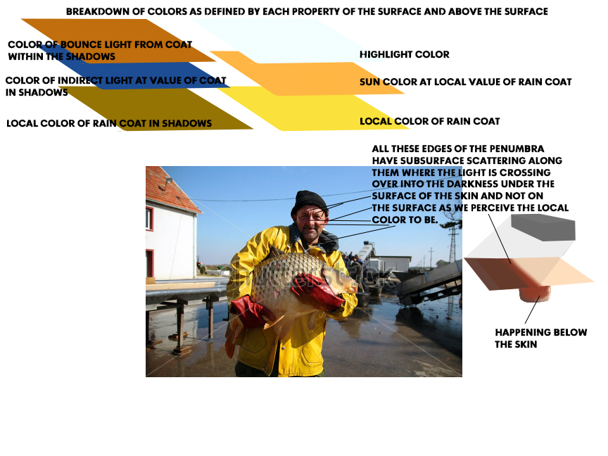
This is a good example of the surface breakdown, this photo has pretty much every layer of breakdown listed above residing somewhere within the picture depth. The diagrams above also show the layer breakdown.
With these colors each separated out and mixed independently, the most important rule to remember is that all the colors mixed SHOULD match in value before mixing them together for the final result.
Also, remember that light is scattered by the inconsistencies of all surfaces therefore color also scatters. The term we use for scattering colors minutely is broken color. Broken color is small shards of overlapping color that helps to solidify a surface impression. With painting, if all the colors were totally mixed together all at once, the result would be value correct mud with the possibility of one of the hues mixed together dominating that muddy mixture.
Also, remember that light is scattered by the inconsistencies of all surfaces therefore color also scatters. The term we use for scattering colors minutely is broken color. Broken color is small shards of overlapping color that helps to solidify a surface impression. With painting, if all the colors were totally mixed together all at once, the result would be value correct mud with the possibility of one of the hues mixed together dominating that muddy mixture.
Tool #2. Temperature Indicator – Thinking in temperature will save the day for many a mixture. Hot and Cool are words not just used to describe Marc Scheff’s facial hair, they are the key to unlocking the mixture of a next to impossible color to identify.
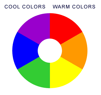
There are 3 warm hues on the color wheel are as follows: Yellow, Orange, Red
There are 3 cool hues on the color wheel: Green, Blue, and Purple. Once you can identify the temperature of the object you are investigating, the choices are now narrowed down to only 3. And through process of elimination/association the color is very quickly and easily deduced.
Tool #3. Instantly Spot the Primary Colors – Everything around you is a hue of some kind. More often than not we see them but don’t really “see” them. I made this color wheel using the rocks along the trail we were hiking as proof that all those objects that we immediately write off as grey or brown is a hue of some kind.
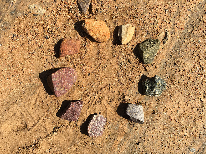
Outside, the immediate blue is the sky, or possibly the gravel below your feet, or granite, bodies of water, or the asphalt if it isn’t too filthy. The reds are typically in the dirt or dead foliage, but can also be seen in so many other spaces as well. Yellow hues are also in the dirt, rocks, foliage, shrubbery, etc.
Once the Primary Colors are identified, all other hues of unknown origin are compared to and the primaries discovered.
Tool #4. Root Hue Identification All colors can be said that they have a Root color which means that every grey, brown or off shade of a color is rooted in one of the primary, secondary or tertiary color wheel mixtures. We use a 12-color color wheel to describe these root colors that we see. If we can identify a grey as a root hue we then know where to begin with our color mixtures on our palette rather than totally and completely guessing.
Remember again that brown is a term for gray. Identify the color of the brown, or the color of the grey. You will never misinterpret the color as a GRAY or as a BROWN ever again once you level up this “eye filter”.
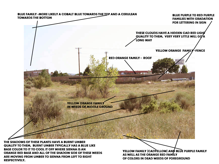
Here many of the earth tone grays and browns have been resolved with a root hue appended to each color space in the picture.
Exercising the eyes or Exorcising away the pedestrian, limited or narrow approach to seeing
Most eyes roaming the world are not artistically trained. All of those eyes I have repeatedly heard by art instructors called “pedestrian eyes” are trained to not bump into objects, stop and start moving machinery according to colored lights, they recognize when it is getting dark, or dawn is approaching, their close friends and family in a crowd, or their car in an overcrowded, massive parking lot. Those very same eyes/brain connection rarely if ever, have a conscious sensitivity to color changes, form changes, edge quality, atmospheric dimension or the shifting harmonies in nature or by design(urban settings).
How can an artist train her/his eyes to see the sensitive color changes in nature?
Here is one exercise that will help you retrain your eyes. And a one and a two and a …..
High Chroma and Low Chroma Painting
This exercise is executed in 3 panels. This exercise should be done with the palette I introduced 3 of my posts ago. Here is the link to the previous post.
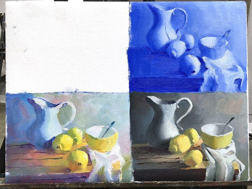
This is roughly what the finished exercise will look like, this is done on an 11 x 14″ board. The individual paintings can and should be done larger but we do them at this size in class since class is only 3 hours long and we have to paint 3 versions within that time period.
Panel 1. Value Comp Painting
This is a study done in Ultramarine Blue and white. This study is to determine the exact values that are perceived in the image or the setting before you. This comp should punctuate the accents and highlights in the scene for greater clarity of their importance in achieving a full value range to satisfy the eye.
This exercise helps us see the formula color/equals=/value and achieve those values with a color other than black which is not necessarily the best color to start a painting/underpainting with. This color exercise also helps you see that everything is colorful enough to have an identifiable root hue and the more you repeat this exercise the better tuned your eyes will become. it is not magic, it is a lot of conditioning to develop these sensitivity level s to seeing color in nature.
Panel 2. High Key of Chroma Painting
This is different from High Key Painting. High Key Painting is painting in a limited range of values on the high end of the value chart from white to about a value 4 or if you read the value chart in the opposite direction a value 6.
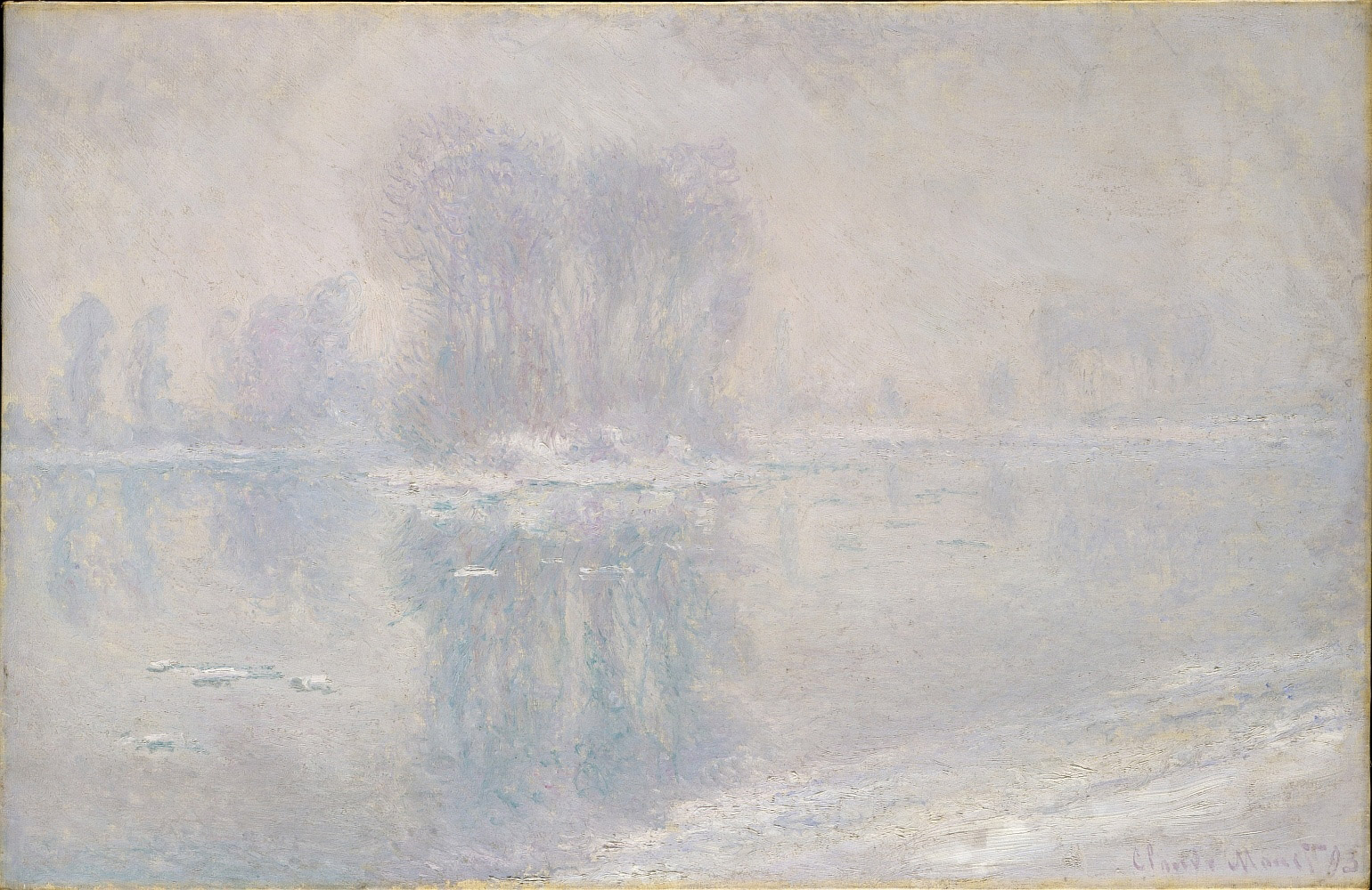
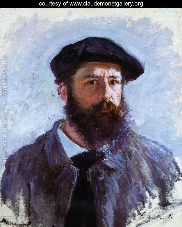
This Monet Painting shows the high key painting in the extreme. Note the limited range of values.
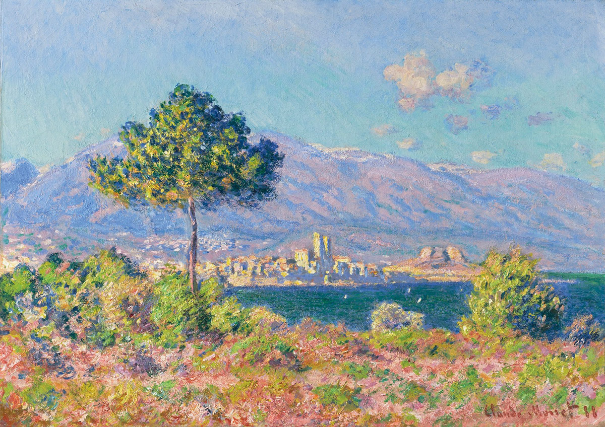
This is a high key of chroma painting by Monet. Note how all the colors are closer to pure and that none of the values are at the high or low end of the value spectrum with exception to the highlights. Also pay attention to how small the accents and highlights are. They do not disrupt the overall value harmony of the painting.
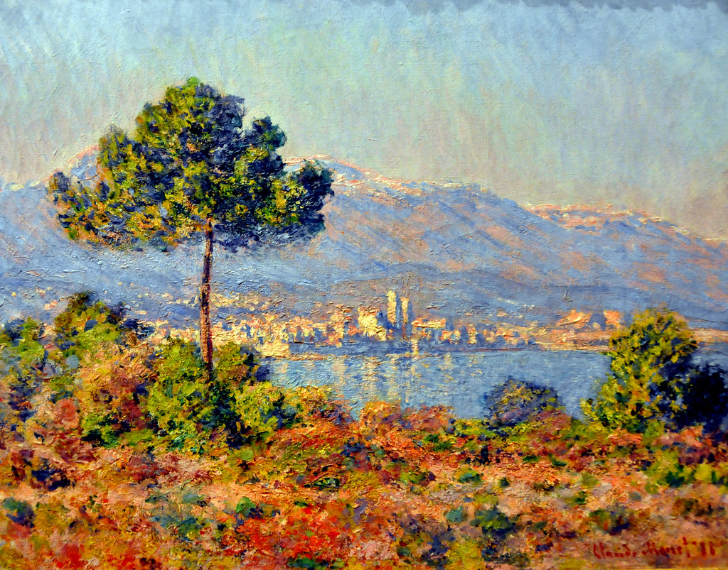
This is the same subject matter but done at a different time of day. This is a high contrast painting. The range of values are extended to both ends of the value scale and note that while looking colorful, these colors are mostly earthen in their mixture, more so than the high key of chroma version.
The objective of High Key Chroma Painting is to identify the root hue of each color you see and exaggerate it towards the root hue. In other words, you will be pushing the color more in the direction of what you would possibly see in an animation vs. what you see in reality.
To paint in High Key of Chroma the painter should objectively meet the list of objectives below:
-The painting should be designed (outlined) in Ultramarine Blue/white line work. This color represents the indirect light in both the indoor setting of a school with the CFL bulbs overhead and outdoors with the sky as the indirect light.
-Paint all the values within a limited range of value. Pure colors are easier to identify in the middle of the value range so the values of the local colors and the shadows are limited to between 3 and 7 with exceptions to tinted colors that could very well extend towards pure white.
-Shadows are first painted with a blue fill, the same 50% blue (Ultramarine Blue cut with Titanium White) scrubbed lightly so as not to coat the surface with loose paint that will quickly blend into whatever color you apply over the top of it.
-The local value on the shadow side is the same value as the shadow, not the value or appearance of the local color of the object in the light side.
-Shadows are not painted darkly, they are only separated from the lights by only a few values total, but if you did the exercise to push the color as far as possible the values of the shadows could be exactly the same as the values in the lights. The difference here is that the shadows are separated from the lights by temperature which has just as powerful an effect of contrast as contrasting values do. And when combining them together you get an even further range of contrast.
-Color mixing-all colors should be first tinted to reflect the same value before combining them together.
-Color mixing should be limited to a distance of 2 colors on the palette left or right of the hue to be mixed with. If the color extends beyond 2 colors the color opposite is used which will lead to a complementary like mixture that will turn earthen. Think like a pianist and each color is a note which has a distance from the primary note/color you intend to start with.
-Earth tones are cut from the program. That is, they are not to be made exactly as they are seen in their tonal state but heightened in chroma to enhance their colorful quality and reflect their local root hue.
-There is no triple primary mixing involved, that is no red, yellow, and blue together at once or the color will flatten to a lower chromatic color.
-Colors are only tinted and there is no black on the palette.
-Since all the values in the picture are altered to stay within a limited middle of the value scale range, the accents and the highlights help the painting to achieve a full value range.
-Highlights are not pure white but very close to pure white with a color accent in them. Surprisingly, the highlight should reflect the light source color, but it has been found that if the color opposite is used as the highlight there is more distance from the local colors surrounding it thereby giving it greater visual contrast.
-Accents are pure out of the tube colors. Most of the cool hues are dark out of the tube, close to black out of the tube than the middle of the value range. So because of the dark value they are made of, the out of the tube colors will work perfectly as accents. Keep in mind that on the average size canvas, any below 18 x 24″, accents are kept to brushstrokes and no bigger. The bigger they get, the more likely they will become visual shapes rather than visual accents.
Panel 3. Low Key of Chroma Painting
This approach to painting also needs altering from what we see before us in a way to subdue all the colors in a scene to match tonally with each other. In fact, this is a tonal exercise if we were to officially label it. Panel 2 is a Colorist exercise and this is a Tonalist exercise. To achieve the entire range of tonal choices is another level of color that all of you should aspire to. Again, as a color key artist in animation, you can do no wrong to learn to control colors under these two conditions as they both also have a mood association attached to them as well as they help one to understand how to extend colors more accurately than just guessing and possibly mismatching them with other harmonious tones.
Tonalism can be misconstrued for dull colored painting but it doesn’t have to be. There is a secret threshold that only a few travel to once they have developed an understanding for BOTH tonalism and colorism. That fine line allows the tonalist to achieve a very healthy range of colorfulness in a tonal arrangement. This is what I consider to be the top of the food chain, the greatest of all painting because with both the colors colorful enough in the delicate and slight nature intermingling with the tonal arrangement of the painting, the illusion is absolutely profound, This is what I call the Grand Illusion of painting or to truly fool the eye and trick the brain into seeing what is perceived as “alive” or “living and breathing amongst us”. The list of painters who could/can achieve this mastery is elite and very very short. Rembrandt is at the top of this food chain, one of the few to have mastered this Grand Illusion.
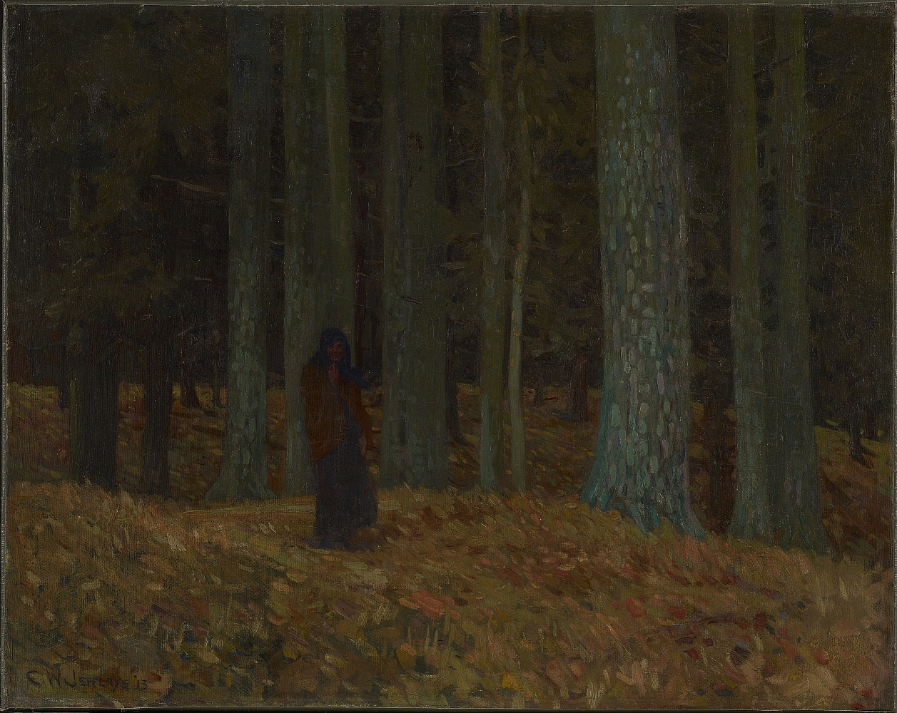
This is a wonderful example of low key painting by Charles W. Jefferys. Note that when all the colors are all subdued together they still all look colorful together.
As blue as these hues might appear, they are all silvery gray blues. This is borderline low key chroma painting. Low key chroma painting is not about the low key of values on the value scale just as high key of chroma is not about the lightest values on the value scale. It is how all the colors appear together in harmony with each other. In this case, the contrast is high and the colors are minimal. The color accents are in the reflected lights and those accents help the picture look more colorful than it is mostly painted. These accents are called counterpoints, in this case counterpoint to the low key chroma scheme used to paint the picture.
Low Key of Chroma Tools and Rules are:
-Black is added to the palette and used as a shade and toning agent.
-The distance between the light and dark values should be distanced further almost removing any middle values from the image. Isolating the values 1 – 3 and 7 – 10 for the image and only suggesting at any values between 4-6. Contrast is the key here and middle values hint at clean and easy to identify colors while the extreme ends distort them towards the tonal spectrum where colors are not necessarily perceived as colorful.
-A corresponding grey is blended in with every color mixed for the painting. This gray is made up of black and white. It is an entirely different way of creating a tonal painting and one that can give your tonal paintings more color life in them.
-Color mixtures should be distant from each other close to if not complementary to one another. But caution using primaries with one another to make grays as this is a different approach to painting a picture and breaches the rule set here.
-Just as the accents and highlights of the high chroma painting help achieve a fullness of color/value to objectively feel correct to the eye, pure notes of color as accents help to round out what would otherwise look a bit lackluster to the eye especially when in a collection of other paintings that are more colorful or in a room with colorful furniture. These colors are mostly out of the tube colors with the values adjusted by tinting accordingly to the surface area.
-All colors in the painting are to be altered to reduce their colorful qualities, this is especially difficult to control in a landscape but important to learn how to control the colors and keep them tonal in their arrangement.
-If mixed correctly the colors should appear like clean and easy to interpret rather than just pure muddy colors-no pun intended.
-Muddy colors can also be harmoniously arranged in such a way that they can also produce a full range color wheel as seen above with the image of the rock color wheel. This tonal painting should feel that way regardless of whether the subject is a vibrant flower garden on a brilliant spring day or a barren burned out building.
And to all of you who see all of this as something that feels like the rules are overwhelming and that painting doesn’t feel very free and whatever you want it to be, as you repeat these exercises time and time again, your sensitivity towards your craft heightens and the goal of painting becomes clear as the balance of successful paintings outweigh the less than successful paintings. Below I have generated a helpful list that will help you understand the transformation you will undergo as you continue to pursue your skills in this craft of painting. SKILLZ UP and enjoy the time you set aside for yourself to learn and grow!
Beginner Approach Levels 1 – 10
-!!!PANIC!!! then gather wits and read notes and maybe too objectively follow them along through the exercises
-separate all colors to be combined together into their own piles and adjust their values to correct them until they each correspond to one another, then and only then will you mix them together – or get a glove slap across the cheeks!
-mix colors together in subtle percentages until the desired optimal value/color is achieved
-apply to painting
Intermediate Approach Levels 11 – 25
-mix colors directly proportionately together or mix them with their corresponding value correct colors to achieve the hues desired as above but much quicker from repeated practice
-apply to surface
Advanced Approach Levels 25- 32
-mix colors until desired optical mixture is procured.
-apply directly to surface
Expert Approach Level 33 !!!Grand Wizard Status!!!
-place palette on canvas above live area
-mix colors together directly on surface
-even dare to use your bare fingers (Spoken with the Monster Truck announcer’s voice)
-never needs to own a palette, the ultimate HARD CORE PAINTER!


Thank you. Us Colourblind artists really appreciate insight into the mysteries of colour handling, and any tools we can get our hands on are appreciated!
Ron, this is one of the best colour lessons I have had in years. I can't wait to go paint. Thank you so much!
Thank you for your time and willingness to share your experience with us, this is extremely helpful, I will definitely try it.