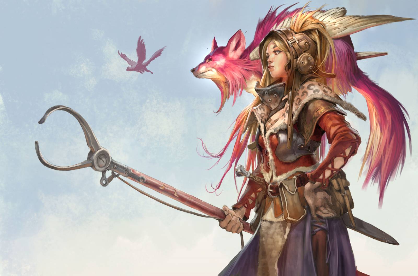
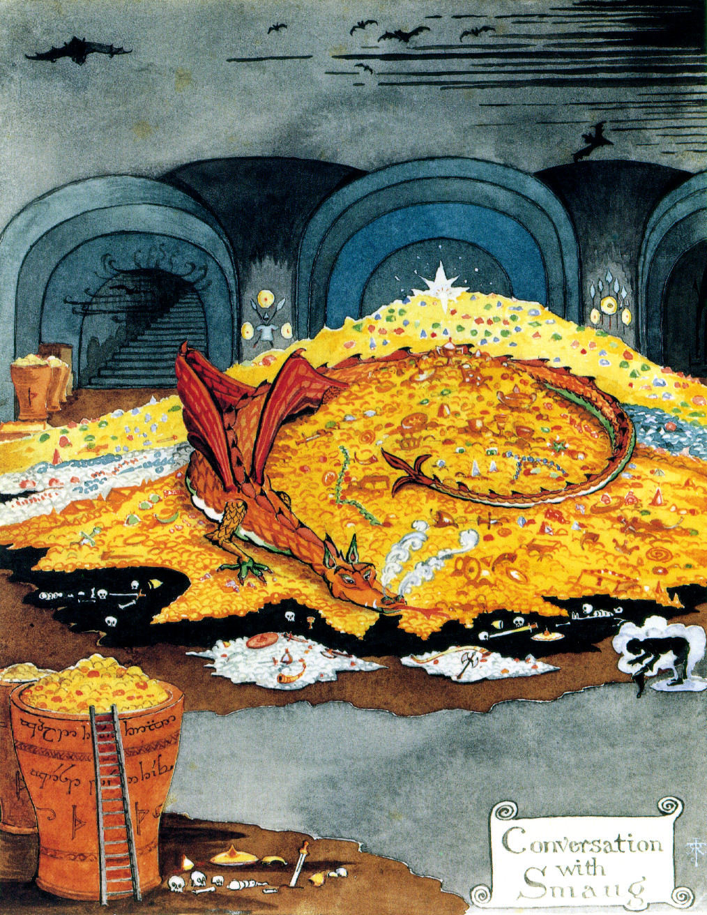
Bonder and flying Fox from Ikoria
For about a year and a half ago I was asked to be a part of the design team that would design a brand new world for Magic the Gathering. The world was named Ikoria. It was a dream to be able to work on that project. Ikoria had all that I love to paint and draw: Huge monsters, colorful landscapes and a playfulness that I think fits very well into classic fantasy. Needless to say, I felt very much at home here.
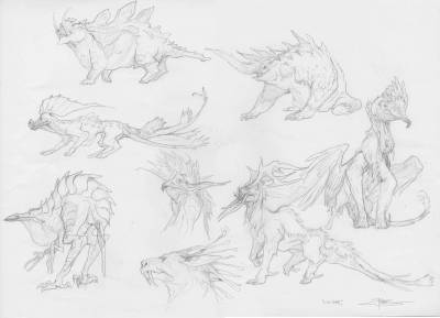
Concept art of creatures for Ikoria
I am mostly asked to paint creatures and people for magic and only on rare occasions have I had the chance to do landscapes. For me landscapes is often what forms the background of a cool character or a setting in which a charging monster is running amok. But with this world I really wanted to push my image limitations and felt that I could contribute to the world. I bombarded the art director with landscapes paintings: I stayed after hours and worked on an Island painting and hung it cassually in his cubicle behind his screen. He woudl see it, but not right away…Later the next morning Andrew Valas came in and said: “Jesper, I see what you are saying. I will see what I can do”. And already there I started thinking about how I would solve the landscapes.
basic Plain
When I got the assignment for a full circle of all five basic lands in Ikoria, I already had a clear idea: I wanted them to look liek a family. So that when you placed them all five together you would see that they complimented each other. That meant I would use the same distance and angle on all of them. I also chose to focus on having crystals prominent in all of them. since magic is about color identity I toyed with the idea of having green crystals in Forest, blue crystals in Island and so on. In the end it seemed less important and I abandoned the idea of colorcoding all with crystals.
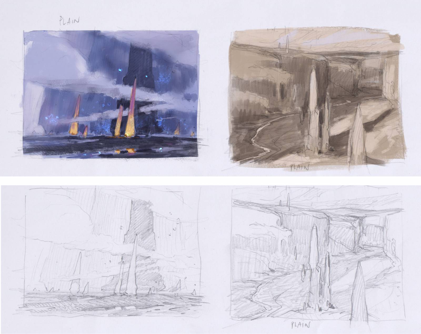 The plain painting was the hardest. My first 4 sketches was abandoned becaus ethey looked too much alike mountains. As you can see I had the golden crystals very prominent in the first skethces: When I started focusing on the sun rise version I liked it better. Andrew asked me if I could go more yellowish to make it fit mor ethe “Plain” theme of magic and thats how it all came together. The difficult part wat the actual painting of the clouds. Its all acrylics but I painted it without and underpaint because I wanted the white fromthe paper to shine through adding light to the thin yellow of the sun: So I had to paint most of it wet in wet. That is really tough in acrylic a
nd I had to constantly spray it with water to keep it from drying. after the first 2 washes of softe clouds I started adding the darker blue clouds on top. But to be honest I almost threw it all away. At the point where I had finished the sky and was moving on to the plain part and the trees, I was looking at it and could only see those street art paintings that some people do with lids and spray cans. It felt too cheesy and my friends at the studio was singing “Hakuna Mattata”, when they walked by me. I reached a point where I decided to abandon it, but would try one last thing before calling it quits: I was gonna add a cold color to the shadow parts of the trunks and the rocks in the fore ground. For me that saved the painting. It was just enough to make it work and I decided to finish it.
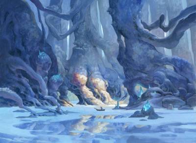
Basic Island
The Island was simple. i did a bunch of sketches focusing on the body of water, but chose the one that would fit the angle of the plain the best. I clouded the trunks of trees in shadows only letting a tiny bit of light down through the trunks because I wanted the focus to be the water surface and not the trees ( that would be for the forest card) the boat is mostly for scale. The sketch was very green and yet again Andrew asked me to go more blue for fitting the card type better. I washed the whole surface with cobalt blue and painted all the trees. When I was finished I scanned it, and in Photoshop I flipped it and mirrored it down into the water. Then I erased the area of the mirrors where I wanted the surface to have dirt and no reflection. I printed it out and used it for reference to paint it onto the original.

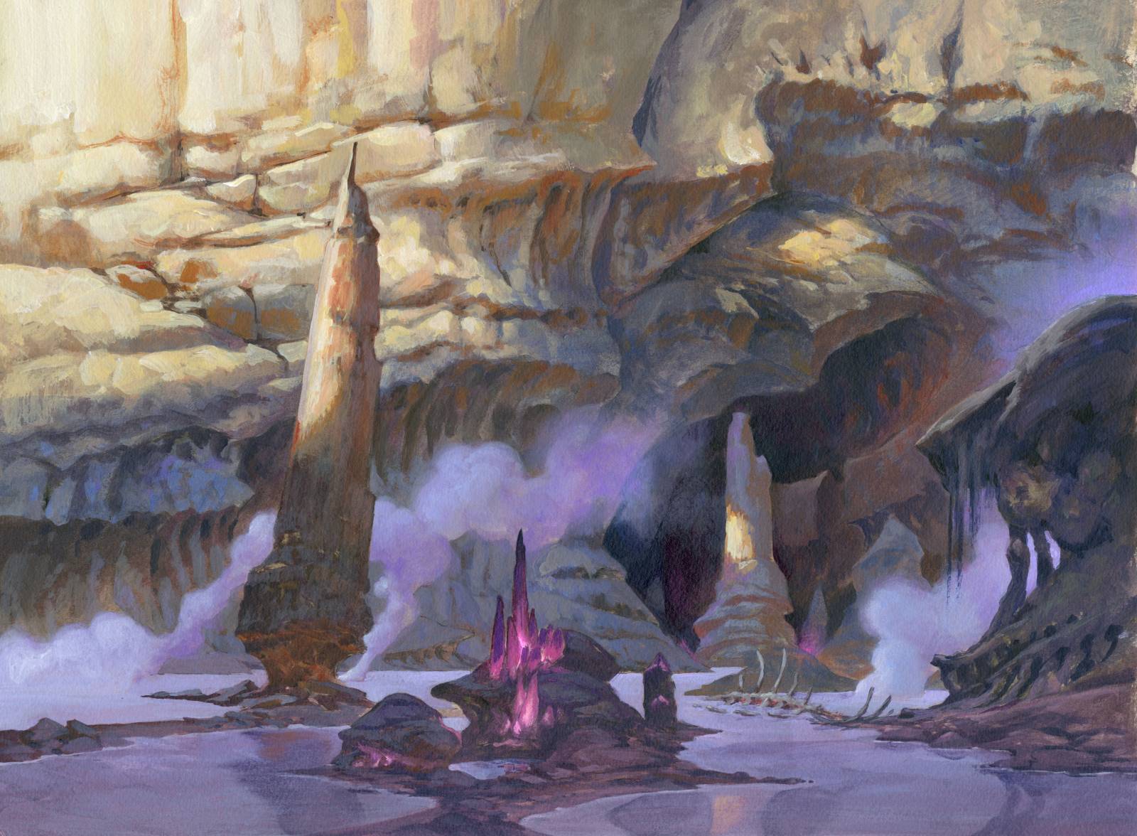
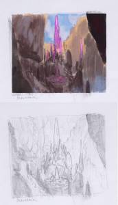
The swamp assignement called for a different take on the classical swamp. It should be the bottom of one of the huge ditches in Ikoria. And the swampy part was the bottom of the ditch. It posed a big problem if I wanted the angle to be the same as the rest of the landscapes because the image would then consist of mainly cliff sides and gorges and would seem very much like a mountain card. Since purple is often used as a color key for Swamps and black magic in magic I decided to solve it by having a low sun rendering all the bottom of the gorge in purple light with pinkish crystals glowing in the fog. that way the focus would be on the bottom and the murky water rather than on the cliff part. It was a fantastic enjoyable experience painting ll the organic shapes of the cliff side. I love going back and forth between warm and cold colors to capture shapes.
 Basic Swamp
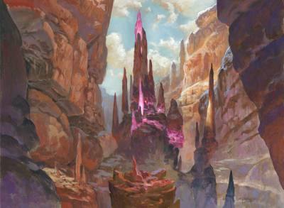
Mountain. My idea was to go with tall pillars of rock with crystals hiding inside the formations. in places where the rocks have broken off we can see the glowing crystal core of the pillars: I added a a foreground pillar hat had been broken, – perhaps by a behemoth walking by – with a growth of crystals. But when I painted it, the foreground pillar stole too much attention away from the center pillar so I covered it up with reddish brown. If I can, I try to have a singular focal point in a painting especially one that will be used for magic since the card format is so small and need to read very clear.
basic Mountain

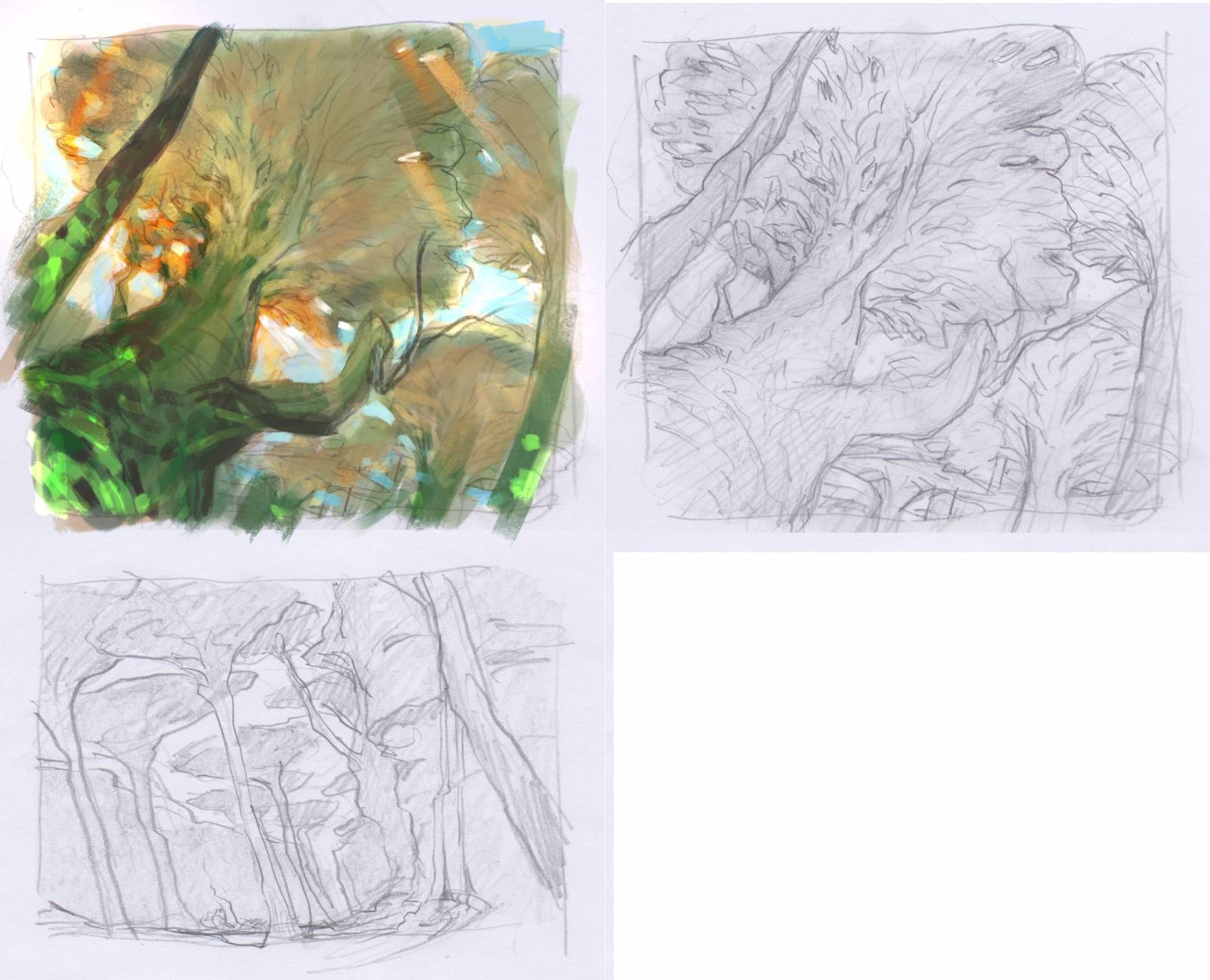
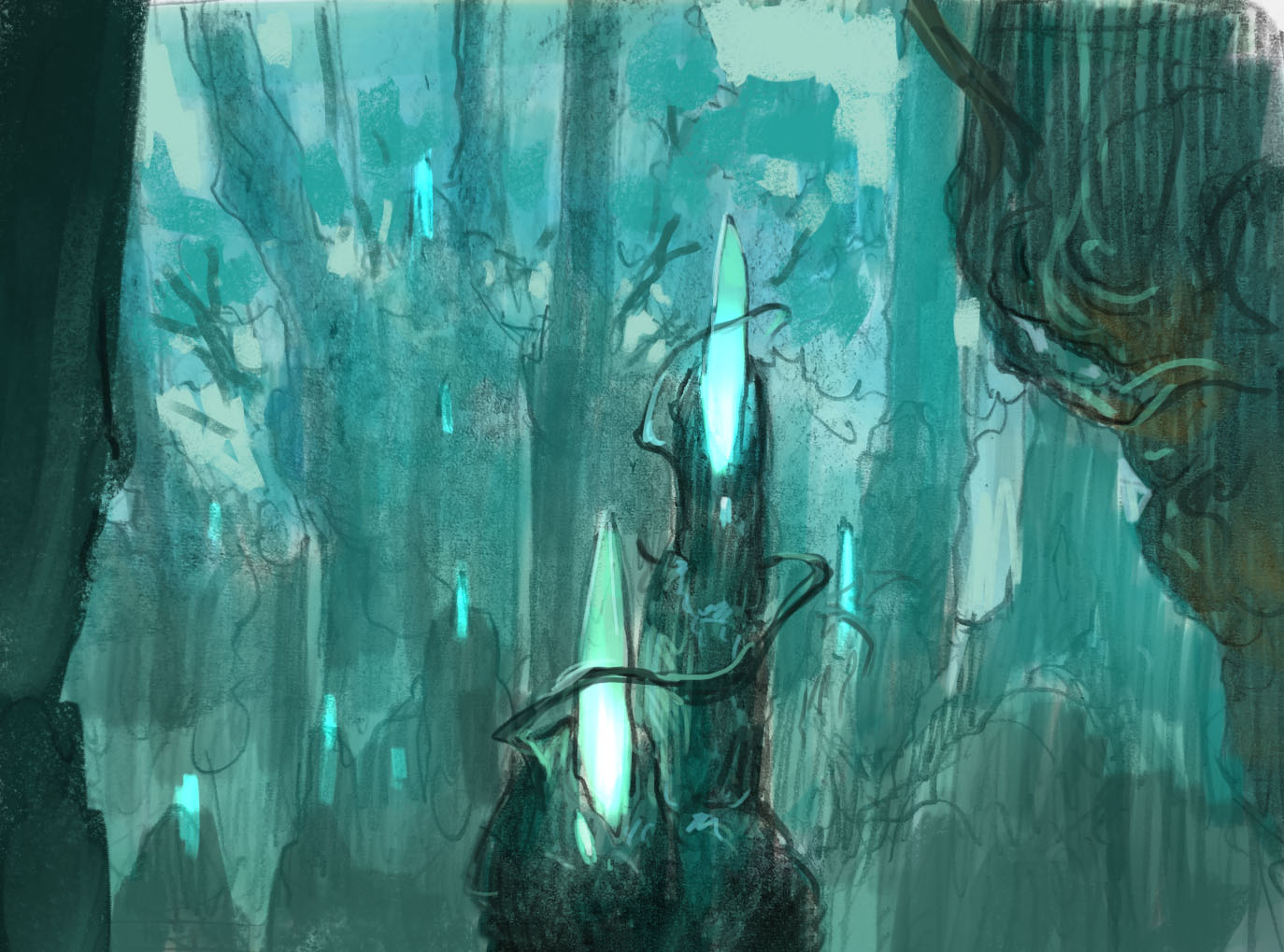
Basic Forest
When It came last to painting the forest I knew that I couldn’t use any of my sketches. The 2 sketches I had was seen from the wrong angle or looked too much like the plain. So i went back and tried a sketch focusing on a structure of trunks with crystal shards. My idea was that the twigs and sticks would grow around the crystals in strange formations never touching them. As of the crystals was pulsing with an energy . My sketch was perhaps too simple but it had the idea that i wanted. Andrew asked me if I could make the crystals in the front a bit smaller and add some more interesting forest in the background? I used what I liked from my sketch but widen the forest out and made the angle seem bigger and seen from a distance. It made it fit so much better with the rest of the landscapes.
I really like the big trunks on either side that acts as a framing of the forest scene. its like the curtain of a theater being pulled aside revealing the scene.
The five landscapes marks a milestone for me. I had the notion of stepping outside of my comfort zone and yet kept the 5 paintings very personal. I aimed at keeping my stylized shape language and attacked the assignment as if it was almost a creature portrait. I think they ended up having a very personal style. From a geek perspective they also mark a great achievement for me: When, in 2 weeks time, they are finally published as cards, I am going to be able to assemble my own commander magic deck using only my own cards.

Lovely post Jesper! Thanks so much.
It’s really inspiring to see how you share your progress every time. Such an amazing artist sharing frustrations and success, and failures, it helps so much.
Love your cards for this set.
Kudos on everything Jesper.