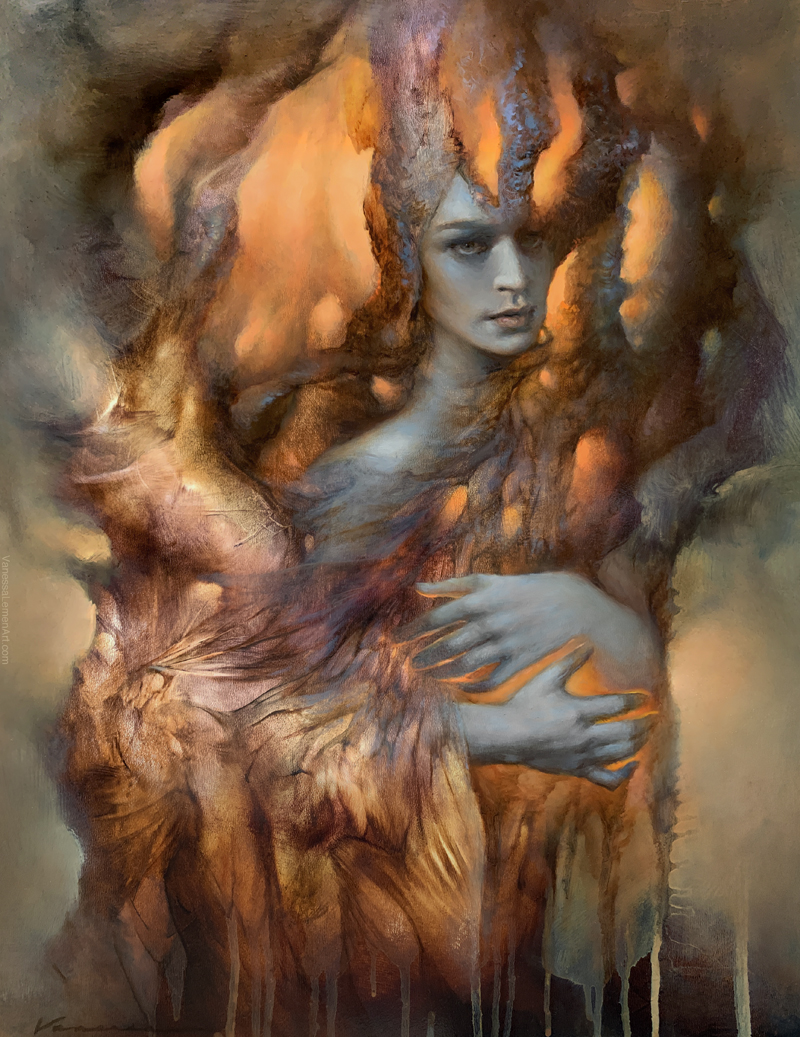
The Lightkeeper, oil on panel, 14×11″
In this post, I’m sharing some notes and images from the process of my painting The Lightkeeper.
_________________________________
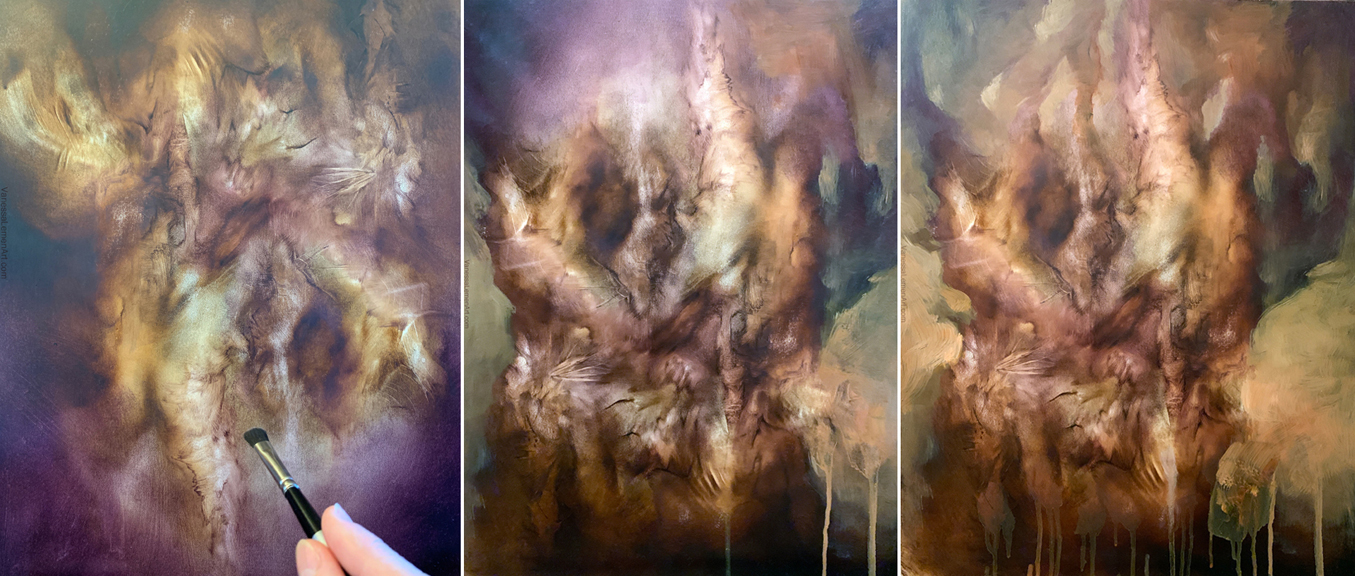
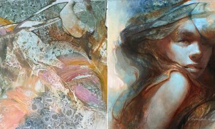
The painting started out as much of my personal work does, by making abstract marks in oil on panel and finding forms that start to read as a conglomeration of familiar forms. The first image here shows the painting in an upside down format, and the other two are in the direction that the finish ends up in. I tend to turn the painting many times during this stage; horizontal, vertical, laying it flat, and upright on the easel, in order to get different kinds of marks. I’ve posted many articles here on Muddy Colors that go over this stage of the process in my work, and if you’d like to delve more into this stage of abstract mark-making and exploration, you can find those other articles here in this list. You can see in these images how I’ve added small shapes of light to create arm-or-branch-like forms by painting the background or space between the forms and not necessarily solely the forms themselves which were already there from the initial larger abstract it started with.
_________________________________
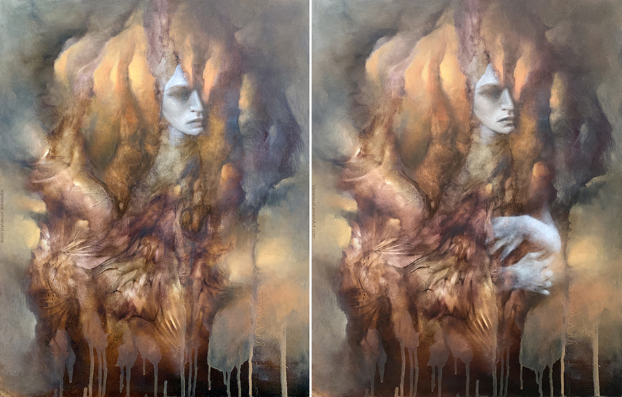
In these two images, I’m showing a rough lay-in of a figure I was inspired to paint by the marks I saw in the abstract. I didn’t see this exact face in the marks, but this is how it turned out after painting a face in that area and then rolling with that inspiration and painting from imagination. The hands at this stage were also from imagination, and I ended up taking photos of my own hands for reference later on in the progress of the painting. I’ve included a row images to show the sort of reference I tend to use later in this post. What I might use for reference isn’t always exactly the thing I’m painting (you’ll see what I mean below), but in the case of hands, I do tend to shoot my own hands in the position I need for the composition I’m building.
_________________________________
This image shows a development of the face in comparison to the lay-in type of marks used for coverage that are more transparent. Some of those will remain transparent but may be glazed to feel more cohesive with the surrounding colors and textures in that area, and some of the buildup of the painting will become more opaque in order to give the illusion of depth in the forms, as if they’re coming forward from the forms they’re a part of, giving the forms a depth of field type of focus.
_________________________________

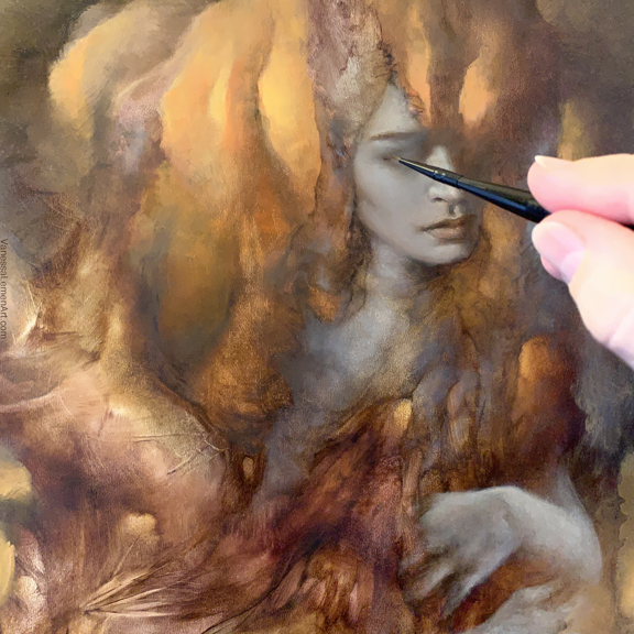
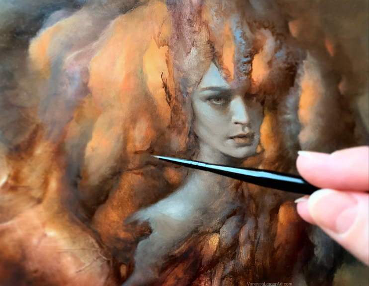
In this image, you can see the buildup of form and transition from transparent to opaque in the new paint being added to the underpainting. There is also more contrast in the forms that are closer to the viewer, and the difference between values in the background elements is more similar in value than in the foreground. Also, take a look at the texture built up on the form extending up from her forehead. That texture was done using the opposite end of the brush (the tip of the handle) and scraping into the cooler paint that was wet on top of the dry brown underpainting. The details in the eye are being added with a small spotter brush. These details are built up in the same way I’d build up larger areas, but just are on a much smaller scale, and so the brush used is relative to the size of the stroke most times, but I do honestly tend to use these small spotters quite a bit in many other areas as well.
_________________________________
In this image, I’m adding details in the organic forms that extend out from the figure using the same or similar small round or spotter to draw the initial intention and direction of the new forms I’ll build there. Again, in this image you can notice the difference in contrast as well as edge work between the foreground and background elements which helps to give the depth of field effect.
_________________________________
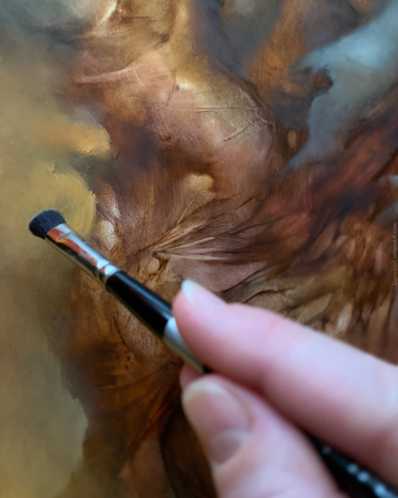
This image shows the lower/mid left corner of the painting. The brush I’m using here is a small mop. I use these mops dry with no paint added to them to soften paint that I’ve already put there on the surface of the painting. I rarely actually pick up paint with a mop and rarely get them wet except to touch the wet paint that’s already on the surface. The pressure I use is pretty sensitive when using this brush as well, in order to get a great softened or feathered area. I love using mops and I use them in all sizes depending on the areas I’m working in.
_________________________________
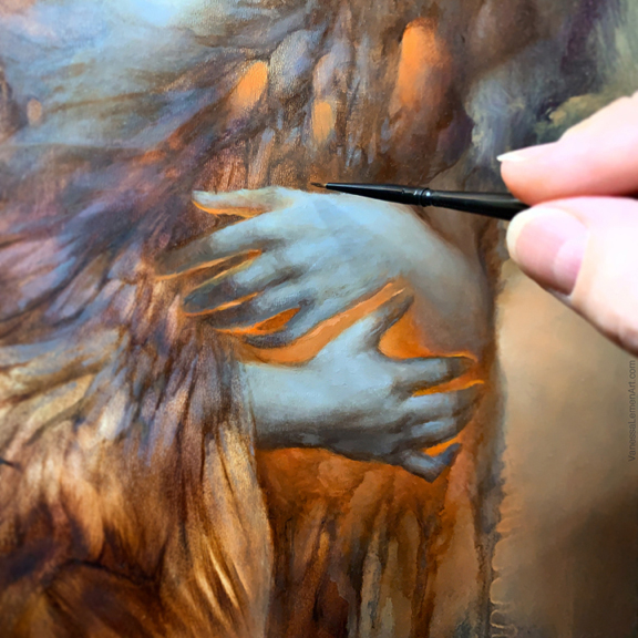
This last detail image shows the hands as they are almost finished. I’m using a small round or spotter brush. This is another brush that I use very often because I paint tiny details often and these little sable brushes have a nice amount of spring and are not too flimsy, while also not being too rigid. I even use these small spotters for larger areas to mimic details of texture within a large area as well as crosshatch for a weaving of colors to create skintone and texture instead of painting with a larger sable and smoothing too much. To create small texture, I also use the opposite end of the brush and scrape off paint, as I mentioned earlier.
_________________________________
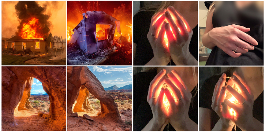
These images here show an example of the types of reference I might use if I use reference. Much of the reference I use might not be the actual same object or environment as what I’m painting, but the reference is for the color or texture, mood, contrast, etc. And some, like the hand on the top right, is my own that I shot (and then flipped to match the painting) in order to get the position of the hand and arm and the anatomy correct. I didn’t use reference for the face in this painting, but sometimes I will also, depending on lighting or a more difficult position or angle, or if I do need to have a specific likeness. At the time I started painting this, there were many fires happening here in Southern California, and I was seeing a lot of images of burning buildings in the news online. The two images on the top left were from the news I was seeing at the time, but I don’t know the photographers’ info. I was struck by the glow of the fire and contrast of color from the interior and exterior of the buildings. The two images on the lower left were from the usinterior account on Instagram. They are of the Gold Butte National Monument, and I was struck at that time how the lighting and forms were so similar to my painting, and I felt that these might be helpful to achieve the lighting of organic forms in my painting. I take a lot of photos of natural elements daily and they tend to be of abstract compositions in nature or of strange textures even of everyday ordinary objects, as well as the lighting in different environments or times of day etc. There’s so much to find in everything around us! The photos of my hands holding string lights were taken as reference for a different sort of painting, but I felt they were helpful also for this lighting, color and organic forms in this painting as well.
And here again is the finished painting below. I hope you find the above info helpful. Thanks for reading and happy painting!
The Lightkeeper, oil on panel, 14×11″


Recent Comments