I always look forward to the weird and wonderful illustrations that accompany the fiction over on Tor.com — so I was thrilled when AD Irene Gallo reached out to me about illustrating their latest, a short story by Michael Swanwick called “Annie Without Crow.” It’s a really fun, unconventionally apocalyptic story in which [SPOILER ALERT] a vengeful goddess dooms humanity to extinction with an edict to womankind:
“Thou shalt neither wed nor bed any man who is your inferior in wit or character.”
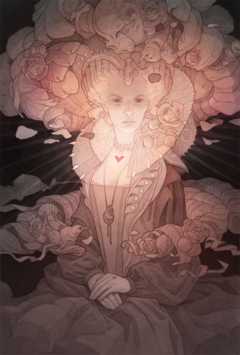
The story mixes so many elements that could make for an iconic image – romance, warfare, death, time travel, hedonistic deities gambling with the fates of humanity – that as soon as I finished reading, I was struck with serious choice paralysis on what, exactly, I was going to draw. When this happens, I usually try to shake things loose with some visual research. The plot centers on the supernaturally-interfered-with christening of Queen Elizabeth I, which brings with it all of the ostentatious fashions of the Elizabethan era; I wasn’t sure what I was going to draw, but I knew for certain it had to have a pretty dress in it:
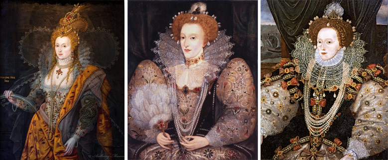
As I hunted for reference inspiration, I realized that Elizabeth is almost universally painted in the middle of an explosion of lace and decorative trim. The longer I looked at the billowing shapes of lace collars, puffy hair, and leg-of-mutton sleeves, the more they began to click in my mind with another iconic silhouette: the mushroom cloud of a nuclear bomb.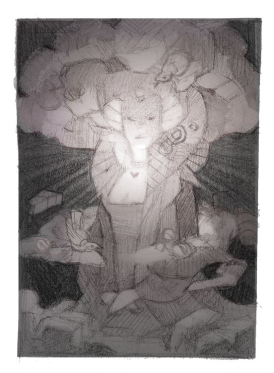
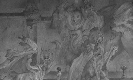
Above, my initial thumbnail sketch: the divine protagonist of the story, Annie, as the epicenter of an atomic blast of all things romantic and feminine. (“Now we are all sons of bitches!”)
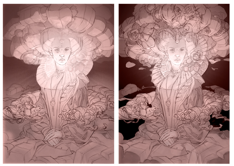
Whenever I attempt to draw a concept like this – a sort of a visual pun – I always worry that the secondary read won’t come across and the “point” of the image will be lost. I want to make sure the shape of the mushroom cloud reads loud and clear, so I start my sketch by planning out its three-dimensional forms (above left), then trying to find ways to build those forms a second time out of various romance-themed objects . This was a bit of a wresting match; going too intricate with the details would start to compromise the larger read of the mushroom cloud, but going too general I’d start to drift away from the ornate and chaotic feel I was going for. This is one of the reasons why I almost always choose to refine my sketches digitally; I certainly appreciated the endless tweaking ability on this one.

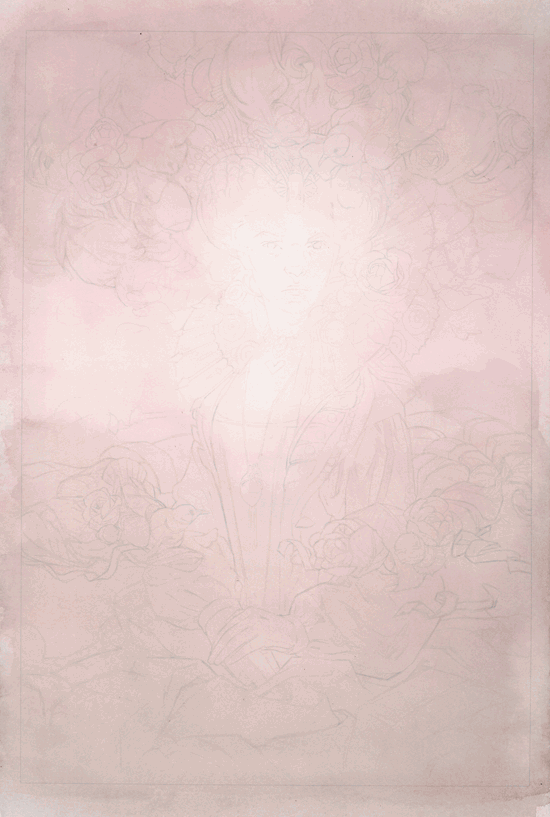
Normally I like to work on toned pastel paper – it takes pencil nicely, and working from a midtone gray gives me a head start on building up the values in ink. On this piece, though, I felt that a pure white base would be important to the brightness of the atomic blast, soI chose to work on Arches watercolor paper – starting with a low-opacity print of my digital sketch traced over in pencil (above)…
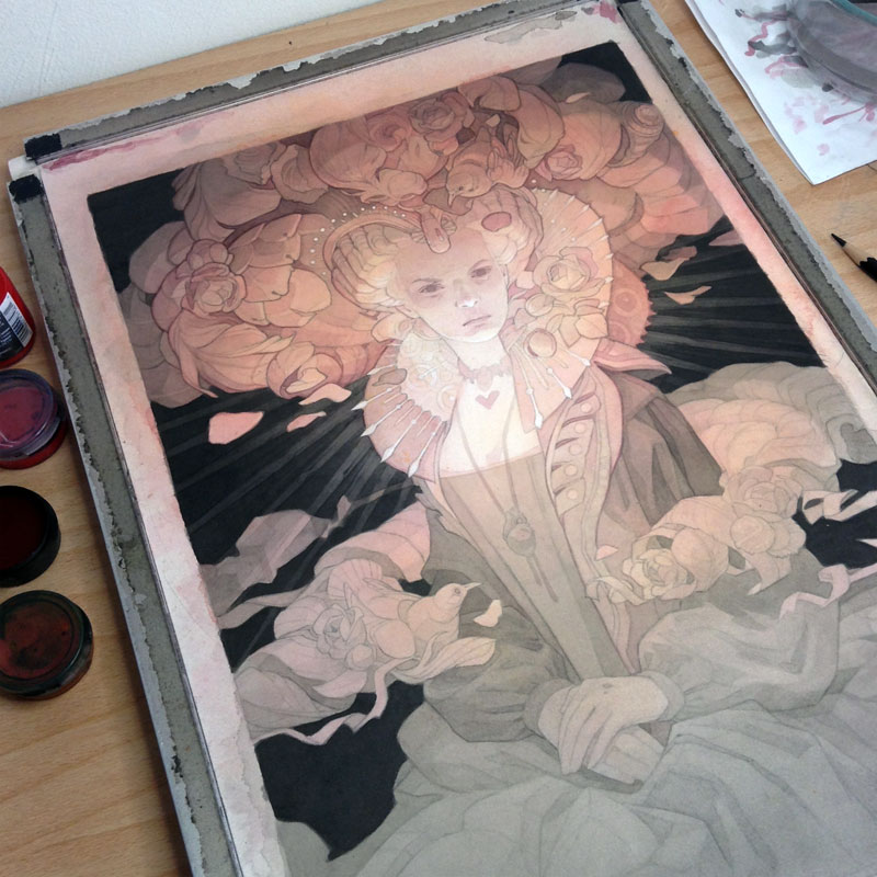
…then building up the values in what felt like a thousand layers of ink wash (hey, I just remembered why I usually work on toned paper!). Since the lighting in this piece relies on the strong value shift from the bright center to the shadowy edges, I apply my big washes of color using a small spray bottle filled with diluted ink. With a light enough hand, the effect is that of a somewhat clumsy airbrush and allows a more seamless gradient effect than I’m able to get with a brush.
In the end, despite my best intentions I ended up going a tiny bit too dark with my washes; my attempts to get a sense of volume in the rendering of the face resulted in losing the bright flash of bare paper at the center of the image. A few touches of white charcoal (and a tiny bit of digital trickery) helped bring it back around again.
Timed-edition prints of the finished piece are available for a limited time on my website; for anyone who wants a closer look at the process steps from the animation above, a layered .psd of the high-res scans is available for free over on Patreon.


Your work is always stunningly well done and inspiring to me. Thank you for contributing here.