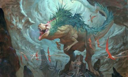
Today, we’re going to walk through the process for creating book covers (specifically mine; everyone has a different method). This one was for Magic Dark and Strange by Kelly Powell, with the amazing help and art direction of Sonia Chaghatzbanian from Simon & Schuster. It isn’t so different from my process when creating personal work, but it is a little more organized, fortunately! With that, the first thing I look for when starting a project is finding out the…
1. MOOD
The first step is not finding out what color the heroine’s hair is, or the accuracy of the setting, but determining the mood. What mood do you need to translate onto the cover? If it’s a dark, horror-themed book, make sure that translates into your sketches. If it’s a light-hearted book, incorporate elements that convey the genre. If there’s magic in the book, paint something on the cover that implies magic. If you have to choose between mood and technical accuracy, always choose mood. Your audience needs to know what to expect when they see the book at a glance.
Another option is if the client doesn’t directly tell you what mood they’re looking for in the cover, you can simply ask and they’ll usually have a good idea of what they need. This saves you time trying to figure it out on your own.
2. INSPIRATION
After I figure out the mood and theme of the book, I go onto Pinterest, usually, and look for inspiration. It could be reference ideas, specific clothing details, or just general aesthetic goals that I want to achieve. I find this is a great way to jog my memory on certain elements, or even just to spark some ideas that I wouldn’t have thought of on my own, while still staying true to my own vision. This is also a great way to look for images that evoke the mood for which you’re looking, and analyze how it managed to convey that mood.

Above is a screenshot of my pinterest page when I was researching and browsing for this project. It helped give me ideas on what type of dress and the fashion elements that appeal to me, the shape or color of the moon, the look of the tombstones and environment, etc.
3. THUMBNAILS
Once I have some inspiration bubbling in my brain, I start the thumbnail process. The goal is to get as many ideas out as quickly as possible. I’m not a fast drawer/painter so I do catch myself getting hung up on small details, forgetting that I need to keep that for the sketch stage. My work time is quite limited, so my thumbnails are pretty rough, just enough to get the point across to the client.
If you have a client that hasn’t worked with a lot of artists, maybe they’re not an art director or something, then put more time and detail into your thumbnails. Experienced art directors can usually make the mental jump between a rough thumbnail and a final, whereas other clients may need a bit more information to do the same.
The same applies if you know your art director will be showing your thumbnails in a meeting, which is rare when it’s so early in the process, but does happen. There will likely be people from marketing, sales, etc. who may also benefit from more refined thumbnails.
Here are the thumbnails that I sent in for this specific book cover. Sometimes I only send two, sometimes it’s four or five, like this one, it just depends on the project. It’s also interesting to note that sometimes the book cover title changes throughout the process, but you still need space to account for the title and author’s name. Again, sometimes I include a rough idea of the title in the sketch, other times I don’t. I usually only do it if I’m imagining the title to be heavy incorporated into the illustration itself.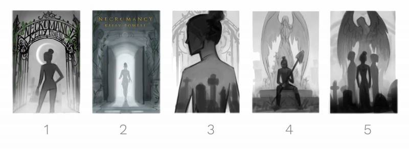
For this specific project, the AD reviewed the thumbnails and then we collaborated to come up with a different approach. She comped together a sample image and I immediately fell in love with it. Sometimes, as artists, we tend to get caught up trying to convey our own vision, but if we’re open to new ideas and suggestions, we can come up with something together that we couldn’t have done alone. This is one of the reasons I really love creating book covers, it’s very collaborative in its nature, and the results can be very unexpected. It gets you outside of your own head and, honestly, it’s a nice change for once, haha.
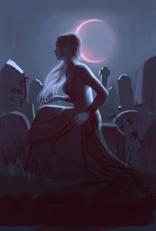
After referencing her comped image, the new sketch looked like this:
With the sketch approved, we also talked about incorporating linework suggestive of cemetery gates into the cover somehow. I really wanted to incorporate the skull and wings motif into the linework (another example of how looking at inspiration gives you ideas), because a) it helps reinforce the imagery of cemeteries and tombstones, and b) it’s SO cool, I mean come on. Add a skull onto a cover and it’s immediately better! I sketched two different variations, and the second one was chosen.
You can also see here that the title changed, and would change again from the final. Now, onto the fun part!
4. REFERENCE
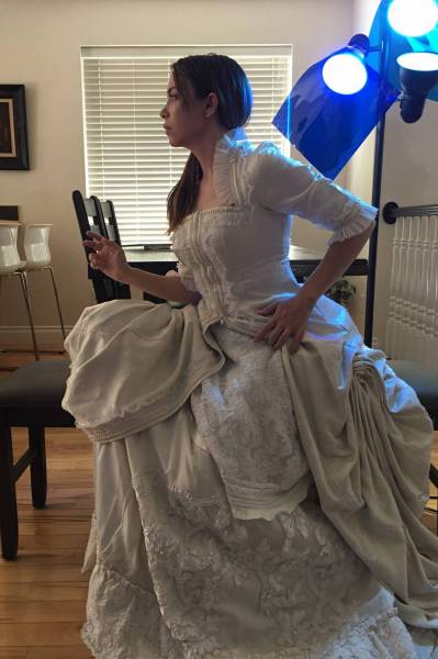
Reference can vary depending on the project. In this situation, a luxurious victorian-style dress was needed, and that wasn’t something I could substitute with whatever I had at home. So I went to my local costume rental place and rented this dress. It wasn’t exactly what I had envisioned but it was close enough. I usually use myself for a model and make changes to the final details, so hopefully it looks like someone else, haha. It was actually pretty fun to dress up and pose!
So I used a floor lamp with a blue gel taped over it (at this point in the process I thought the moonlight would be cool-toned), propped my phone up to make it snap pictures on a timer, and took about a million photos, with various different poses. I’d adjust the dress a bit, adjust my hand position, look different places, etc. It’s way better to be in a position of having too many reference photos vs. not enough, so when you think you have enough, take a few more. I often find that the later poses are more captivating, intriguing, etc. than the first photos.
It’s also important to remember to keep your sketch close by so you can continue to reference it while you’re taking the photos, so you can remind yourself of details, angles, expressions, etc., while you’re there, instead of having to go back and retake photos later.
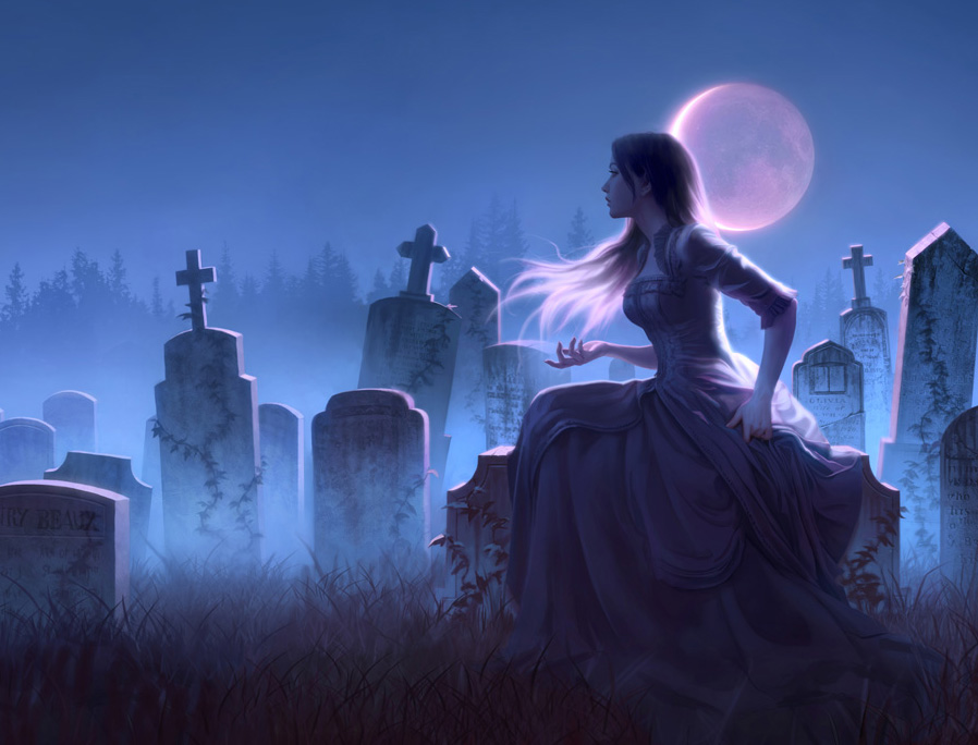
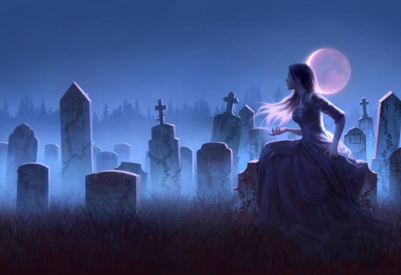
6. RENDER
This is the stage that takes the longest, but is also pretty fun, since you’re just painting all the details. I’ll usually take this stage to a sketch and show the client, to make sure we’re all on the same page and they don’t need any revisions. I think in this case, I got a little carried away and ended up almost finishing it before sending it in, woops. If you watch the gif above, the second-to-last image is what I sent to them, and the last image is the final with adjustments. Some of the adjustments included brightening up the highlights, lightening the sky sans stars, and adjusting her pose/face to match the initial thumbnail/sketch.
As a book cover artist, you learn very quickly that making changes is the name of the game, and it’s a rare occurrence when a client wants no revisions at all. I was happy to make those changes and I think the adjustments helped the image pop even more, especially from far away, which is essential for book covers.
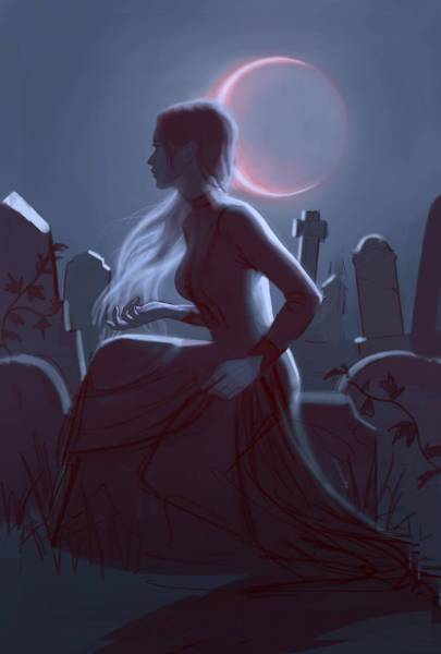
8. FINAL
After everything was finished and approved, here was the final. I forgot to mention that this is for a wraparound jacket, so I illustrated the back cover for it as well.
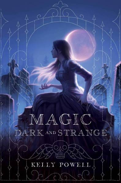
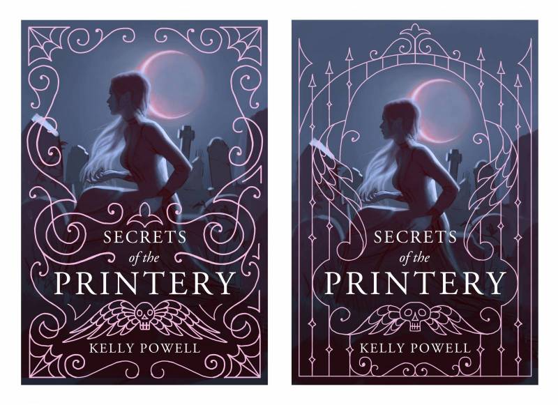
Here’s the final design, done by AD Sonia Chaghatzbanian, and the linework. I love that we were able to incorporate the cemetery gate linework into the final cover, and that they chose an old tombstone-style typeface for the lettering, such a fun detail!
So there you have it, my general process for creating a book cover. Overall the most important thing is keeping open communication with your client, and working with each other to come up with something they’ll really love, and hopefully, you will too.
Thanks for reading, please take care of yourselves!


Love when people share their full process break down like this. Cheers!
Thanks for sharing this! I got to the final image of the cover and my brain went “I want to read this book…”! The focus on the atmosphere at the beginning of the process really comes through in the final image–makes me want to curl up with the book and lose myself in the world that the art is a window into.
Superb article!
That final tilt of the head/face away from the viewer was such a great change! The initial was “Come and look at me”, and that small but significant adjustment changed it to “Come and read this story”. Brilliant!
Thanks for sharing!
Thank you very much for your help, and I hope to be of use to you in the future. It’s writingjudge that’s my favorite website since it includes the most impartial assessments of the greatest writing services accessible everywhere.
Thank you very much for your help, and I hope to be of use to you in the future
Thank you very much for your help, and I hope to be of use to you in the future.