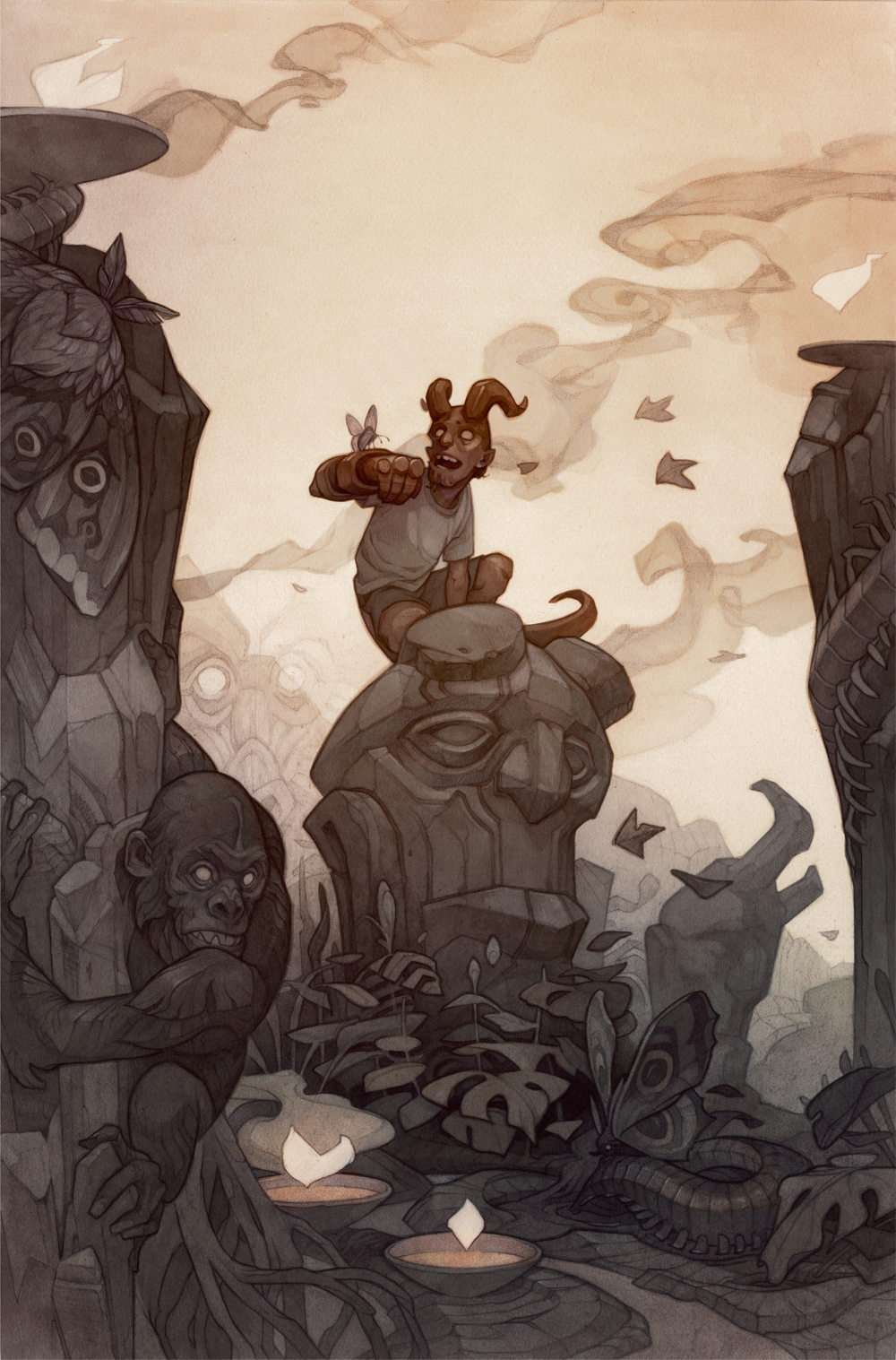
This past winter, I got the chance to illustrate the variant cover for Young Hellboy #3 for Dark Horse Comics! I’m obsessed with Mike Mignola’s work, so it was really cool to get to tackle something from his universe in my own style.
As a longtime Hellboy fan, one of the things that struck me about this series is how the young and old versions of Hellboy manage to be such distinct characters. Old Hellboy has the world-weariness of someone who has been clocking in every day to fight monsters, and isn’t surprised by anything; Young Hellboy is seeing everything for the first time and couldn’t be more excited about it.
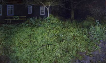
I wanted to show both sides of the coin with my variant cover by contrasting an immovable stone idol of Old Hellboy with Young Hellboy’s awe and delight over the strange jungle critters around him.
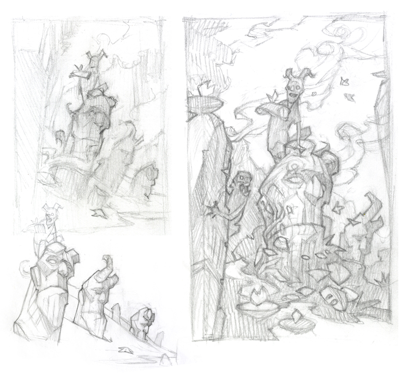
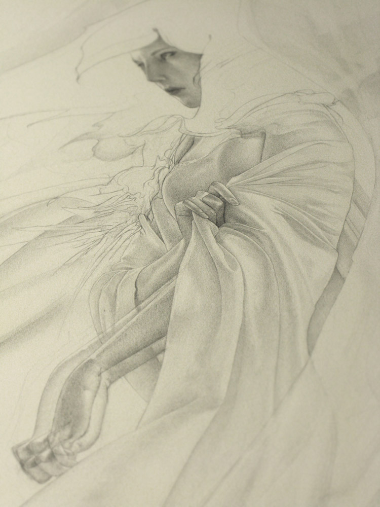
The final cover art was colored digitally (more on that below) but started life as a traditional-media underpainting in monochrome pencil and ink: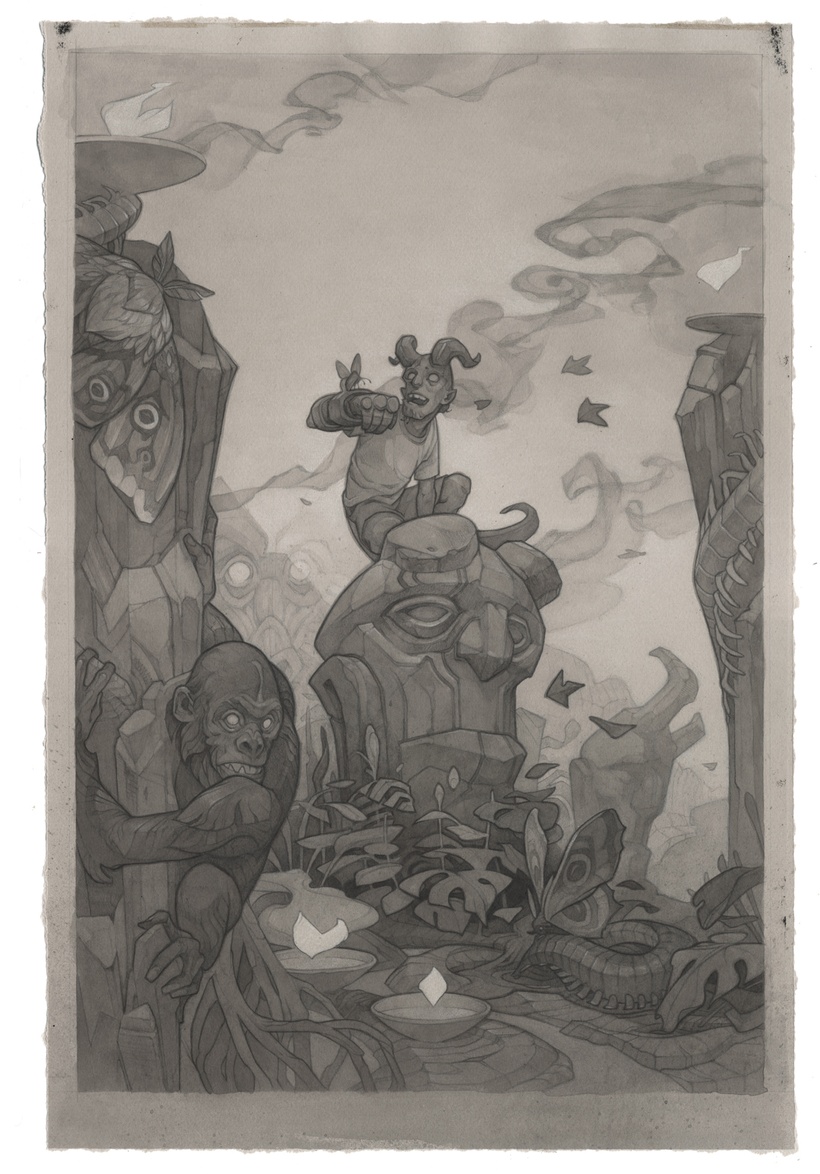
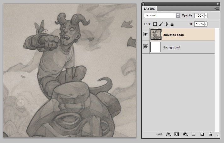
My process for coloring a traditional-media piece digitally is a chaotic one, pieced together from wrong turns and much trial-and-error. For this tutorial, I wanted to shed some light on one of my less intuitive (but extremely useful) digital coloring tricks: the use of alpha channels for traditional-media lineart. You can see this technique in action in my working .PSD file for this illustration, downloadable here.
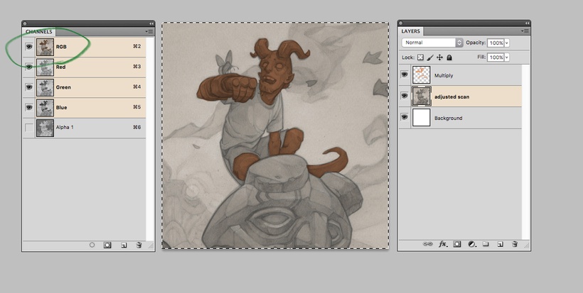
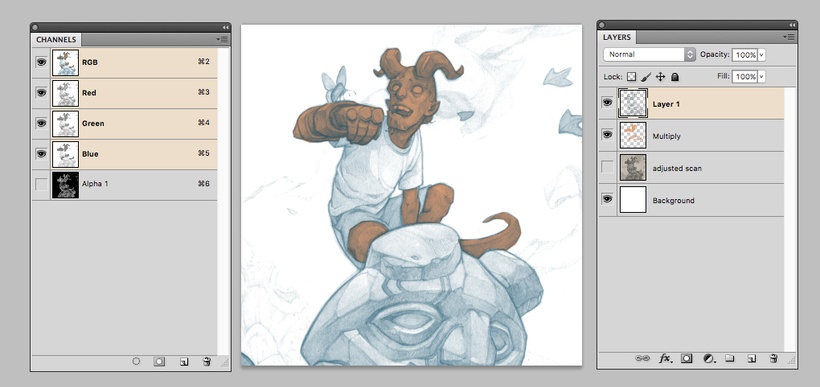
Here’s the adjusted scan of my traditional-media artwork:
There are a few ways to add color to it; the most obvious one is to add some fill on a multiply layer on top of the artwork.
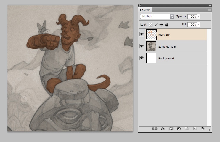
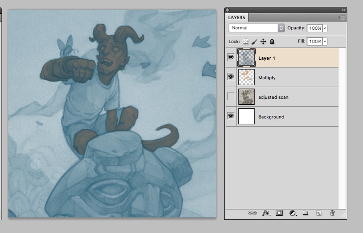
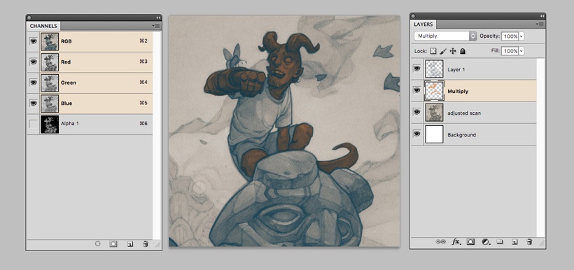
This will do for simple coloring, but it has a few problems. It essentially acts like a wash of dark ink; it influences both the value and the color of whatever’s under it. This isn’t a big deal in the example above, but let’s say I decide what Hellboy really needs is some bright teal lineart, and colorize the original artwork:
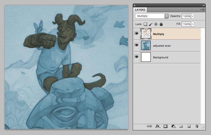
Now that my red Multiply layer is sitting on top of a teal-toned underdrawing, you can see a problem: the bright red of the Multiply layer and the bright teal of the lineart layer are pretty much cancelling each other out for a nice gross brown. The lineart is also getting pushed darker than I’d like thanks to the Multiply effect.
That’s why my preferred method when I’m coloring a drawing digitally is to use Alpha Channels. Here’s my process:
1) Select the artwork layer and copy (Command+C)
2) In the Channels palette, create a new channel and paste (Command+V)
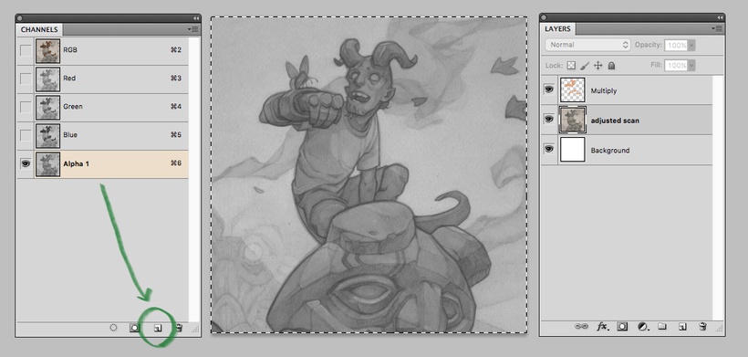
3) Invert the contents of the channel (Command+I)
4) Click on the RGB channel to return to the normal color channel view (important!)
5) In the layers palette, make a new layer. Load a selection by going to Select>Load Selection; in the channel dropdown of the popup, select Alpha 1 (the channel you just created) and click ok.
You should now have marching ants around just the lineart.
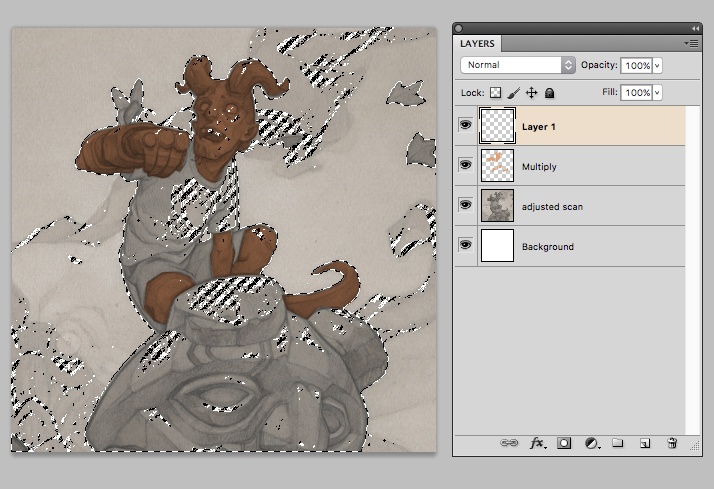
6) Pick a teal color and fill your selection (Alt+Delete). What you’re looking at now is opaque, isolated lineart sitting on top of the red fill (turn off the original artwork layer beneath to see this more clearly).
The version above is still not the prettiest, but you can see that both teal and red are holding their own now – they aren’t “adding” to create that darker brown color.
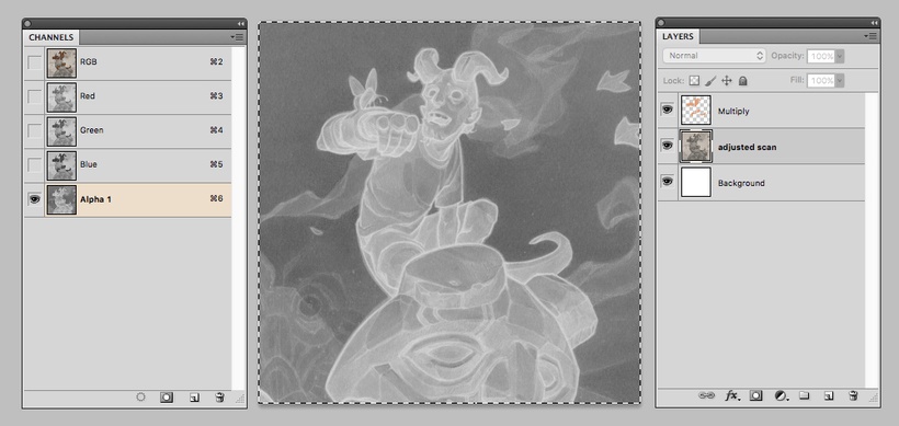
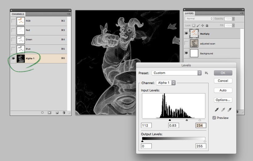
Some of the remaining muddiness is due to the fact that my original lineart was pretty low-contrast (the Alpha Channels trick really works better the closer the artwork gets to pure black and pure white). So let’s take a few steps back, delete our existing Layer 1 and try again.
7) Back in the Channels palette, open the Levels adjustment (Command+L) and move the sliders around for a more contrasty image (pure whites here will translate to colored areas; pure blacks will translate to “empty” space).
Repeat steps 4-6 to load the selection from this new alpha channel to a new Layer 1, and fill the selection with teal. This time around, you can see that the lineart is a lot cleaner, and lets a lot more of the red layer beneath shine through.
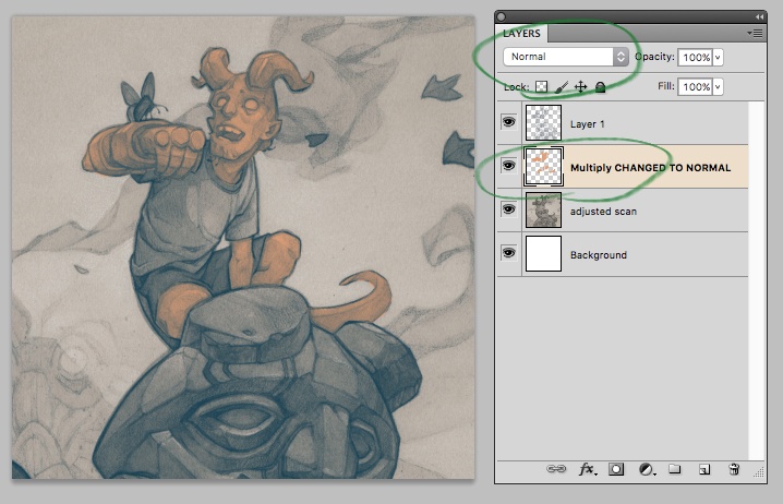
I’ve lost a lot of the lovely traditional-media subtleties of tone, though. If I turn the original artwork layer back on (below) I get them back – but, once again, I have the problem that my red Multiply layer is darkening the lines of Hellboy beneath it.
To fix this, change the layer mode of the red fill from Multiply to Normal. Now I have my Alpha Channel lineart over my solid red fill for Hellboy, and the traditional artwork everywhere else. The change of layer modes has affected the shade of red…
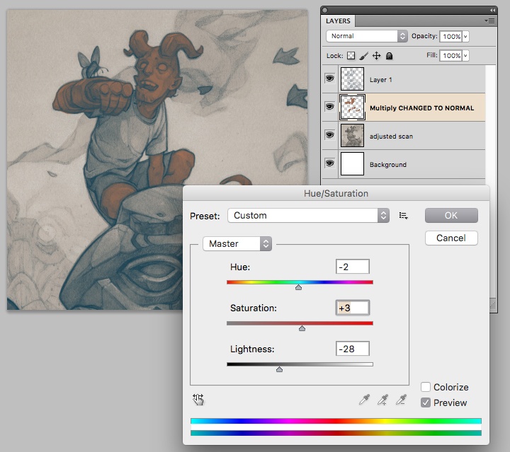
…but I can tweak this with a Hue/Saturation adjustment, below.
And there you have it! I can do other cool stuff from here. If I add a layer mask to Layer 1, I can paint the blue lineart in and out of the other areas of the piece to my heart’s content (try the Gradient tool here for cool effects).
….and now I can paint opaquely over my red fill layer without disturbing the lineart above it.
You can also repeat this process as much as you like, masking and layering colored lineart layers to get whatever effect you like (here I’ve filled a new layer from my Alpha Channel with bright pink and masked a small swatch to show the kind of effects you can get as you build things up).
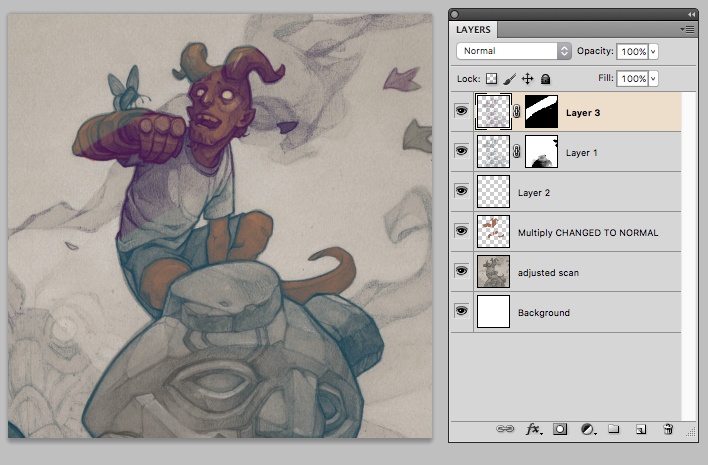
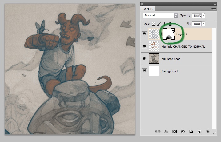
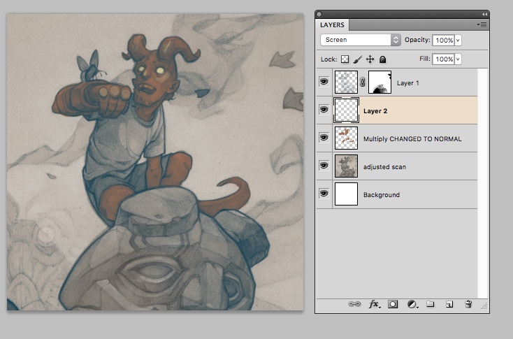
If you click through the layers palette in the process PSD for the Hellboy cover (I recommend turning them off one by one from top to bottom – it really is pretty crazy in there!) you’ll see several instances of Alpha Channel lineart being used to tweak the look of the piece. I rely quite heavily on this tool in my digital process, and I’ve found it’s a great way to preserve the texture and feel of a traditional media underpainting, while still getting the level of polish that a digital piece needs to feel “finished”.
If anything about the above process is unclear, feel free to ask questions in the comments!

Great tutorial. I really love your work!
Wow thanks for sharing the PSD! I can now follow along from the relative comfort of my own chair, which is helpful as this Alpha stuff is often over my head.
Cheers and thank ya for the post.
Fantastic piece and article, thanks for sharing!
Layer masks and creating channels from existing data in the image are two very powerful methods to take guesswork out of achieving what the artist really wants. Impressive to see a (mostly) traditional artist have such a good understanding of it.