 |
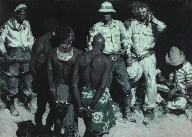
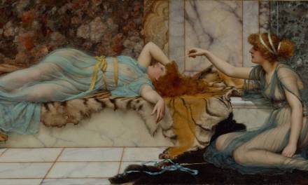
| Maed Schaeffer using only Viridian Green, Black and White. |
Duotone is a printing process by which an image is created using just two colors. Traditionally, it is created by applying a single color halftone (usually blue, red or yellow) over a black halftone. Whites are achieved through the use of the paper’s surface. The printing process is very simple, and extremely cost effective, making it a popular choice for projects where budget is a major concern, like newspapers and classic pulp magazines.
Golden Age Illustrators, commonly had to paint their illustrations with these printing restrictions in mind, limiting their palettes to just black, white, and a single other color.
So just how much can you achieve with only two colors? A surprising amount, even when one of those colors is black!
Take a look at a few of the following duotone illustrations, and pay careful attention to how much tonal and temperature variation the artists achieved. And remember, these artists weren’t even able to use a complimentary color in order to dull out the chosen color. They had to reduce saturation levels using just black and white. Truly astounding work.
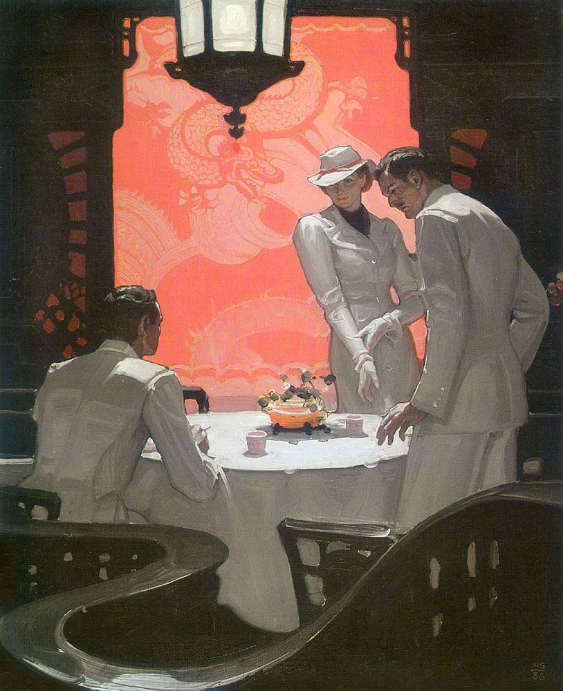 |
| Mead Schaeffer using only Red. |
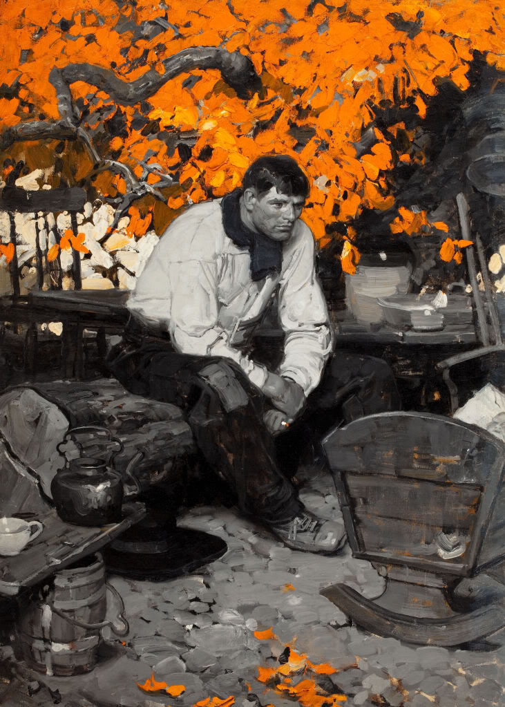 |
| Dean Cornwell using only Cadmium Orange. |
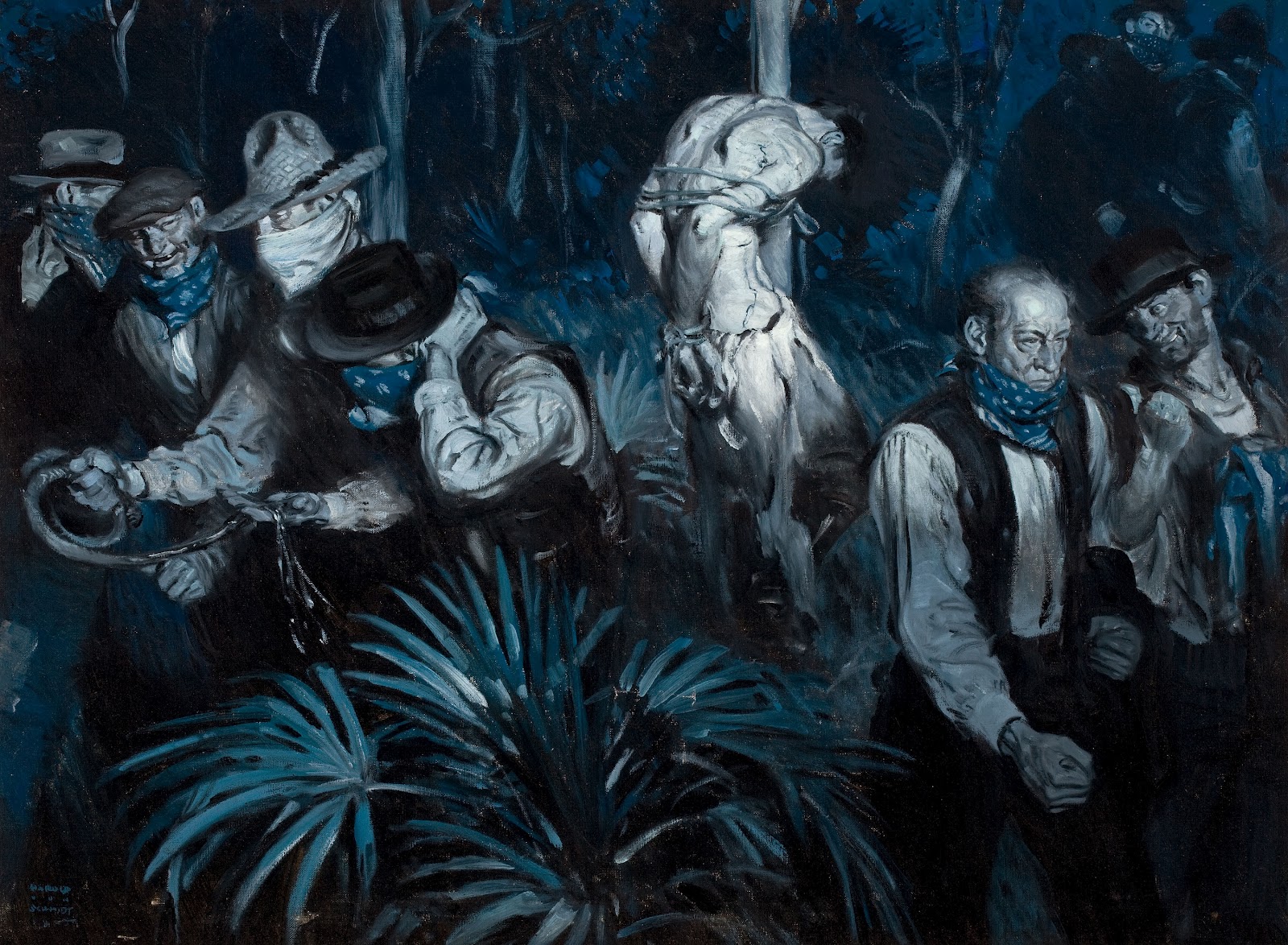 |
| Harold Von Shmidt using only Ultramarine Blue. |
Duotone illustrations weren’t just for the Golden Age guys, though. The process was still quite popular right up to the 1970’s, and is still in use today.
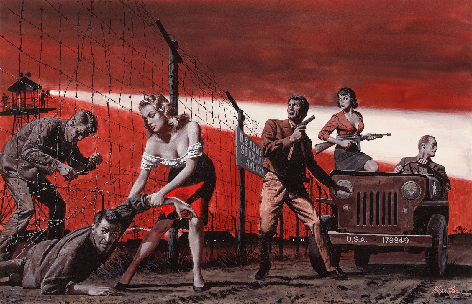
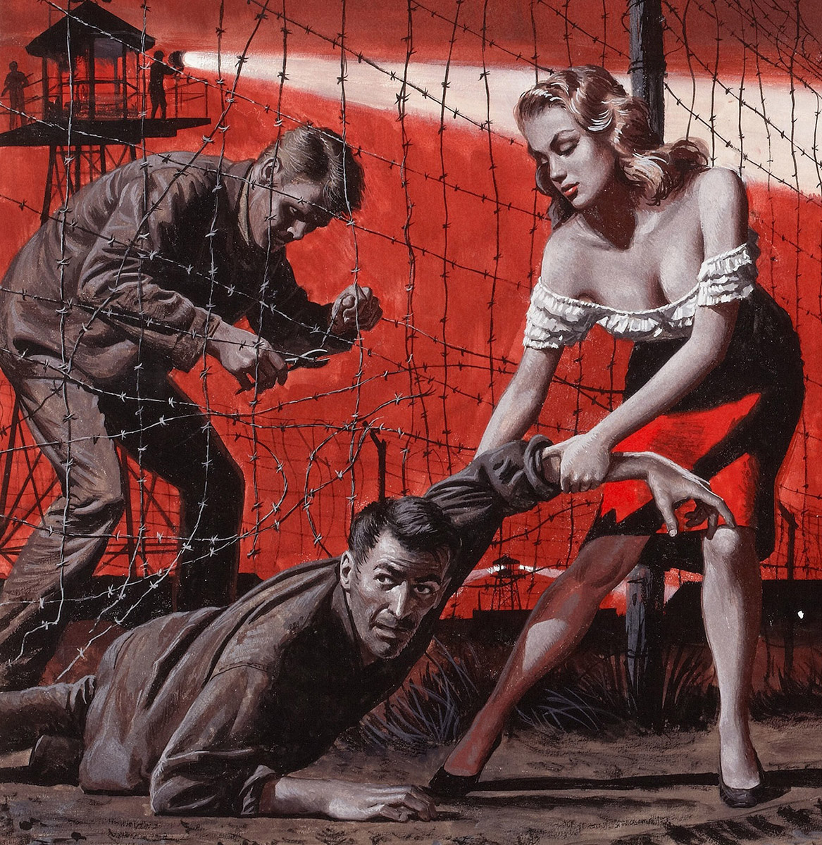
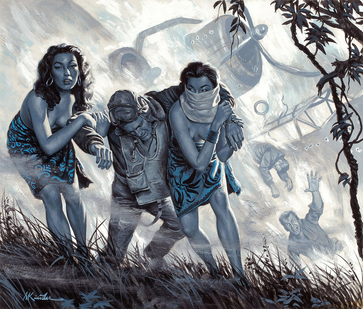
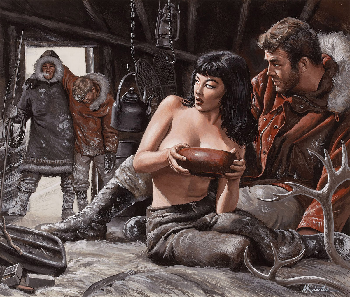
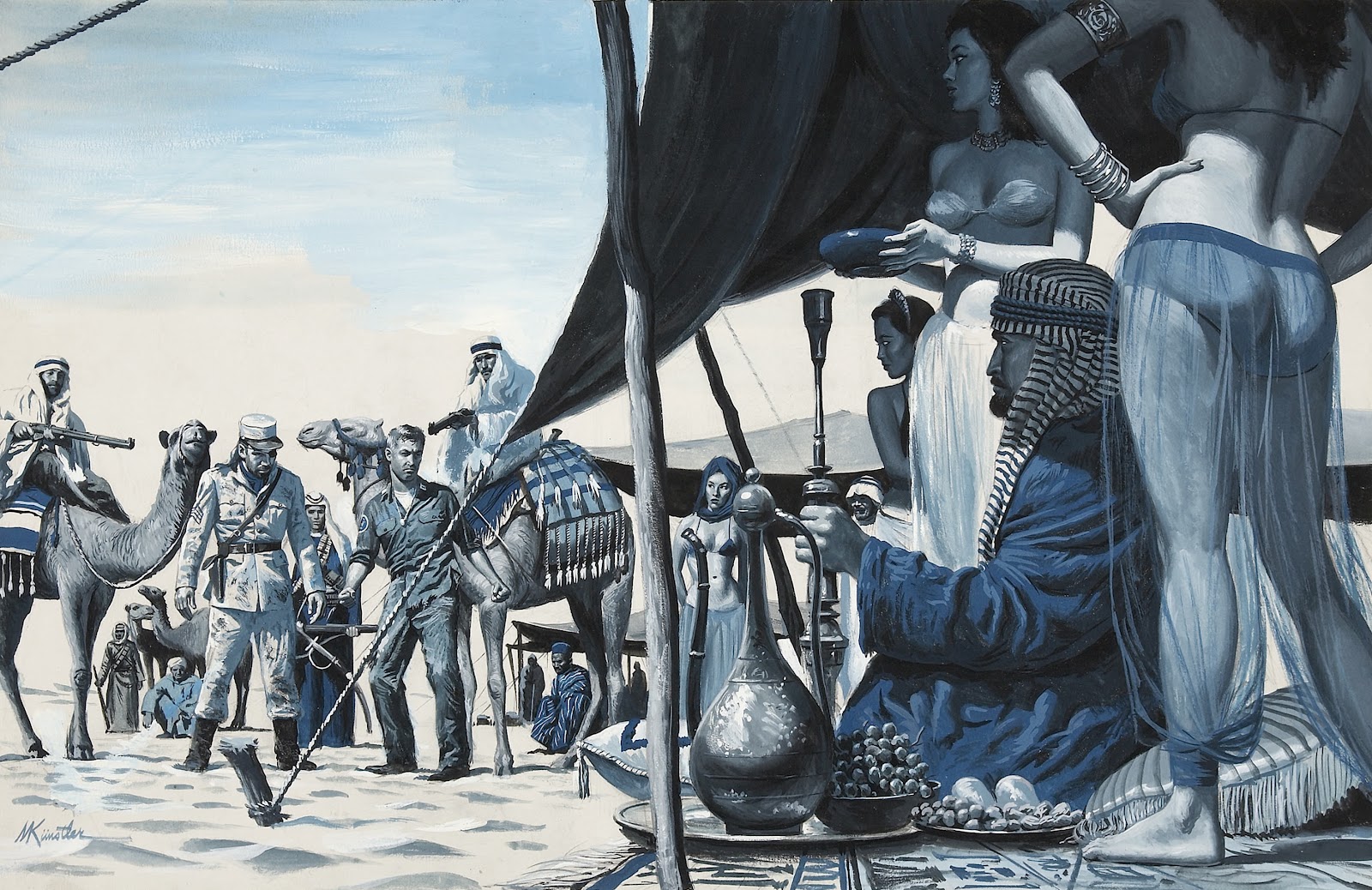
One of my favorite Illustrators is Mort Kunstler, who did a lot of pulp/adventure magazine illustrations. One of the things I find most impressive about Mort’s work, is his able to imply a wide range of lighting effects with just about any color. He didn’t always use the obvious choice of blues for cold settings or night scenes, and reds for day time or hot climates. In fact, he would often choose the exact opposite color one would expect for a given scenario.
Value and temperature always take precedence over hue.
So the next time you’re struggling with color, remember what you’ve seen here. Value and temperature always take precedence over hue. You can imply a surprising amount color with very little, provided you are careful to control your saturation levels. If your color scheme is giving you trouble, try removing colors. It will force you to pay better attention to what really matters.

Excellent examples of skill and understanding.
I agree those are great examples! Takes a lot of guts to do what Mort did by tinkering with traditional color choices.
Works good if your printer only has a 2 color press instead of a 5 color.Eclipse comics printed a few books around 1980 .They looked good in my opinion.
We used duotones for photos in books too. Check out the Hollywood Portraits or Hollywood Classics series of oversized coffee table books. The images were duotones, using a warm grey. The image is a little washed out, the actual cover looks better. http://www.amazon.com/gp/customer-media/product-gallery/0517658453/ref=cm_ciu_pdp_images_0?ie=UTF8&index=0&isremote=0
Great post, thanks!
I love straight Cadmium Orange oil paint. These type of paintings showcase the color of choice really well.. kinda shows how unappreciated we are about color. We usually think of color as this is that color and that is this color while painting. We don't see the brilliance in color somethings and the effect it has. I was saying “we” but I meant “I”. lol. Good post!
time for me to try this and fail multiple times 🙂
definitely agree that a limited color palette can do more than one thinks. I love these paintings, the strokes and thick paint and value grouping is so confident. it doesn't need color to make its point.
“Truly astounding work..” Amen to that!
I'd like to see the film industry look at some of these colour concepts more often.
I am wondering if they used Black and White for the Mid-tones and neutrals, or if they sneak in a part of their 'color' pigment into it (or perhaps even something completely new)?
All the early saturday evening post covers were done black white and vermillion. sometimes yellow ochre and burnt umber, but still extremely limited in colors used, even if not a true duotone. And it often times it looks better than a painting packed to the walls with color.
Thank you! I have been curious as to what reds were used by people like J. C. Leyendecker for their limited palette covers. It always seemed like an indian red or cad red from the reproductions I saw but vermillion would work too. Although I suppose they all would work really but the gamuts maybe more limited/wider depending on the pigment…. anyway thank you!
This concept was eye-opening for me in art school! I feel this method is foundational for understanding the concept of warm/cool vs value. We perceive color only in relation to the colors that surround, so you can create the illusion of 'full color' with just warms and cools…
Once you learn this “secret”, you'll see it everywhere: many old portraits are done with only burnt sienna/red oxide, black and white (I'm thinking of Van Dyke for instance). This saved a ton of money when pigments were all naturally derived and rare/expensive.
When working with black, there's a lot of temperature variation depending on the pigment.. Some blacks are naturally cooler than others (“Blue Black”), where others are warmer (Ivory), and Mars is considered to be the most neutral… For this reason, to get the most range out of a limited palette, you want to use a cool black to go with a red..
Thank you! I have been curious as to what reds were used by people like J. C. Leyendecker for their limited palette covers. It always seemed like an indian red or cad red from the reproductions I saw but vermillion would work too. Although I suppose they all would work really but the gamuts maybe more limited/wider depending on the pigment…. anyway thank you!
I am wondering if they used Black and White for the Mid-tones and neutrals, or if they sneak in a part of their ‘color’ pigment into it (or perhaps even something completely new)?