
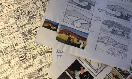
The last article was an unofficial kick-off to a new series on Color Theory that I am going to put some focus into for a bit since I keep getting hit up with emails regarding the subject. I will return to world building after this series, but for now I am going to treat these articles like a progressive class, focusing on one component of color theory at a time. We are eventually going to go through three essential color conversations that affect the modern artist/illustrator, starting with standard color theory of white light, then moving into colored lighting, and finishing with color recipes and formulas.
Beginning with the three components of color, hue, value, chroma, we have partially covered the subject of value in the last article, and I will do a follow up after this article.

I can give you a simple explanation of Hue in one sentence: Hues are the colors we use by name, like blue or chartreuse.
Chroma is the least understood of the three aspects of color: Hue, Value, and Chroma. Unless you have taken a class in the Munsell system of color control, there are very few color theory classes that have broken color down into a science. Color theory IS objective with universal information transcending all our media, as much as color is personal in how each of us chooses to use it, there is a difference.
Personally, I am in favor of grounded information that makes life easier in whatever trade it is we choose to take on. Science is our friend and the sooner we embrace it the sooner we find creative freedom. I also want you to remember to treat learning differently than creating. The two are separate from one another, but we sometimes confuddle them into one thing. Much like when someone wants to try something new, a new material, new technique, whatever, it might be, IN THE MIDDLE OF FINISHING SOMETHING IMPORTANT WHEN IT’S DUE TOMORROW! Why oh why would one do so much mental damage by attempting this? Just because you make art does not mean everything you hear or see is going to “just happen” for you, until you make time to learn about it, make mistakes, and figure out how it can then benefit your work flow.
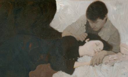
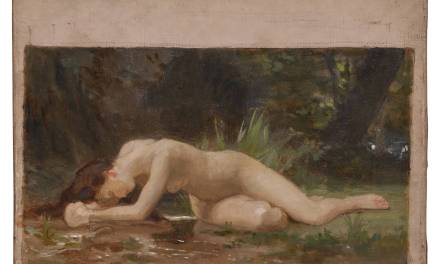
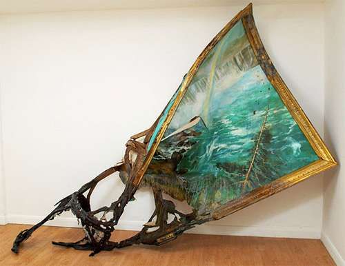 Art by Valerie Hegarty.
Sidenote of great advice: Something my color guide told me, “for the purpose of gaining a very strong foundation, try to separate your creativity from your learning exercises. You need to know certain things to have lasting creativity”.
Sidenote 2: Color theory is most beneficially learned when using traditional media. Colors are separated in such a way in the digital field that there is no real color mixing taking place which also affects the artist in understanding color families, color grouping, color harmony through the use of the root color(called mother color to some schools of thinking).
I ask you to read through the list and whatever you have a hang up with, whatever you feel you would like a deeper explanation for, I will use your feedback to fuel extended articles in response to your requests. We will learn color theory at your pace rather than at my “cram it all in and throw it at you all at once” approach.
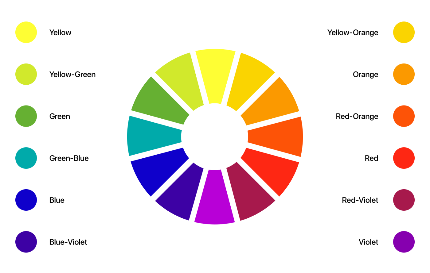
What is Chroma:
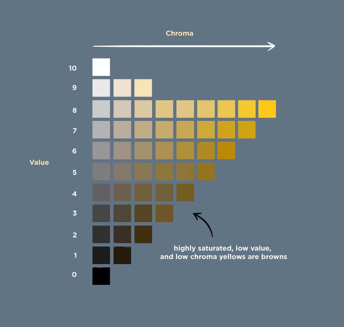
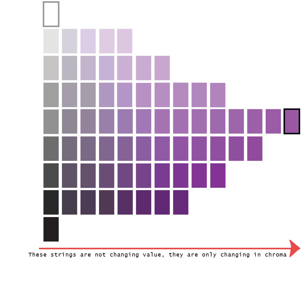
- Chroma is the quality or purity of a color(s). Every color is assigned a value value=color, shifting from gray scale to full chroma of the color is done with gradient steps like a value scale except that they do not change value across their string.
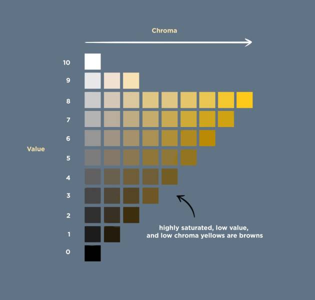
- The string of gradient values of each hue also changes in the number of steps that it will take to achieve a “colorful” hue, some have fewer steps than others.

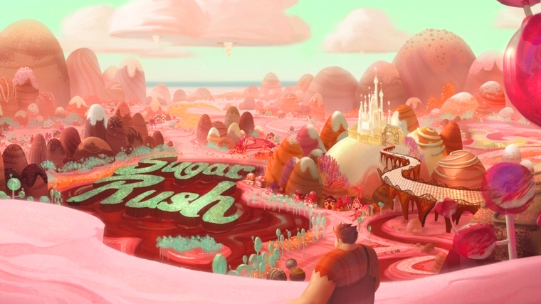
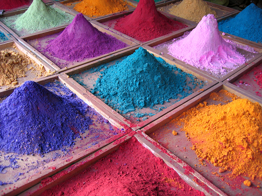
- Chroma is measured high to low, low chroma being close to a contrast only photo, or extreme washed out and lacking in color character to fully understand what each color might be, while high chroma is more like a Pixar animation, saturated or very “Skittles” like in its appearance.

Mostly High Chroma Painting with accents of middle chroma.
 Low Chroma, the colors are mostly washed out and grayed.
 - Chroma is the tool for establishing harmony amongst all colors within the painted picture field. There is both a general harmony as well as micro harmonies within specific color shapes on the canvas. It takes lots of practice to develop a sensitive eye for the slightest changes in a hue, the same way that it takes a lot of ear training for a musician to hear tone in everything around them, and to know which note best describes it.


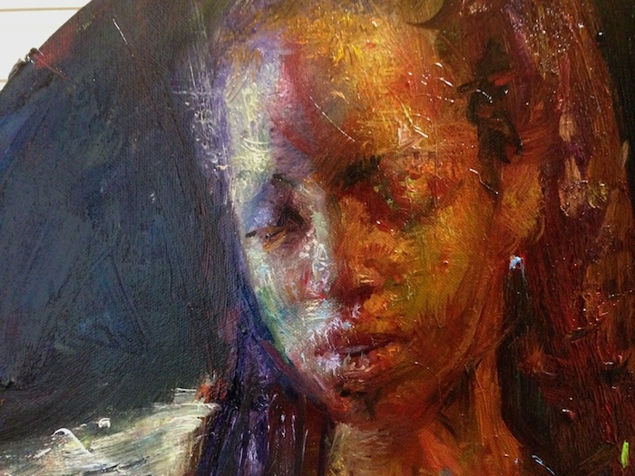
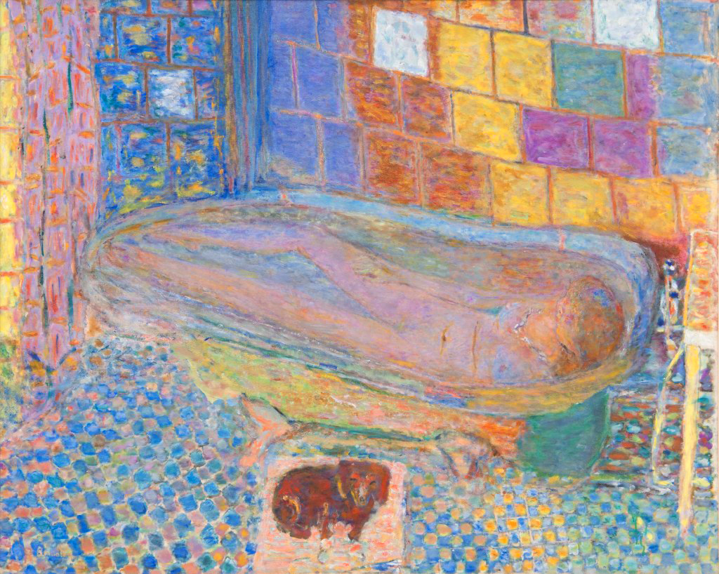
Steven Assael is one of the few oil painters I know that can paint how light feels, the macro and micro control of color is just beyond impeccable.
- Chroma is historic, with the number and quality of hues increasing with the improvement in science. The earliest hues were all earthen, and as technology was allowed and developed, so too were the number of hues discovered. We are still discovering new physical hues to this day, while with the computer we are blessed with a palette of millions of colors and is also increasing in its quality and subtle range with each new generation of computer and scale of screen resolution.
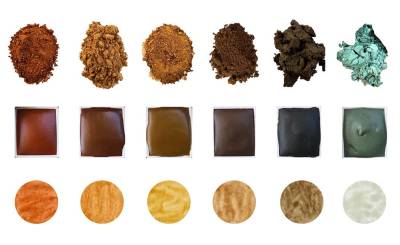
The old masters colors were made from earth materials.

Science has given us hundreds of pigments and still designing them to this day.
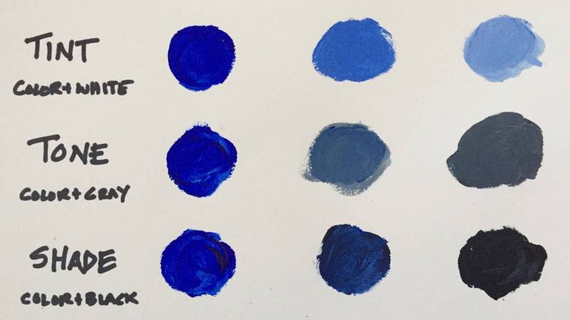
- Reducing the Chroma of a color is the same thing as Graying a color, which is the same thing as tinting(adding white), shading(Adding Gray), or toning(Adding Black) a color. Complementary color mixing is actually making a new hue, not necessarily graying one, and only appears grayed dependent upon the palette used and the color mixture approach.
- As noted above, Chroma is the state of all the colors within the picture field, but to expand, chroma is a gradient gauge of color harmonies that can be intermixed together within the same picture field once one understands how to control them to coordinate them in a more complex way.

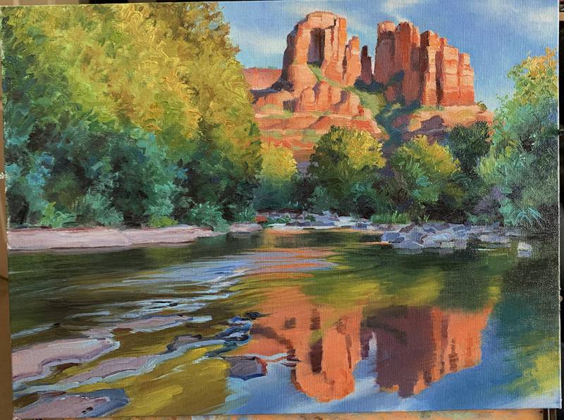
The control of the chroma supports complex shots like this one in helping the artist determine where to control the colors for effect. - Chroma is mood, and a painter should be open to range rather than harshly critique one approach over another. In the painters world, low chroma and tonal painting are synonymous with each other while high chroma painting is also termed colorism. A painter paints mood, and not all paintings can be well achieved in one style or approach, and color theory helps remove the stigma of one over the other by understanding the control that it takes to truly achieve a feeling that might sometimes extend beyond our norm. The study of total color theory also helps the painter understand that color can be pushed in tonal painting just as color can be smartly and expertly controlled like values in colorism. California and Spain do really exist and so do their bright colors. Its not all steamy and gloomy out there in an old tonal way, and not all stories are told with earth-tone colors and tonal moodiness.
Tonalism
Colorism


This next list can help you study chroma more effectively by understanding how to control the chroma of a color mixture. This conversation is aimed towards mixing physical materials together, as this physical experience helps one understand where colors come from, and how colors form families and harmonies. I strongly suggest or recommend that regardless of your medium and if you are a digital only artist, that you should really learn color mixing using traditional tools and materials. The reasons are many, but the fact that having a physical experience is far more memorable and impacting more so than reading something and never applying it.
This list focuses on high and low chroma painting. Middle key of chroma is “normal painting” for lack of a better term, but when you go back to normal painting after working on high and low chroma control, typical color has more clarity, and your understanding of the pigments will warrant more choices when faced with a bad color mixture.
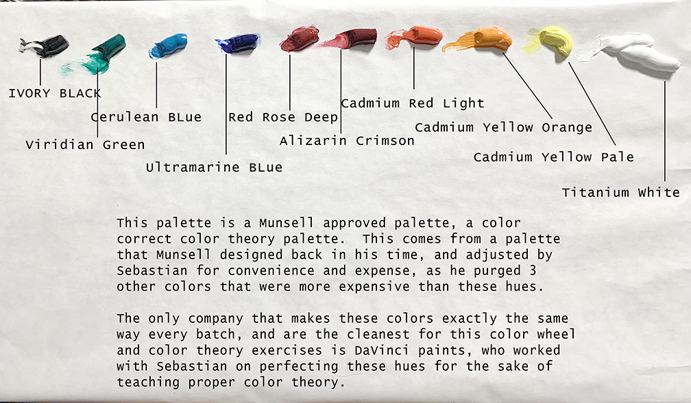
We also need to first refer to the color wheel that is constructed using this approach. This color wheel is not store bought, and teaches much about the characteristics of color and how to control them, and we construct them from scratch. By learning how to construct one of these color wheels, one learns how to control pigment in its hue, value, and chroma with greater expertise. This is built using a specific palette and dare I say a specific brand of paint to achieve this color clarity, but could probably be done with any one specific brand, but the greens and reds will likely look different, and yellow orange can only be found by DaVinci paints anymore. It is not manufactured by any other brand at this time, but if it is, it will usually look identical to cadmium yellow deep. I have tried looking for these colors for my international students but have not yet found anything regional that comes close to this hue.
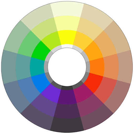
This is getting pixelated, but this is the color wheel I refer to which is not your typical store bought wheel.
Here are a few tips to help keep those colors under chromatic control:
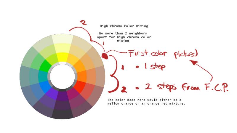
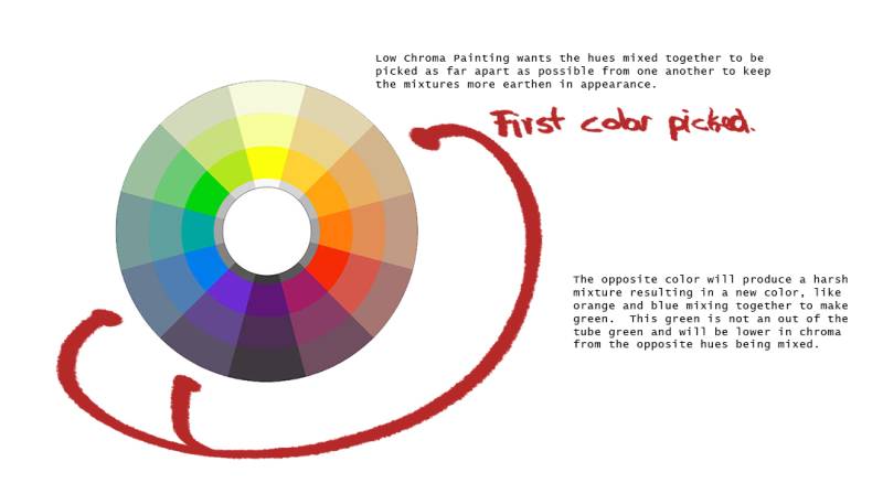
- High Chroma Painting: All mixtures should be done with palette colors that neighbor the initial hue you are attempting to achieve, at most, by 2 hues. This ensures that the color in question is mixed as cleanly as possible. Opposing colors on the color wheel will cause an abrupt change in the hue that cannot be steered back once adulterated.
 The logic behind chromatic mixtures is to find the root hues of every color you see. Root hues are the inner ring of the wheel, and every object on this planet can be pointed back to one.
 - High chroma painting: No black is added to the palette, as black will result in an immediate loss of hue and in all cases will deviate to another hue family depending upon which black paint you use on your palette. In addition, it will immediately drop the value of the hue.

- High Chroma painting: Is a painting of mostly middle values. If a color is visible, a value is present. Most colorful colors reside within the middle of the value range(pigment), therefore a high chroma painting is mostly a tonally controlled painting, which means manipulating the value grays to achieve a successful relationship of colors. Pure color = mostly middle values the extreme ends of the value gradient are considered high contrast, the opposite of high chroma.

- High Chroma Painting: With the above stated, high chroma painting uses temperature and color opposites to achieve separation between the lights and shadows of the subject matter.
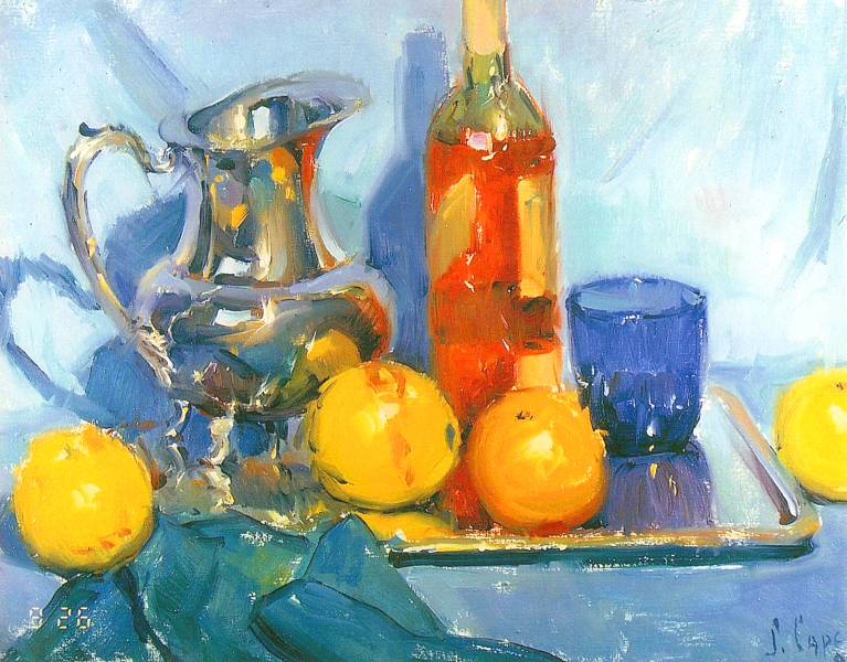
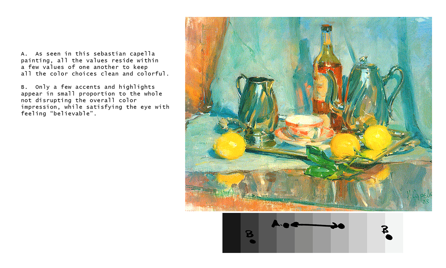
As you can see here, color is used to produce the shadows in this still life from my former mentor Sebastian Capella. - High Chroma Painting: High chroma painting is best done with an “impressionistic” flair to it, or the painting does in many cases run the risk of feeling “fake” or “WAY TOO CRAYOLA”!
John Asaro is known to push the boundaries of color, but always keeps it impressionable keeping the feeling of it “just right”. - High Chroma Painting: This kind of painting is optical in its effects, all the effects are a result of nature, but heightened to a Disneyesque finish.
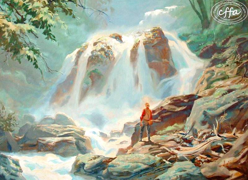
The incredible John Pike, one of the earlier Disney Instructors back when they still used traditional media. - High Chroma Painting: Requires one starts with a blue underpainting (ultramarine blue) as opposed to the typical brown mixture that preceded the impressionists in technique. Not all conditions are correct for a brown underpainting such as high chroma painting and formulaic painting, as the underpainting is what controls the quality of the colors on the top layer and correctly mixes and is the correct hue that would distort the local colors as they transition away from your optical view.
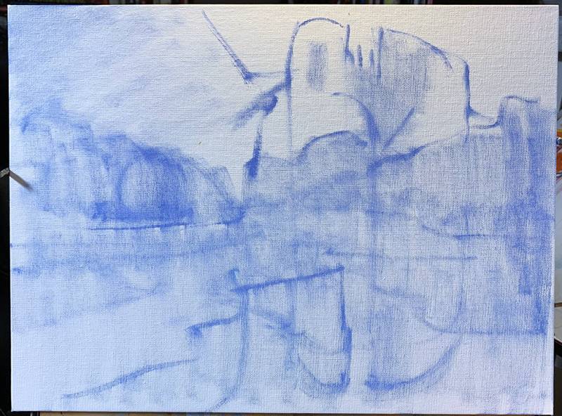
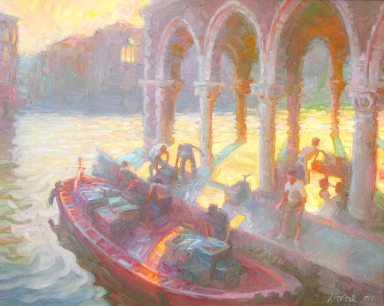
Blue is the starting color for a more chromatic landscape. The blue is in all the halftones both lit and shaded, so it makes sense to begin with the color that will be used as a distortion vehicle for the other colors within the halftones of the canvas. Usually the starting color is a part of the half tone system of the picture.
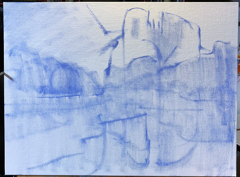
To keep these colors clean and as chromatic as possible the canvas needs to be white, and not color keyed, or the colors will fall victim to whichever hue as been used for the underpainting. This is a medium high chroma painting. The dark values look blackish and are no where near that dark or black, but reproduced look great as accented shadows.
- High Chroma Painting: To achieve a full value range, highlights and accents are added at out of tube value range. The accents will be colorful and chromatic, but will help the painting feel “optically correct” to the mind. Avoid pure white as there is no such thing and the highlight will feel detached due to its lack of chroma. A color should be added to it ever so slightly to keep it in harmony.
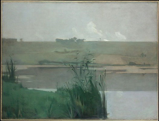
- Low Chroma Painting: This type of painting is a painting heightened in contrast and less about the colorful quality of things. This kind of painting is indicative of tonalism, albeit this approach is more modern by graying the hues rather than through a mostly earth tone palette and/or optically mixing them through glazes and scumbles.
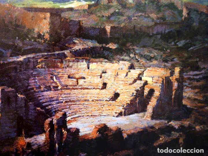
This painting is poorly shot, but is a masterful low chroma painting. All the colors, as colorful as they might appear, have been grayed to help achieve this beautiful chiaroscuro landscape. - Low Chroma Painting: This painting approach requires black be used on the palette, as all the colors are subject to mostly shading and toning the colors to reduce them to a less intense chromatic state. Tinting is a primary tool for high chroma painting since it does lighten the color but does not gray the colors.

- Low Chroma Painting: This painting approach is high contrast painting, pushing the light and the shadows as far as possible. Contrast painting does not want colorful fields, as both contrast and colorfulness are both stars of the show. By having both in the painting simultaneously, the picture loses its focus quickly to the lack of technical control. This is not a kind of painting where you just gray the colors, it is heightening the contrast of the light to reduce the colorfulness of the subject.

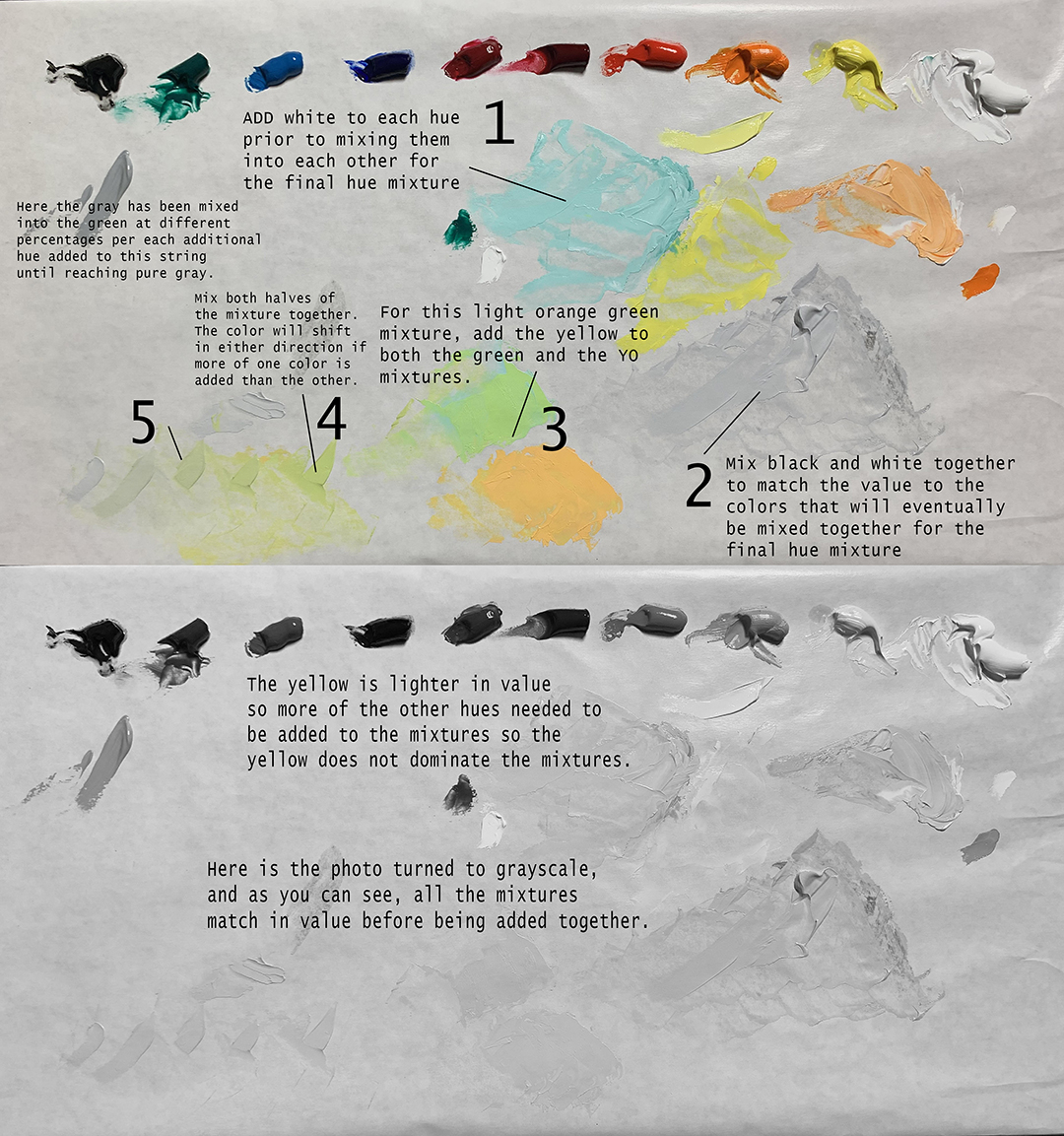
These monstrosities are what occur when both colorfulness and contrast play together at once. I need a drink. - Low Chroma Painting: To effectively make low chroma colors that are all objectively grayed simultaneously, the grayscale value of each hue is mixed to match each hue then mixed in to detune it, another reason why learning that Value=Color is such an important concept to understand.
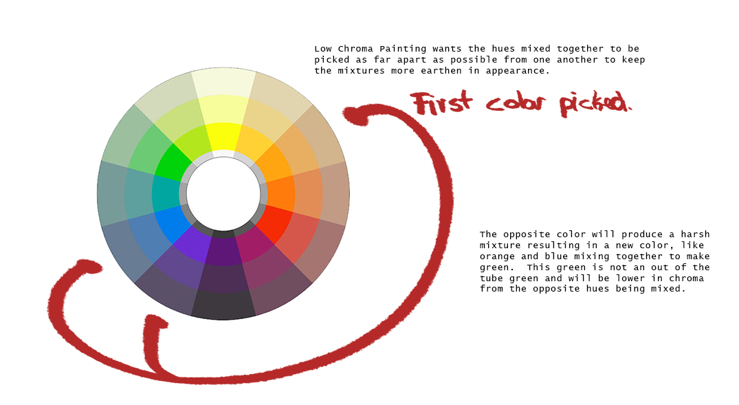
- Low Chroma Painting: Where high chroma painting warrants a color be mixed with a neighbor or nearby color to keep it pure, low chroma painting colors should be mixed with hues further from them on the wheel so they change in their properties becoming earthen and dulled.
- Low Chroma Painting: To achieve optical balance for this otherwise contrasted approach, the accents and highlights are colorful, the opposite of the rest of the hues of the painting. These little tiny accents will “counterpoint” all the lower saturated hues giving them a more controlled color feeling. The highlights should also have color in them for the higher value range. These colors will give a grayed painting the feeling of chroma without pushing it in an unnatural direction.
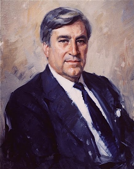
One of Sebastian Capella’s many portrait commissions, this one is middle low chroma with all the colors mixed with a gray to subdue them, which then allows Sebastian to paint accents on the face using high chroma strokes that do not stand out chromatically but draw attention to the face around the eyes.


A strong argument for understanding color = value and practicing with value first besides matching value to hue for middle low and low chroma painting, once you start to use color theory as a tool for mood you will be manipulating the value relationships of the subject matter to steer the mood and feeling in the works you produce. This will be covered in a future installment.
Leveling up is a beautiful thing. Keep it real and expand your potential!
Loving this post Ron. Love the way you approach most subjects! As per your initial comment on what’s next, I’d say maybe sharing what excercises could be useful to enhance this learnign would be of great value for people!
this stuff is GOLD!!!!!!
Great article, thank you for your insight!
There might be an error though at chroma 6. shading and toning seemed to be mixed up in the text while it is switched in the picture below.
Haal je authentieke rijbewijs. Een rijbewijs halen is heel reëel. De moeilijkheid om rijbewijzen te verkrijgen in Europa (Nederland en België) heeft ons ertoe gebracht een geavanceerde rijbewijsstrategie te ontwikkelen. Het is aan ons om elke burger van dit land of immigrant het recht te geven om in Europa te rijden. En dit omdat hij praktische rijvaardigheden heeft, wat we ten zeerste aanbevelen. Voor het kopen van een rijbewijs in Nederland en België is geen examen nodig, noch een kassa zoals bij sommige rijscholen, wat het slagen van het examen thuis niet eens garandeert.
Great article, thank you for your insight!
There might be an error though at chroma 6.
shading and toning seemed to be mixed up in the text while it is switched in the picture below.
Prawo jazdy i zarejestruj się na naszej stronie internetowej bez konieczności zdawania egzaminu ani testu praktycznego. Potrzebujemy tylko Twoich danych, które zostaną zarejestrowane w systemie w ciągu najbliższych ośmiu dni. Prawo jazdy musi przejść tę samą procedurę rejestracji, co prawo jazdy wydane w szkołach nauki jazdy.