I know I keep saying this was a dream job/ bucket-list project, and it truly was. I just have a really HUGE long bucket list of dream projects. But among them THE PIANO stands mighty and tall. I had just seen ANGEL AT MY TABLE about a week before this landed in theaters way back in the early 1990’s, and the leap between them was engulfing and mighty. The unconventional nature of it, the blossoming sexuality and victorian struggle against suppression… the constant environment of chaos and colonial domination of it… it was just a feast for all the parts. Jane Campion is among my all time favorite directors and this is one of her most personal and prized films, so to be able to do it for Criterion with the venerable Eric Skillman running the design and AD duties… was a match made in the highest of heavens. One of those opportunities you say yes to even in the midst of too much work. You just figure it out later.
*A little sidebar before we dive in, at this exact same time, out of a total coincidence, I was also doing a pair of posters for Julia Durcournau’s TITANE that Neon had just begun planning to distribute here in the states. The connection between them? Jane’s The PIANO was the first ever woman to win the Palme D’or and Julia’s TITANE… the second. in its entire history with decades in between. As cool a convergence that is, I think it also speaks a lot not to just the deficit of awards given to female directors, but the lack and presence of women in this field, and a conversation that deserves a much bigger platform than this here article. Still… a pretty interesting convergence. My art work version of looking at the clock by chance and it always being 11:11. Whatever it means or doesn’t… I’ll take it.
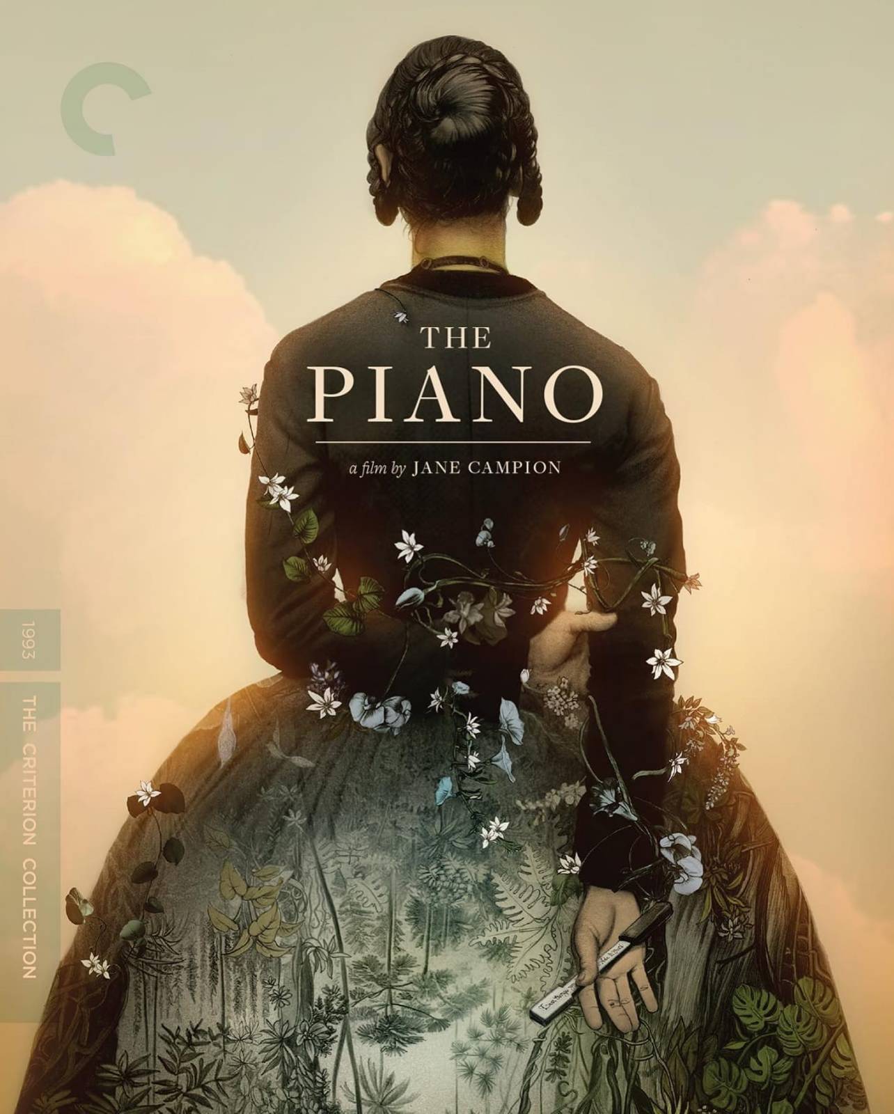
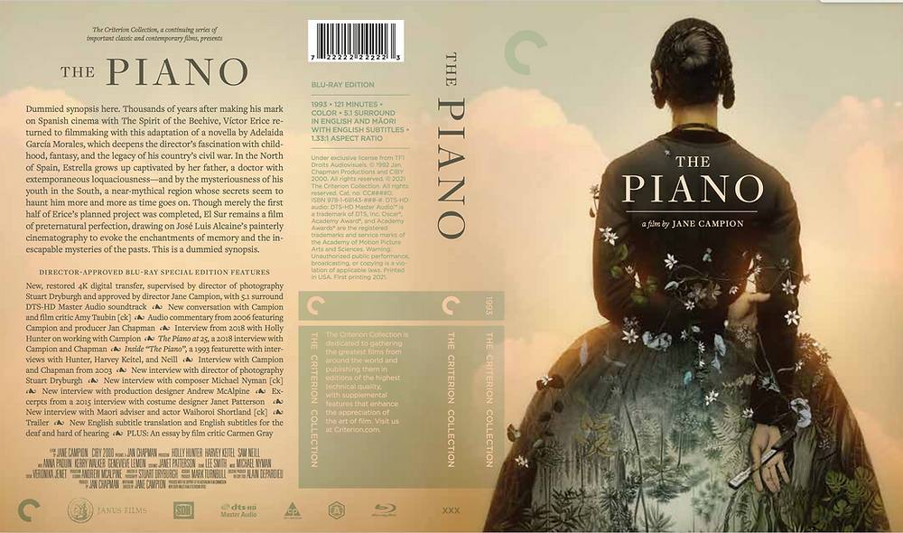
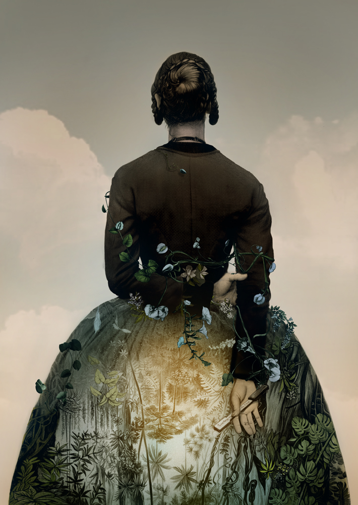
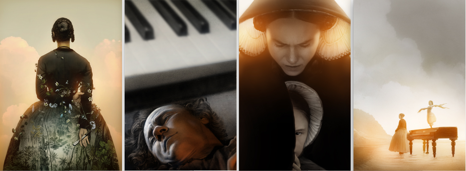
SO. The Piano! As per usual, which has become an easy glove to slip into with Criterion given the raft of past work with them, we began with the cover image. The covers for these things are where nearly all of the tsuris, work and back and forth happens. Once we get that nailed down, unless I’ve really cocked it up on something for the inside, it’s usually a glide path after. As per usual I tend to overwork these projects and such despite the two or three requested interiors for the project I created much more. But more on that later. There was an immediate consensus on that the cover wanted to be derived from this moment in the film, where we pan up from the bottom to top on Holly Hunter as she stands in her dress from behind, and use that as a framing element for whatever we wanted to do here. It’s a film where the environment plays almost as much a role int he film as Holly, Anna, Harvey and Sam all played… a kind of retreat a hidden place for secret trusts and a threat like they were all living inside the mouth of some great unconquerable wildness ready to snap its jaws on everyone. So the obvious opportunity was to use the dress as a background through which to view the world they were in. It struck me as obvious to include the Piano key in her hand through which she bargained with her lover for its return and wrote the love letter that would result in her maiming by her brutal and emotionally stunted husband. They wanted an option to turn her head a bit to catch her likeness, which of course makes sense to do. In the case I felt strongly agains the notion- I just find these kinds of poses inherently troublesome as they tend to reduce any mystery a turned back can offer, and created a weird moment of anatomy to express something in and if itself indeterminate. But in these sorts of cases it’s always good to proved what we need to and hope to convince in another direction by what the better solve CAN do. Happily that scenario won the day and we moved on to the final detailed graphite drawing.
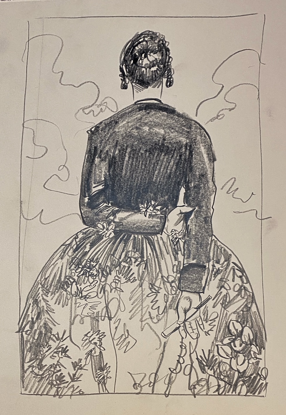
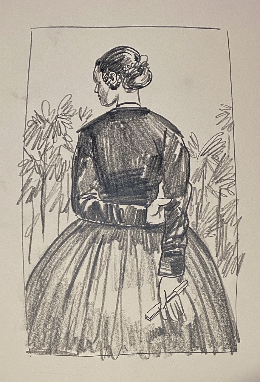
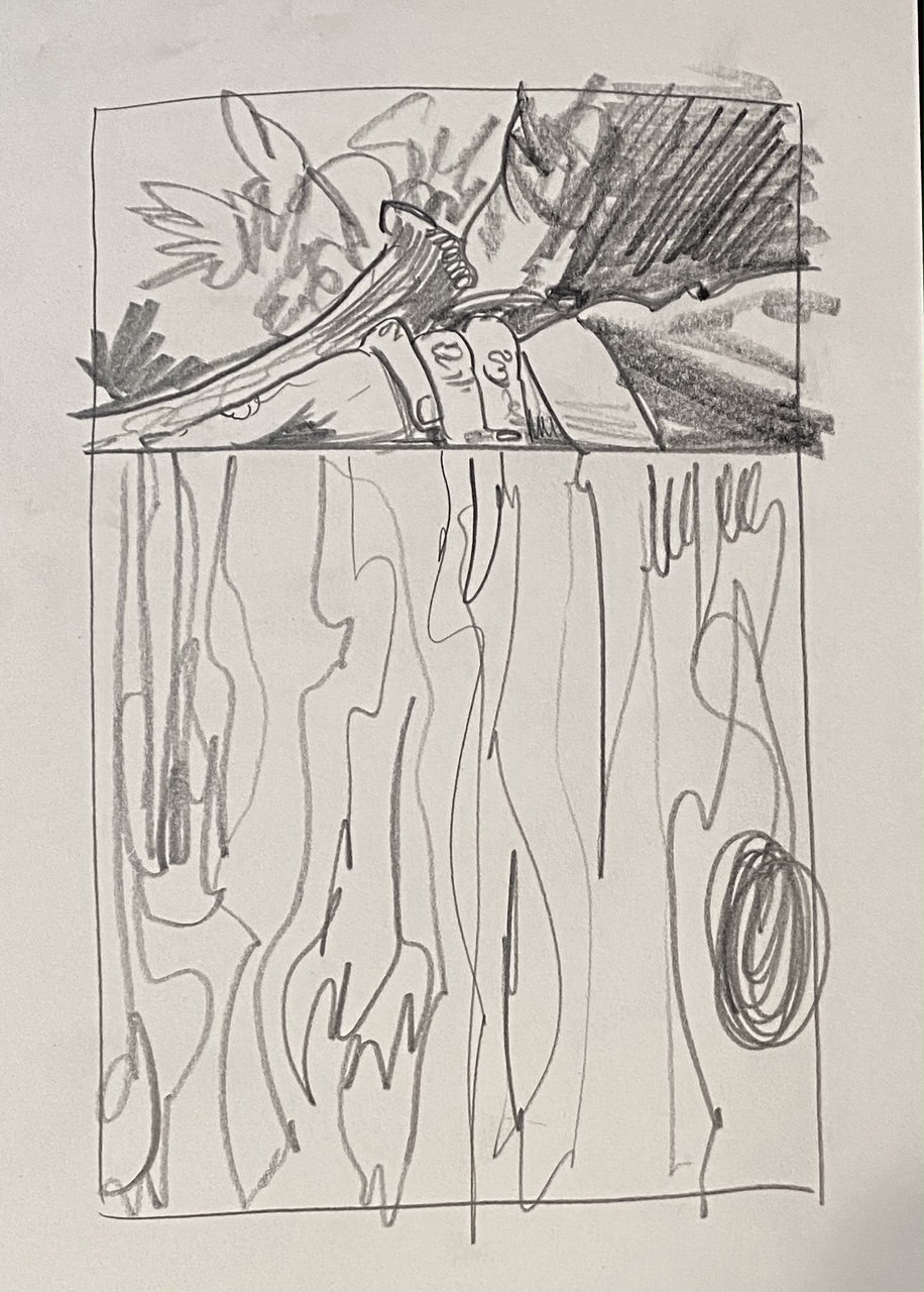
So as per my usual attack, I hit the paper full force and worked on this piece relentless for a couple of days. These are the kinds of mixed emotions one gets when one has chosen an approach that is bound to be in a lot of ways tedious as hell, exhausting, and also… the only possible solve on the table. I think we also knew straight away the title and director credit lines would land dead center in the black of her back, which made the rest of it a place to go nuts in. SO many LEAVES! And yet whose fault was it to do it this way? While I knew we’d likely be adding some flourishes to it later, I wasn’t;t yet convinced of what they might be so went with a more simplified approach to if later we wanted to hang, say an intertwining of flowers to echo her subjugation and binding to the place she has found herself stuck in, we could. It would just mean drawing that all separately and dropping them in later in photoshop. That’s what it’s there for. There wasn’t a ton of time to get this project in, despite Jane being on set for Way of the Dog and making back and forth a little more sluggish than usual… the schedule is the schedule so we march on and do our part best we can.
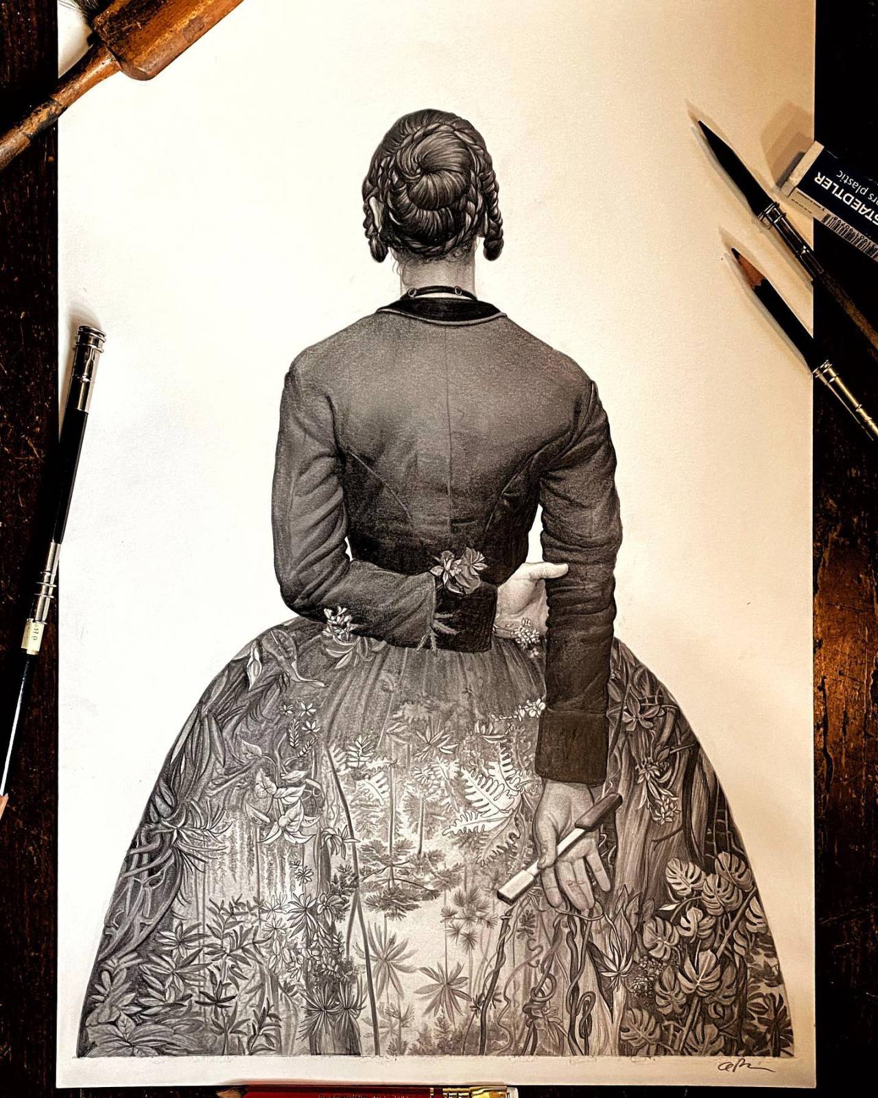
The next step after the drawing was approved was to bring in the scanned image, cleaned up and sorted with an initial color treatment scheme and design. I drew in and painted the clouds and cast a kind of dusky light over it all which is my usual go to here, wanting the sunlight piercing through the forest set in her dress to act as an almost counterpoint of dawn to the setting sun of her outside surroundings. It was a little bit murky and not quite there yet, and the need to see the vines and flowers intertwine became obvious so that was a thing too.
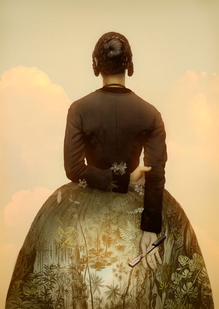
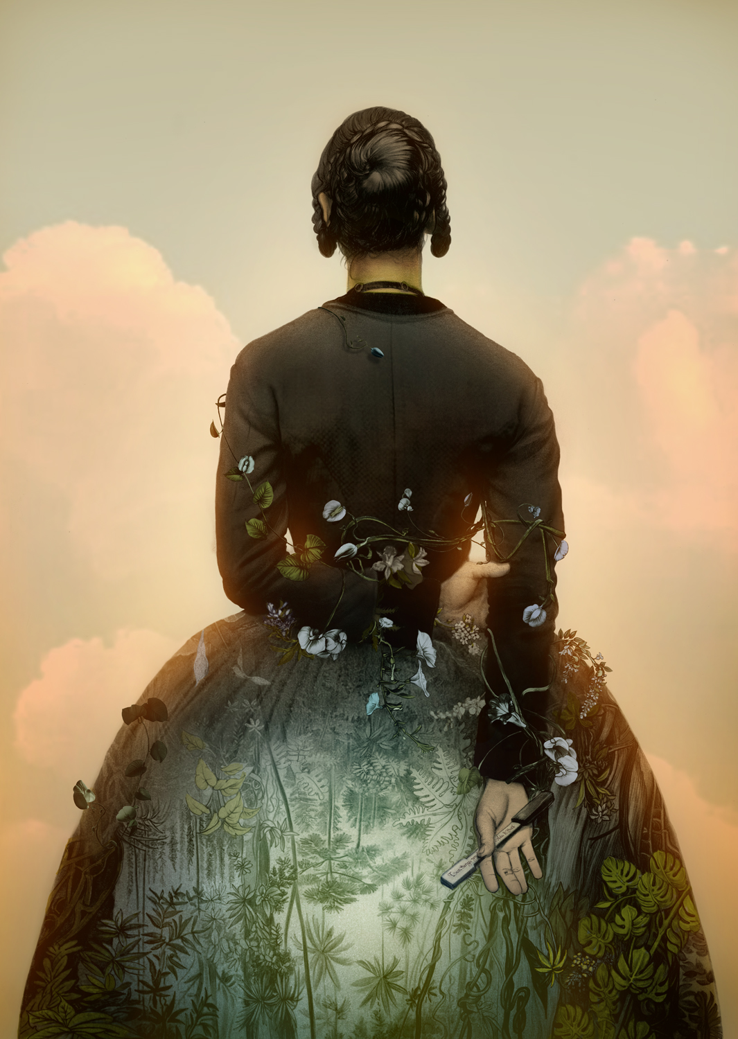
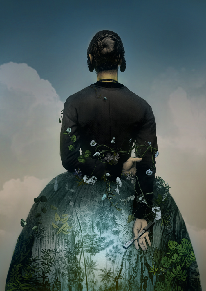
One of the great bits of getting to work intimately on a project like this is the secret languages directors use in the their films, and one of them that I wasn’t ever aware of until now was the use of the color blue as an expression of eroticism, so a darker more blue/night version was supplied. At the time I was still certain about the color scheme I had started with but thought I might be able to convince more by bringing in the blueish tones to the forest set in here dress and make the light outside a little punchier so it read better and more visually striking. I also worked up a less colorful more pure chiaroscuro/graphic approach too just in case, because.. well I can be sort of an insane person in this way. In the end Jane lit up big time for the top approach and the one I’d hoped for and championed. She was effusive about it and let me tell you, there is no better moment in these kinds of jobs than when the director feels like you’ve blown her hair back with your interpretation of her film. She had a lot of certainty to make sure we used indigenous flora and the vining flower in particular as it is a personal favorite of hers natives to these forests. Happy to accommodate and subtly add some versions of the flowers to tickle their obvious sexual implications of them as well as use the blue tones to honor Jane’s secret language about the film. All were finally approved and Eric went on to design the exterior package and title treatment as we discussed and we were off to the races for the interior pieces.
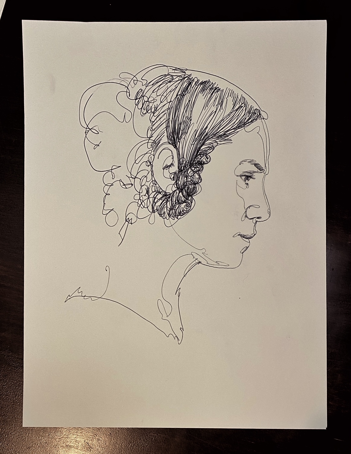
*Another sidebar, when we first began this project I proposed the possibility of using the recursive single line drawing technique for the project. It’s a method I’ve been dying to apply to a big event like this and seemed a worthy and solid match of the subject to the film and the method of working, and so I took the style out for a test drive to see if there was a good place to go. In the end it didn’t feel as epic and atmospheric enough, and also I couldn’t;t escape the nagging indictment that it was more about me trying to escape my own typical style approaches but taking an unexpected and hard left turn in a way of coming to a project. But in the end it wasn’t the right fit so I tossed the route into the hopper despite liking in some form some of the studies to see if it worked. I’m glad we chose the path we did because the cover we ended up with FAR exceeded anything I could have achieved with the line drawing approach the recursive method offers.


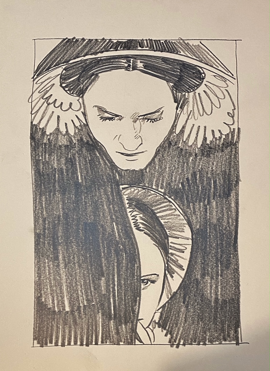
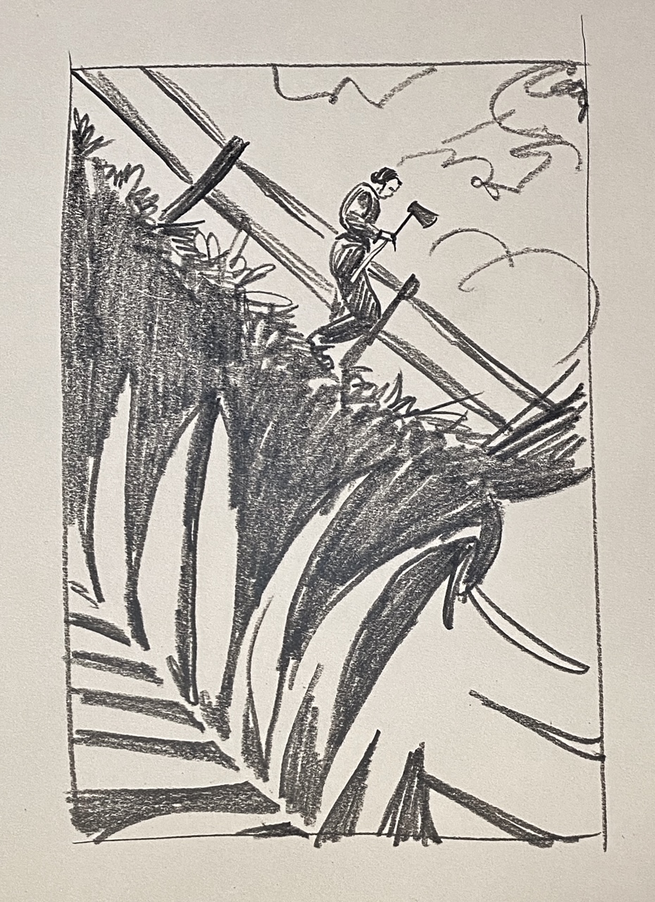
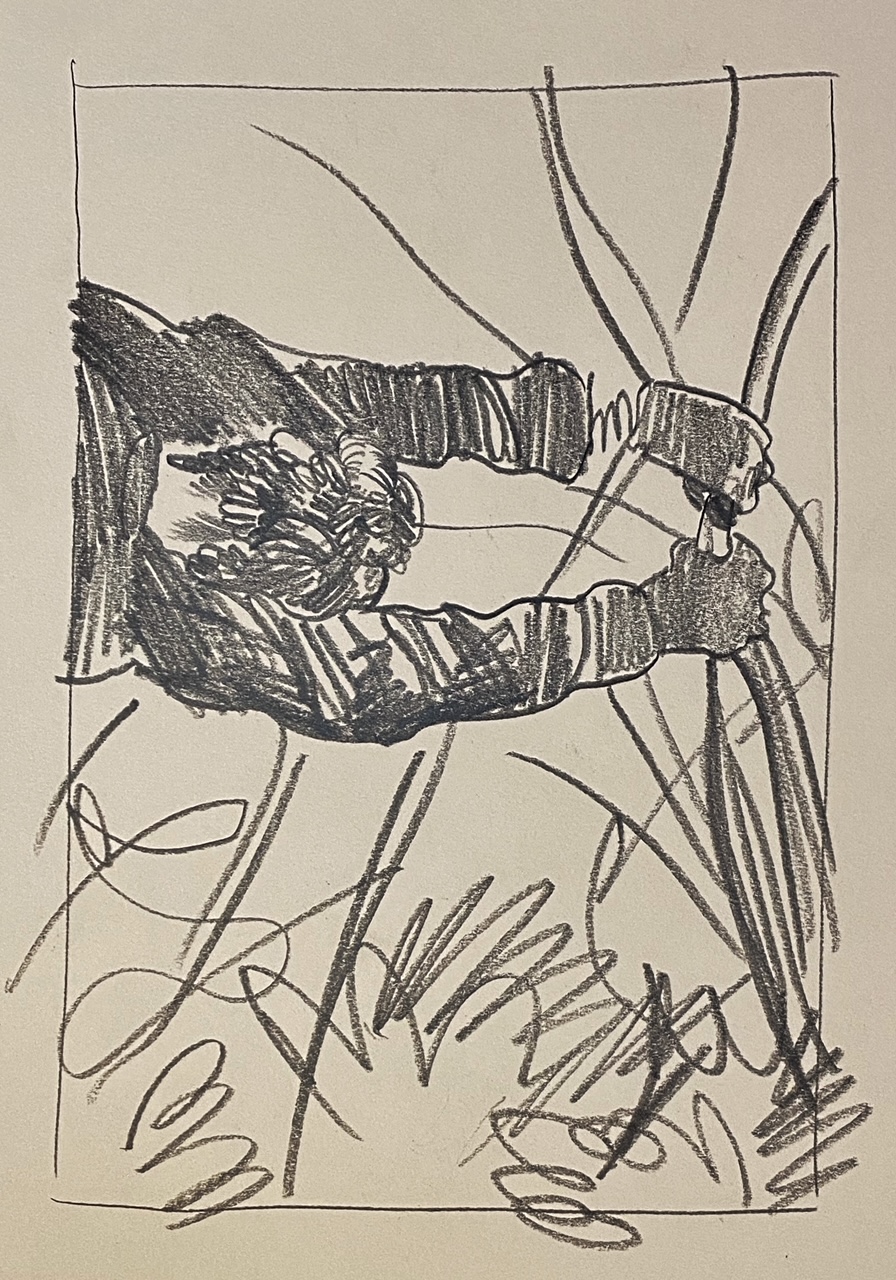
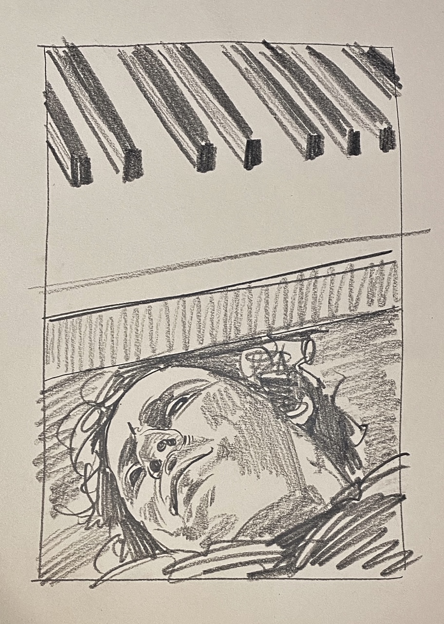
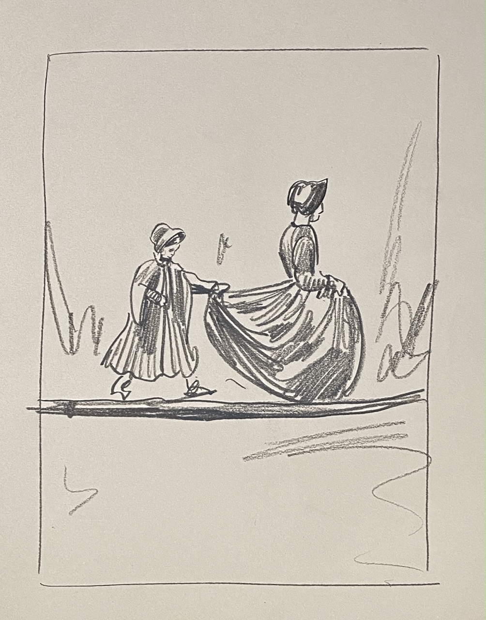
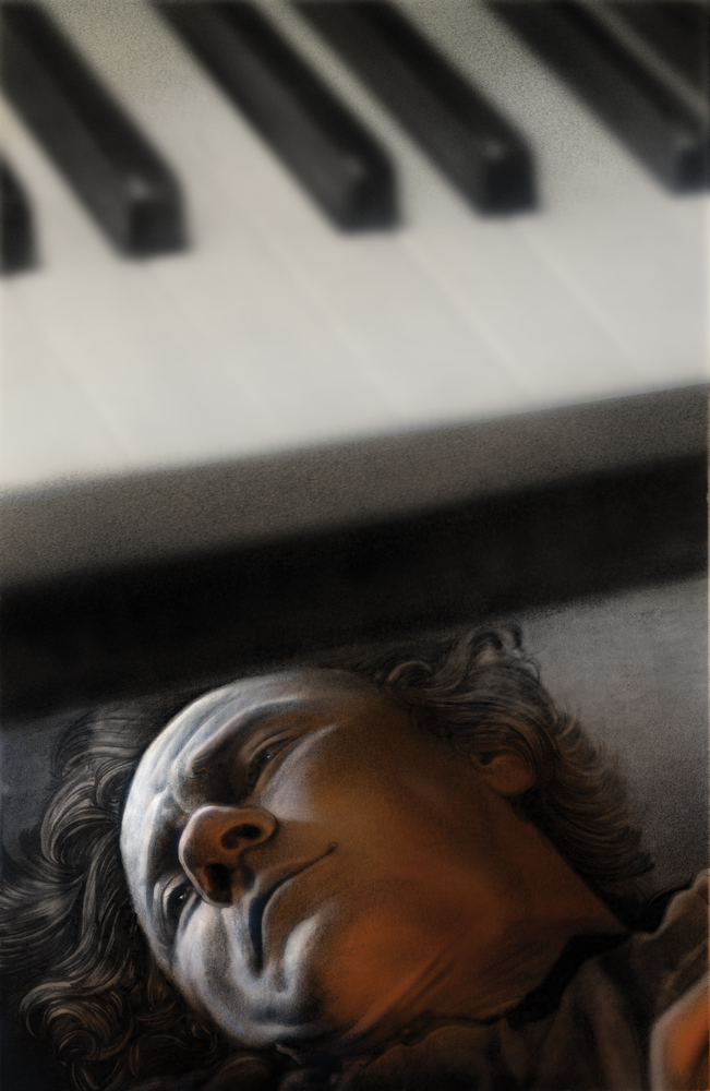
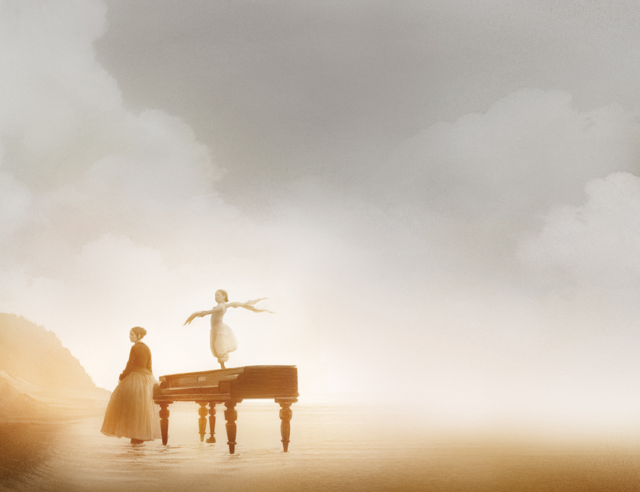
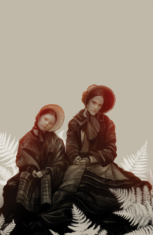
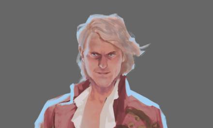
SO, now into the interior landscape of the project. In a lot of ways this is where things get really fun despite the import and prestige of the cover image. But having the cover taken to its final thrust early and with such energy as a response does lend itself towards rocket fuel forward in this stage. And practically, gives the publisher a banner piece to use as an early promotion or preorder while we’re still working out the interiors and kicking the tires on the overall design. As per I drafted a ridiculously large amount of options with my favorites listed in the email to Eric and the rest at Criterion. Eric tends to do the final pick and most every time he choses from among the ones I also prefer, but always manages to surprise with some off hand sketches and concepts I’d not have thought worthy of attending to. But in the case with Skillman, he works at such a high level of quality and design, I assume he’s got a layout and purpose in mind I am not privy to so I always trust his choices above all. There’s a case sometimes where I am insistent on the value of one or the other- never really against executing any of the ones offered, ( I learned LONG ago, though also recently as I am apparently slow on the uptake, that you NEVER submit a concept you won’t be happy executing. They’ll always chose it and you’ll be stuck doing a job you are bitter about and unhappy with. So make sure you only ever submit ideas you are okay with seeing chosen. Always and never do the dummy sketch to make your choice one stand out… some one will always spark to the dummy, and then well.. YOU are the dummy). These are all done fairly swiftly, say in the course of a day or less usually. We knew we needed the image of the mother and daughter on the beach with the Piano itself, Keitel’s face tats and some indication of their interplay together as well as the weird “twinning” relationship between Ada the mother and her familiar like rascal of a daughter. I had also wanted very much to draw that piece of Sam Neil walking down the fence path with his axe but time was the enemy here and I didn’t;t get a chance to tackle it.


The ones chosen got turned into the usual graphite drawing that then found their final paths through photoshop and we were donezo! While there is always a wait to get the final product in your hands from a thing like this, they announce a preorder listing early so there’s the sweet satisfaction of seeing the thing you did land before it’s gone stale on you. Now I say this fully aware this is likely a me problem, but it’s hard and weird often to wait a year, or in the case of a graphic novel MANY years, before the project is out in the world- and made weirder by having to promote it as if new… because really, it’s new to everyone else, and thus… new. This happily was not that.
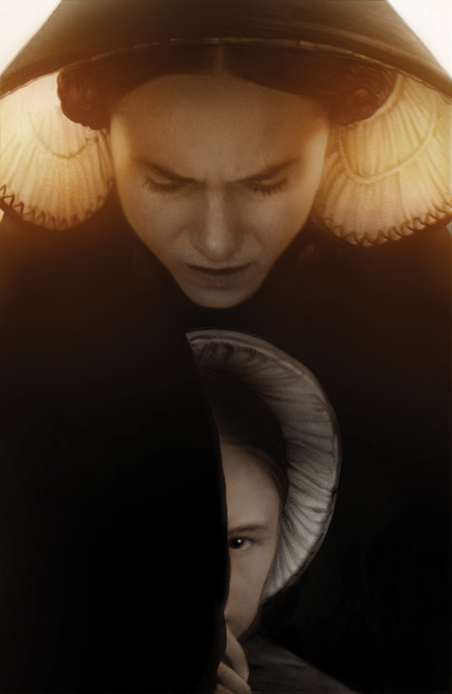
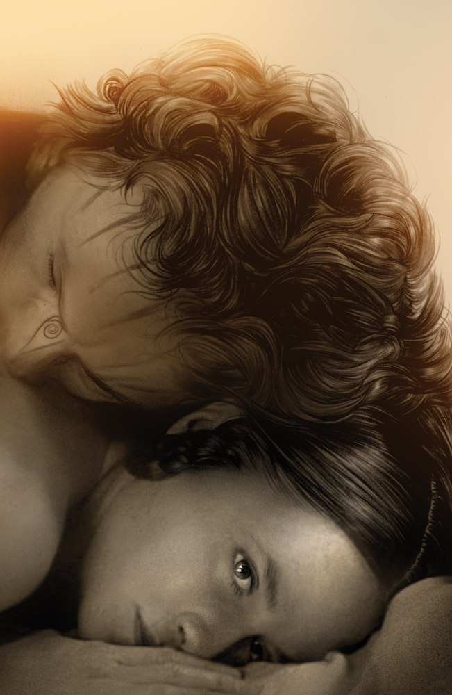
One of the things I adore most about working with Eric and Criterion writ large is the baseline ethic of both honoring the source as much as is possible but also seeking a new vision and perspective as a response to the films the publish. It’s an artist’s medium through them in a way that is unique to them. They may have a thing in mind that needs doing or a brief going into a project… but they select their art through a desire to see the voice of the artists they hire to do the work. They want that vision and that voice. So when you’ve got something like this on deck, where there’s a lot of tentpoles that need to be honored, there’s still a sometimes implied or explicitly called for weird choice to hit. This last piece just above is that combination of both and I wouldn’t;t have either been this loyal to the source or have experimented as much with the cutouts and compositional choices without that particular crucible. The slightly weird guy that can still fake his way through a dinner party.
Anyways, I hope this was interesting and helpful. Please do yourself a favor and pick up the new release which lands officially January 25, and learn more about the release, HERE.
I will be posting the remaining originals up on the site, MONDAY, January 24th right HERE at Noon EST.
If you’d like to see these and a few others, they are now archived on the site HERE.


Great pic! The piano is a piece of my childhood memories. Thank for your article.
I can say that you are the best quality article I have read lately,
it contains horizon-opening and enlightening information
Thank you dear editor
Thank you for the kind reply. It was and remains one of the great gift projects of my career.