Notan
Every time I am reminded of making an article, I want to do something simple and quick, but nothing in art is simple and quick. My explanations are sincerely designed to inform as much as possible. A quick explanation to me is cheap and meaningless, therefore if those of you scan the length of an article before reading it, I am letting you know that all of mine will be lengthy and information packed from start to finish. I am concerned with the future of the learning of our craft and disappointed in so much of the noise and debris floating about on the web that is half heartedly posted and devoid of quality content or explanations with “why” it is what it is leading the charge. This is what drives these articles and influences their length, and with that, I am not sorry about the TL:DR experiences.
Before we really get lost in color theory, we should learn a few more technical aspects of building an image. It takes exercising the eyes to see correctly. Notan is the most stable way of seeing shapes and their relationships and a fantastic practice in improving your drawing. Once the paint blends out into a gradation, all bets are off in locating the errors of the canvas. If not done properly, gradation can lead to the wrong change of form or turning of the form, lost of structure, and more importantly, because there is now a continuous flow of values, finding errors that were graphically easy to spot until now are near impossible to resolve.
Every picture is a sentence. There is technical structure behind every sentence and its deeper meaning. This philosophy applies to picture making as well. We devise a system of checks and balances to guarantee that our painting is successfully built. Part of this process is involved in the preparatory studies we do, many of them called thumbnails and their simplification of the subject. We do these thumbnails to define the many aspects of the pictures visual structure. These studies are reduced to simple shapes and values, which maximizes our chances of seeing mistakes or confusion within the composition.
These studies are done in flatter values than the finish, working out the largest shapes and their “big picture” value relationship that will be seen from afar. Pictures are read or viewed from 2 convenient distances, from a distance or thumbnail sized, and up close to the image, like zooming in on the thumbnail. The value comps help solve the big picture design structure or the view from a distance. The big picture read should be as awesome and eye catching as the nuances of the image up close read.
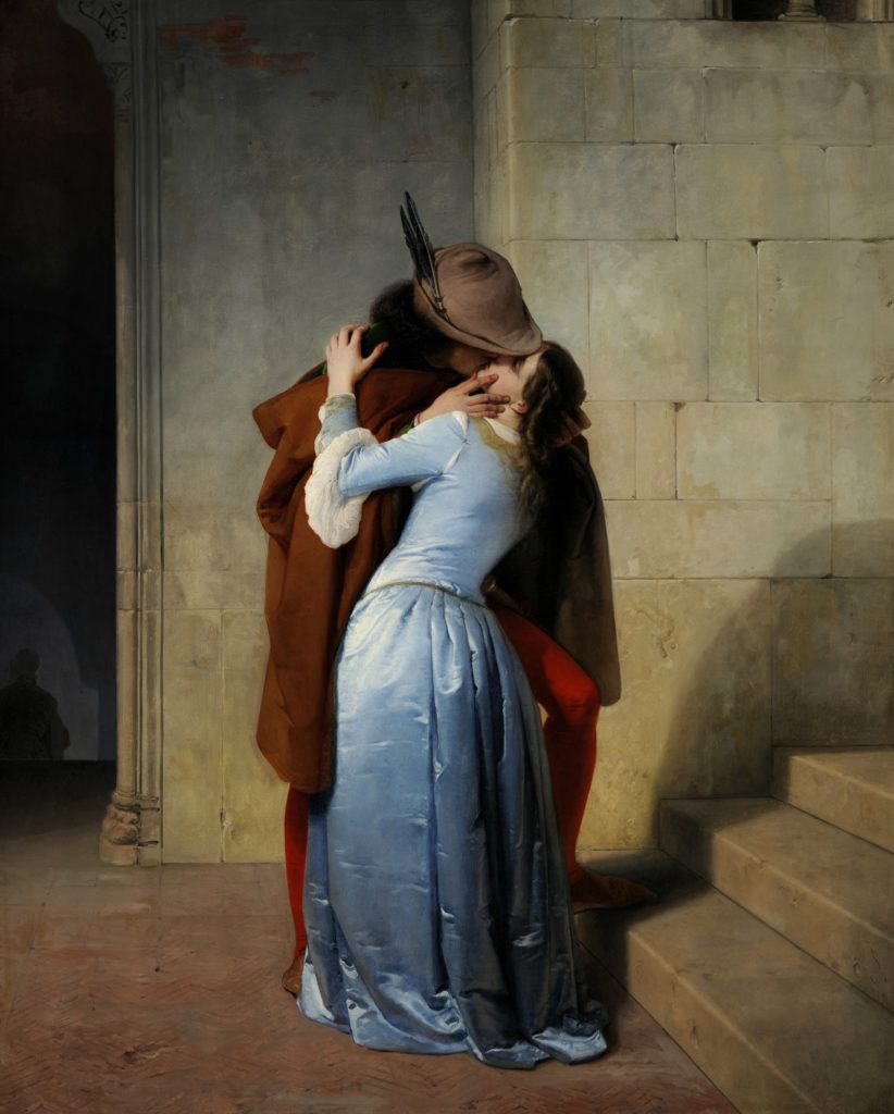
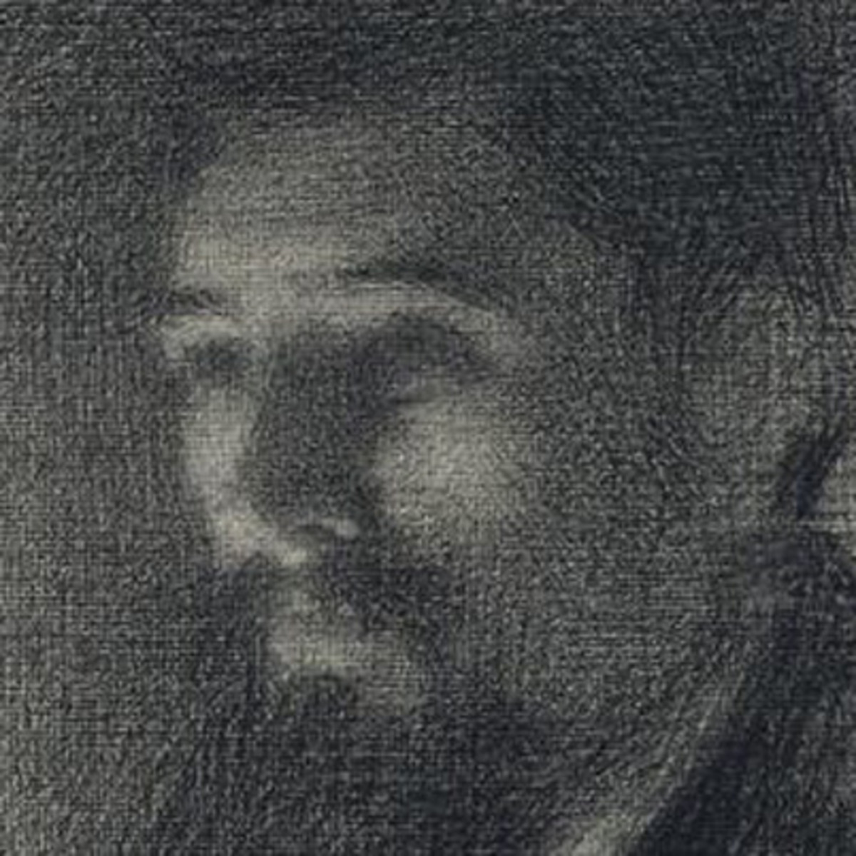
This is an example of one of Bouguereau’s color study.
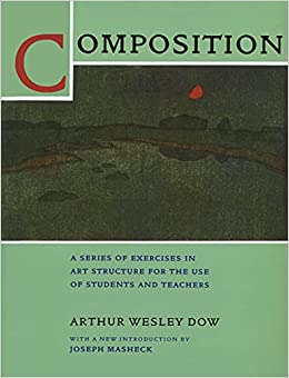
Notan is the term we use for these big shape studies. Notan is a Japanese term that means light/dark. The deeper translation is light/dark and the differences in their contrast. Arthur Wesley Dow wrote a definitive exercise book on the subject covering more on this subject than any other author. The book is an exercise book with comprehensive explanations.
After reading it for the 5th time recently, I realized for the first time that the artists of his time did not have a term yet to describe what we now know today as posterization. Towards the end of the book as he discusses 5 notan images on up, he is alluding to the art of posterizing colors, and might also very well be describing what we now know today as tiling.
Posterization and notan are very different, but the concept of the flat tone is a shared concept. Prior to Dow, the word was not an industry word as of yet, Notan is a crude starting point for this technical concept.
Notan does mean light/dark, but Dow took it further to say that Notan does not and is not limited to two values, and expanded the idea that notan can also denote the separation of light and shadow. His book progresses through from a simple notan to a string of notans, and ends the book describing its use with color. Like the word cartoon as an early use for line drawing, Notan was the early term used to describe the act of posterizing the image. However, with the word Notan does come more weight with the definition, in that it is a comparison of lighter to darker tones, posterization does not allude to this.

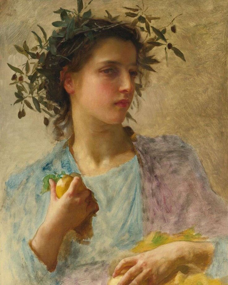
An example of posterizing an image, not quite the same thing as the definition of notan, but the same with regards to the flat graphic tones.
When assembling a picture and because of the nature of oil paint, a picture is produced in layers which can be painted alla prima (all at once) or over time. The underpainting in color also called an ebauche is done to build the large color/value relationships before focusing in on an area to completion. They are then developed further through gradation between the light and shadow side of the forms.
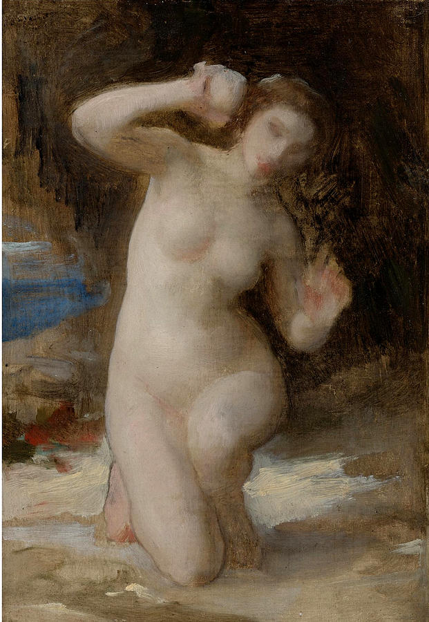
Here in this unfinished painting by Bouguereau you can see the ebauche in the less rendered areas of the canvas.
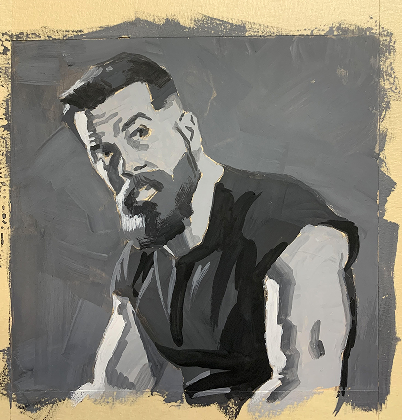
The picture is then taken into the next notan stage, or defining the brightness of the light source by designing the shadow shapes and their corresponding value to the light source. This stage helps to establish the amount of light is on the subject, and how bright or intense that light is in relationship to it.
This Julie Riker painting clearly defines how powerful the light source is by the contrasting dark graphic values of the shadows.
During the block in stages, some painters will do both notan stages simultaneously with the initial block in, defining the light and shadow relationships along with the local color/value relationships, rather than doing it as a two step process. This consolidation is done over time as one grows familiar and comfortable with the steps.
I will get more into gradation in another article, but I want to make a quick note on the dangers of blending too early. Gradation should be left until all the surface forms have been graphically blocked in. Gradation is the harmony stage locking everything endlessly together and makes it near impossible to easily detect the errors in the drawing.
Seurat built up all of his drawings in beautiful veils of gradation, hard to fix an error at this stage of the drawing if something is off in location or scale.
As a technical rundown, I am going to repeat what I wrote above, but with more information into what you are doing and what to look for in each stage.
The Early Stages of a Drawing or Painting
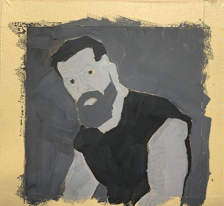
1. Cartoon – The cartoon, or outline stage is the graphic design relationship between shapes in the canvas. Shapes refer to everything from a head to the sky between the head and edge of the canvas, and everything else in between. Design is attractive in all stages, if the line drawing looks well balanced, the image will hold up in the next stage.

I would recommend not going this dark with your cartoon/line art. I used a 2b when I normally use an HB for my line work. Over time, as the pigment loses opacity this line drawing will dominate the space and make the painting look terrible.
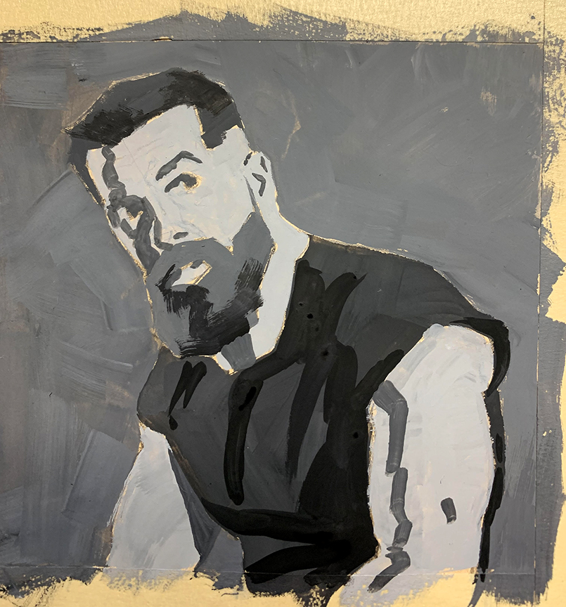
2. Notan 1 – The big picture read, the overall relationship between everything, simplified, no minor shapes involved, and no shadow shapes involved. These are the localized values between all things in the picture plane, and if the light changed, this relationship would not change. A light ground will always be light next to the darker grass will always be darker than the ground etc. The local value relative to the other surrounding values do not change regardless of how much the light does.
The benefits of this stage:
-Graphic design is easy to see with no details and can easily be strengthened in this visually simplified step of the process
-Likeness can be improved in width, height, and angle by reading the simplest measure of an object, its contour
-Focus can be enhanced or improved upon by making subtle to major adjustments of the big picture values
The notan/value relationship between the shapes has enough contrast to easily recognize the scale. Here I can start to fine tune the big shapes getting closer to a likeness before getting lost in the noise of the gradations.
And as you can see, the line drawing still shows through with the pigment, something that will be a forever fight with this one unless I go with a heavy impasto to the paint.
3. Notan 2 – The light/shadow stage of the process, this stage determines the strength of the light source by giving value distance between the local values and the values now allocated to the shadow side of the objects. Done in flat, posterized shapes, the edges of these shapes are strong and sharp, giving clarity to the side of the form unlit. More light is added to the picture in the ambient light stage, but the overall strength of the light can easily be read throughout all the shapes regardless of how light or dark they appear to each other.
The benefits of this stage:
-Shadow shapes can be better grouped together when we see them altogether, and their design can be strengthened and controlled before any gradation masks our problems.
-Likeness can be further improved in this stage between height, width, and angle of a form with more surfaces to compress the size down or up further towards the overall appearance.
This image does not yet have both light sources at their full intensity, but the shadow shapes that are present help me continue to refine towards a better likeness. Scale and angle are constantly considered as each new brush stroke is added.
4. Notan Stage 3 -??? – Form Notans or Tiles, is the buildup of smaller surfaces or facets of the form. Each range of value is a separate notan, and they are usually painted in in order from darkest to lightest across the form. Norman Rockwell was one of the better artists in history that worked this way, or was at least one of the few that left these small changes in color/value visible across the painting surface. The number of notan steps between this and the gradation stage is really up to you and how far you want to turn the form. If enough tiles are successively placed next to one another in their changing values and colors, no gradation is necessary to paint. The facets will turn the form just fine and the difference in their change in value will be only noticeable from up close.
This version includes both light sources and their surface influence on Amos. I continue using the shapes to constantly refine areas of the painting. It is because the shape values stay graphic that I can continue to improve the shape likeness of the overall picture field.
Here are two fantastic Rockwell paintings that show the “tiles”, not blended gradations that help to turn the form. Each of these tiles, in its flatness is a different value or temperature neighboring other value and temperature changes creating the visual illusion of a continuous form.
Gradation is measurable, the longer the gradual change of form, the more curved a surface will look, or light will appear to drop in intensity from the gradual change of value/color. As stated above, gradations join surfaces which makes error harder to find. When all the surfaces appear continuous, measuring their absolute size is near impossible, thus making scale errors very difficult to find, even for an advanced painter. This is why any kind of polishing of the form is left until the very end of the process.
Keeping things flat in a notan manner is not easy to do and does not at first feel intuitive, as we want to blend it into its neighboring colors. Blending is a hard habit to break. It produces an instant result that feels good, but without observing, can become a destructive force in developing a painting. I’ve said this before and I can’t stop repeating it, practice when you can, all of you, pros included. There is not a single sport or other artform that the artist stops learning as they develop, and because our nature is to work work work, we feel that stopping to practice is not worth it, a waste of time, or whatever negative we attach to it. If you want a new result you have to stop working, and block out time for crap art, meaning, stuff you don’t need to share with anyone for the sake of growth and learning.


Fascinating post, Ron! Always love your long technical explanations, especially on color theory — don’t ever feel the need for brevity if it’s not needed. Just a thought on the ’tiling’ — I wonder if some of this might come from Cézanne. At least it’s very evident there, in his paintings of apples, etc. Also, how did the word ‘Notan’ come into English? Who used it first, and was it based on Japanese precedents?
Hello Chris, thank you for writing. I’ll answer in reverse order the questions you asked. I believe it was arthur wesley dow who first brought the word to light in the United States. If Whistler was still living, he would of course say that he was the originator of the term since their group of painters were highly influenced by the simplicity of the Japanese screen art and he was also a big fan of the Asiatic Region.
Dow was the assistant curator of the Japanese collection in the Boston Museum and taught at the ASL in New York. I am certain the two artists paths crossed more than once in their history.
If you look back even further, tiling was done as a means of sketching shapes as far back as Rubens in his sketch work.
In Cezanne’s book of composition, he talks a lot about surfaces, planes, and breaking down an object into the separate surfaces, each possessing a different variant of hue represented by how the light reflects off of it. He also broke tradition with the surfaces receding back into space creating a primitive variant of cubism, dissolving the rules of perspective for planar representation, which were not quite flat, but mostly uniform values within each regardless of their color shifting.
The word tiling was coined by Frank Reilly in his attempt to break color down in this very fashion of facets and color change. Reilly and Loomis generated most of the modern language we speak today when describing the foundation tools of art.
Thanks Ron! This is all really interesting, and surprisingly new to me. How did I miss the concept of Notan all these years? It seems really basic, but I only encountered the term recently in Rowland B. Wilson’s cryptic ‘Trade Secrets’ book — guess I’ve been out of the loop. I will really have to get hold of a copy of Arthur Dow’s text to see the fount of all this. Notan seems like one of those concepts that is fundamental to practice, but a bit hard to explain to outsiders (rather like ‘parti’ in architectural design.) In terms of ’tiling’ in painting, maybe an analogy could be made to older traditions of mosaics, relying on careful arrangement of flat, discrete tesserae of different hues and values to create illusions of volume. A single brushstroke = a single tile. Anyway, thanks again for a stimulating post!
In a much older article on MC I mentioned that tiling was a word taken from the construction of the mosaic, Reilly made this comparison in how he described the faceting of paint. I also made the comparison of tiling to a mid-high poly 3D model, the earlier stages of this process in the first two layers of notan is equivalent to a very low poly model, again, relying on facets.
And yes, this entire process is taught by many without any specialized terminology to accompany the process. It is disguised in titles like, Golden Age of Illustration Painting Techniques, Norman Rockwell’s Technique, Impressionism, Fechin Like, and on. Without any specified terminology its a “My Best Comparison Title” to describe this process. Notan and posterization are the closest terms I find relative to one another but not the same, otherwise “painted flat all over” is the next best attempt at describing the process. It works…maybe…uh…:)
I can always count on you to lay it down like it is. god bless you sir, Your articles are always a treat to me and like all good treats you have to keep coming back to them. Its good to know that this is actually your intention!
These series of articles are amazing so far, so many things used to escape or I just could not quite formulate are being laid bare here.
Thanks so much to you and muddycolors for this!