
A story needs contrast for a reader to experience character. Characters must live in the world created, but must also feel familiar to the reader. Familiar aspects within a world of different, unfamiliar, even strange aspects is interesting and keeps them reading.
Painting is storytelling. Painting is communication. The mind likes to compare differences in order to make judgements. The brain enjoys a mystery and the search is appealing, as long as the payoff is discovery. Likewise, a painting with multiple levels of contrast drives the narrative and gives the viewer magic.
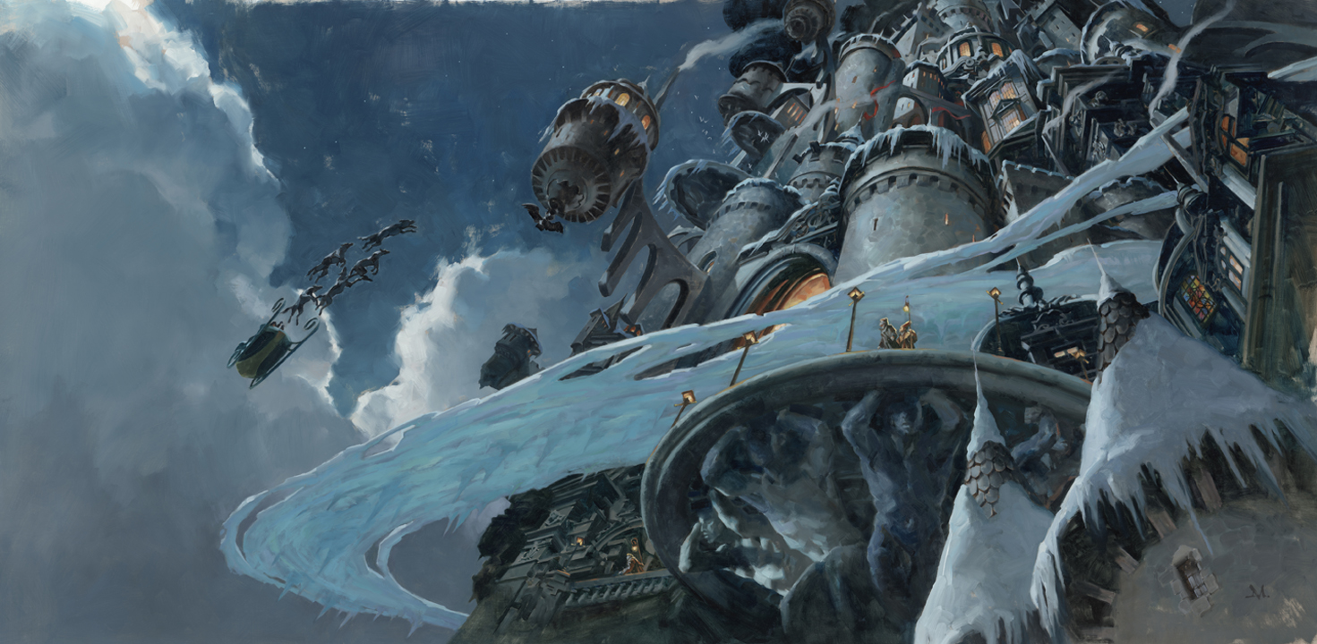
I’ve used this recent painting of mine to show how contrast works within and enhances a painting. You may not have thought about what this is or why it’s important. The contrast between the extremes I mention below is the engine for giving a painting life.
The concept of a floating city in moonlight, surrounded by a frozen moat is based on the novel, A Winter’s Promise, by Christelle Dabos, and will be displayed in a group show about the book at the Galerie Daniel Maghen in Paris, opening November 28th. I’ll be doing a live demo during the opening, a portrait of the lead character, Ophelia.
The points below are not suggestions. They are principles you’ll need to deal with sooner or later. Hopefully, sooner. If your painting feels dull, staid, or missing its juice, look to how you’re controlling contrast, from value and shape to color and light.
Values: light against dark
Probably the easiest contrast to understand is value differences. Light against dark is quick to identify, and even if you don’t realize it, your eye and brain are picking up differences in value immediately to understand what it’s looking at. If you control the difference, you can design a painting to lead the viewer through the composition. The fascination developed between the two is captivating.
Scale: large vs small
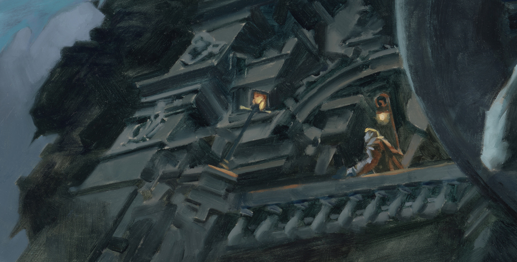
Large elements against small. The size of the city, which takes up most of the space in the composition and most of the attention, is made even larger by scaling down the sleigh in the painting. Likewise for the small figures we see around the ramparts. Their scale helps depict the scale of the city by comparison. Too large, and the figures would make us believe they are too close to the viewer. Too small, and the city would become immense.

Color: bright vs dull
Think more about the temperature of your color. Under the light of the moon, most of the painting is shown muted in this picture, the way the moon’s reflected light reduces color to greys. Adding a little saturation to those dull colors enhances the feeling of cool moonlight. Like blue-greys with touches of brighter blues.
Simply put, warm versus cool, or grey versus vibrant.
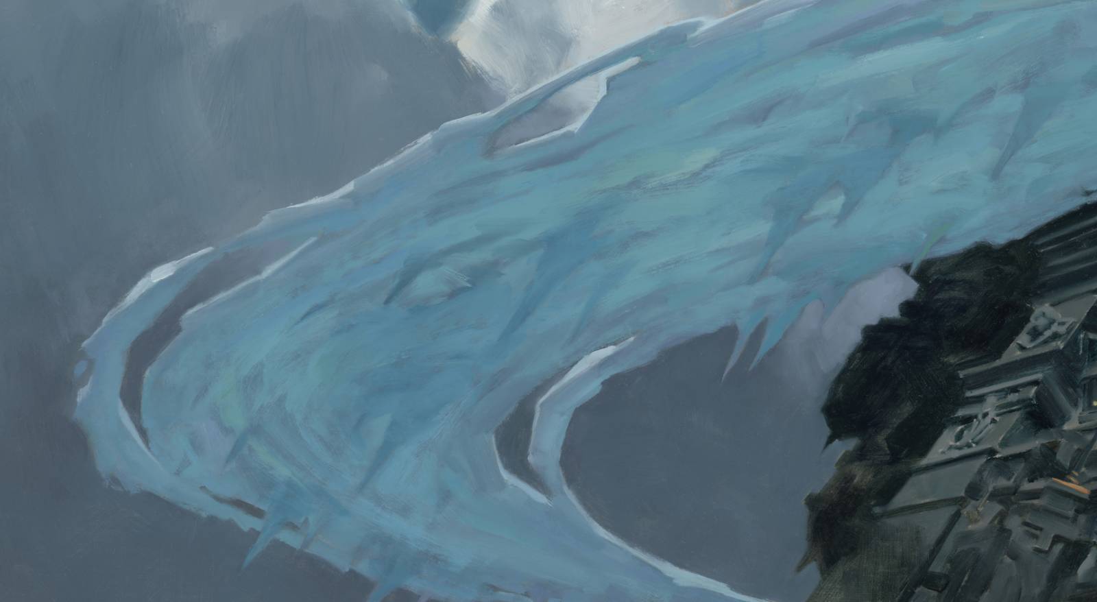
The sky is a combination of dull color mixed with brighter colors, i.e., Paynes Grey versus a brighter Cerulean blue. The clouds are a similar combination, but mixed to be slightly lighter in value, accented by (or contrasted by) bright values to express the light striking cloud edges. (There’s another temperature shift between the clouds, the city, and the ice moat.)
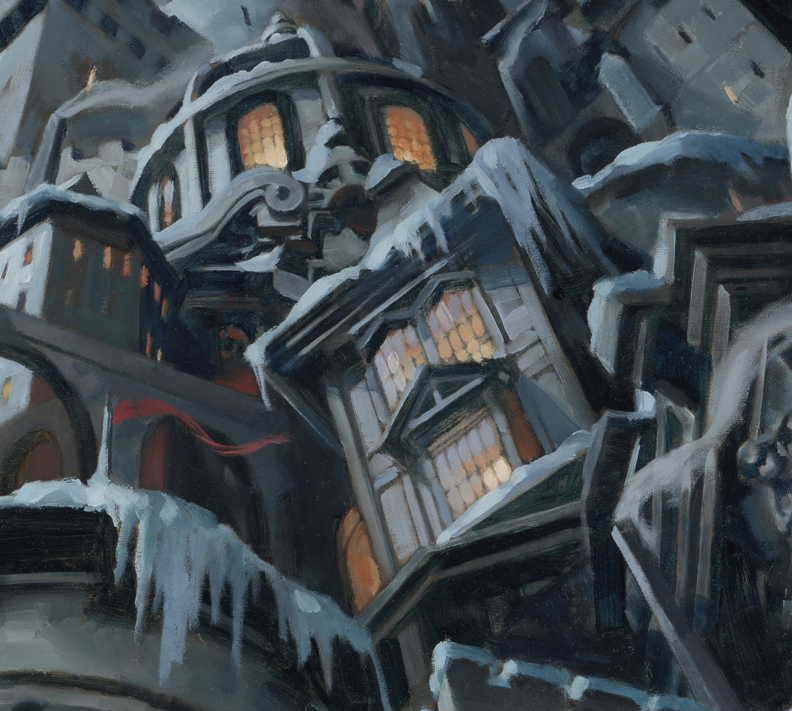
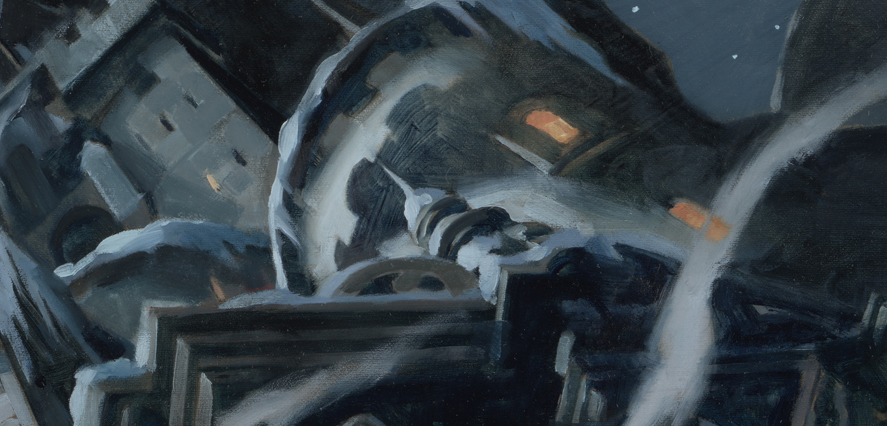
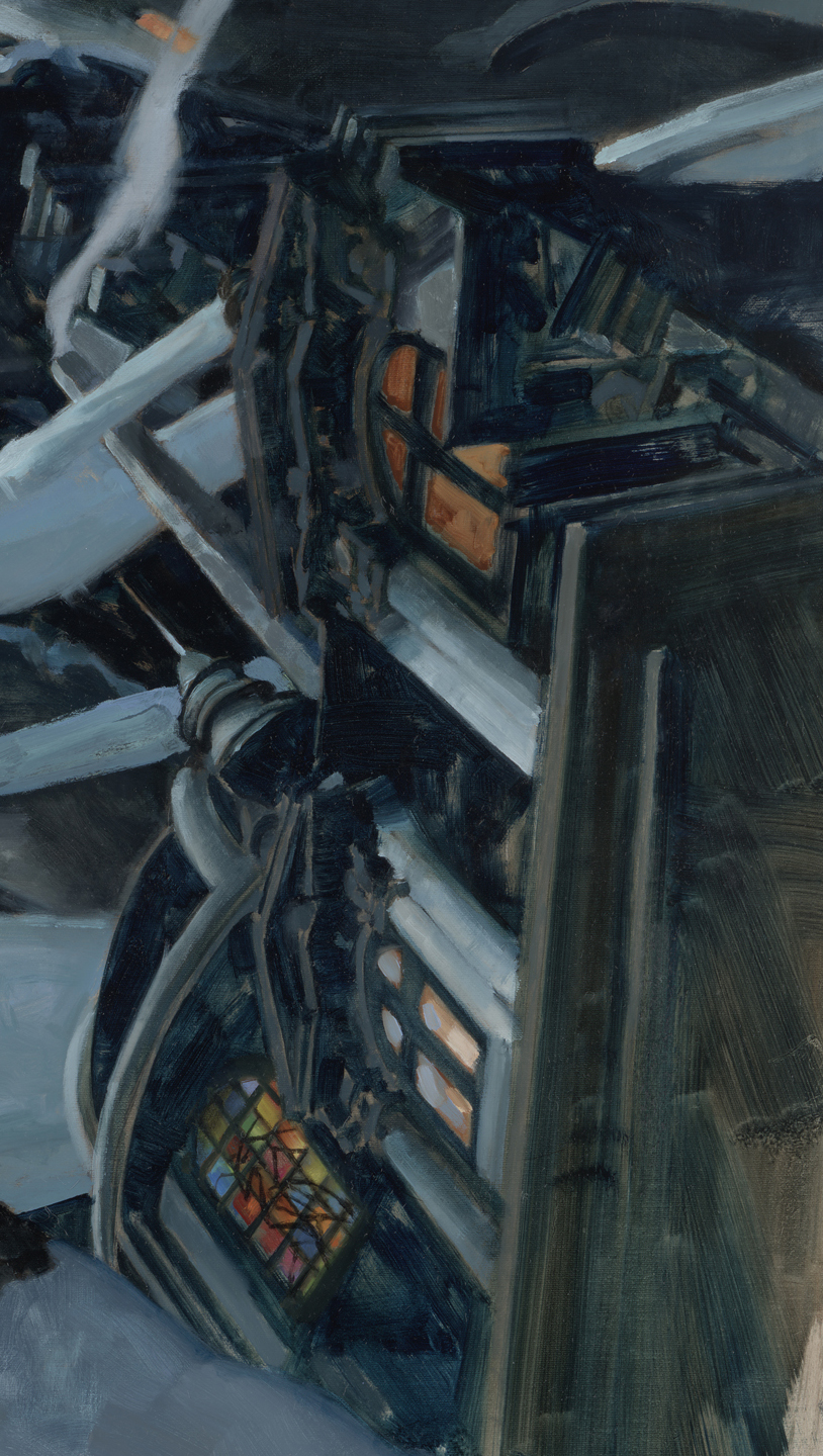
And certainly you can see how the light from many windows stands out against the softer, greyed colors overall. (a touch of red for the flags) Warm window light against the overall cool of the scene. The contrast is why that works.
If you’re having trouble capturing a color within a piece, change the temperature.
(Do yourself a favor…don’t light all the dang windows. Generally, a building that’s evenly lit in all windows means it’s on fire, and not a cozy one at that. Yes, I’m looking at you, Cozy Cottage By The Sea paintings…ahem.)
Animation vs stationary
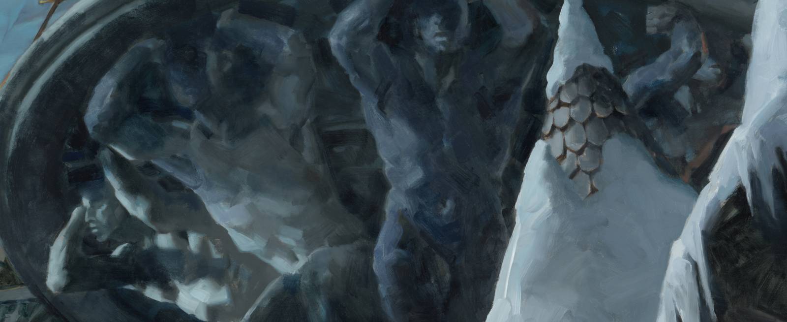
Simple: a city doesn’t move. How can you give movement to a stationary object? You don’t. You merely imply that it’s surrounded with life. We see the small figures moving amongst the rigid walls. Even the large, decorative stone figures give the allusion of holding up the balcony. The implication of human movement gives the city a feeling of life.
In other paintings, showing figures that express movement contrasts with figures that are restful or still. For example, in a battle scene, it’s imperative to display figures in violent motion, contrasted with other figures that are stalled or held back in their efforts. Fighting figures contrasted against fallen figures. Horses rearing versus horses controlled by their riders, etc.
Noise vs calm
Like action versus areas of inactivity, the contrast between the two causes the viewer to move from active areas to calmer passages, giving the mind a chance to rest, reflect, and re-approach.
See my post about Edges to get an understanding of how the contrast of soft edges to sharp can give a painting depth.
Flat vs depth
When paint is mixed too evenly, too formulaic, the effect flattens the depth in a painting. But the contrast between having flat areas involved with areas of paint that are less overly mixed helps give the surface interest. By using more active brushwork within passages of flatness, texture is built. And the eye adores texture when it is presented in a way that doesn’t overwhelm the focus of a piece.

Brushwork vs color fields
Notice that the brushwork in the edges of the clouds versus the broader, less active areas of the clouds. It allows the eye to pay attention to those busy areas of marks and then provides a place to compare the activity: by resting in the softer, less active fields of color.
………
Stay with me now. We’re still talking contrast. Y’know…dark against light, bright against dull, thick against thin? Still there? Ok. Keep going. Remember it’s comparing one thing against another thing.
………
Lighting: focused vs overall
The contrast between dull and bright cloud passages, the contrast between the broad areas of the shadowed clouds and the smaller cloud surfaces that face the moon adds interest to the moment portrayed. We pay more attention to those because of the contrast between the values, brushwork, color, and shape.
It doesn’t just work for clouds either. You can light a figure, animal, room, landscape, or sculpture, to get the same effect.
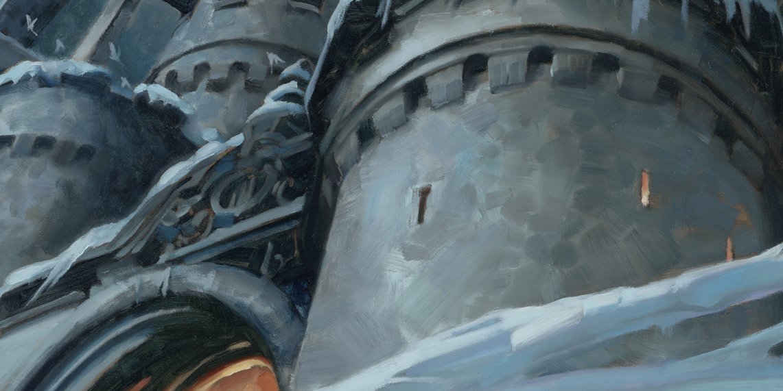
We pay attention to the shapes in the city walls that have more brush activity in the stone structure, and lose track of the areas of bold shadow. But without the contrast of interesting shapes in the light areas against the simpler shadow areas, we wouldn’t notice the differences. That’s how a painting becomes dull.
Detail vs shape
As above, painted detail in areas of interest, like the light on the shapes of the stone walls, is contrasted with areas of slight-to-deep shadows from the walls and towers. This is what drives the focus to the shapes in the city. Large shapes, like the towers, broken by small windows, or the formal lines of the architecture challenged by the freeform shapes of the snow and icicles, almost forces the issue.
…………
Look at all the stuff going on in this complex piece. The detail of little figures against grand walls, spots of light from the lampposts against the broader light of the moon, even the sky being lighter than the shadows of the buildings themselves helps achieve the mood of a moonlit floating city.
By controlling contrast you control interest.
Notice that after all of those subtle contrasts the entire painting could shift again by changing the angle of light and throwing more shadows across the scene. Or just the opposite, by lighting it much more directly. Yet another reason why paintings are never quite finished.
But that’s another post.

Thanks so much for your posts Greg, they are always full of insight and experimental wisdom. Thanks so much.
As always, thank you for your valuable post!
I love your style of painting. One of your paintings is my PC desktop background and I have your book “Above the Timberline ” in my collection. This is just a love letter to your art. I wish I could paint this way. There seem to be a freedom about it I can’t achieve. Thanks for the your generous advice and instruction. Your work inspires me to keep trying to find my way to a style of my own.
I agree with you!
Thanks everyone!
Andrea, I appreciate your kind words and interest in my approach. Let me suggest something that may help you with the paint.
Think about calligraphy. Take a class, or study with someone, but the idea behind this is that creating pen and/or brush letter forms helps one to get an excellent feel for the brush and how to make appropriate strokes. I’ve been fascinated to discover that many artists I admire have been good letterers!