As I mentioned in the previous article here, the painting journey respectfully begins with converting your drawing process in dry media to drawing with your process in wet media. If you learned with a pointed implement and build up tones using a hatching or cross hatching process, the same applies to your painting process. If you used charcoal blocks or vine, you’ll be massing tones to start your painting. Drawing = Painting = Drawing, just as color = value = color, they are both similar in concept.
Start this process with one hue just as you have with a pencil or charcoal stick; black paint. This paint is accompanied by oil in a little cup that you can both couch your surface with as well as soften your pigment. Softening is the act of making it a little less stiff to smoothly apply to the surface, especially when using a finishing brush (typically sables). This hue should be dark, I am using ivory black in these images to reproduce the charcoal experience.
To begin, before starting the drawing with pigment, we need to treat the surface so the paint will smoothly flow and easily wipe away when the lines produced are incorrectly positioned.
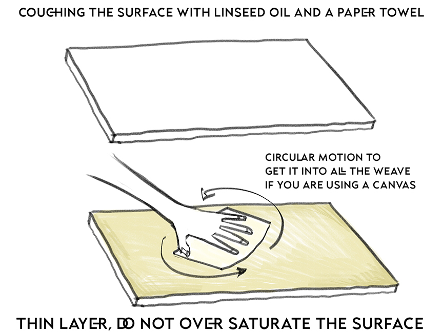
Formally known as couching, we also call this oiling out, or the process of rubbing into the surface a layer of oil to condition the surface for the paint to transition smoothly either with a fresh new surface, or with an already painted surface that has dried. In this example, the surface is couched before starting the drawing. Not only does this make the pigment “melt” into the surface blending smoothly into the weave, but it also makes it easy to remove any mistakes with a simple wipe of a paper towel. The oil acts as a barrier to the surface of the weave thereby making any pigment you paint down just as easy to wipe up, taking the surface back to its pure white tone.
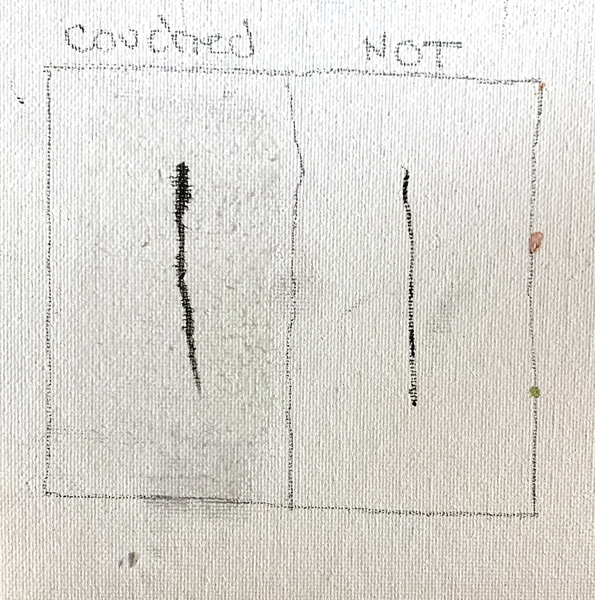
The left side is couched, the right side is regular gessoed canvas, I double wiped the surface and did not let it air dry a little so the line bled a little.
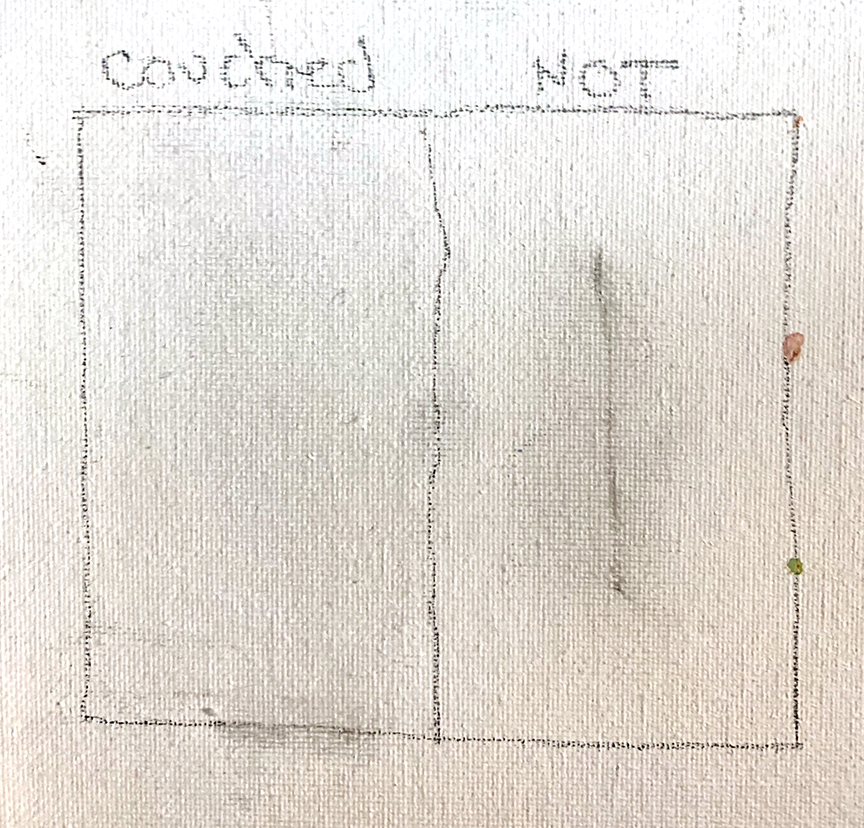
The same panels are wiped after the lines are drawn, and as you can see the couched side is basically back to a clean slate while the line on the right side is ghosted on the page, impossible to remove from the surface without needing thinner which would strip the surface but might not be able to remove the entire line. It will also stain the surface beyond where the line was drawn.
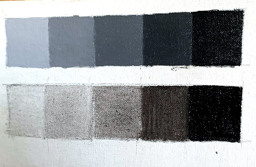
I would call this true “oil” painting because you are mostly pushing oil content around that happens to have some pigment in it to stain the surface area with the value intended. This value scale is just ivory black paint and oil to produce the watercolor like effect of the black pigment. This scale of the ivory black pigment with nothing added other than more oil appears warm in temperature, almost brownish. Mars black will produce a warm brown like undertone, most of the other black are more neutral than chromatic.

This value scale is painted with just ivory black with linseed oil.
But when titanium white is mixed with the ivory black in as in this value scale, the black pigment turbidly transforms into a blue shade, or the appearance of a blue hue is more noticeable.

This value scale is both titanium white and ivory black, and as you can see, the paints turbidly mix towards a blue hue.
Side note, these value scales are “VALUABLE” exercises to frequently do for yourself. They are a true gauge of your ability to control change in the mixtures in even increments, and teaches us what part of the value range we have difficulty seeing and separating so we can practice increasing our dynamic range of sight. Like the color wheels I was taught to build, these should be repeatedly exercised throughout your career, and not just isolated to your “student years”. In reality, you are a life long student. Much like athletics, an athlete conditions their body to an optimal level of performance, the artist does the same with seeing, with tactile control as well as pressure sensitivity and range of hue, value, and chroma. Our hand eye coordination and eye for change is very easy to lose peak performance if not exercised on a regular basis much like muscles, stamina, and energy levels if we are inconsistent with physical training.
As simple as they appear, these exercises can be tricky and are valuable eye training as well as learning about the temperament of the materials.
One Color Drawing Also Called Pickout, Rub-Out, or Wash Painting
This portrait is done in just black and oil. It is drawn using a hatching method similar to one of the methods I use for shading in dry media. If the surface is couched, the drawing will not take long to produce, like this one that took a little over 10 minutes to complete. With all the drawing training, the act of making an image, especially when copied from a photo should not be tedious and time consuming. Accuracy has already been developed in the drawing stages of training therefore making the act of drawing less difficult or time consuming. And with any exercise, setting limits helps improve peak performance.
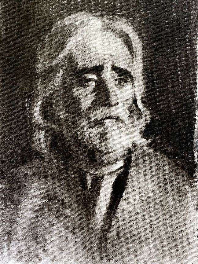
When couched, the surface is soft like markers on marker paper, and the paint glides around making it easy to soften or gradate.
Black and White Direct Painting
The next type of painting to work on is to copy an image or a subject from life using both ivory black and titanium white to create an opaque grayscale image. Both light and shadow are painted opaquely, mixing both pigments together to produce the appropriate value that accurately and best represents what is being painted. While the first painting used the white of the canvas to support the lighter value range, this approach uses pigment and forces one to learn to judge accurate value range.
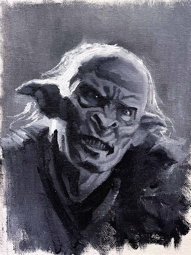
This painting is done with titanium white and ivory black. Both the lights and the shadows are mixtures and both are opaquely applied for the sake of this particular exercise.
The act of tiling is not necessarily something that begins right from the first stroke of the painting, it is what you do with the paint as you tighten up your level of render. (I say this because in the hands of a pro, they can start a painting any way they choose with the level of mastery they have already accomplished) and we only see the end results rather than having a strong understanding of how the painting was built up to appear tiled in the end. Each tile subdivides a previously larger patch of paint.
This demonstration painting was first large value spots that best related scale of light vs. shadow lit surfaces to one another. The tiling is chiseling down the surfaces from generalized to specific in their anatomical delineation.
It was finished in about 20 minutes and done at a manageable scale of 5 x 7″ of space. The scale of the painting can also dictate the amount of time one needs to spend developing the forms. I want to preface that when I talk about how much time it takes to do one of these, I am speaking strictly in terms of painting exercises. How fast or slow you choose to be in your work is up to you. But when pushing the exercise envelope, there are constraints we should want to place on them or they will likely develop into “habit” pictures, the type we blindly do when we draw with no direction.
Two Hues, Two Temperatures
The big color theory lesson comes from this next painting process, combining both exercises above with logic as to where to use the transparent washes vs the opaque mixtures. This process is visually divided by temperature. Using the black only mixture for the shadows and knowing you can control the value range with oil, paint in all the shadows and give them whatever range of value necessary for them to transition correctly to best describe the type of surface or space the values represent.
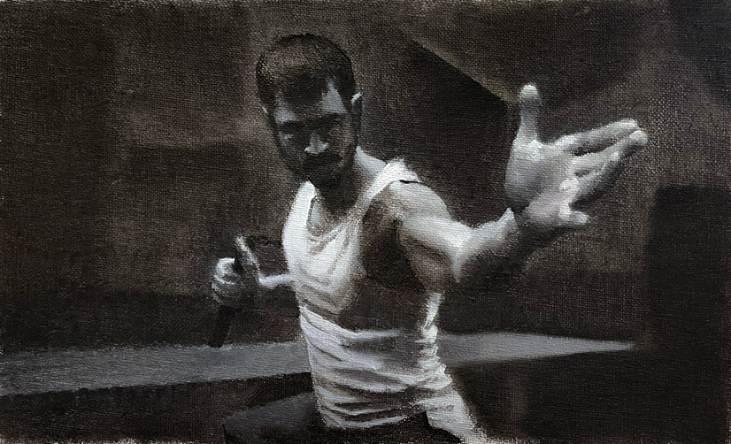
This photographed a little darker than I would like it to have, however, it does help push the chiaroscuro effect even further. All shadow areas of this are transparent, black only, while all the directly lit portions of a combination of the ivory black with titanium white, producing a warm/cool effect or relationship between the lit side and the shadows. I kept this study to under 40 minutes. Placing a time limitation on each painting forces me to come up with unique solutions to solve problems. I recommend doing this as part of your exercise training.
The direct light should be painted using the mixing method with white and black, and refrain from pure white for as long as possible knowing that it represents the brightest light value and using it liberally too soon will diminish its impact on the hierarchy of the light and the forms.
If the painting is successfully divided in temperature, the image will have far more depth than either of the previous two exercises, because not only is value being used to help separate forms and space, but temperature is also included expanding the possible range of visual contrast.
Value contrast, and color contrast, or temperature contrast are two of the most prominent devices we use with color painting. Oil paint has several other unique devices that can be employed that also help generate visual contrast unlike the water media that have a tendency to flatten out because of the water as the vehicle. We start our training with drawing to learn the contrast of value, then graduate to paint to employ color contrast, which is similar to value contrast but has unique characteristics that go beyond just simple value contrast.
Summary
In summary, these initial exercises help one move over from the drawing experience to painting, and help connect the two as one technique. There are a few simple exercises to help with this transition, the exercises in their appropriate order are:
1. Crossover from dry media to wet media with a 1 color exercise mimicking the drawing process with the wet media.
2. Add white to the black and make a true black and white mixture painting relying upon your control of value to assist in clarifying the light shapes from the shadow shapes.
3. Combine the above exercises into one image, using the difference in temperature to separate the light side from the shadow side. This is the first direct step towards understanding the distinction and clarification of temperature in both nature as well as in our separation of light from shadow in what will eventually be full color painting.
*Impose time limits on your studies to force the drawing rules you know into compartmentalized decisions. This is where you learn what is known as a “painterly” decision. You can’t really be painterly until you’ve modeled the crap out of the subject, at which point consolidation is easier to see and design.
See you in the next installment with a palette level up, the limited color palette.

Hello, I have read your blog. this blog was very nice and give a lot information. thanks for giving us…