Since most of what I’ve been busy with lately is either under NDA (awesome secrets!) or non-art-related (moving!) I thought this would be a good time to crack open one of my old hard drives and see what slithers out.
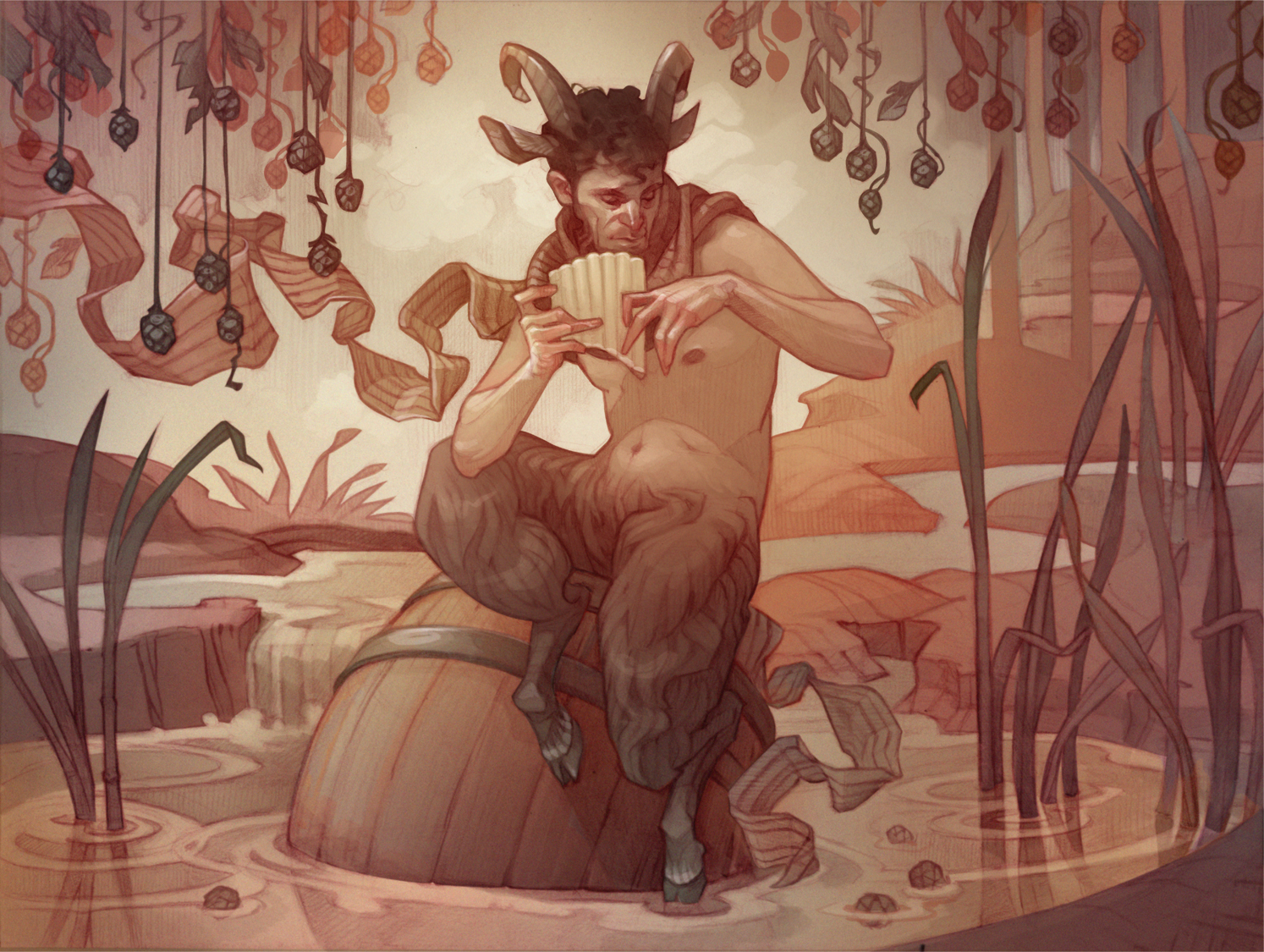
In this case, the god Pan, for a mythology-inspired beer label I illustrated way back in 2017 . And hey, is that the face of noted illustrator and occasional Muddy Colors contributor Micah Epstein??

I think it is.
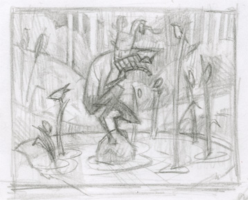
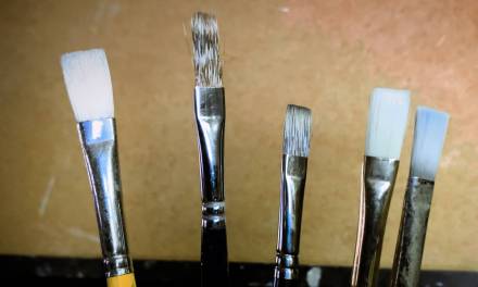
This piece comes from an era when I was willing to allow a much larger slice of my process to unfold on the computer; like most of my digital work, though, it still started with traditional media in the form of a very rough thumbnail sketch…
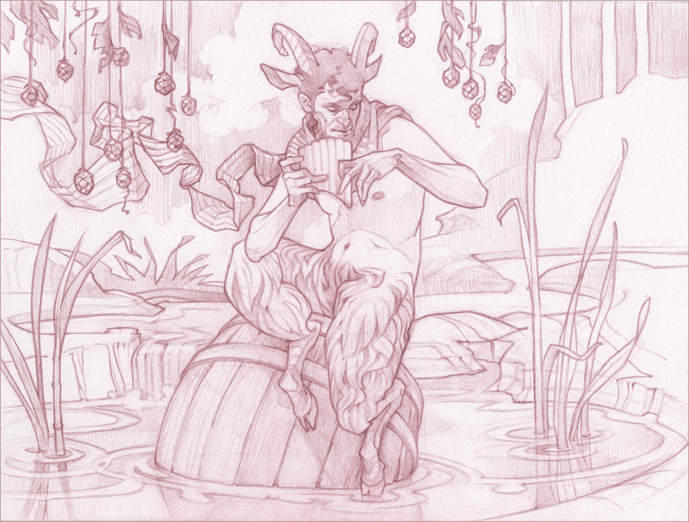
…which underwent extensive client revisions, eventually spawning a tight drawing in my beloved, discontinued Tuscan Red Col-Erase pencil (farewell, old friend).
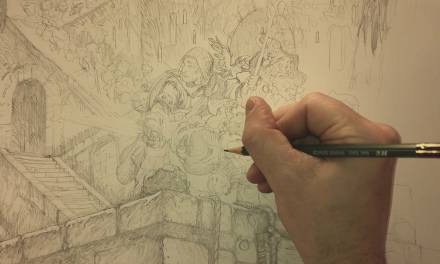
I finished the piece out in Photoshop; I think of the method I used here as a “digital oil” process — a lower-contrast monochromatic underpainting in brownish-grays and white before glazing over with more intense colors and values. I really liked how the warm lineart from my traditional drawing interacted with the soft grays at this initial stage, which inspired the final color scheme.
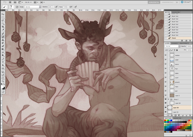
I recorded the digital phase of the painting for this one (video below). As I’ve mentioned before, looking back on my process is one of my sacred art traditions, and, occasionally, it serves as the boost I need for leveling up — or at the very least, not backsliding too far! Even though this particular painting process isn’t one I use much nowadays (I’ve been getting more milage out of my digital toned paper process lately) it’s still useful to look back on how I used to handle the challenges of finishing a piece, and consider what elements of the process might benefit my current work.
The upside of working digitally is that it’s possible to cycle through my ever-present artistic indecision much more rapidly (and dial back any particularly poor choices with a few keystrokes). Color is often an “I’ll know it when I see it” proposition for me, which leads to a lot of false starts and frustration when working in traditional media.
While traditional-media color studies can help, I’m usually too damn impatient to really sit down with one and work out all the issues before starting the final; as much as I hate to spend time in front of a computer screen, I’ve begun to realize that frontloading my process with a bit more digital problem solving is the key to many of my woes — I’ve never regretted taking a few minutes away from “real” media to whip up a color or value study in Photoshop.
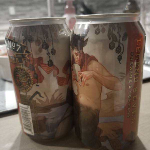
Photo via Untappd.com
Even though I’ve made a name for myself in fantasy/sci-fi, my secret passion has always been product illustration — so it was especially cool to see the finished art for this one out in its final form.
This was one of several beer labels I illustrated for this client — some of which are still in circulation, some of which now exist only in legend. I’ll share a few more of these paintings (and brews) in the future, once I’ve unearthed them from the crypts of digital storage into which they’ve disappeared!


Fantastic article, i love seeing your process since it’s kind of close to my own. RE: the col erase disaster- i’ve had luck on ebay and locally some shops carried them. on ebay – the originator of the col erase was under the Sanford name, of which there are a lot of listings. managed to scoop up my sweet beloved vermillion and scarlet red in a couple 12 packs for about $1 each. just fyi!
Entering the domain of sociology research requires a robust foundational step, that begins with choosing a relevant topic. This platform significantly aids in this endeavor, presenting a variety of modern issues ripe for exploration, making the commencement of the PhD journey less daunting and more directed.
cool!!!
Hi Hi. For rugby fans, Betshezi seems to have carved out a special spot. The platform provides an engaging experience with its vast array of betting options on betshezi login for rugby, making it easy to find and place bets on local and international matches. Their user-friendly interface enhances the betting process, allowing for a smooth navigation. I believe you are as interested in this as I am.