The next few articles on color theory are big ones and require more time on them than I have at the moment. In the meantime, here are a few instances that might relate to the work you are currently doing and some possible solutions to help you work through the issues you face.
Below is related to traditional painting, a reasonable explanation for solving these problems when painting digitally will take a lengthier explanation which I intend to do in a future article.
Do these things happen to you when you are painting?
-
Every time I mix colors, I get mud, not the clean colors I need for my piece.
-
I cannot get the values correct and the colors take over.
-
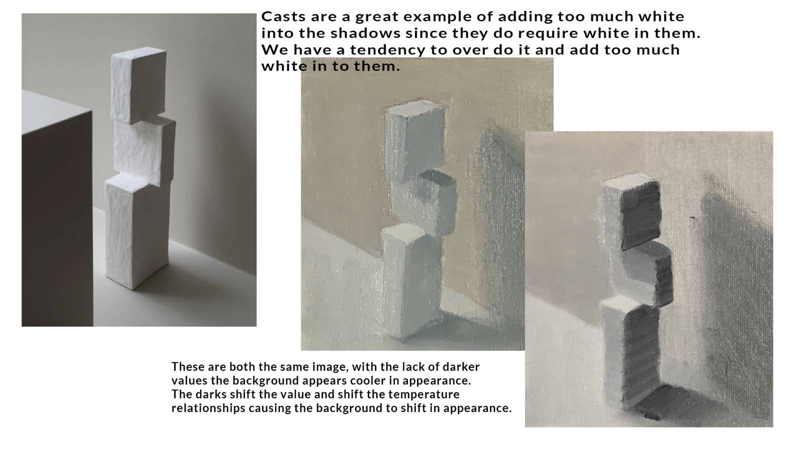
My painting ends up with too much white all over.
-
Painting the visual differences between metal, skin, and leather is impossible for me to do.
-
I can’t keep the contrast between the lights and the shadows.
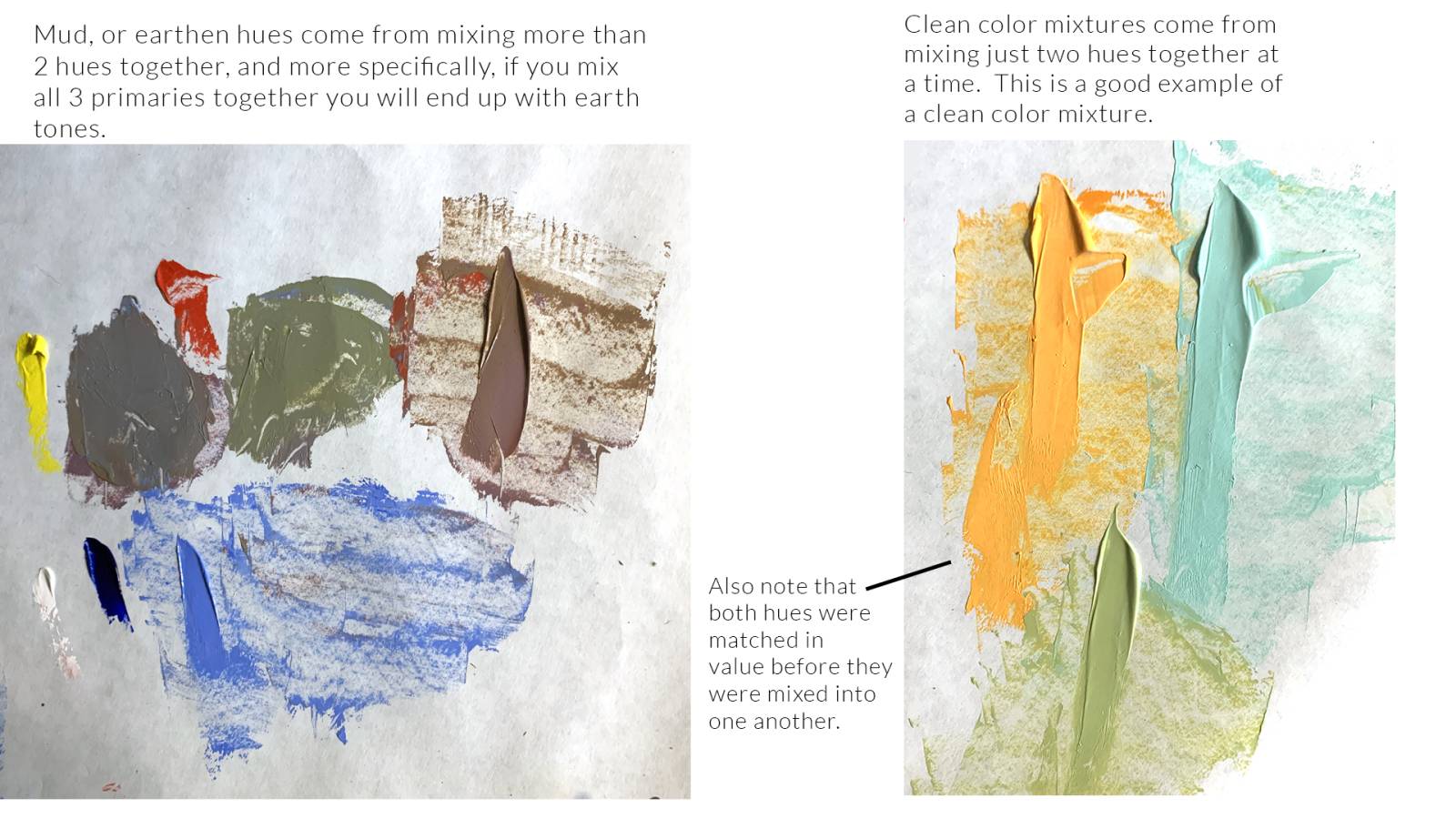
1. Every time I mix colors, I get mud, not the clean colors I need for my piece.
Muddy mixtures are caused by too many different hues being used together at once, and/or all three primaries, red, yellow, and blue being used simultaneously. Ideally there should only be two colors mixed together at any one time, and even more ideally each hue should be matched in value prior to mixing so that there is no value shift or dominant hue shift as a result.
Earth tones are a combination of all three primaries being used simultaneously, three hues at once. The first two hues are mixed to approximate the new hue in question, and the third is used to adjust its chroma, dulling the mixture down towards an earthen mixture.
Out of the tube hues are adjusted with either white for tinting, black for shading, or the equivalent gray for toning the hue.
Match each hue in value to one another before combining them will retain the value of the new hue. Problems occur when we mix direct out of the tube mixtures together, forgetting that some colors out of the tube are a lot darker than the hues we intend to mix with them and this leads to new mixture problems, another round of trying to save the mixture which many times leads up to a more complex mud.
In short, knowing that mixing is a science, and that there are limits to what and how we mix is what leads to much cleaner colors for you to use in your work.
2. I cannot get the values correct and colors take over.
This is common with someone who is not familiar with rendering form using local value, and separating it from the light and shadows produced by the light sources illuminating the subject. Academic training helps one understand how to separate all the noise of what we see into practical parts and pieces, providing a clear road map for what needs to be mixed and when to apply them, for the piece to be accomplished with a realistic end goal in mind.
A big problem here is that the colorfulness of a color is sometimes so overwhelming that it can affect our ability to judge its local value or that it has a local value at all.
Color equals value.
When we can adhere to this principle, we can see right through any colorful experience to find the controls that allow us to replicate that experience.
Squinting cuts through the colorfulness, reduces the ambient light and bounce light to help the eyes see true value in each color, or how light/dark each color is relative to its neighboring colors without distortions.
Drawing is how we learn to see color as value and where we learn to control the values we use. Controlling the values in a grayscale image will help us connect the color equals value experience in our mind and make it much easier for us to identify the differences in light and shadow regardless of the complexity of the subject.

3. My canvas ends up with too much white all over.
Where there should be color, the colors feel washed out. Where there should be flesh tones, the skin feels like giant highlights. Where there should be light, sunlight, and shadows that reflect the blue sky, there is only dullness in color and the picture lacks the feeling of real lighting.
Someone who has not had much of any color theory will look at white paint as the answer to everything. White is how to lighten, white is how to gray, white is how to…white is the abused hue because we think it is supposed to fix the colors we want in our piece.
White is not wrong to use as a color adjustment tool, but this again goes back to color equals value, as well as understanding that light has hue to it that alters the quality of the colors we see with our eyes. Without knowledge of this, white is literally the answer to everything we make to a fault.
Most often, white is not needed to make something lighter, rather, all the neighboring values could be darkened down which in turn will lighten the value spot in question even further without anything added.
Any hue that is light on our palette is likely premixed with white already, therefore can also be used as a tinting agent, if it has the color properties needed to enhance what we are mixing. As an experiment, lighten a darker hue with white first, then try it with all the lighter hues on your palette to see what you get as a result. The goal is to retain the local color and turn the form with the appropriate value simultaneously, sometimes the other hues we have might suffice in substitution of the “use white paint” solution.

4. Painting the visual differences between metal, skin, and leather is impossible for me to do.
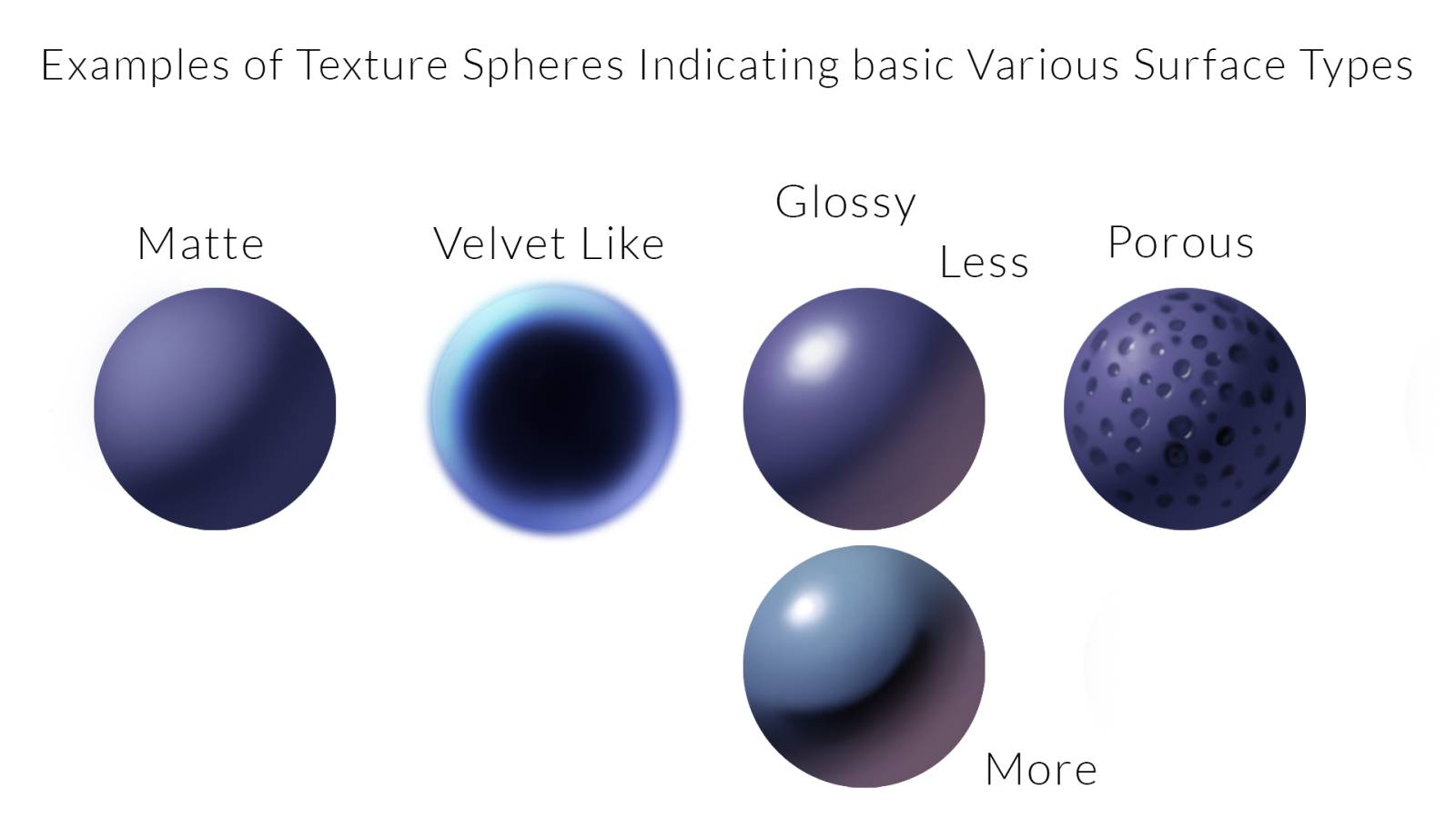
Still life painting gives the painter a chance to practice the differences in surface quality between objects. Some objects are shiny, others can appear velvety, while others are might look dull in appearance.
This is the study of surface properties and how to identify them by label, and how to treat them in the visual hierarchy. Unless they have an overwhelming appearance which cannot be avoided like, say, lava rock, or intricate chrome, surface texture is usually the least important of our findings as an artist, and the form and local values of the object in mind are more important to identify, separate, and turn in form.
In most training the texture is the last thing we study if we get there at all. It should not compete with the form, so there is constant adjustment to it to allow the form to remain the dominant influence in the visual hierarchy, or the way we see things and perceive their level of complexity.
Much of the study of surfaces has been shifted over to the CG world where designing realistic textures is crucial in replicating realism for motion pictures and for video games. A great amount of information on the differences in surface properties and qualities of a surface can be found in this area of study. A quick browse of the deviant art wall will warrant many texture cubes or sphere studies, and online there are many tutorials on how to control these surfaces on a very technical level.
A few things to keep in mind:
Matte surfaces are less likely to show off the light source as a reflection because it has been diffused into the surface and scattered from the micro texture that we perceive as somewhat smooth to the eye.
The more velvety something is, the more the edges will glow, which is where the direct light has shifted because of the architecture of the micro surface shapes and how they absorb or reflect light back at our eye.
A glossy surface will reflect the light source back at us, the glossier the surface, the more mirror like the reflections will be, and the more we will see the surroundings on the surface of the subject than we will see a clean representation of the local color.
Additional Note about highlights
Avoid drawing and saving a shape on the form for the highlight unless you are using watercolor where the whites are the paper color and painted around. Trying to preserve a special spot for the highlight usually leads to awkward and oversized shapes for the highlights, something that doesn’t feel adhered to the surface, or doesn’t appear adhered because it shows no hint of local color within its defined spot.
Here is a quick technical list of surface types and a few of their characteristics:
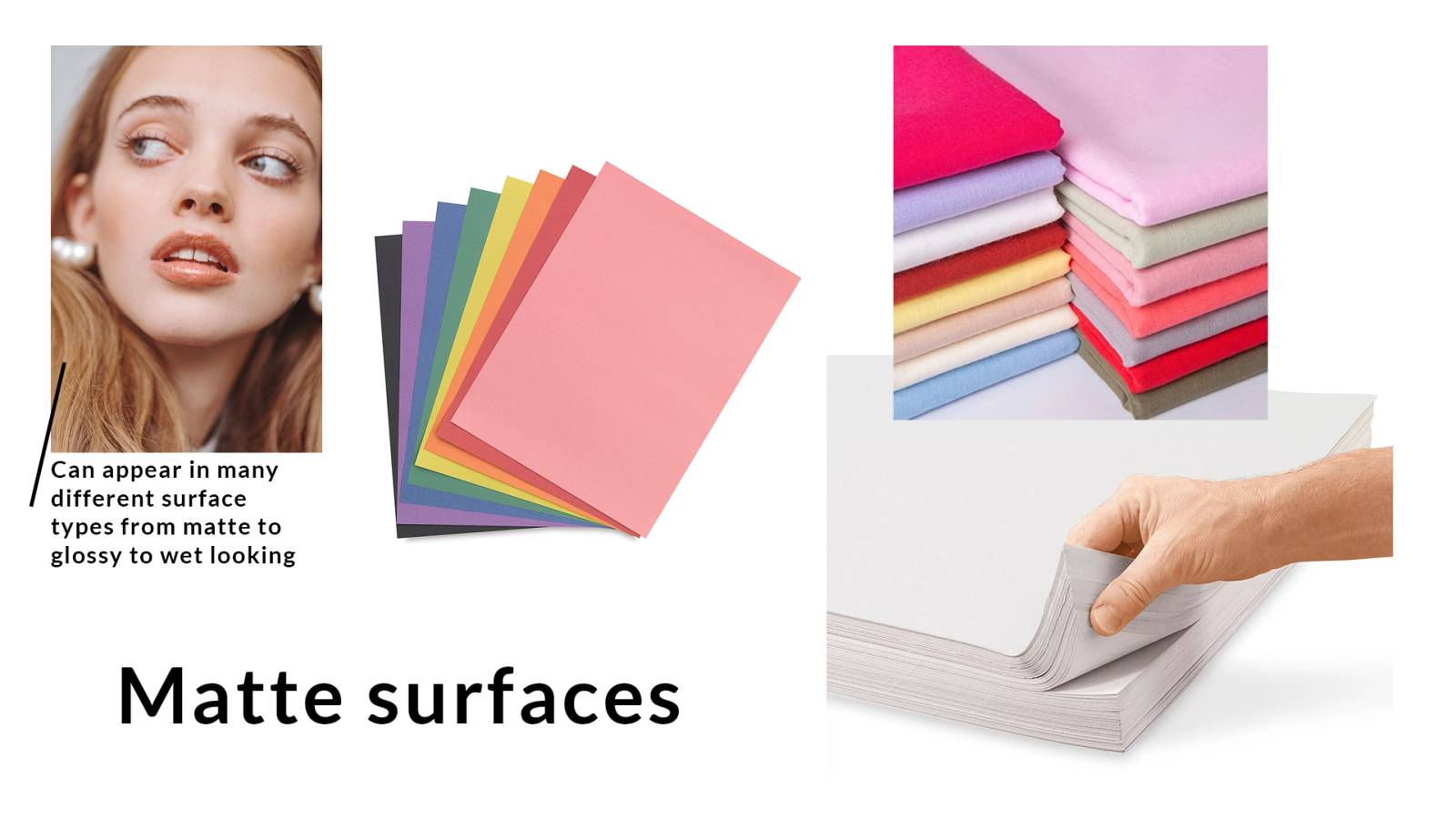
Matte surfaces – skin, cotton material, construction paper, rough newsprint paper, are a few objects with a matte like appearance to them. Skin is an exception, where it can appear dull, or wet, or damp in appearance which gives it a full range from matte to glossy.
A matte surface is easy to identify with its lack of any obvious appearance of a highlight, or a reflection of the light source illuminating it.
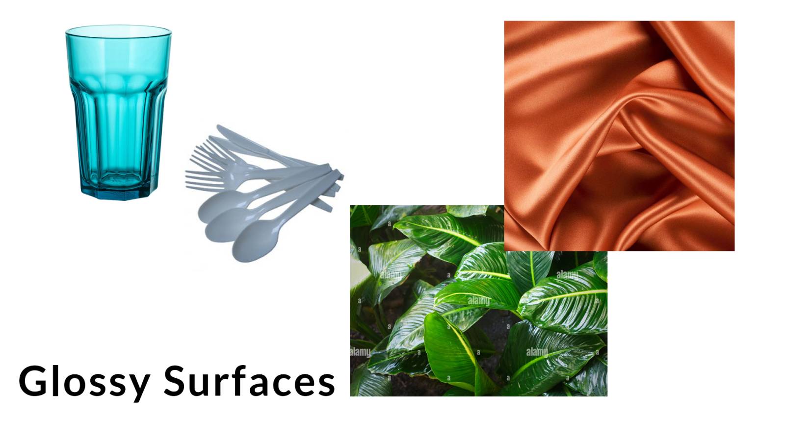
Glossy surfaces – Glass, plastic, large leaves, metal, silk material have a “reflective” surface to them, which means that the light source is going to be more visible on the surface. The glossier the surface, the more mirror like the reflection(s) will be on that surface.
In addition to the light source being one of the reflections, the ground plane, the horizon, the sky, will also likely be reflecting onto the surface as well, but not nearly as strong as the highlight.
The shadow side of a very reflective surface is also not as easy to identify because of all the reflectivity. The more reflective a surface, the more that surface all the way around the object is bouncing back the environment like a mirror to our eyes, more obvious on some planes, less visible on others.
Velvety surfaces – Velvet blankets, peaches, certain succulents, some animals all have a velvety quality to them. This is caused by the hairs on their surfaces. When the hair is at length to the light, like at the edges of their forms, the light reflects off of them. When the hairs are facing towards the light, like in the middle of the bigger forms, the light is absorbed.
We can say, light bends awkwardly over these surfaces. The lightest lights appear on the edges of the forms in many cases while where the light should be in the center looks the darkest. This is caused by the fibers that make up the velvet material, or the micro surface on the surface that is reflecting and absorbing light, and/or scattering it differently than most surfaces show us.
Not only will light shift from where it is usually the brightest, but the surface will also appear out of focus, soft, fuzzy, because of the micro fibers and their lack of adhesion to the bigger surface they are attached to.

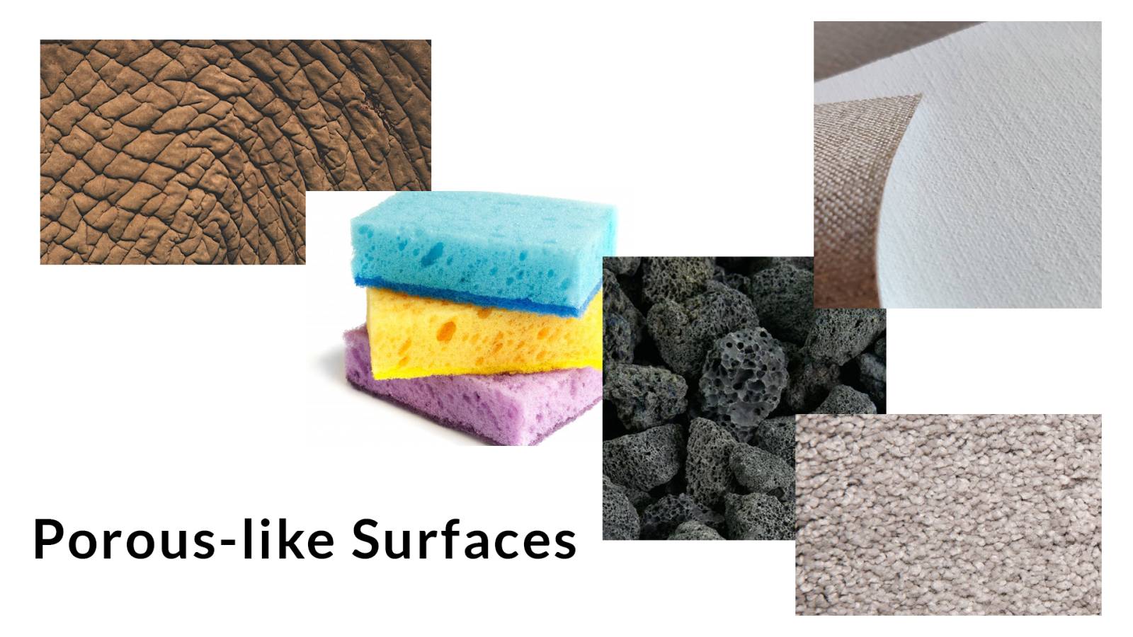
Porous surface – Elephant skin, sponges, lava rock, canvas, carpet are porous surfaces, or surfaces where there is enough variation or elevation change to cause light to be less consistent across it than a much smoother surface shows a more cohesive gradation of light. The pores can vary from indentations to holes, to cracks, and more.
The forms of the subject are far more important to solve than struggling over how to control the details of a complex surface. Once the surface forms have been rendered, it is not too difficult to add smaller shapes to break up the surface as long as the values used complement the forms that are being rendered.
Squint to see the big picture forms and block them out, gradate them, add the reflective lights, before chewing the bigger surfaces apart with smaller shapes. Painting them onto an already properly adjusted surface will help get them to adhere to the bigger surface far easier than trying to start with just the details and hope that the bigger surface will be seen in the end of the render.
5. I can’t keep the contrast between the lights and the shadows.
This could be one of several things:
-lack of training in the ability to separate local colors, the lights, the shadows, and reflective lights.
-lack of color theory training and the lack of understanding that color = value
-the concepts of color theory are intellectually understood but a lack of practice inhibits one from objectively separating the components as well as designing successful technical demarcations of each.
-the contrast is harder to see when the colors are more chromatic and extremely vibrant, we no longer perceive that color=value.
-technically, by adding white into the shadows, the shadows lose a quality that visually separates them from the light side of the forms. With the mindset that “white fixes things” it is easy to take the concept too far and overextend the whites where there should probably be much less of it used, if used at all.
-we tend to focus on lightening the light side more and more, and sometimes it is just better to make the darks darker, giving us much more range on the light side to work with.
-we “look” at the reference too much, and too often we focus on the tiniest of changes. Instead, squint at the subject, and rarely look at it with eyes wide open.
We tend to believe that once we “know”, we can kick back and just make art. When you really “know”, you really realize just how much you don’t really know at all, and want to stay on top of that game to continue learning as an artist, and continue growing as a human being. See you in the next one.

Recent Comments