At your local hardware store, you will see paint colors with all sorts of names. Kettle black, Frosted Toffee, Aqua, but artists don’t refer to color this way. The reason is simple, it’s confusing! When you hear “Periwinkle” everyone has their own interpretation of what that color looks like. Artists have a system for naming colors to avoid these problems altogether. When describing a color, we can do so in two parts. Let’s take the color Red-violet for example.
RED-VIOLET
The second word, “violet” refers to the general hue you see. This is going to be one of the secondary colors. Orange, Green, Violet. Second word = secondary color (easy to remember, right?)
The first word is one of the three primary colors, red, yellow, or blue. Depending on which way the temperature leans, it will be the next closest primary on that side of the wheel.
Finding which primary color to use can be tricky at first. The violet we are naming is on the warm side of the color wheel, closest to red, so we call it red-violet. Red-violet is technically a cool color, but it’s leaning warm. It’s warm-er than regular ol’ violet.
TIP: Always “picture” or hang your color wheel with yellow at the top, it’s the lightest of the primaries. Visually it makes sense to have it up top. Since we know purple is its complement (the opposite position on the color wheel) it will always go at the bottom. If we always think of the color wheel the same way, it makes it easier to remember.
Be careful to pick a primary color that makes sense. If we skipped over red and said, yellow-violet, out loud it doesn’t sound right. We know yellow and violet mixed make grey. If we dumped a lot of yellow in the mixture, the color would be more accurately described as yellow-green (obviously, a very desaturated version.) If an artist does say, for example, a yellowed violet or yellow-violet, likely they are talking about a violet that has been desaturated with yellow. It isn’t as common to hear in my experience. Most artists might say, warm or cool grey but it certainly isn’t very descriptive. You could say that’s where language gets a bit muddy. 😉
This system is not only helpful for communicating about color, but it also can improve your mixing. You’ll notice that if you can name a color accurately, mixing becomes easier. If you are like me, you’ll find yourself driving down the road pondering how you’d mix and name every color you see!
I know some of you want to ask… what about pink? How would you name that? Pink is a tint, which means white has been added to it. The name “Pink” is similar to what some call “lime green,” which is a tint of yellow-green. My theory is that humans, (myself especially) loved the color so much that we gave it its own name. Some people may call “pink” a tint of red but to me, that isn’t descriptive enough! I find many pinks I use are cool and have a bit of blue in them. I’d likely describe them as a tint of red-violet. What about the kind of pink some people might call “coral,” that’s a tint too but of red-orange.
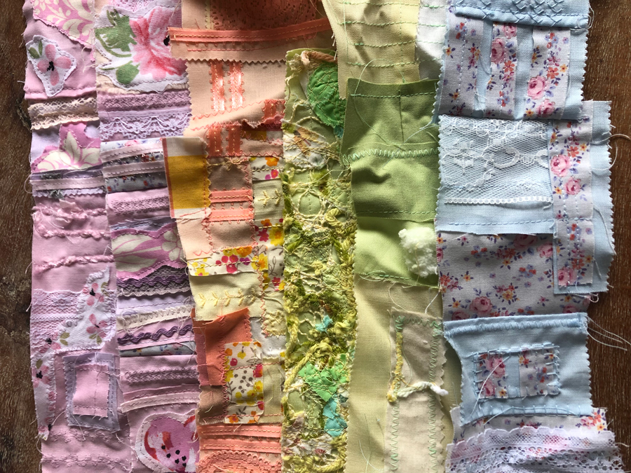
Some lovely tints from my scrap pile
Other Ways Artists Talk Color
This two-word system isn’t the only way artists will talk about color. Commercial artists, like myself, may also refer to a color in reference to CMYK – the ink colors printers use. That’s Cyan, Magenta, Yellow, and K. The K in CMYK stands for “Key,” as in “Key Color” or “Key Plate” but usually, black ink is used as the Key. More on that another day.
Let’s break down CMY properly. These colors are similar to our standard primaries but with a bit of a twist…
Cyan: Blue-Green
Magenta: Red-Violet
Yellow: Yellow
Most comics are printed in CMYK, when I worked for Marvel years ago, this often posed a problem for me. If you have a lot of orange or red in your work, CMYK is never going to replicate your work as you have them on your canvas (or screen canvas.) So say you are working on a superhero who has a red outfit…. Yep, been there! Made mistakes and learned a lot.
There are also pigments (organic and synthetic) that are closely associated with tertiary colors (or sometimes called intermediate colors) Blue-green, blue-violet, red-orange, red-violet, yellow-orange, and yellow-green. Artists, usually painters, may refer to colors by their pigments as a shorthand for tertiary colors. A few commonly used colors are: ochre, sienna, umber, indigo, pyrrole, cobalt, cerulean, ultramarine, phthalo, cadmium, and alizarin crimson. This would seem problematic because we may interpret those words differently but for the most part, these colors represent something specific to artists and have subtle differences among manufacturers. You don’t often hear these terms come out of a non-artists mouth either.
Let’s break a few of these down! If you are struggling or want to check yourself, a Quiller Wheel is a handy tool to have, it shows the color wheel represented in these pigments.
Cerulean: Blue-green
This blue hue is warmer than Phthalo and Ultramarine, leaning towards green. It’s often described as a color on a clear blue sky day. In my mind, it relates similarly to cyan in the CMYK world.
Phthalo: Blue-green
Phthalo comes in two hues, phthalo blue or phthalo green. This blue leans warm, toward green. The phthalo green hue is shown warmer than cerulean on the quiller wheel. Phthalo blue hue, it’s cooler. They used the word “turquoise” (which kinda annoys me but you get the idea.) Some phthalo is labeled that way on paint tubes. Either way, it’s a powerful color in mixing, a little goes a long way. It is also transparent, making it good for glazing.
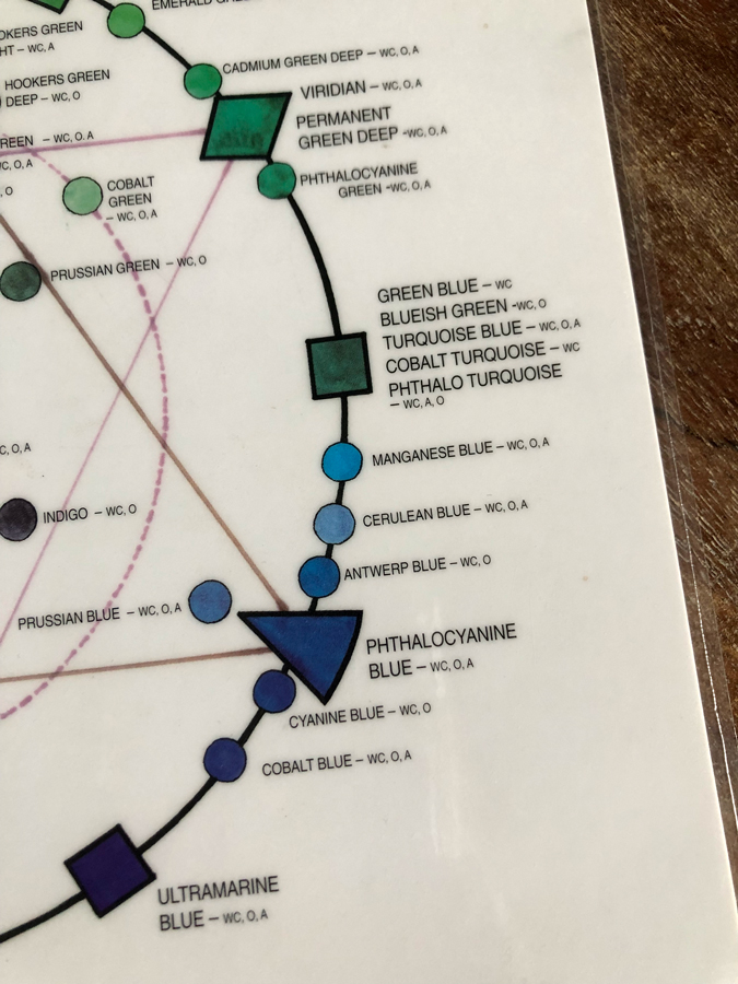
Quiller Wheel blues and greens.
Ultramarine: Blue-violet
Also in the transparent family, ultramarine is a blue hue that leans cool, toward violet.
Alizarin Crimson: Red-violet
Another powerful transparent color, this red is cooler and leans toward blue.
Cadmium: Red-orange or Yellow-Orange
Cadmium comes in red, yellow, and orange hues. It’s warm and not transparent. In paint, cadmium is as warm as it gets.
Whether you are working with paint or pixels identifying colors is the first step to a deep understanding of temperature and saturation. If you are a teacher, streamlining your color language may make a world of difference to the artists who are mixing for the first time. If you are an artist learning about color, stay aware of these terms, it may help you decipher what you are reading or what your teacher is saying.
As always, I hope this was helpful, and that your colors stay out of the mud. As I wrap up, I’d also like to share the cover for a new book, “A Horse Named Sky,” written by Roseanne Parry and illustrated by me. It will include over a hundred pastel drawings in black and white. Coming out in September. Maybe we can talk horses later this year?

For more about me and my work please visit, www.kirbifagan.com.
Kirbi


Recent Comments