Like a lot of Art Directors, I was trained as a graphic designer, not an illustrator. And while there’s a lot of overlap in a designer’s education and an illustrator’s education, the #1 difference is typography. In this (and probably a few more) posts, I’m going to pass on some simple and easy rules for working with type, to support (but not overwhelm) your illustrations.
Best practice for an Illustrator’s portfolio is to use as little typography as possible. In other words, pick a nice simple font and stick to it throughout. Same goes for other things you might need to put type on (prints, personal projects, promo postcards, crowdfunding graphics, etc). You’re not going to go too wrong with a simple font set cleanly. Here’s some good rules to start with when you have to deal with Typography:
1. Let Your Art Be the Star
As Art Directors always say, you’ll get hired to do what’s in your portfolio. So, logically, if you want to be hired to illustrate, then your illustrations should be the first thing people see. Sure, it can be fun to have a logo for yourself, but it should not be the star of your website or portfolio. When someone goes to your website they should see your art first, not your logo. Yes, there are artists who have cool logos, but honestly, in 99% of cases, it’s much better to just set your name in nice, simple type, and leave it at that.
2. Don’t Put Type Over Your Illustrations
When you’re starting out, the urge to put type over your work can be hard to resist. Either you have samples that you want to show to publishing ADs to prove you’re ready to work, or you’ve had a few illustrations used for books and you’re dying to put them in your portfolio to prove they became real finished book covers. Or you’ve made illustrations for book covers and you’ve left obvious “holes” where the type goes and the illustrations look weird without it. RESIST THIS URGE! The main image in your portfolio should be your illustration without type on it, whether it’s on the web or in a physical portfolio. End of story. No argument. If you have a small, or obviously secondary, image that shows the final piece with type, then fine, include it, if you insist. But if a publishing AD can’t tell an illustration is a book cover from seeing it without type, then it’s not a good book cover illustration.
Most importantly, do remember most publishing ADs are trained designers. And you don’t want us judging your piece by the type design. If the type is there, we can’t help judging it. And if the type sucks, we can’t help it making your work look bad in our eyes.
Also you also don’t have to tell us that there’s areas where type was supposed to fit over the art. We know that. For the record, you’re not supposed to make obvious holes in your illustration for type – less busy areas, sure, but not empty. An illustration should always still work without the type.

3. Keep it Simple, Stupid
Again, you are not a designer. So don’t get cocky. Stick to simple, elegant typefaces. Use one, or at maximum two, typefaces at a time. Do not use intricate fonts with a lot of character. Do not use very complicated fonts. Whatever you do, do not use Comic Sans or Papyrus, or an AD will immediately close your website and never look at it again.
4. Use Type to Set the Mood
Remember, typography speaks to the subconscious in the viewer more subtly than anything you can draw. Be aware of what your type is saying about you. Start to pay attention to themes and styles. If you want to seem formal and elegant, use a Serif typeface. If you want to seem more casual and modern, use Sans-Serif. Think about your industry. If you’re working in SFF or gaming, you probably want to use a typeface with a slightly Roman feel, and strong serifs. There’s a reason Trajan is the movie font. If you want to work in kids or young adult, a font with a touch of hand-drawn irregularity can be nice (but don’t overdo it, no crayon fonts). If you’re in branding or advertising then sans-serif is probably the way to go, because it has the least personality and works as a good chameleon. Again, be subtle. If you’re working on something futuristic, use something that has a subtle touch of the futuristic, not something that screams LOOK HOW FUTURISTIC I AM at you.
5. (Extra Credit) Contrast is Your Friend
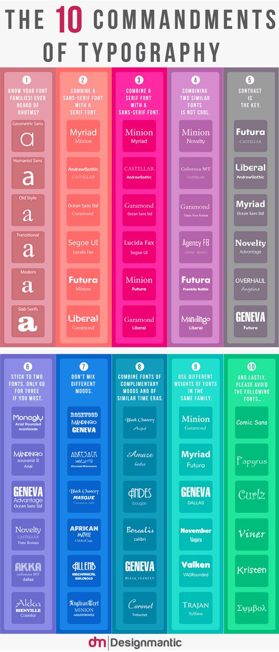
If you find yourself needing to do some higher-level design, then you can get a bit more complicated. The key to a good type design using more than 1 font is contrast. Don’t mix two fonts that look alike. Mix fonts that are very different — you will almost always mix a serif font with a sans-serif font. They balance each other. You can also create contrast by adjusting the kerning (space between letters), changing whether the font was set in all-caps or upper & lowercase, or using bold and skinny fonts together.
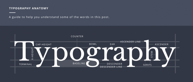
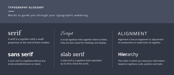
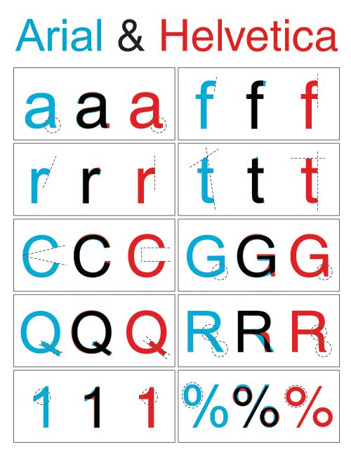 |
| If you look at these and say there’s no major difference then you’re not a designer. |
6. Legalities
Remember, fonts are art also, and you have to make sure you use that art legally. So always make sure you own the right to use the fonts you’re using before you put them out in public on a big project, or anywhere other people (including the designer of the typeface) can see it. Trust me, this happens in publishing all the time. Let’s just say when books hit the bestseller lists, the font company pops right out of the woodwork to make sure you have a legal license to use the font on that cover. A great simple—and generally cheap—resource is www.MyFonts.com – you can search by tag or mood, you can license most fonts very affordably, which is really important for freelancers, and you can even upload jpegs of type and the What The Font Font Finder will help you figure out what font it is.
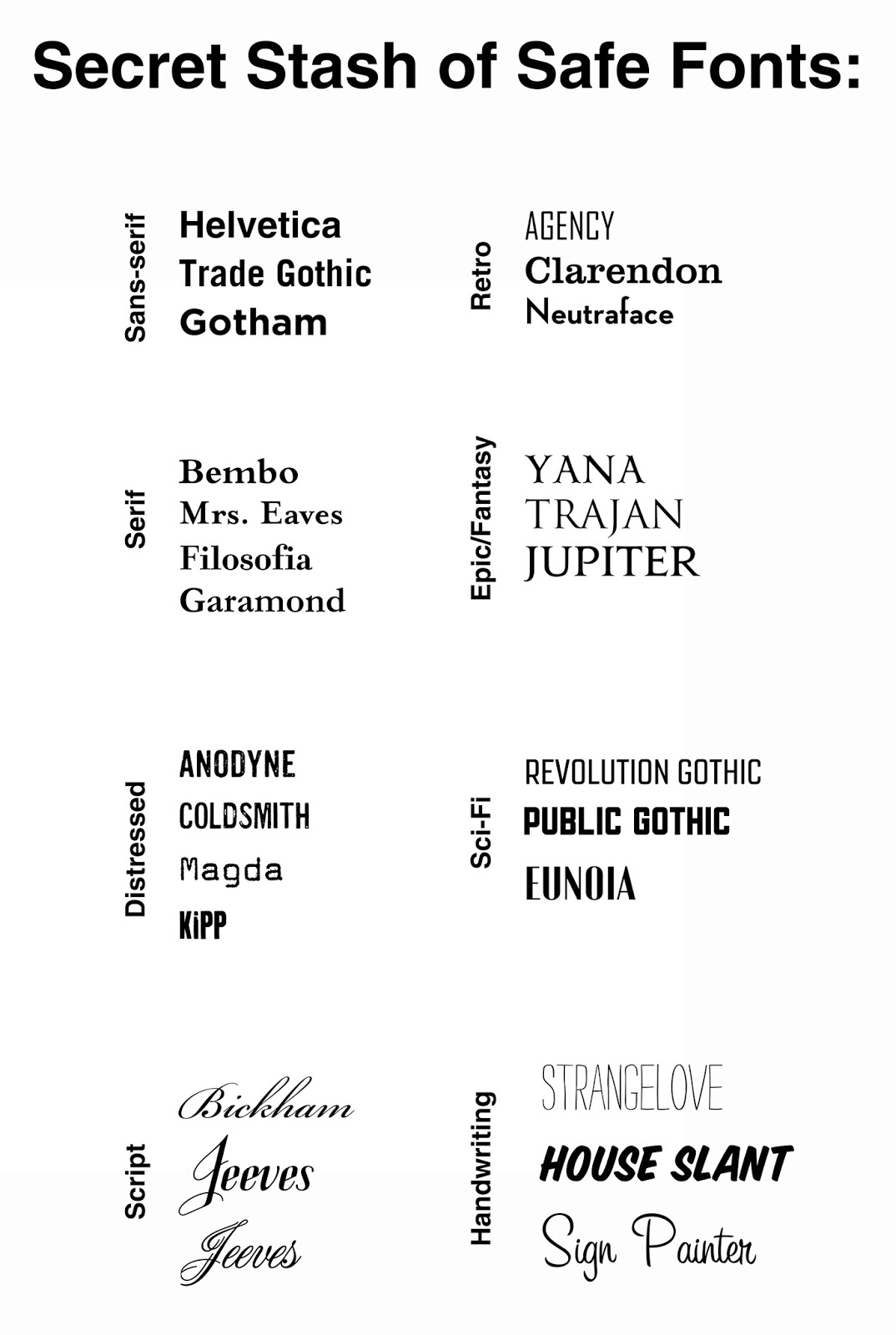 |
| Disclaimer: This is far from an exhaustive list, it’s just a short list of some easy-to-use fonts that won’t make my eyes bleed when I see your portfolio. |
So there you go, baby steps and first pointers on how to start using typography properly, as an illustrator. Start practicing, and I’ll pull up a lot of resources for next time. <3


Really handy post Lauren!
The type of post I like to save and share. On point, sans fluff, and justified.
This was great. Thanks! I'll hopefully have to beg less of my graphic designer friends when I need to make business cards and portfolio headers and such. (that's a big hopefully)
And… check out the new Met logo… http://www.vulture.com/2016/02/metropolitan-museums-new-logo-the-met.html?mid=fb-share-vulture
Left-Justified or Right-Justified? HA! TYPE JOKE!
thank you
Great post! Was it inspired by a certain logo thread in a certain Facebook group?
This is handy info for web developers as well.
Actually no! I had no idea what to write last night, so I texted Dan Dos Santos, and he said, do something on type, and so I did! (but that's not the only thread it's bee popping up in)
Fully!
What do you think of fontsquirrel.com? They say they offer fonts free for commercial use. Are these good for new freelance artists, whose clients don't have the budget to allow purchase of more popular fonts?
Hi Lauren, is it ok to put in the bottom right corner and super small type just our website name though?
The problem with the free font sites is either
A) the fonts are done very cheaply and don't have the proper kerning programmed in (the space between letters) – they're all set to one distance, instead of different distances between different types of letters. The easiest way to check? Type “OW” – if there's a TON of empty space between the O & W, instead of it nestling in closer, then you have default kerning.
B) Many of those free sites don't police pirating. So someone can upload a well-known font, and just change the name. Shady.
Look, I understand that no freelancer is going to go back and buy licenses for every font they've picked up along the way. HOWEVER if you do a big project that may or may not go viral, then absolutely put in the extra $20-$50 to get a single user font license. And if you include a font in a freelance project, then make sure to add the cost of a single-user font license to the contract/expenses/invoice for the job. As a bonus it will make you look super professional.
Yes, absolutely watermark your images. small and simple. generally use a basic sans-serif, all-caps, like a trade gothic or a helvetica.
And here we can see Lauren being a hero 🙂
It's a shame I do have a degree in graphic design and none of this was taught to me.
wait what?
Weird long stories about community colleges and first classes and strikes and teachers being fired and a general mess. Now you know why I dropped out hah
Thanks! I guess that automatically rules out the clients whose budgets don't include font license costs.
Oh, another question: If our portfolio includes things such as maps, which usually have a lot of text/labels on them, is it better to use a good font and do the best we can (at the risk of making your eyes bleed nonetheless), or post it without any text (at the risk of making it look awkward)?
Type and typography is a science unto itself. I had to learn it on my own and my own knowledge is only basic. Lucky, I have a guy who helps on graphic design for my comics. Anyway, two more good resources for type are the books “Twenty-Two Tips on Typography/Twenty-Two Things You Should Never Do With Typefaces” by Enric Jardi and “The Non-Designer's Design Book” by Robin Williams.
If you put the type on them then yes, include it, it's part of your illustration.
oh good tips ill have to check those out!
I'd any more we've evidently seen that the dominant part of the enterprise activity in the Stark Trading System business activity is Belle being done of surety it's being done over convenient networks over cell structure over wife circumstances and that does not.
http://brokerscamalert.com/stark-trading-system/
Software Terbaru
Game Android Terbaru
Game Pc Terbaru
Lagu Terbaru 2016
Film Terbaru 2016
Aplikasi Android Terbaru 2016