As folks that have met me in person (or seen my meat suit on instagram) know, I have a big upper-arm tattoo of an art nouveau piece. (Shoutout to Iris Compiet, I think this was from an Spectrum or IlluXcon convention before the pandemic)
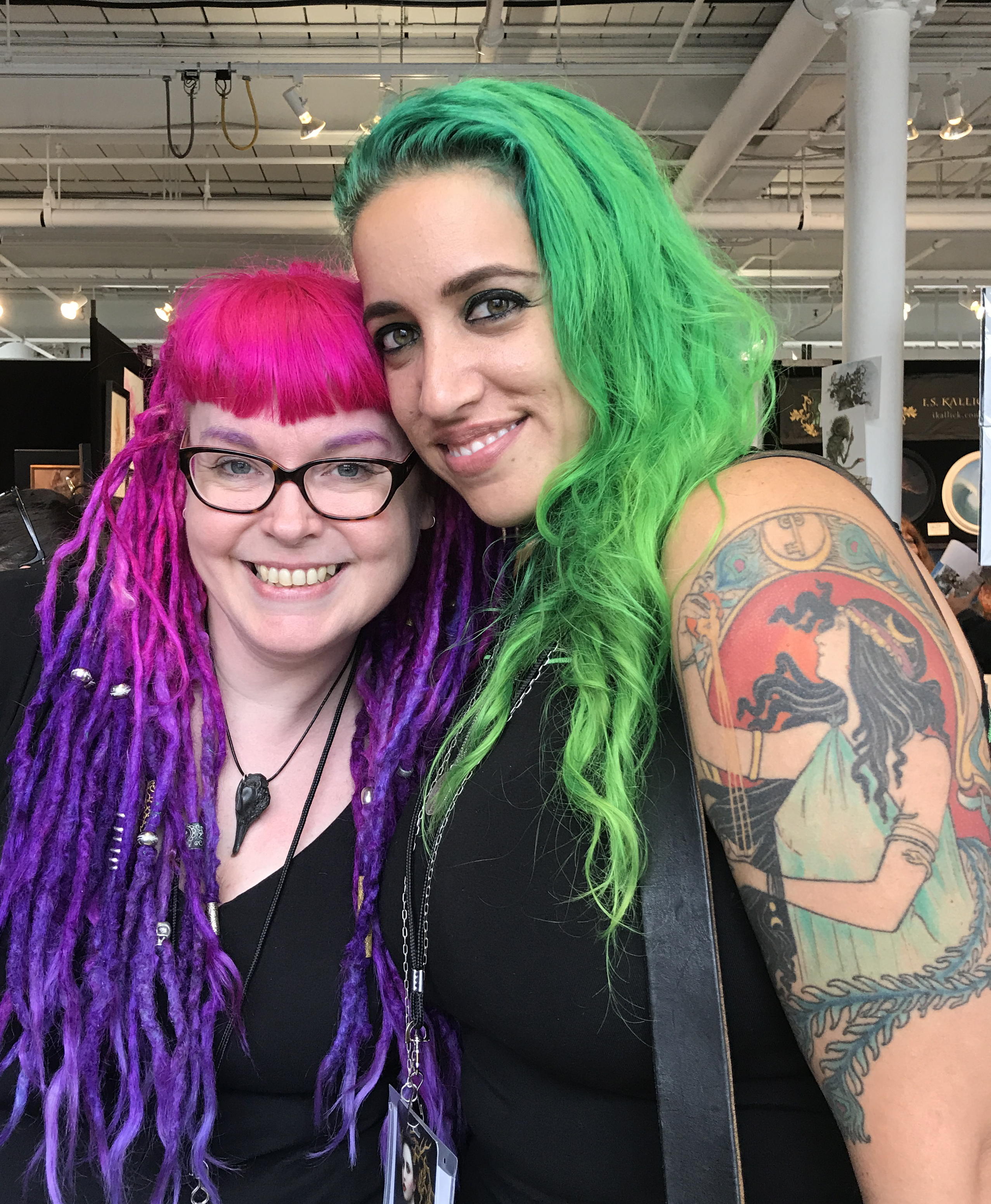
Many people comment on this tattoo (done by the amazing Stephanie Tamez, a fantastic tattoo artist and fine artist who’s done 10 of my 13 tattoos) and very often people assume it’s a piece by Alphonse Mucha. Totally understandable, given that Mucha is the most well-known artist of the Art Nouveau style, but this tattoo is actually an adaptation of a poster by an artist that predates Mucha: Henri Privat-Livemont.
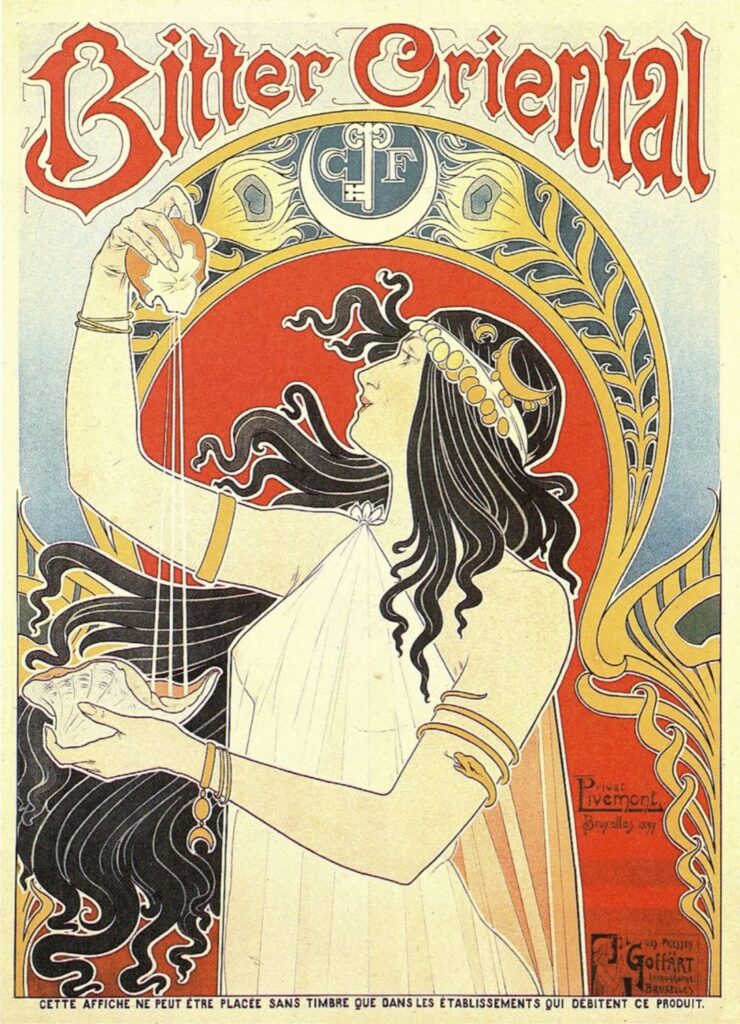
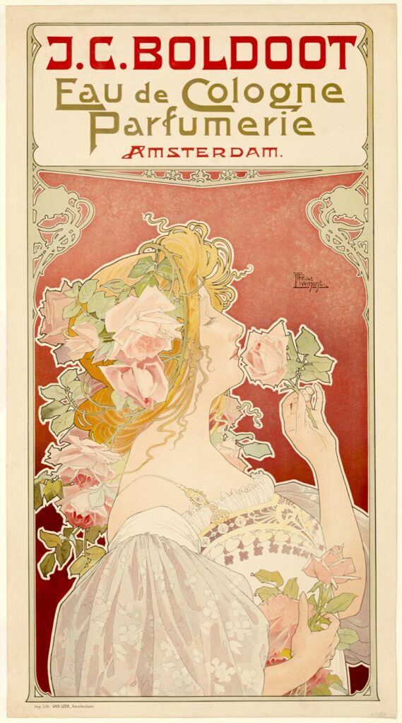
In fact, you’ve definitely seen Privat-Livemont’s most famous poster, and you’ve probably also assumed it was Mucha’s:
Now there’s CLEARLY great similarity between the two artists — I mean look at the hair on these women — and when fans (usually artists) are savvy enough to realize these are not Mucha’s posters, they believe that Privat-Livemont was a later artist copying a style set by Mucha. This is supported by the fact that Privat-Livemont was actually a year younger than Mucha. However, if you go back to the actual records Privat-Livemont, a Belgian artist based in Brussels, was working very successfully as an interior/exterior building designer and decorative architect first and he ended up eventually using the same style for posters, some of which predated Mucha’s first poster. In fact, Privat-Livemont had already established a popular studio and was doing a large number of commercial works before Mucha got his first big break.
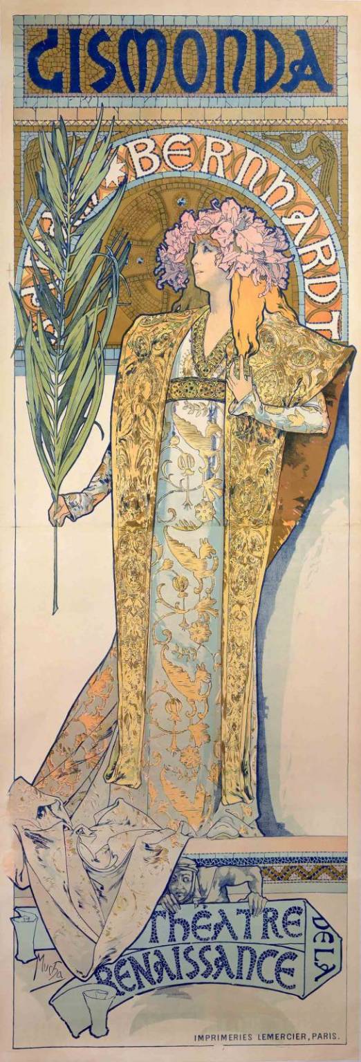
You can read more about Mucha’s break and career in the Turning Points article I wrote on him, but Mucha was considered a struggling, if not failed, artist all the way up to the age of 34. He was roommate to Paul Gaugin, and embedded in the Paris artist scene, but he didn’t have enough money to go away with everyone else for the holidays. A rush job came in for a poster for Sarah Bernhardt’s play Gismonda that wasn’t selling enough tickets, and Mucha was in the right place at the right time to hop on it. That was December 1894.
By 1894, Privt-Livemont was already well-established as a poster artist, and had really defined what the Art Nouveau style looked like in print. He won a poster competition in Brussels 5 years earlier in 1889, and that was the motivation for his shift from Architectural and Interior Design into primarily posters. By 1891 he was already teaching in Brussels at the Josephat School for Drawing and Crafts, which became famous for codifying and spreading the Art Nouveau style. He taught there from 1891 to 1935, an incredibly long and influential position.
![]()
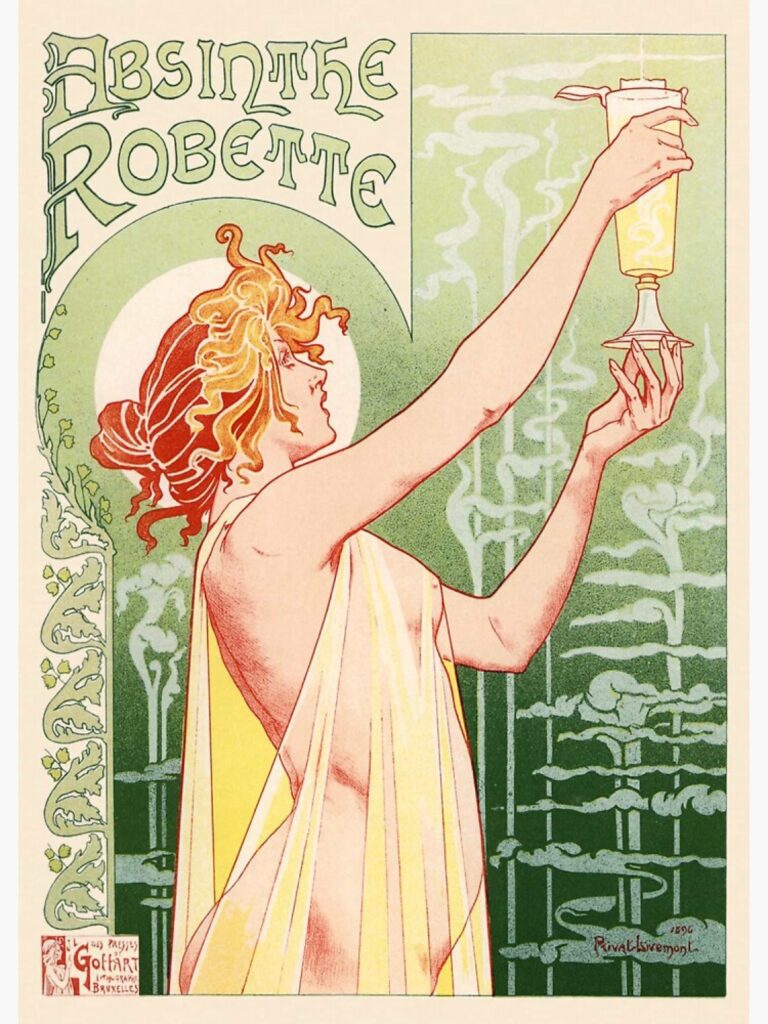
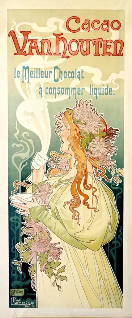
So look, I’m not trying to take the wind out of Mucha’s sails. I love Mucha’s work, and the way he furthered Art Nouveau’s popularity and then moved to Prague to support and glorify his heritage with things like the Slav Epic are worthy of as much artistic admiration as possible. That said, it irks me how many folks assume that he was the first person to come up with this style, and that any poster that looks like this is a ripoff of his work. Although it’s hard to show proof of this, the fact is that it’s highly probable that Mucha was already familiar with Privat-Livemont’s posters when he was tapped for that rush job that lonely December in 1894. And that there was clearly an artistic dialogue (or arms race) going on between Privat-Livemont and Mucha over the years. And Privat-Livemont deserves to be remembered in his own right, and not as a cheap copy or rip-off of a style he helped create. So enjoy these pieces, some of which I enjoy even more than Mucha’s posters:
![]()
And extra credit for illustrating a woman with green hair back in 1897! 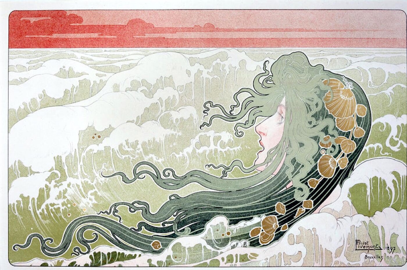
So, how did I end up with this poster on my arm? I wanted an art-nouveau style tattoo for many years, and of course I assumed it would end up being one that was based on a Mucha piece, but nothing ever felt right. And then I was lucky enough to be in Paris in 2010 when there was an incredible Art Nouveau Revival exhibit at the Museé D’Orsay, and I spent hours there. It was filled with works inspired by the original Art Nouveau period next to their inspiration — so think 1960s psychedelic concert posters next to original Muchas. And as I was coming up a set of stairs, there was Privat-Livemont’s advertisement for Bitter Oriental Liqueur. And it just floored me. It was not only everything I loved most about Art Nouveau design, but also well-shaped for a tattoo, and as a bonus, it also spoke to my hobby/interest in cocktails, especially around historic liqueurs. The only problem was that it’s impossible to tattoo white, so my artist Stephanie did a bit of color adaptation to it to make it a better tattoo. It wasn’t until later that I realized it was the same artist as the Absinthe Robette poster, which I already knew and had considered as a tattoo as well. Except it turns out I don’t like the taste of Absinthe! So I had hesitated to go with that image. Once I saw the Bitter Oriental poster, I was set on getting it tattooed.


0 Comments