
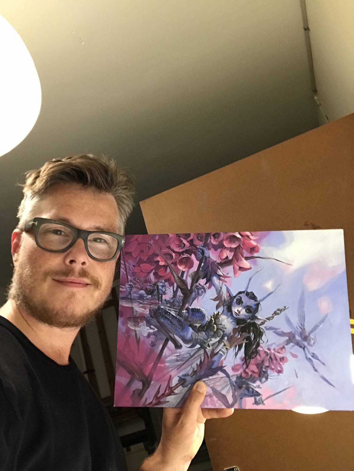
This image for Magic the Gathering was already known to me when I got the assignment. And it made me very excited. I had played the original card a lot and it was first published in the set where I started as a magic artist. The card was going to be reprinted and I was honored at being handed the artwork. Because; lets face it. I have only about a handful of playable cards among the more than hundreds of cards I have been illustrating over the years. This one would be the best card I had done.
My mind immediately settle on an angle where we were looking from down amongst the flower field, at an eyelevel with the fairies. The illustrations prime focus was to show a deadly but beautiful forest bed of Pink flowers. I started looking at Macro photos of insects in flowers to study the way that only the main element of the photo is sharp and the rest, even the edges of the flowers the insect is sitting in becomes blurred and out of focus. I was looking to do the same effect.
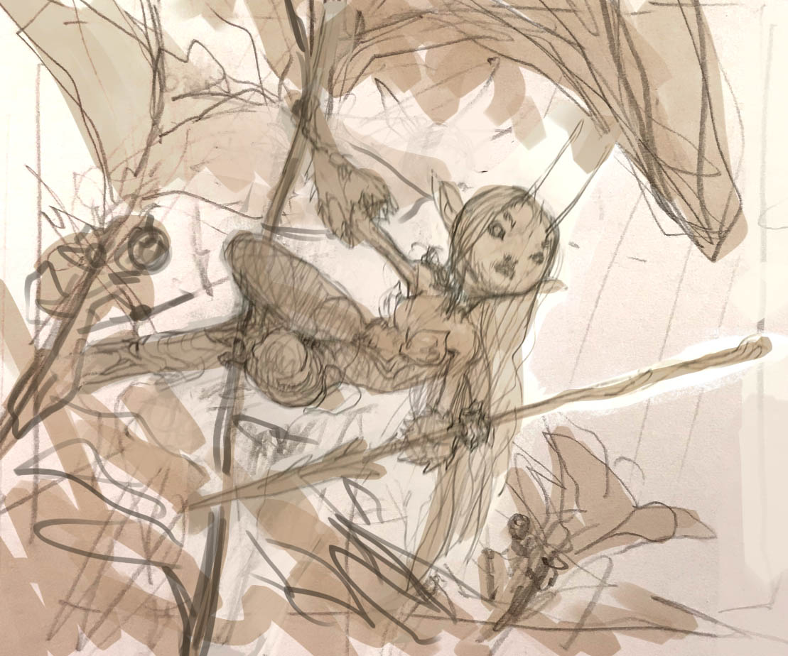
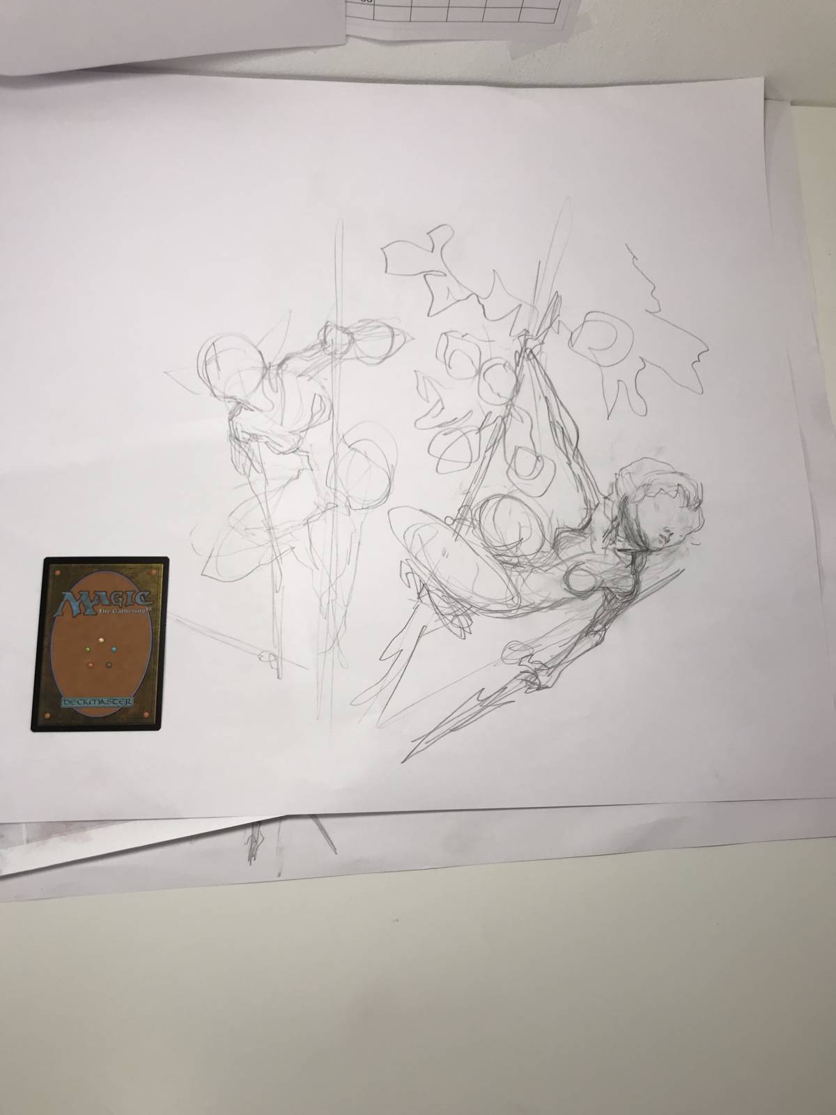
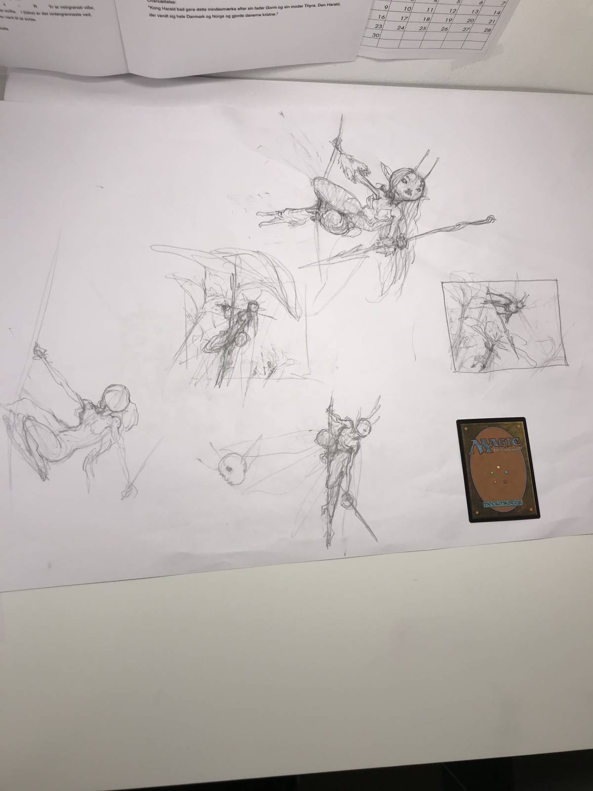
My composition would center around one female fairy hanging ready to take flight. Behind her and underneath every other flower cluster would be yet another fairy hiding but ready to swarm. In the first sketch I liked the pose, but thought the overall look was too cute and cartoony. Too much Little Pony too little Brom. But I liked the rest and I went with the composition. I redrew the fairy and changed the face to be looking straight at us for a better connection with the spectator.
I have to mention that the faeries in this world called Lorwyn is very tiny like small insects. And they have the legs of dragon flies.
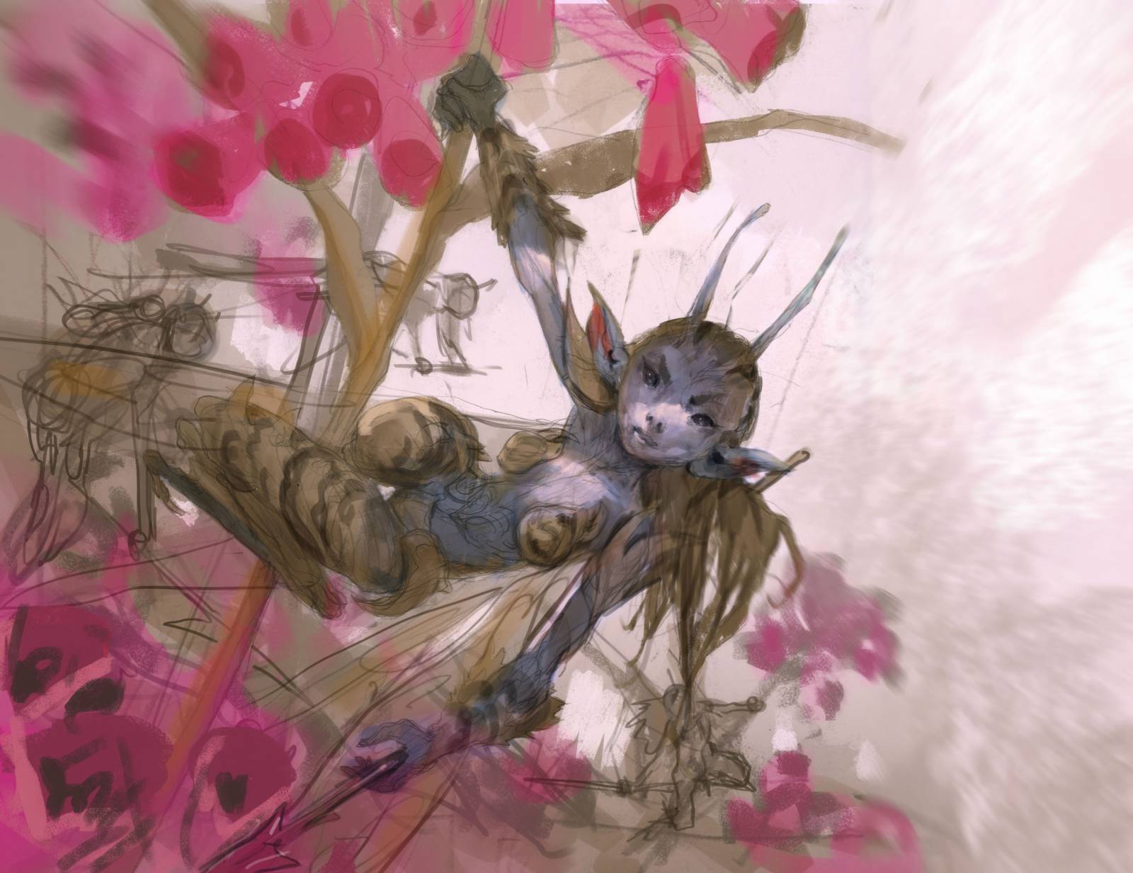
I send the sketch to my art director Taylor Ingvarsson and crossed my fingers that he would like it. He had one comment that I am crateful for. Since the card mechanic is that it puts a Fairy into play every turn, he suggested that I added a small flying faery that has already taken off in the background.
The story line becomes so much better with this little additional faery. Now we see what is about to happen rather than the fairies just hiding there. Oh yeah, he also asked me to make her a little less naked. So I gave her a small corset made out of pinecones to give her size some scale.
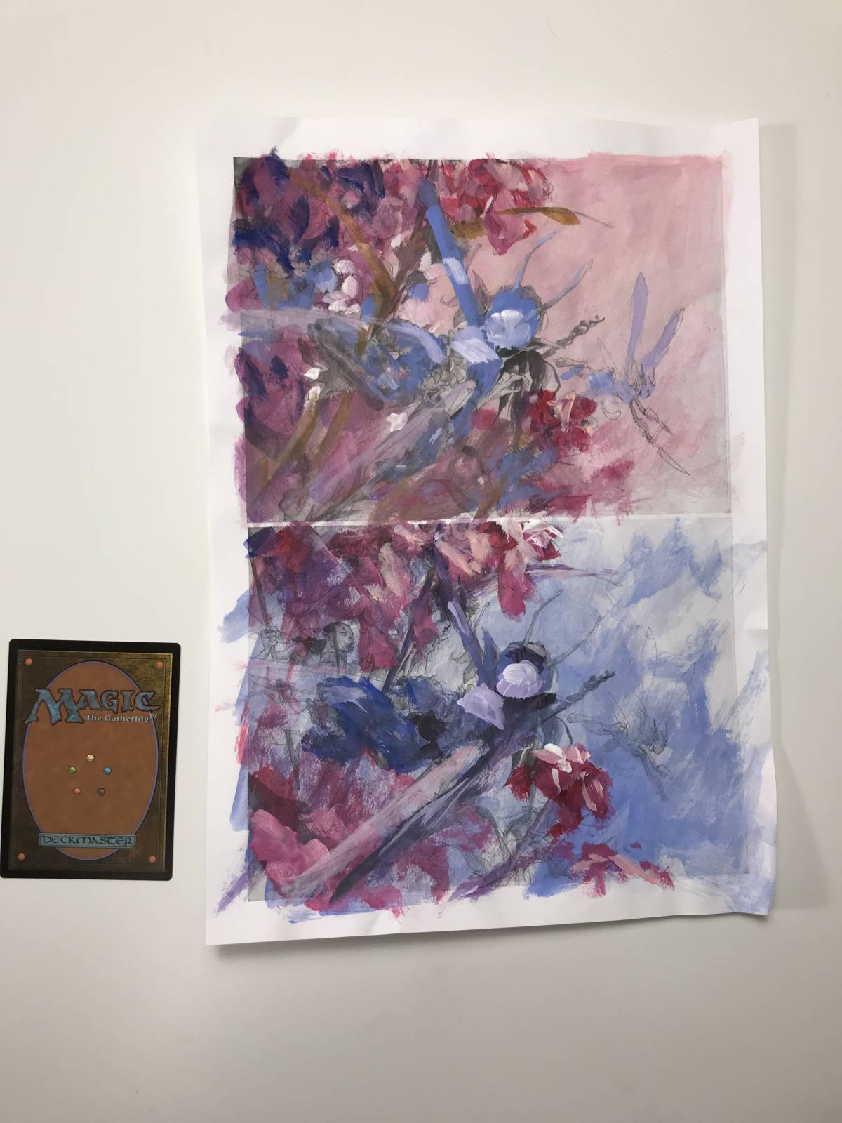
The color comp was almost a given. The faery was going to be very blue in the skin tone, the flowers pink and violet. So the only thing for me to try out for was the background. As you can see I did 2 versions and went with the bottom one for one reason. The blue sky would cut out the figure and allow for better silhouette reading of the flowers. Also this blue Light Magenta Happens to be my third favorite color after Purple and Pink.
The rest of the process is just painting. It is acrylic paint on water color board. I printed out a version of the sketch with just he face, because I wanted that expression she has that seems beautiful but deadly. Like she couldn’t care if you lived or died. The cast shadow that half covers her face was chosen fro the same reason. I wanted the give her that mysterious feeling.

Wow! Great art. So much movement and color in each piece.
OMG, this is one of my favorites, absolutely love the color. GREAT work!
And thanks for sharing the process, it is very inspiring to see your sketches.
I have a few wishes I hope you will talk about in furtur posts, it doesn’t have much to do with this post, but I thought here would be a good place to mention it:)
I have noticed that when ever you make capes, they are so alive and dramatic posed…..how the do you do that? I find it very hard to find good reference for that.
How do you make your digital paintings look so alike your acrylics? Brushes, special techniques etc.
And last but not least, a post about Ejsing armour.
I’m impressed — as I planned to paint something with the same theme and idea (little people and plants. You did a great work here.
great post