
Here’s a caricature of the californian model, Vanessa Lake. I did this picture last year, after several tests. I just wanted to do a picture full of pink.
Vanessa is a great model, she’s got a very interesting face. I used several photo references for her face. Here’s a list of links:
http://www.modelmayhem.com/1135277
http://ispyvanessalake.com/
http://vanessalake.deviantart.com/
https://www.facebook.com/pages/Vanessa-Lake/156046511100024
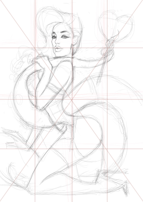
Well, yes, I know, all this lines mean nothing. In fact, I added the composition over the sketch … 😀
Seriously, if you work with a computer, don’t think too much about “lines” (curves are far more important if you paint pin ups). You can easily change your composition, change scales and ratio, erase and retry… Composition is more about training than rules.
The final picture is an A3 format, 300 dpi.

First, as usual, I choosed my background color. This pink color was my background tone and my ambiant light. For the skin, I started with a swath of classical flesh color. For all the gradients, I used the airbrush ( the soft round brush) with very low opacity.
Once again, the more difficult part was to find the good contrast. Once again, the skin looks very plastic (as all the parts of this picture). Once again, I had to cheat a little bit with the volumes…

The hair were an interestig part to paint. Indeed, I’m still trying to find a way to do “cartoon” hair. My good friend David “Loopydave” Dunstan provided me good inspirations.
I added a little bit of pink retro light on the edges. I think it works well and the hair look more plastic that way.
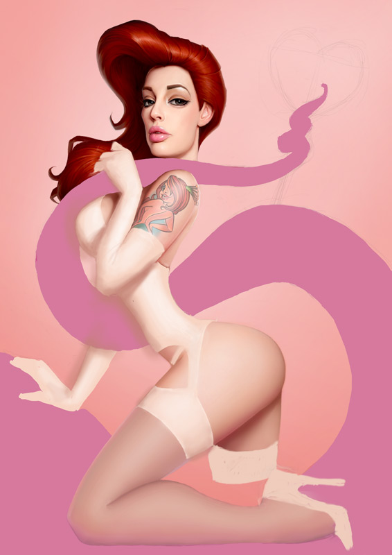
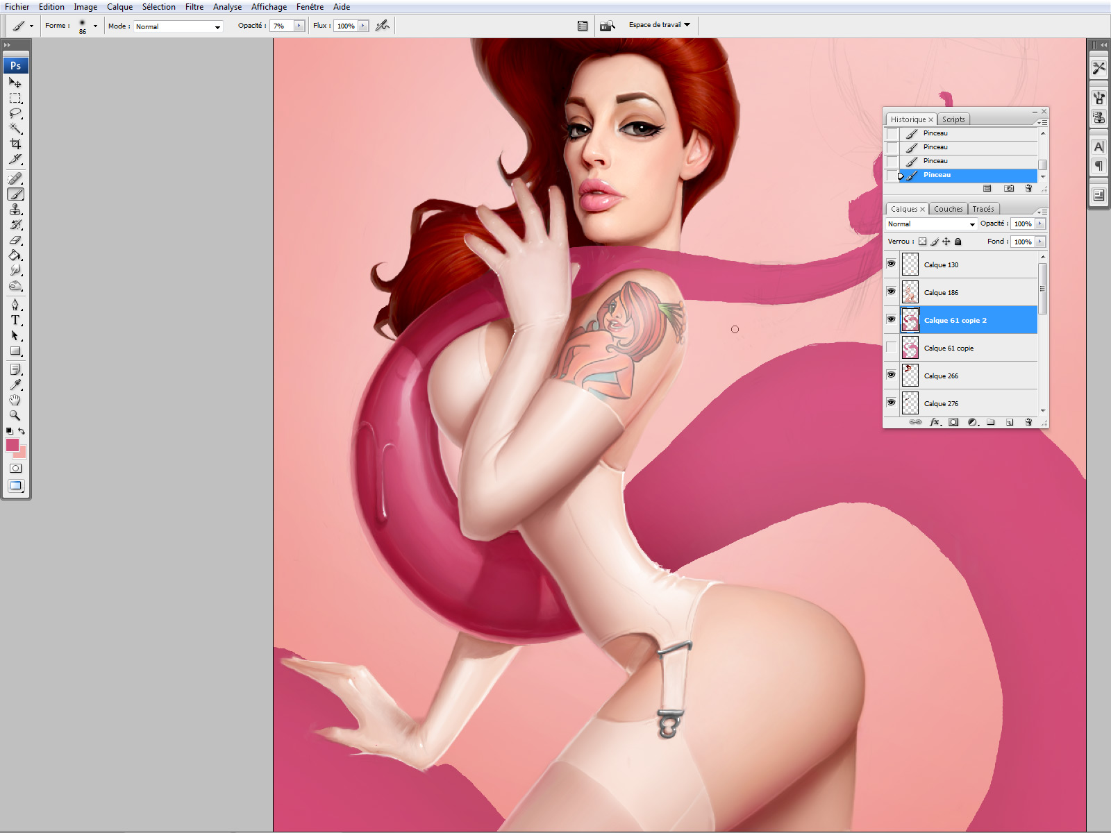
I did the tattoo on the shoulder with a lot of different layers. It would be too long to explain here but I did a small tutorial in order to paint tattoos on my FB page HERE
It’s the real tatto of Vanessa, she provided me references. White latex is not easy to do, it’s very difficult to fnd the good contrast. I finally changed my mind for her left hand. Yes, you have have the right to change your mind whenever you want with softwares :p
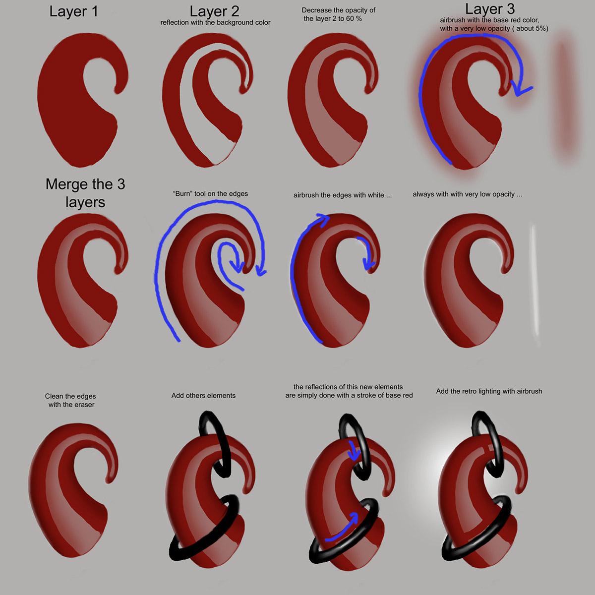
The pink tentacle has to be a little bit transparent and very reflective (like the lollipop). Here’s the method above.
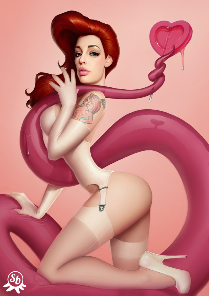
I did very few adjustments on this picture : a little bit of contrast, a little bit of yellow and a very soft gradient on the background. I can’t remember how much time I spent of this one, but less than 20 hours.
It seems Vanessa liked it a lot … Job done 🙂


So you dont do the normal blocking in colour thing first? You pick an area you want to do first and finish it before you move on?
It's certainly a fun piece, but the shadow/reflection of the lolly pop doesn't make logical sense to me. Still very well done though.
hey mnonmymous what dosent make logical sense for you? maybe u are mentally disabled?
Very informative and clear.
A painting either looks good or looks bad. Picking out details and listing small flaws that probably only you see is best left to amateur critics. I trust, Anonymous, that you are above those low folks. You and I both know that sometimes rules are broken to serve the greater vision/composition. For me, I see the whole…and it works well.
So, this piece looks good. Damned good. You and a I can both agree that Serge is a master. Well done, Serge!
If you are going to insult the intelligence of other commenter, you might want to at least try to sound intelligent yourself.
The reflection doesn't make sense, reflections on curved surfaces behave differently than those on flat surfaces and that reflection looks like it's on a flat surface. I don't think that damages the impact of the illustration at all since it's obviously already highly stylized and unrealistic. If the subject can have a torso with no internal organs than reflections don't need to adhere to reality either.
Indeed ^o^
I'm pretty sure he commented on the reflection because the light source for it is coming in a different direction compared to all the other highlights.
No it's not, it's perfect