I used to put my head down and plow through a piece, waiting for it to turn up some magic. Wanting it to be exactly like the picture in my head. The one I saw so clearly.
And it wouldn’t. So I forced it to succumb to my will. I beat on it, rendered it, pounded it into submission. Like a blacksmith creating a sword.
It was agony. This went on for years. Only a few times a year did I get glimpses of that magic. And in those rare pieces, I was able to discern how I got there. I noticed that I had been extremely focused, from concept to completion.
So now it’s your turn. And you step back to look. You try to step outside your skin to see what others see. You have to pretend you don’t know yourself. You have to fool yourself into believing that you are looking at some other person’s artwork. This is hard, man. This is difficult to achieve. It takes……wait for it……practice. Duh. Where have you heard that before?
But there’s hope. Below are questions to help you figure out if your painting is working. Viewers, whether they know it or not, are evaluating your work much the same way. They can’t articulate these questions, but they feel them just as strongly.
Ask yourself these questions about your piece. Analyze and evaluate. The viewer doesn’t know what you meant to do. Only what you showed them.
Line
Do the elements in your piece flow through the rectangle?
Does your eye easily move from the main objects to the minor objects?
Is there a sense of rhythm to the elements?
Depth
Does your painting feel dimensional?
Does it have foreground, middle ground, background?
Does the scene feel staged, from orchestra pit to rear scenic drop?
Area, Space
Does the space that you’ve shown feel designed from side to side, front to back?
Does every square inch feel purposeful and necessary?
Have you described the area with necessary information? Can it have more? Should it be less?

Value
Is there a full range of values from dark to light?
If it’s meant to be mostly light, do you have a tight range of these values?
(same is true for mostly dark pieces)
Does it capture interest by providing contrast between the main passages and the minor passages overall?
Light
Is there interesting light throughout the piece?
Is the light consistent, believable?
If that’s not necessary, have you described the light in ways that create curiosity?
Is the lighting bland?
Have you controlled where the eye looks when the light is revealed to the viewer?
Form & Shape
Do the shapes of all the elements vary across the piece?
Do the folds of clothing, mountain edges, tree shapes, rocks, animals, shift and change?
Are too many elements repeating in the same direction?
If they’re meant to, is there any contrasting element that can help enhance that direction?
Cropping
Is the subject too safe within it’s borders?
Can something crop without losing impression?
Can something crop that would build interest, curiosity?
Have you pushed yourself to crop for impact?
Color
Does the color vary across the spectrum if needed?
Is there contrast between overall dull colors and bits of bright passages?
Can something stand to go brighter? Lots duller?
Does most of the piece need to go more subtle to allow the main subject to command attention?
Point of View
Does the piece reveal a unique point of view?
If the piece is meant to be classic, has your pov given it anything that marks it as unique to you?
Can the piece use a twist, or change of view, or setting?
Change the time of day?
Focus
When you look at the piece, does your eye go directly to the main subject?
Does your eye get confused as to where to look first?
Have you controlled the focus through light? Color? Value? Contrast?
Texture
Is the piece too flat to provide interest?
Are the elements all too smooth? Too rough?
Do the layers have some texture interest?
Can the piece stand to have more texture? Less?
Have you controlled what needs to be textured vs what shouldn’t be?
By now you’ve probably noticed that most of these questions work better if you’ve asked them much, much earlier in the process, i.e., at the thumbnail stage, and the subsequent sketch stage.
Still think painting is magic? It’s only magic when you’ve molded it into magic. And that’s through trial, error, failure, and recommitment.
Don’t wait for it. Go after it.


IMHO, this is your best post on Muddy Colors to date, Greg – insightfull, full of nuances and brilliant sensibility, as only a handfull of artists nowadays could develop on each topic, wich obviously includes you at the top. I need to print this and hang on my studio!!! I guess we all should do it. Bravo, maestro!
Thank you so much Greg!
You have a knack for breaking down these vague/complex/simple/assumed/foggy issues into concise advice. I just “went blind” with an image last night. Having an internal checklist like this will help immensely.
Really great post… thanks! Loved the examples that illustrated your points and would love to see some more of Matti Martinnen's work. Any links we should be aware of?
Though I completely agree with what you've written and am in serious need of following this guide as well as so many others. How does one account for target audience and subjectivity? Despite how we view our work in the grand scheme of things when people view our work I feel as though there may be a set of prerequisites the viewer may have which in the past I was under the impression was control-able by the way we set our piece up. Now I'm not so sure…
This is really inspiring, it actually made my work better!
This is so what I need right now 😀 thanks (and for the awesome examples)
Angela….you know what they say, 'when the student is ready, the post arrives!' LOL!
As-If : )…..funny you should bring this up….again, perfect timing! I've been writing a post on this very topic, and would like to turn it into a 10 Things post. I think I will do this next. It's about audiences. I don't think you'll be surprised about it. As you may have suspected, there are no guarantees….. But it will be helpful. In fact, I dare say it may clarify some thoughts for you.
This is a great post! It's a good reminder that wonderful spontaneous-looking painting is, barring happy accidents, planned to some degree. It's something we all need to be reminded of, I think. It reminds me of the well-known fact that John Singer Sargent advocated making countless studies before progressing to the final image, keeping these various aspects in mind all the while. Thanks!
Thanks, Karl! But planned to GREAT degree. HUGE degree. Complex paintings need to be planned and planned. That's kinda obvious. You can do stream-of-consciousness paintings, and that's valid, too, I think. But the best of those come out of a long bunch of years painting.
Design paintings. Plan them to be spontaneous. I do that, too. In fact it recently took a few days before I could paint the current piece I'm working on because I didn't have it completely painted in my head yet.
But practicing, rehearsal, like that will give you the skills to do things spontaneously that will surprise you. It is like anything else. A musician practices. Why is it that artists aren't allowed?
That's bogus.
There are a wide range of painting approaches. But if you are beginning to paint seriously, and by that I mean to earn a living by it, then planning is critical, and planning will develop your skills faster than others who refuse to understand that skills are built, and THEN owned. Not given.
Great tips for anyone. I do think of this all the time and sadly, sometimes in the battle of working with a project's perimeters, the battle can't be won on all fronts. But for sure, the more of those items on you checklist that are followed, the better the piece
Great tips for anyone. I do think of this all the time and sadly, sometimes in the battle of working with a project's perimeters, the battle can't be won on all fronts. But for sure, the more of those items on you checklist that are followed, the better the piece
Fantastic post… Can't wait to use this checklist next time I get frustrated! Thanks!!
This was a great post. Saving it to use the checklists as I plan future paintings. Thank you!
Haunting last words there, Mr. Manchess.
I'm off to do battle with my paints and pencils!
Thank you for the post, 'twas a very good one.
I did forget to mention that the list is helpful for most points, but hitting them all is not always necessary in one piece. There were counter examples I had for each item, but thought that might be confusing.
For example, sometimes a painting just needs to be monochromatic, so a range of color isn't necessary, and so forth.
fantastic post Greg!
Great post, thanks!
Amazing post! Muddy s my online School!
Kind of needed this. Been feeling a wall lately. I also appreciate all of the examples to go along with it, thanks.
I have also been needing this. Thank you for sharing your expertise!
This was an amazing breakdown thank you very much Mr. Manchess!
That is what is rly lovely about teh digital media- it yet, once more, combines it all – complex painting and stream-of-consciousness painting. You can never make a mistake that cannot be fixed with the click of a button…it is jsut perfect for those hysterical, overexited guys like myself. Great post btw, I must say that your “top 10 posts” are the essence of MC
PS: The anti-bt thing made me type Hamlet…how cool is that 😛
infact, there is 11 things in your article Greg 😉 Anyway, thank you for your very helpful advices.
LOL! Yes, a bonus point, kiemtong! Sometimes I only get to 9 points, other times 10. It's just a general way to say “list.” But I always shoot for 10….
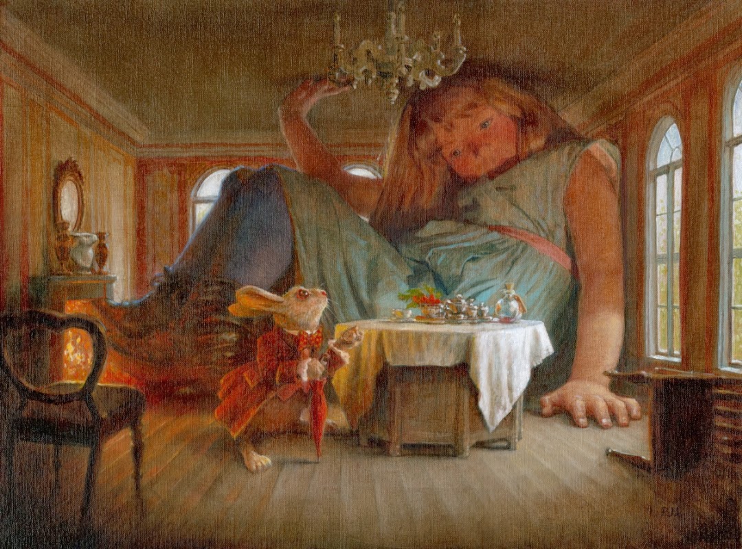
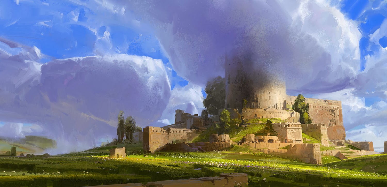
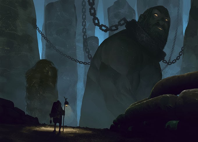
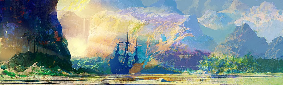
Great post, so many good reminders and revelations along the way. I love all the images you used too. Inspiring. Thanks Greg! Every day, something great here. Like creative jet fuel for my soul. I love this site.
Brilliant and pertinent, as usual. Thank you, Mr Manchess.
Post of the Year 2014: Nominee
Absolutely amazing. Thanks so much for the many hints. I am very new to painting, but can't get enough of it. Currently doing a Bachelor of Fine Arts and Visual Culture, so hoping I will learn heaps.
Cheers
You can check out my website if you are interested. I've just been painting from photos, so need to find my passion. http://angelinelily20000.com/
Very helpful! Thank you for taking the time to share these thoughts. I completely agree and look forward to creating my next piece and asking myself these questions. Thanks for making this fantastic blog!
Awesome!!!!!
I was thinkink about putting together a list of important stuff to watch for, while making a picture.
Now I have it, thank you 🙂
Angela…you may be interested in my next '10 Things…' because it's about finding your voice and your audience! : )
Thank you so much! It is very helpful!
Nice examples of each technique value.
Thank you so much for the tips, true inspiring!
Your wonderful insights remind me of how I edit written work…especially my own. I have to tear it apart, look for flaws and inconsistencies – blandness, overused, trite expressions, etc. I have to step away from the ego-driven pride I have in what I write to make it better. Same with my art. Thanks for the pointers!
Thanks a lot Greg! I first read your 10 things and your one single piece made so many things clear in my head. I wish you knew how it feel when one is at the receiving end of your writing. I am a fan! You are truly a sensitive thinker, who can clearly understand delicate patterns and express them unambiguously. To top it all you have been dead honest! Thanks for writing so beautifully
oh my please edit the original article and add this piece of information, I thought I should be striving for all if not most of these in one painting, good thing I read the comments and found this comment. thanks!