 |
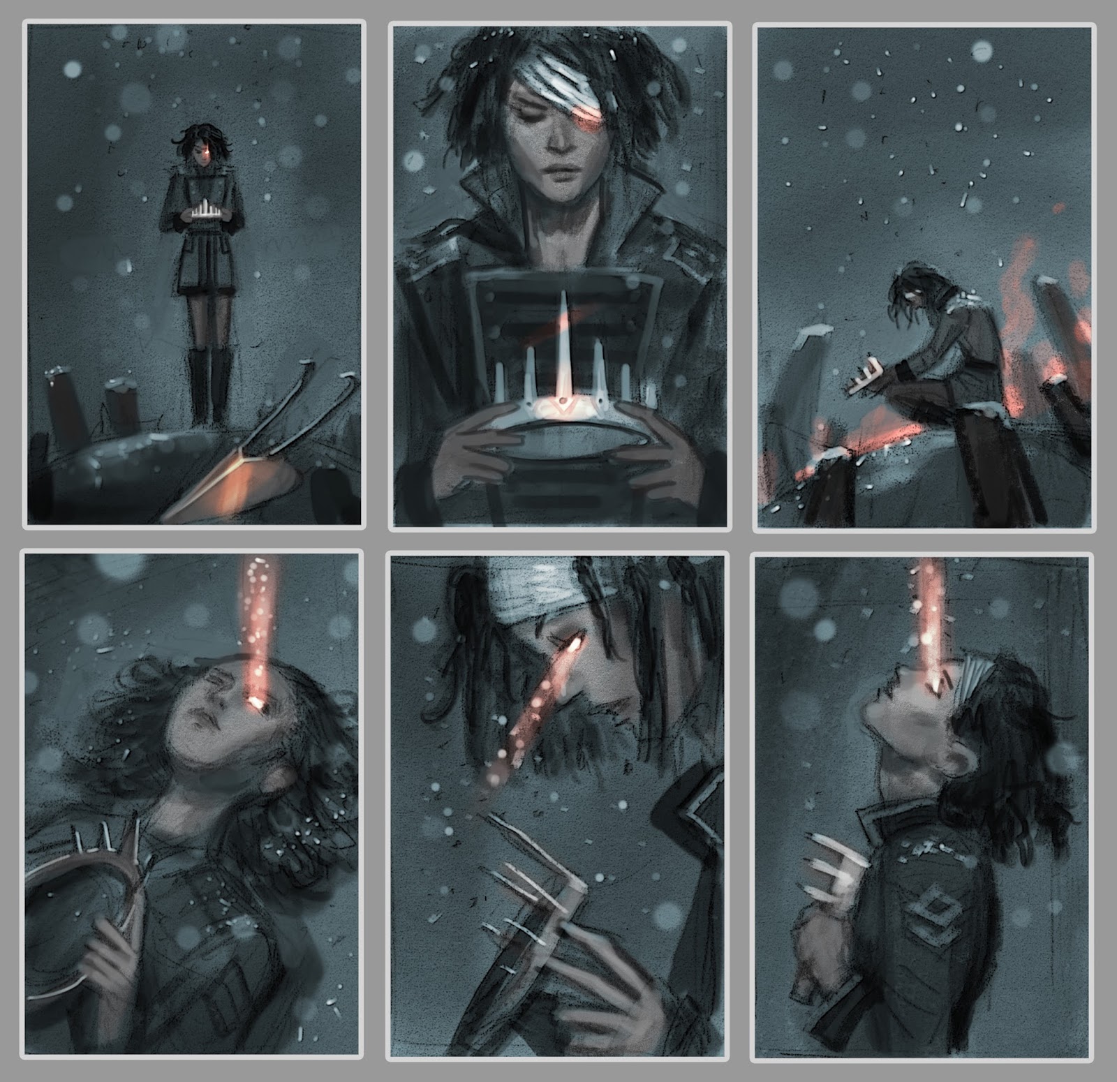
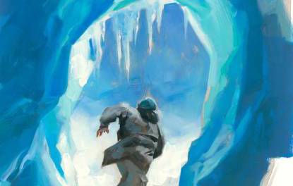
| Actual thumbnails submitted to a client for concept approval. |
In this post, I’d like to demonstrate my process for sketching concepts for a client. I’m not talking about sketching with the intent of making a beautiful drawing, where line weight and texture matter. Nor am I talking about making a realistic one. I’m talking about sketching very rough concepts that quickly convey your idea to a client. In essence, these are just elaborate thumbnails.
It seems to me that a lot of students have trouble sketching thumbnails. They either don’t spend enough time on them, or often times skip the phase entirely. The result is, they spend even more time repeatedly revising a painting that was flawed from the start, when a much better option was just a few scribblings away. Part of me suspects they either don’t realize the importance of this phase, or avoid it because they simply do not know how to approach it.
Sketching thumbnails should be fun, and easy. There are as many approaches to doing it as there are artists. My method is just one of them, and by no means the best solution. I’m sharing an approach that works for me, in the hopes that it will demystify the process for some of you.
I used to do all of my sketching in pencil, but found that I drew too linearly when I did so, almost comicbook-like. For some styles, that’s fine. But because I paint realistically, and there are no actual ‘lines’ in my finished works, I found it to be an ineffective method. Things that looked really good in my sketch fell flat in the final because they did not have the strong impact of a line holding it all together.
Instead, I now do all my sketching digitally. This allows me to ‘paint’ my sketches. Amorphous blobs of grey gradually come together to reveal forms and space. This translates a LOT easier to my painting style.
The choice to sketch digitally is personal preference due to my own habits. You may not have the same problems with pencil that I do, and may find better success drawing traditionally. That’s fine. The medium here is absolutely irrelevant. It’s the approach that matters.
In an earlier post, I talked about Value Structure, and how by simplifying your composition into 3 or 4 basic values helps increase legibility, and creates a more believable sense of depth. This method is not something you just implement at the end of painting. It is, in fact, how I start all of my compositions.
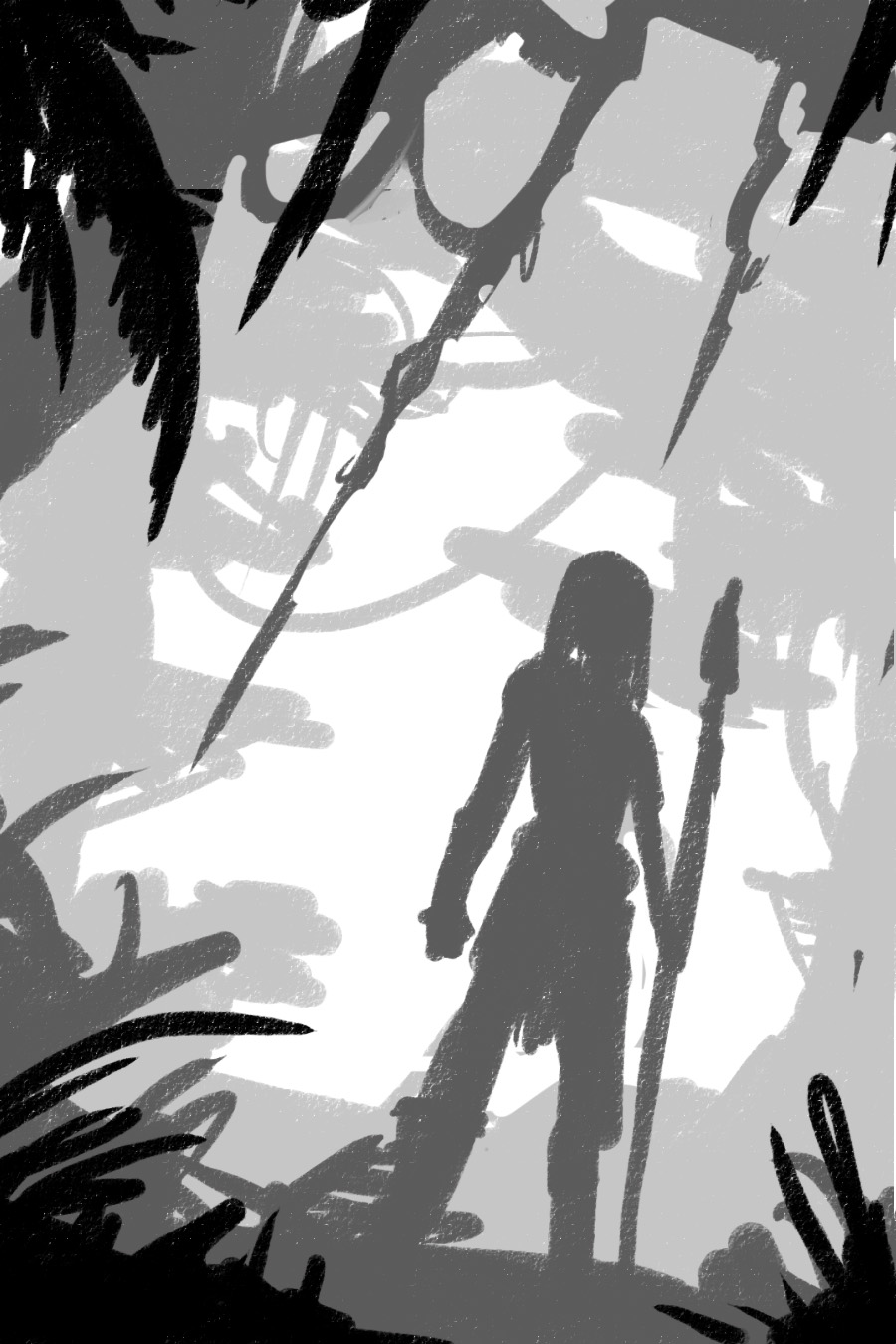
Let’s begin by taking 4 simple values… white, near white, near black, and black. By eliminating a true midtone, I force myself to make everything in my composition either light or shadow. This makes for stronger, more striking compositions.
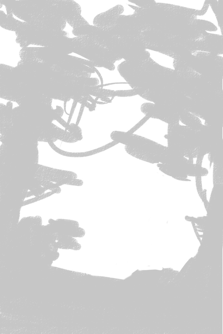
I am going to start with the white of the canvas, and gradually build upon that.

Let’s add in some near whites. This part is very experimental, just reckless scribbling, until I find something appealing.
Now onto the near blacks. Again, this is just stream of consciousness scribbling until I stumble across something nice.
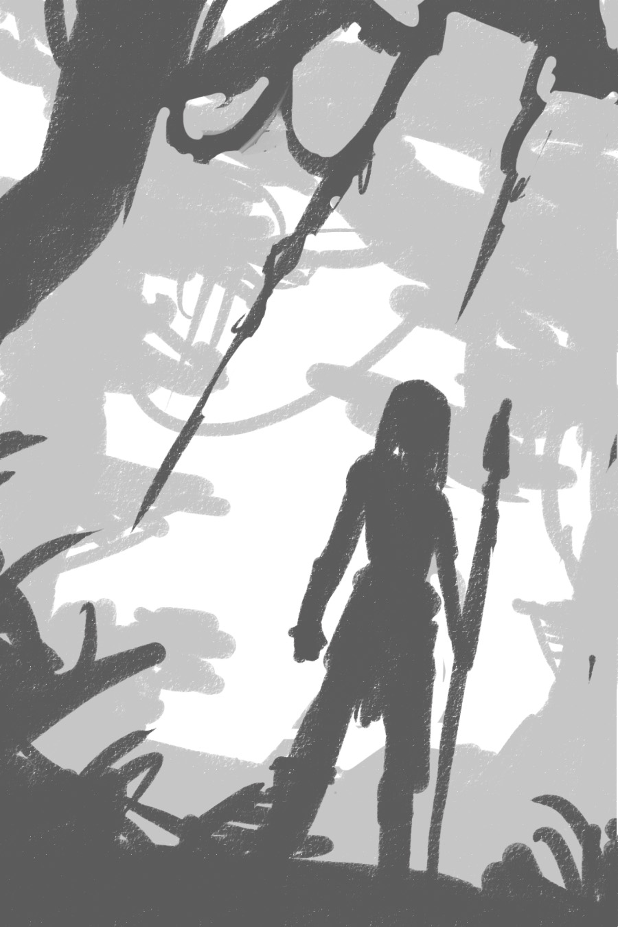
Already you can see that the sketch has depth and a strong silhouette. In just 30 seconds, and only three values, I managed to create a fairly legible composition. Let’s keep going and add some blacks.
At this point, you can stop.
Seriously, that’s it.
This is as detailed as your thumbnails ever need to be. After this, everything else is just embellishment. If your composition isn’t working at this point, all the details in the world aren’t going to make it any better. If your composition isn’t good enough for you, do another.. and another… and another! You can easily bang out 20 of these in an hour, and I encourage you to do so.
Thumbnails… easy-peasy, right?
So what happens if you do like the thumbnail? Sketching always seems to be some personal form of hieroglyphs for me, and even though I may understand what’s going on, someone else may not. So if I decide to submit this composition to a client, I need to refine it a bit further still.
Let’s start by scribbling in some details, so people can tell what all this junk actually is.
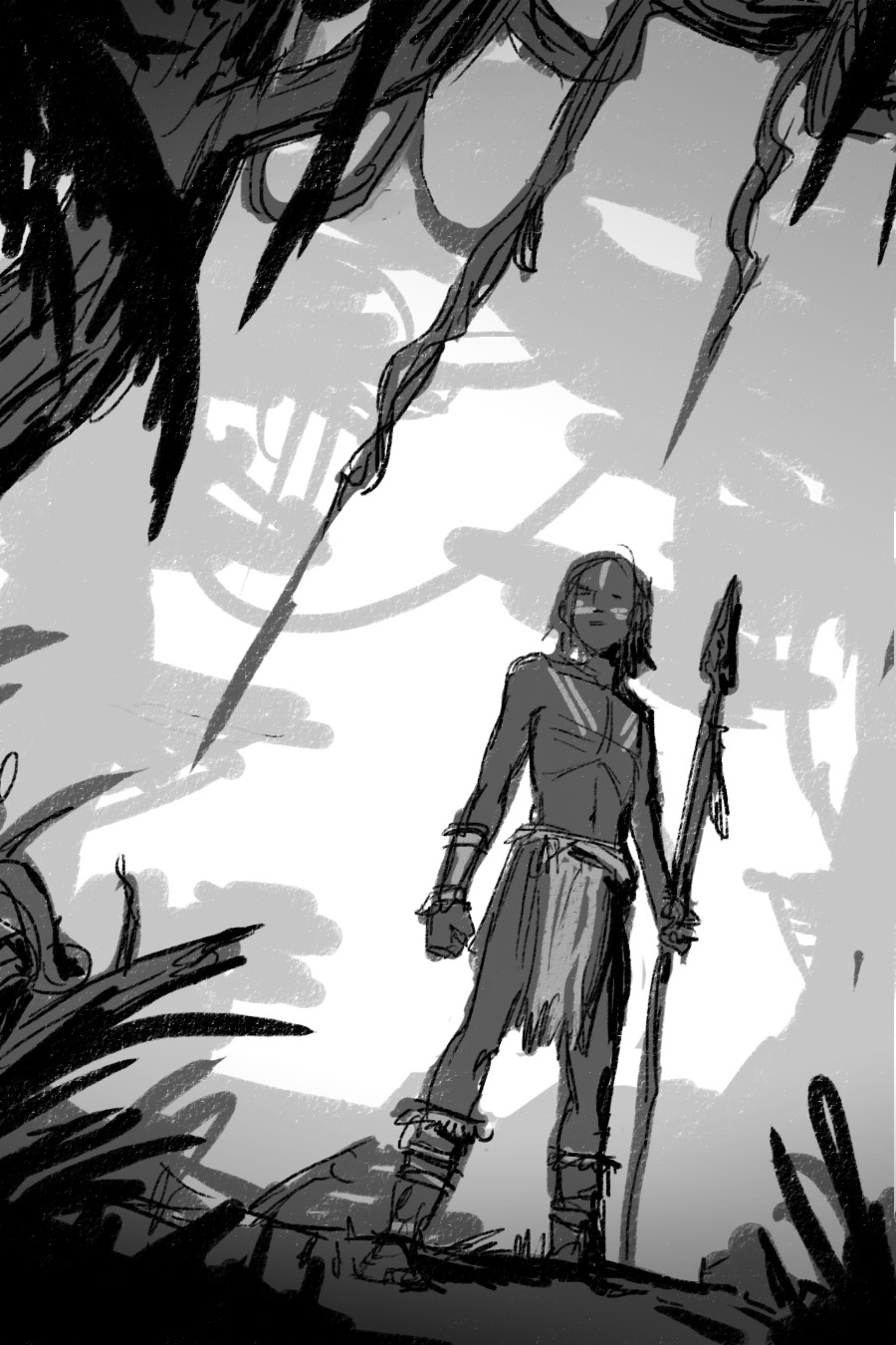
Since I started the composition with such a strong value structure, I can easily add gradients and details on top of that, without fear of losing the impact of the piece. This strong value structure will also prevail if I decide to add color to my sketch.
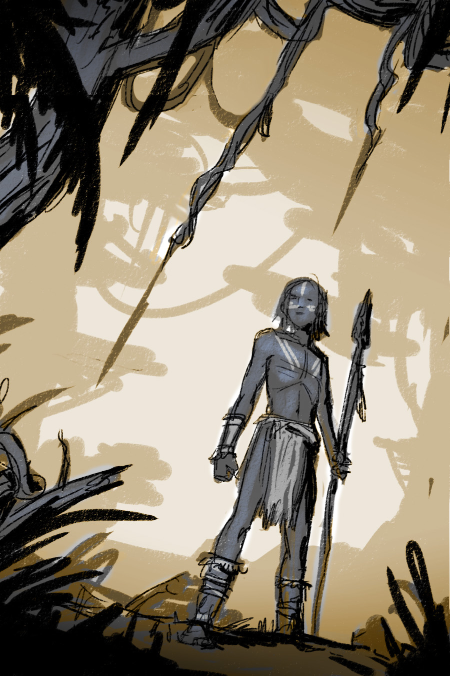
Remember that previous post about Temperature Structure? Well, let’s implement it! The idea is no different than value structure. Let’s place some warm, near warm, near cool, and cool tones on top of this sketch. The values are still doing all the work, but the temperature shift just pushes their effect even further.
Let’s add a few more details, some highlights to snazz it up… and voila!
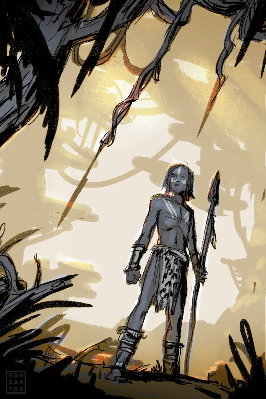
It’s still pretty sloppy, but honestly this is usually about as detailed as my finished sketches get. I tend to submit 3 or 4 sketches like this for my clients to choose from. If I really want to impress them, I may go in and refine things a bit a further, but it’s really not necessary. A good Art Director knows what to expect from his/her Illustrator, and should be able to envision what the finish product will look like.
So that’s it.
The next time you’re working on a new composition, challenge yourself to do as many rough sketches as possible, at least 20. And remember to be fearless! There is no need to refine and be precious about every little step. In the time you spend fussing with one bad thumbnail, you could have done 3 more!
I tend to think of it like panning for gold. You have to sift through a whole lot of crap before you find that one sparkling nugget that makes it all worth it!


This post is right on the money for me. One question I have is this: how well does this loose compositional stuff work when it comes to working within specific parameters? For example, I do a lot of card illustrations where the brief tends to be pretty specific about what needs to be in the composition. Do you find that this method of working is adaptable to those situations, and how do you adapt it?
Thanks for encapsulating the process.
I do find myself reaching for the finished work even before putting pencil to paper. Holding personal enthusiasm back and looking at a likely illustration from a greater distance, utilizing these helpful “tools” like you outlined in your post above and elsewhere, helps to keep my endurance toward actually finishing instead of walking away frustrated.
Thanks
I have a lot of similar clients as well. In those cases, I won’t show them these sketches… but I still do them. Instead, I pick my personal favorite from a few loose ones, and choose 1 or 2 to really render out.
lol. I know the feeling! Even when painting, I often want to jump right to my favorite parts. Instead, I force myself to save those for last. You’ll find you’re a lot more open to change, and inspiration, when you’re not overly committed to some finished part of your painting that you fell in love with too early.
My biggest struggle with thumbnailing is deciding the size of it. I usually have a clear image in my head of what I want from the start, and the small thumb is in a way preventing me from seeing it clearly – it then makes me avoid the process.
I have started doing rough pencil sketches about the size of 4×6′ and found it work a lot better for me. It gives me enough size to go more detailed if I get a sketch I’m happy with. It is a fun process I really enjoy, but it is no where near “30 second sketches”.
Thanks for a great post!
This is probably pretty similar to Jake’s question, but I would be interested to hear what you would do in the case of a very constrained brief, like the details in the brief essentially demand the artist draw the same “camera location”. For the thumbnails on those kinds of briefs, I always end up just doing slight variations of poses and trying to mush around background objects, neither of which dramatically affect the composition or read of the thumbnail. It’s unfortunate because often I feel like I’m forced into a mediocre composition (or it’s just naivete) because it’s demanded I have certain details in the composition that I can’t just “fake” in there, i.e. “We need to see the whole body of this character, and this character has to do this action but needs to be looking at us, and this thing in the background should be back there and behind that you need to see this other thing, and these guys need to be coming in from the right side and…” At a certain point, it feels like the art director should just provide a thumbnail for us to derive the best possible composition. I think it stems from the creative director getting really married to some minutiae they see in their head but really makes it hard for the artist to do a compelling composition that is not static, dumbed down, or cliche. I have a feeling this is more common in things like RPG illu than book covers (though I don’t imagine you always have too much more freedom, either :P)
Thanks for your time, Dan!
Great post, Dan. I especially love the 4 tone approach–why didn’t I think of that! It addresses all the problems I see most often with people’s thumbnails in my class: value control, compositional depth, and silhouettes. Time to start hawking an anti-line approach.
“A good Art Director knows what to expect from his/her Illustrator, and should be able to envision what the finish product will look like.”
Most important sentence in the whole post.
I have only had one such AD, I tend to make my thumbs the level of your finished sketch and then refine it for another hour before sending it out to a client due to them not being able to envision the finished product. In my experience the size of a company has no impact on what level their AD’s are at, better safe than sorry.
I’m in school right now and I’ve always struggled with my thumbs. I think I’ve been approaching it wrong and I’m going to try this for a while and see if it works better for me. Thanks!!!!
What does happen when I have a big volume highly contrasting? Should I sketch it with an average value or should I split it in dark and light parts? In the first case I’ll have an approximate value study, in the second one I’ll have an unclear sketch (and I’m not sure i can do it without line guides)
Marco, I don’t understand your question. Perhaps re-phrase it for me again?
Are you are asking what to do if your figure (or whatever subject) has high contrast lighting, or is wearing high contrast clothing?
These 4 values do not necessarily need to be separated by depth liek I showed here. That just happened to be the case for this drawing. Those values could be structured so that the white and black were on a face, and the mid tones are all in the background. There is an infinite number of arrangements.
That’s a tough question. Some clients are incredibly difficult. But what separates a good illustrator from a great one is their ability to turn that awful idea into good picture.
I’ve gotten a lot of game cards that I thought were impossible to turn into a nice image. Like a picture of boots or something. How do you make boots exciting? I’ve passed those cards on to other artists, only to see them knock it out of the park.
It’s made me realize that it’s usually ME that’s stopping a piece from being great, not the AD.
I mean high contrast lighting. Well, you answered me. If I want to paint an huge elephant – who cover the 70% of my canvas – under high contrast lighting I can use black and white and not just one value. Thank you Dan for this post and for your answer, I’ll experiment this.
How I wish Muddy Colors had been around while I was in school!
Great post, Dan. Thank you!
Great post, thanks! If folks don’t want to do this digitally, you can get similar results using Copic markers. Digital is my preferred method, though, because if I stumble upon a background I like, I can use layers to swap out mid and foreground elements.
I can only echo Megan Johnson in wishing you were about when I was at school. Thanks for thaking the time to teach this.
Dan, this is honestly the most insightful post about thumbnails I think I’ve ever read. Seriously. Thanks so much for sharing, you’ve given me a kick in the butt on getting those concepts down.
Very intersting approach. Like of you deal with value and tones.
Thanks for sharing once again.
-Pit-
_____
cours de dessin
Thank you for this Dan! This approach is amazing. Thanks again.
Guau!!! Eureka! thanks for your explanation … is super practical!
Dan did you already have a basic idea in your head before you started this process, like for instance, did you know you wanted a character in a jungle, but you used this method to work it out tonally and composition-ally, or was this how you found you idea as well
Usually I’ll have some sort of idea of what I need to draw, since I am usually painting for a specific cover. In this particular instance, I had absolutely no idea what I was going to draw.
Thank you Dan, coming up with the right idea / composition is what comes hardest for me in paicture making. Like many others I want to have the picture figured out quickly = fewest number of sketches as is possible. Your advice of doing many sketches with minimal detail is the advice that I needed. Thank You!
This approach is amazing cheap logo desgin services
Great advise im currently working on a graphic novel and im doing rough sketches im doing them the way im used to: i split my a3 page into 6 and get a rough idea for the page. My writer has seen the first ones and has gone balistic that the boxes im using as pages arent the right ratio. Now i know i can fit whats on the box into proper scale but he said : if you dont do the boxes in the proper scale im not doing this with you. Whats your advice? Ive tried explaining but he doesnt listen have you had this experience?
Very good, thanks for putting this article together!
This 4-value and 4-temperature approach could be a big time saver, as well as being a path to better final works. Haven’t tried it yet, but it seems extremely versatile.
I’ve always struggled with thumbnails, so this provides some great insight. Thanks!
My pleasure, Nico. I think the ‘four value’ tends to really simplify the thought process for me in much the same way a Zorn palette simplifies painting. When there are so few choices available, it’s a lot easier to find the solution to a particular problem.
Thanks, Hena. Glad it helped!
Perfect, Dan!
Super helpful post about thumbnails – I’m trying to put your suggestions to work right now!
This is a little off-topic, but I’m wondering what kind of lighting you use while you paint. I’m thinking of moving from digital to oil (I’m an experienced painter), but I won’t be able to use natural light. Do you keep a lamp on your easel? If so, what type of bulb do you use? Or do you just use ambient room lighting? I really appreciate any input you can give and thanks in advance!
Hi Dan, How do you make boots exciting? I’ve passed those cards on to other artists, only to see them knock it out of the park. I have only had one such AD, I tend to make my thumbs the level of your finished sketch and then refine it for another hour before sending it out to a client due to them not being able to envision the finished product.
Recommend some useful AI tools to improve work efficiency. Come and try them
Kontext Image:https://www.kontextimg.com
Wan 2.1 AI Video Generator:https://www.vidorai.com
ParkMaker Pro:https://www.southparkai.com
Mermaid AI Generator:https://www.mermaigen.com
Seedance pro:https://www.seedancepro.com