I graduated with from the Graphic Design department of SVA 18 years ago, and I have been working in book covers for 18.5 years – the extra half-year I owe to James Victore, who kicked me out of his portfolio class after Christmas break in order to find a job, and Adam Wahler, another teacher who happened to know St. Martins Press was hiring a junior designer. So my last 6 months of school I also worked full time. That’s a story for another time. The point is, I’ve spent my entire professional career in book covers, and I’ve absorbed/studied a lot of the history of book design.
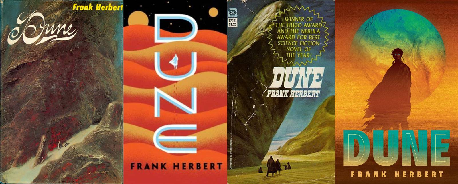
One of my favorite ways to visualize how much book cover design has changed over the years is to track one classic book that tends to get redesigned every few years and see how the designs have evolved. Honestly the entire Penguin Classics imprint survives on this as an entire business model. There have been entire academic studies and books published on the design history of books like Lolita. But this is a SciFi Fantasy Art blog and it just so happens that the new Dune trailer finally came out today, so we’re going to be looking at the last few decades of book cover design through the lens of Dune by Frank Herbert.
First, enjoy this glorious trailer (and I can’t embed it but I actually recommend the launch video on twitter with director & cast where they show some of the art and development for extra geek points):
Full disclosure: Dune is, not incidentally, one of (if not the) most important book series to me as a SFF fan and person in general. So forgive me for gushing a bit. Now, on to the book versions!
Pre-Book History
The stories that would become Dune were first serialized in Analog Magazine starting in December 1963. John Schoenherr was commissioned on August 7, 1963 (great backstory on the blog kept by his son Ian Schoenherr here) to create images for the covers and interiors for “Dune World” 1, 2, and 3.
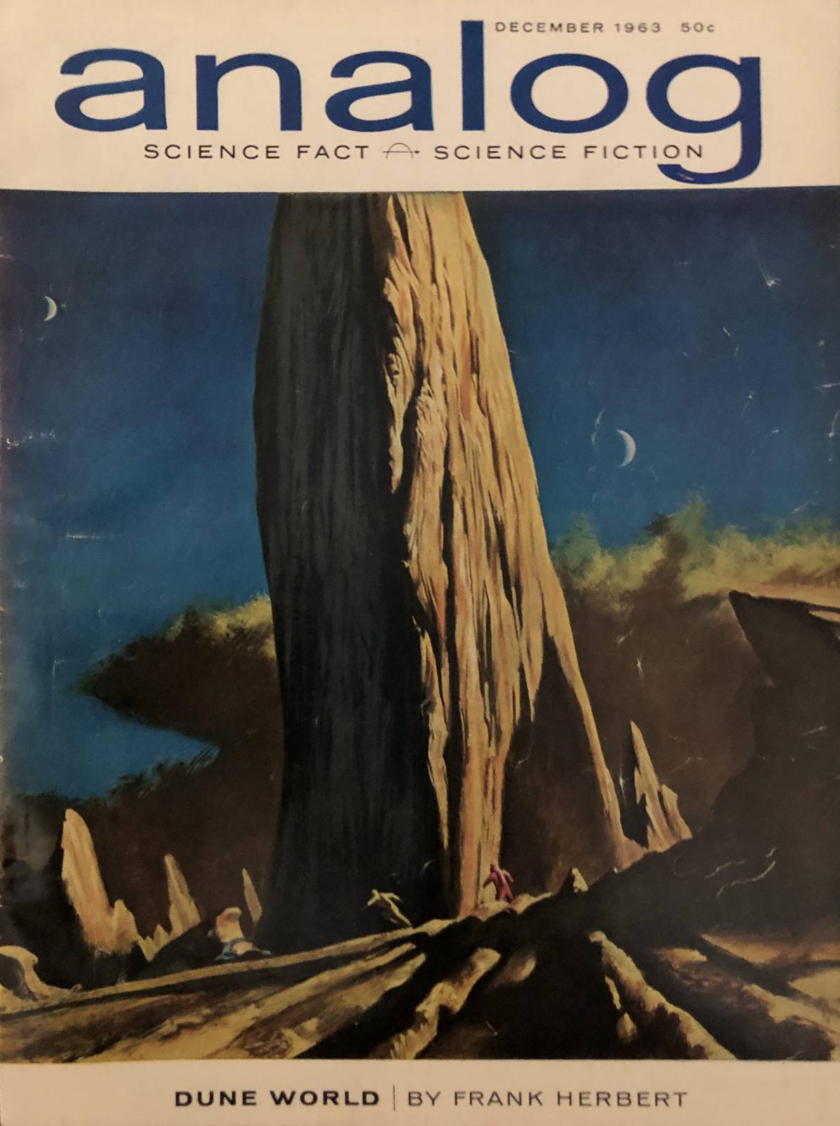
Here you go, the very first piece of Dune art ever published, by John Schoenherr for Analog Magazine, Dec 1963
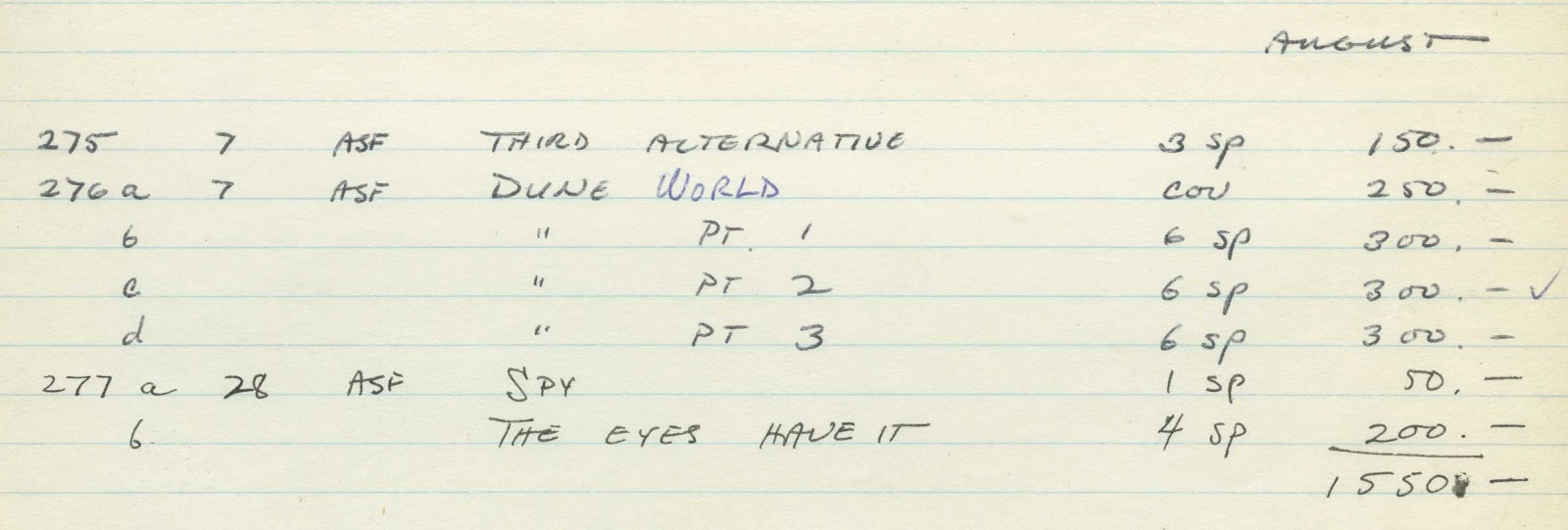
I love an artist that keeps great notes
The stories were serialized over time thru 9 issues, with Schoenherr doing the covers and interior illustrations. Keep an eye on that last cover illustration, because it’s about to pop back up in a second.


Now magazine covers and book covers are different animals. They may appeal to the same audience, but dealing with a masthead above an illustration is very different from dealing with title and author type that needs to go on top of an illustration. Frank Herbert loved Schoenherr’s art, and said “Frequently, I have to ask myself if the artist was actually illustrating the story his work accompanied. Not so with John Schoenherr. His December cover caught with tremendous power and beauty the “Dune mood” I struggled so hard to create. It’s one of the few such works of which I’d like to have the original.”
First Edition
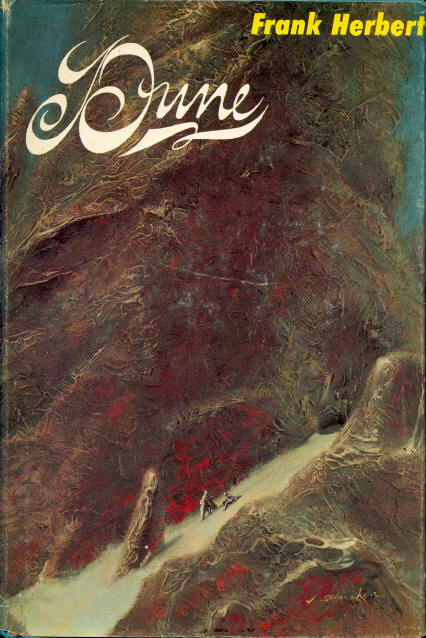
I’m not going to deviate from the art path here too much, because I’m a big Dune geek and we’ll be here for a year. If you’re interested Herbert’s biography Dreamer of Dune is really interesting (his background was political journalism, not fiction, and it shows). Suffice to say, the Dune serializations were very popular, but the book was still rejected 23 times before it was picked up by a tiny publisher of mostly car manuals called Chilton Publishing. (Science Fiction was definitely not the pop culture powerhouse it is today.) I don’t know the story of how the cover became the cover, but knowing it was a very small publisher and there was already a body of art that fans would recognize and the author loved, picking one of the Analog covers for the hardcover jacket is a no brainer.
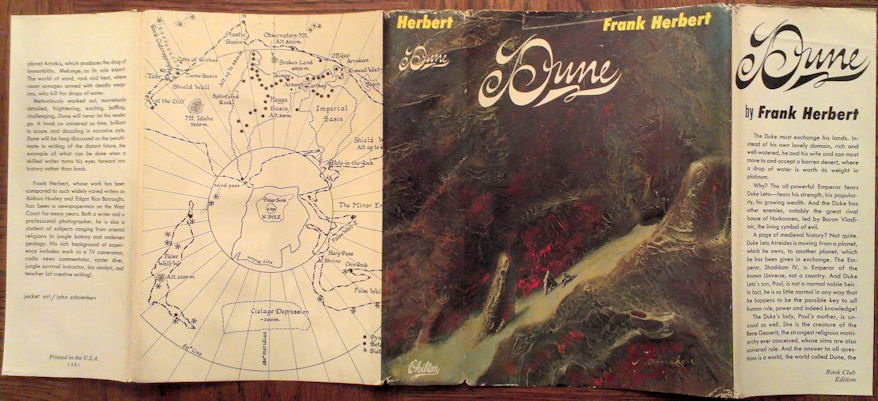
I definitely want to bring back the trend of using the maps on the jacket sometimes too…though today back covers are so full of pull quotes I’m not sure I’d ever get that past editorial.
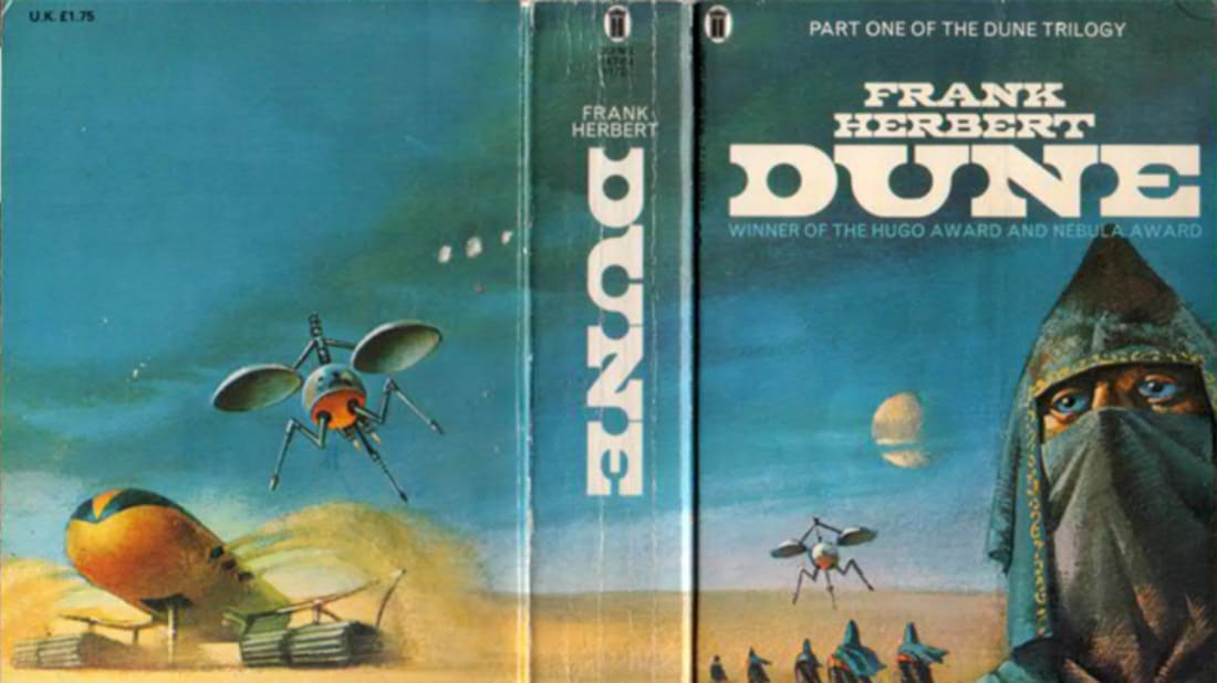
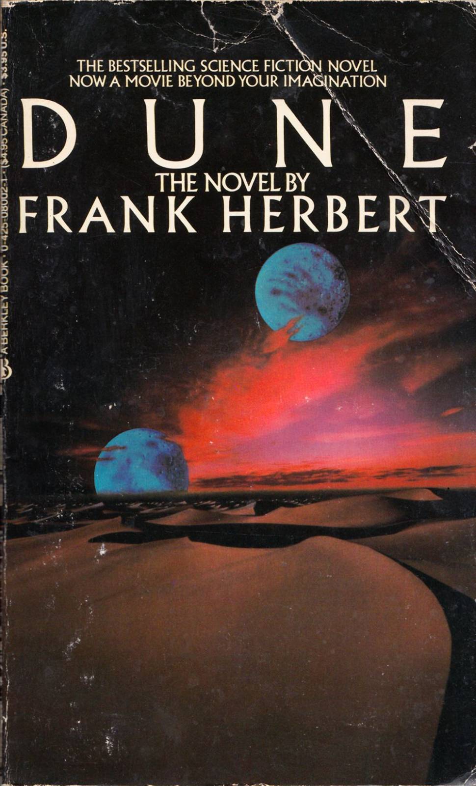
However, notice that they picked a piece of art with nary a sandworm in sight. Again, I don’t know what the discussions were at the time, but SFF was very much looked down upon and always relegated to small paperback formats. This was a book that wanted to be taken seriously. It was a hardcover. That was pretty much unheard of at the time for a new SFF book. If you look at this cover without knowing anything about it, would you really know it was necessarily an alien planet? The landscape could be earth. The figures are too tiny to see stilsuits. The type is more reminiscent of sand than anything we’d think of as science fiction. They are deliberately trying to distance themselves from what the standard pulpy SFF covers looked like at the time. These are all decisions that say “take me more seriously than the disposable paperbacks you geeks have been reading” and it worked. It was a huge bestseller pretty much as soon as it came out in 1965. It won the very first Nebula Award, and won the Hugo Award.
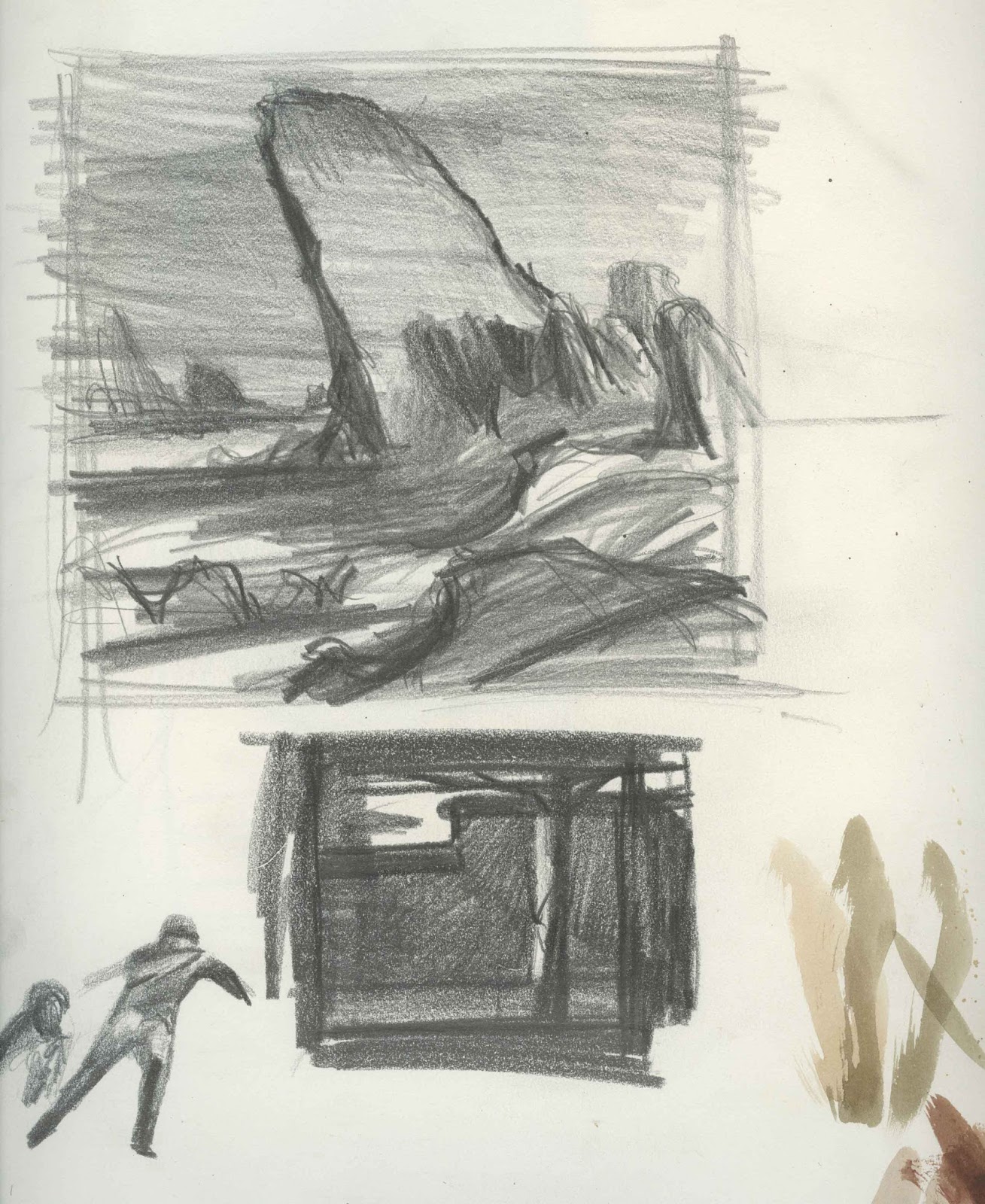
We even have the sketchbook pages where Schoenherr was working out the Dune thumbnails
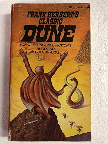
First Paperback Edition
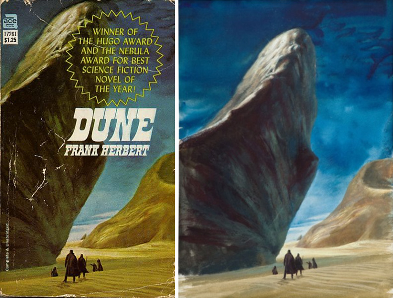
Now by the time the first paperback edition rolled around Dune was already a known hit. I’m sure Herbert got very different receptions at publishers then. He decided to go with Ace, one of the bigger paperback publishers at the time, who had a deep backlist of SFF titles. They had Schoenherr create new art, which made sense, as his art had become so closely tied with the work. An early case of very strong author visual branding we use today. When you manage a great author/artist pairing it’s exponentially powerful. There’s a lot of examples thru SFF history, but keeping close to home just consider Patricia Brigg’s books without Dan Dos Santos’s art. What’s interesting to note here is they really just ask Schoenherr to recreate his own piece, but (no offense) dumb it down a little for paperback. The forms are simpler, the colors brighter, the textures simpler. You can see the characters much more easily. It still retains the classiness compared to a really pulp SFF paperback, but it’s still more easily digested, and subtly shifted to being more about the characters than the landscape. It’s also easier to put a lot more type over.
Schoenherr some amazing pieces of Dune art up to this point, including a ton that appeared in The Illustrated Dune (published in 1978)
The Rest of the Series, First Editions
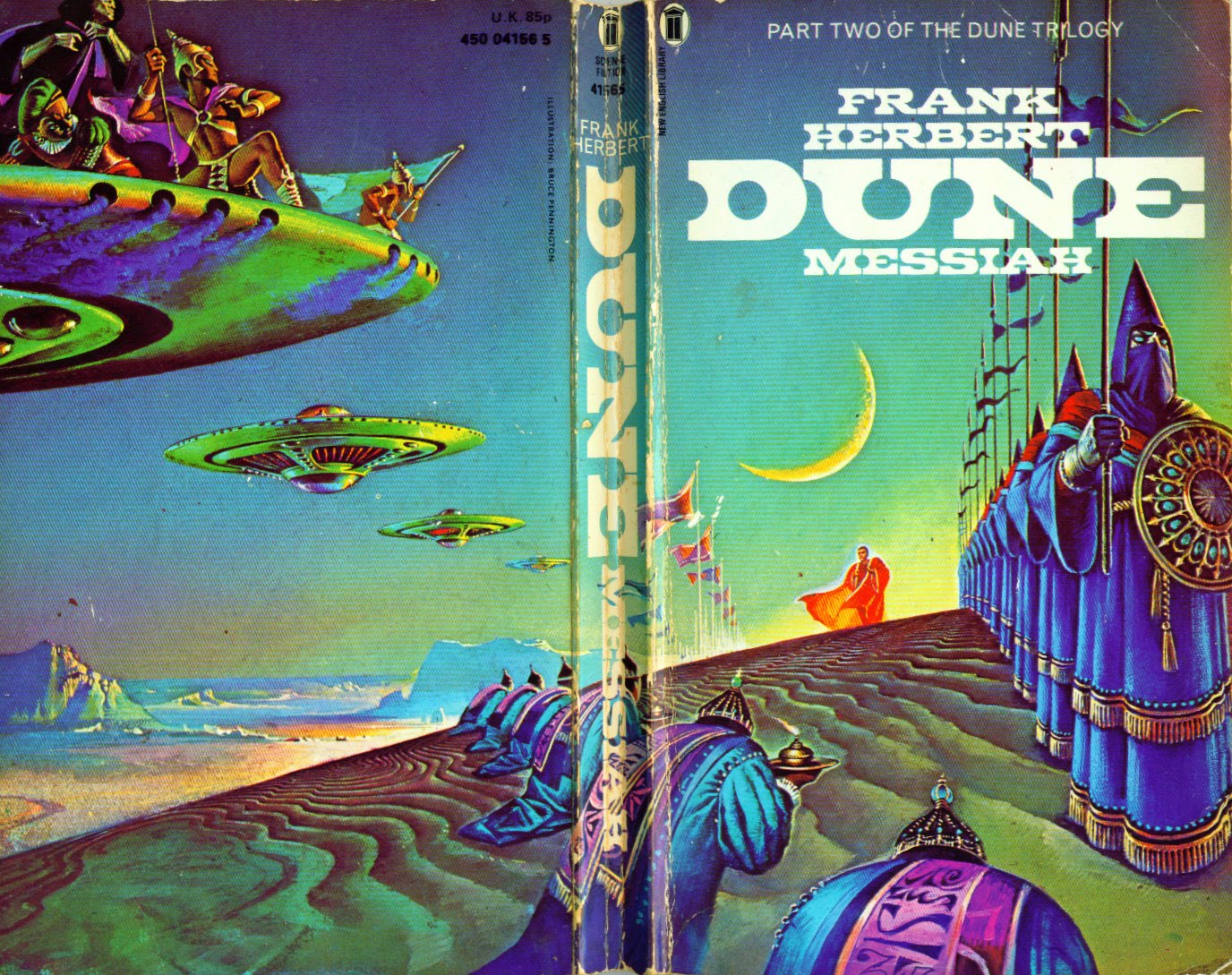
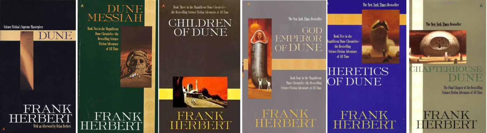
At this point the cover artist switches to Jack Gaughan and I really don’t know why. Maybe now that the series was a bona-fide award-winning SFF masterpiece they had some more leeway with the art. Maybe Schoenherr was unavailable. Parts of Dune Messiah were serialized in Galaxy Magazine and maybe that had something to do with it, though interestingly none of the Galaxy issues it appeared in had a Dune cover, which to me would have seemed a no-brainer. The sequel to Dune was going to be a guaranteed hit, and Putnam Books took over the hardcover and paperback rights. Looking at the Dune Messiah cover it’s definitely a step toward the pulp SFF feel that the Schoenherr covers had stood apart from. If you’ve read these books, you know Dune Messiah is a big departure in tone and maybe the more metaphorical cover (there is no giant rock head in the book) was more fitting for the headier nature of the writing. I’d love to know what those conversations were, but I can imagine there were suddenly a lot of voices competing. That happens often when you have a surprise best seller and suddenly you have all the attention on the next book, and everyone has an opinion, and everyone thinks they know what’s best for the cover. It’s 10x as hard to balance the forces you need to as an art director. That’s why most designers honestly prefer to work on unknown books that have less expectations. You have so much more artistic freedom.

First Edition Dune Messiah, cover by Jack Gaughan, 1969

The rest of the series followed suit, with hardcover and paperback editions sticking pretty close to one another with the same art, slightly different type. But they jumped artists multiple times, even though the books were all published by Putnam. Again, in hindsight it might seem silly, knowing how iconic Schoenherr’s art would come to be for the world of Dune, to consider anyone else, but at the time it’s hard to see that kind of thing clearly. All I know is there must have been Reasons because you’d never choose to jump artists this many times through a series if you can help it.
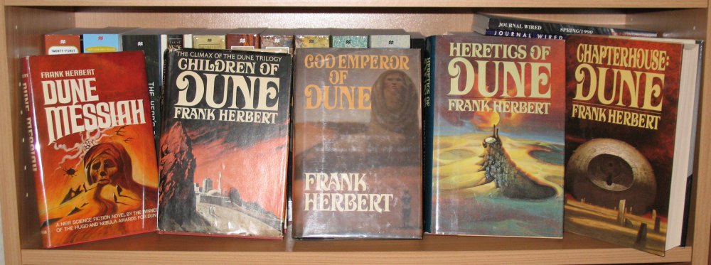
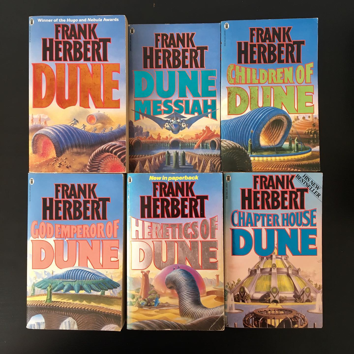
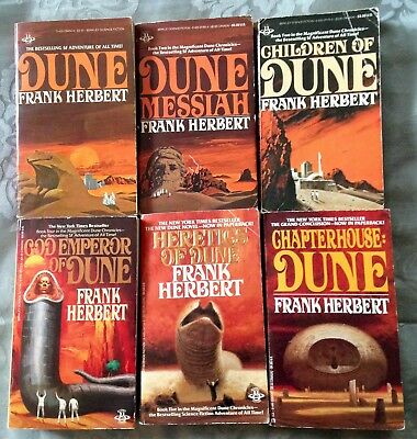
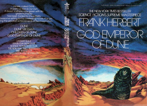
For Children of Dune (1976) they jumped to a different artist, Bruce Pennington, Vincent DiFate (thank you for the edit from Ian Schoenherr, son of the artist Jon Schoenherr) which makes sense because he was another well known, SFF fan pleasing genre artist. But the choice for artist for God Emperor of Dune (1981) was Brad Holland, who has a totally different style, and was not known as a SFF artist at all. Honestly having a giant man/worm hybrid on a cover would scare the shit out of any Art Director, so maybe taking it to a less pulpy place was a good concept, but it must not have gone over well because for Heretics of Dune (1984) they moved on to Abe Echevarria,who I can’t find much about online, but was definitely firmly back in the SFF camp. Then finally for Chapterhouse: Dune (1985), we get a new John Schoenherr. Unfortunately that ended the run of Frank Herbert’s books. Frank Herbert died in 1986. There were supposed to be more, as Chapterhouse ends with more story to tell The end of Frank Herbert’s original arc was told later, from notes left by Frank Herbert, by his son and another author. In fact there’s more books written by Brian Herbert than Frank Herbert now, and I am not going to go down that wormhole anytime soon. (Pun intended.)
I would like to think there would have been more Schoenherr covers for the final book(s) Frank Herbert had planned, because they were clearly going back to the source, and in my opinion Chapterhouse is the strongest cover of the series after Dune. Unfortunately we’ll never know.
I would love to know who originally started using the now iconic Dune typeface, it’s so integral to the branding, and once we see it on Children of Dune it sticks around for a long time. To me, that’s some of the most iconic use of typography in the entire history of SFF book covers.
70s-80s Paperbacks
I’m doing my best to credit artists where I can, but if there’s a credit missing bear with me, I’ll fill them in as I track them down. Also having a hard time figuring out what came out in the US vs. UK, and I am not even touching foreign language editions. So here’s a selective overview…
Bruce Pennington illustrated a set of paperbacks that gave him a much freer artistic interpretation than the original illustrations. I can both appreciate how fun these are and also say as a Dune fan they have almost nothing to do with the actual book content. That Dune Messiah wraparound art tho!

I can’t find a lot of info about Gerald (Gerry) Grace online, but he was one of the early Magic: The Gathering artists (illustrated the original Circle of Protection set) and he did this set of covers that work together as a panorama which is completely insane and again, very fun (if a little too cartoony) for me. Any artist that can keep a theme going that far is a winner in my book. I think these came out in 1985.
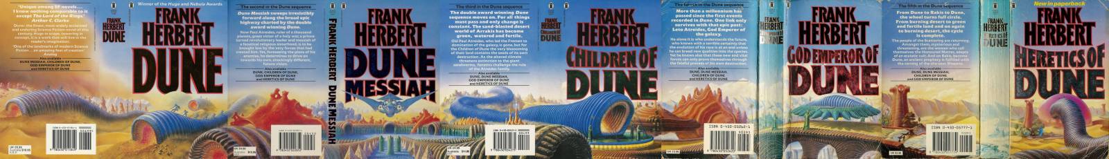
Then there was a set of paperbacks that I knew best, which mixed and matched a few versions but took a step back towards the original hardcover art. I can’t figure out who the artists were that changed – it seems like the same artist reworked Dune, Dune Messiah, and God Emperor. Children of Dune is the original Pennington art, and honestly he might be the one that reworked 1,2, & 4. Chapterhouse stayed the original Schoenherr, and Heretics became a Schoenherr too at this point. Next time I am in my parents’ attic I’m going to dig out these versions and report back.
(Edit from Ian Schoenherr: Vincent DiFate did the original Children of Dune hardcover art, and was the artist that reillustrated 1, 2, & 4 below)
On the whole, what I can say about these 70s-80s versions is that they’re very indicative of the split in camps between art that absolutely has to be roughly true to the book vs. art that can be as out there as it needs to be, and just needs to attract eyes. I can’t speak to the times then, but as much as I have a nostalgia and soft spot for a lot of the art that was completely unrelated to the stories but really fun, I also know it was a hindrance to being taken seriously by the mainstream. Just like romance covers were at the same time, SFF book covers talked to already-fans, but were often a barrier to people outside the genre ever picking the books up. You have a nostalgia for the ridiculousness factor if you’re already in the tribe that understands the visual language, but you’re turned off by it if you’re not already part of the tribe. It’s the visual equivalent of preaching to the choir. And while, yes, it is very important to keep your core fanbase happy, and they’re as vocal as a choir when you do not, you are also selling a book and author tremendously short if you only design for the fans that they already have. You have to keep one foot in the fanbase and one foot ahead. Striking that balance well is the single hardest thing to do in my job.
Art by Don Ivan Punchatz
Trying to figure out who the artist is on these, but another great set that worked together.
Except maybe the sad worm god…
And of course there were a number of movie tie-in editions when the Lynch movie came out in 1984
90s/00s Editions
The 90s into the 2000s was a transitional time for SFF, where it slowly started to ooze out of it’s genre fencing and start to infect the mainstream. Movies really led the way, with huge francises like The Matrix breaking way into the popular culture. Around the same time Star Wars returned with the reissues in theaters of the original trilogy and then the prequels. And regardless of how you feel about the prequels the SFF torch was passed to the next generation in a much bigger way. It wasn’t just the nerds and geeks who were into SFF, it was every. single. kid. An entire generation of SFF fans were born at that moment and in the ten years it took for them to grow from children to young adults the entire landscape changed with them. Star Wars mania opened the door for more comics adaptations, and the return of superhero movies, and then Game of Thrones hit HBO. And suddenly people everywhere were tearing through George R. R. Martin’s books and they wanted to know what else was around to read like it, and that was when SFF book covers really took a giant step into the mainstream. And while that was great, it also took a little while to educate this new audience visually.
I was working at Orbit already by the time GoT started on HBO, and it was fascinating to watch what these new fans would and wouldn’t relate to. Book covers needed to either be icons like on the Game of Thrones covers (which is why we have so many giant sword covers and house seal covers and such) OR they had to look like movie posters. Everything else kind of…was too much of a reach for the new audience. Photography came into SFF book covers in a huge way. Illustrations were still fine for the dedicated SFF audience, but for a while you were really cutting down the potential of a book’s appeal if it looked like a 1980s illustrated cover.
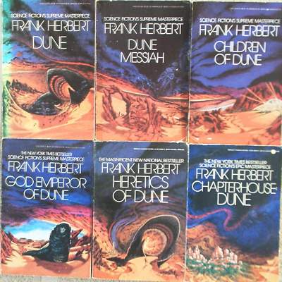
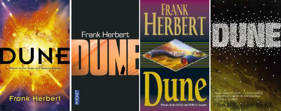
The covers above all kind of play it way too safe for my liking, and feel way generic, but I really did like how the earlier art got remixed into these classy editions below. This was about the time Dune hit the 40th anniversary, and these came out to commemorate that. It’s hard to split the balance between appealing to a SF genre fanbase and a mainstream audience at the same time, but these do it nicely.
Current Editions
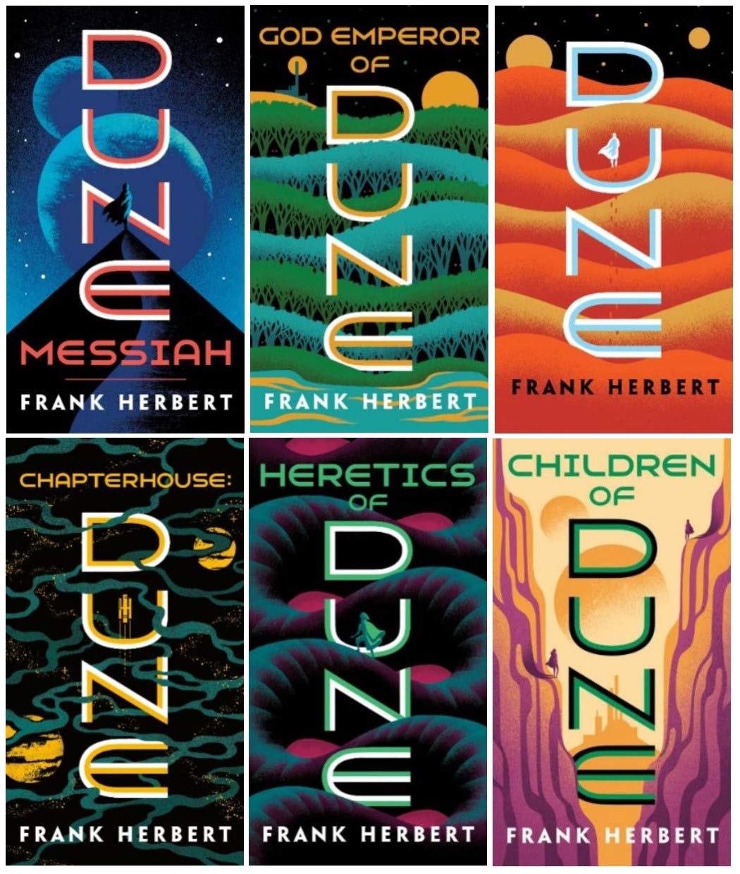
In the years since Game of Thrones really broken down the last barriers the mainstream audience had against reading SFF we’ve been able to get back to more illustration. The audience no longer needs to be lured in by things that look like movie posters, that battle has been won, and solidly in the last 5-6 years the pendulum has swung ever further into illustration and abstraction again. So you’re seeing a lot more illustration and design-forward covers that don’t need to rely on the generics and photo/CGI of the 90s/00s.
This is the current US paperback series style, published by Ace, designed/illustrated by Jim Tierney:
The recent Penguin Galaxy edition designed by Alex Trochut:

The more design-forward versions of these hardcovers reflect both how design-literate a general book-buying public has gotten over time, but also how much the walls between mainstream fiction and genre fiction have lowered. You’ll see a lot more illustrators who were thought to be strictly SFF illustrating more mainstream books and vice versa. Now that the audiences are mixed the art has more freedom.
Modern Special Edition/Illustrated Hardcovers
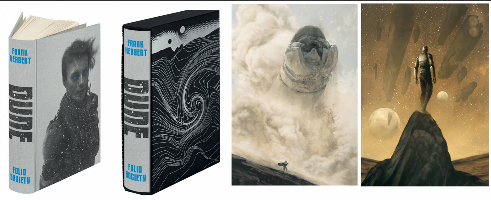
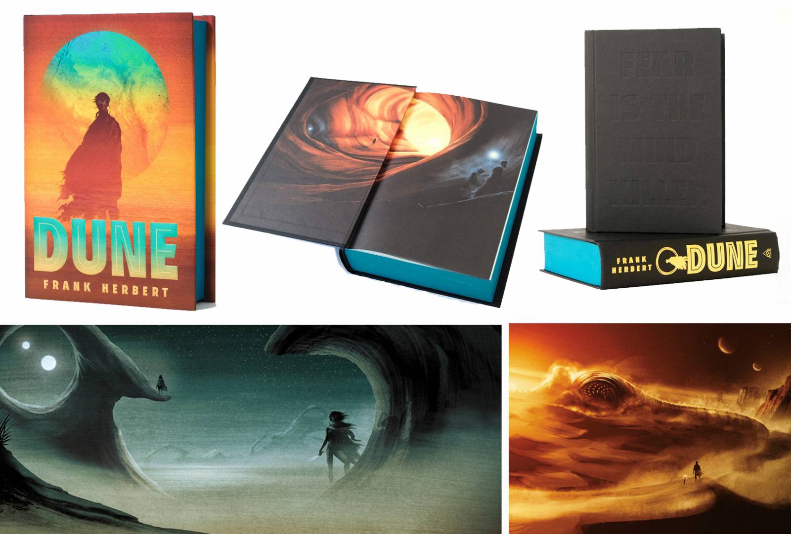
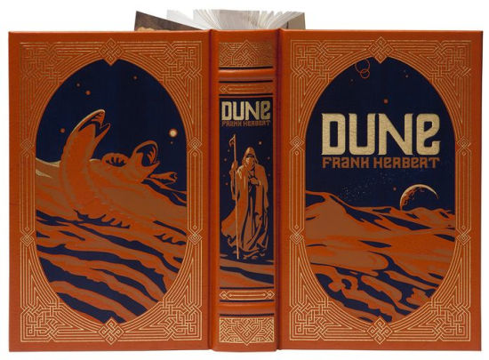
We’re also seeing a rise in special editions moving into the SFF space. The Folio Society has always focused on classics, and realized there was a large audience of SFF fans looking for their classics to get the fancy illustrated treatment as well. Sam Weber’s Dune illustrated edition really blew me away when it came out, and over the years general publishers have also jumped on board with realizing this was an untapped market.
As the 50th anniversary of Dune came around, there was a spike in new editions. This special edition was done by Ace, with art by Matt Griffin and design by Adam Auerbach
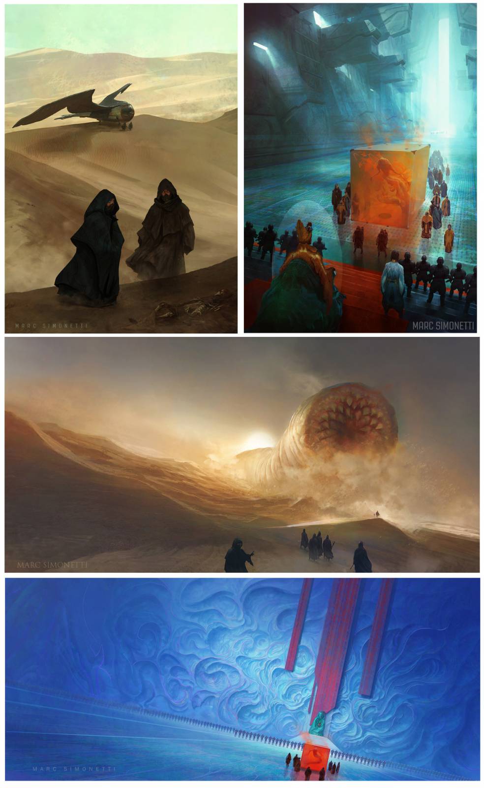
Here’s some lovely pieces from Marc Simonetti‘s Dune work, for Centipede Press’s illustrated editions of multiple books in the series:
And this edition was part of Barnes & Noble’s classic hardcover series, cover illustration by Nancy Stahl, design by Jo Obarowski (with endpaper art by John Schoenherr):
The uptick in special edition/limited release hardcovers and simultaneously more special effects on regular market hardcovers in general (not just of editions of Dune) really show the reaction of the market to the rise of ebooks. The smallest, disposable, mass market paperbacks got hit the hardest, and were almost entirely cannibalized by ebook sales. But Trade Paperbacks (the larger size, usually 5.5 x 8.25″ to 6 x 9.25″) and Hardcovers remained strong. But they also had to address the changing way people think of physical books: now that you don’t HAVE TO read a book physically, you can choose which books you want to have physically take up space, and those books are probably books you already know you love, so you are willing to spend more money on a nicer edition with special effects and illustrations. You’re not just buying a book, you’re buying an art object, a showpiece, and interior design.
More to Come
Clearly Dune is about to have a new wave with the release of the new movie (hopefully movies) and I can’t wait to see the concept art that comes out with the film. Dying to know who the concept team was! While we wait for the release (and the “Art of” book) we can pick our favorite versions from the above. And for all the other versions I left out, you can see pages and pages of them listed here.
I singled out the main editions and the versions I felt really illustrated the changing trends and audience for the SFF publishing genre. Next time you see a cover in a store and wonder why the Art Director made that particular choice of artist or design, know that it was based mostly on the target audience and what other media they were affected by at the time.
And if you want to read more behind the scenes on what goes into making a book cover, you can check out these articles:
Book Covers: Photo vs. Illustration vs. Design
How does an Art Director pick an Artist
Center It! (Or Why a Good Illustration Doesn’t Necessarily Make a Good Book Cover)
4 Art Directors talk about Book Design
And if you want to really be a Dune nerd you can see the nonfiction historical book that Frank Herbert pulled a lot of the cultural inspiration for the Fremen from here.


Love this writeup, Lauren, thanks so much! I have some of those original hardbacks and paperbacks, I can possibly check some of those questions for you.
As an artist myself, Schoenherr has always been *the* Dune artist for me. Heretics and Chapterhouse are my favourite Dune covers. (love his interiors and calendar pieces so much, too – “Dawn at the Palace of Arrakeen” is flat-out one of my favourite SFF illustrations ever, and “The Flight Through The Shield Wall” is also right up there).
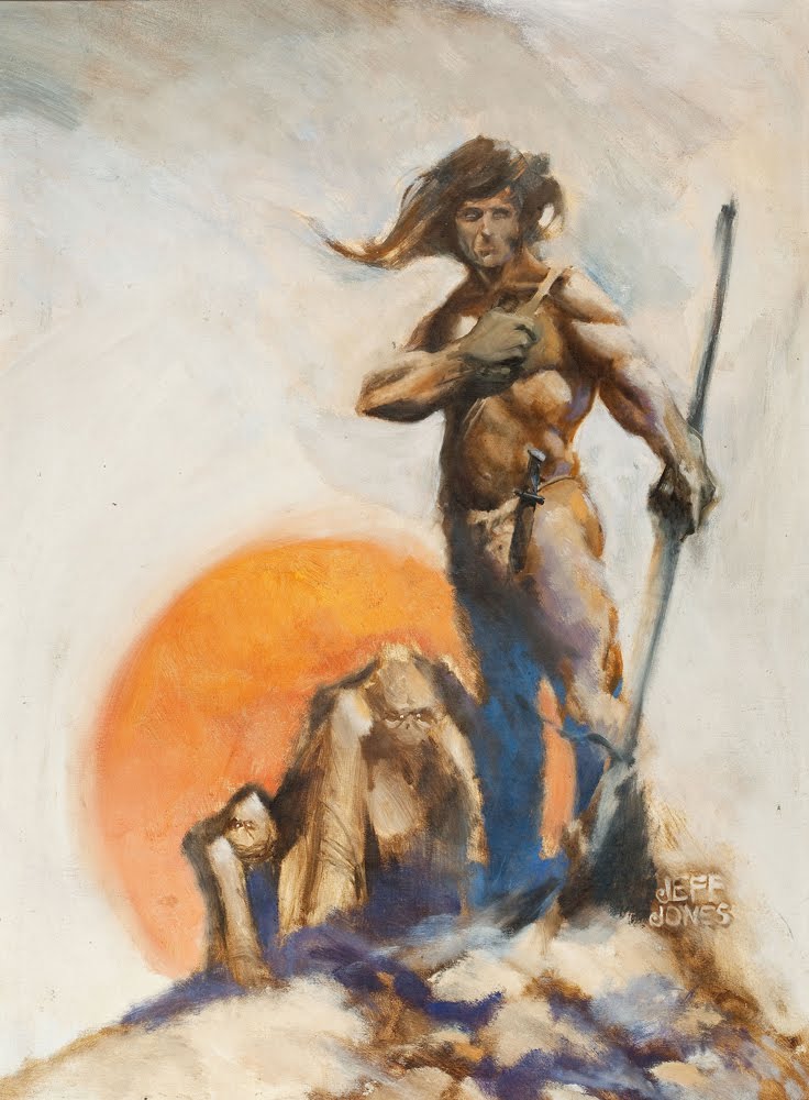
I still dream of obtaining a copy of the ’78 illustrated hardcover. It’s on my “Holy Grail” list, right next to a Jeff Jones Game of Thrones edition… 😀
I have the Ace paperback of Children of Dune and the Berkley paperbacks of Dune Messiah and God Emperor. There’s no artist information at all in these that I can locate… which doesn’t seem fair, since the photo of Frank Herbert on the back cover gets a photographer credit.
Sometimes even if it’s not on the jacket/cover it’s on the copyright page, you can check there!
Great article ! It’s indeed a great example of the evolution of book covers and designs in SF. I came to Dune in the 90’s, my dad already had the books (french edition with visuals by Wojtek Siudmak) and I was intrigued by the covers. I dove into the books and devoured the 7 of them (the books were split in seven ones in the French edition). I can’t wait for the new movie, even if I have of soft spot for the Lynch version…
Yes you are write, its like a full fledge article
Thanks for the overview. Nice to see all of that in one place. And, it looks like you’re hunkered down for a year of Dune-ish content.
Hadn’t known about the Brad Holland cover. That was amusing.
An important point about the dismal 90s/00s versions. Illustration really took a bath in the 90s onward because of Photoshop and art departments bringing a lot of content creation in-house to mate stock images to a staffer in order to keep costs down, particularly on something like an old piece of fiction that wasn’t where they wanted to invest time and money. As the tools have gotten better and so too the designers things like Trochut version become available (and possibly only because it was part of a suite of releases?) Thankfully, things like Kickstarter have brought attention to niche vanity publishing and there are a lot of great publications being brought to the fore in the past five years or so.
Keep up the great work.
Vincent DiFate was the artist for the Children of Dune hardcover and the Berkley mass market paperbacks in the 1970s – the “set of paperbacks that I knew best”
Hi Ian! Thanks for weighing in, your blog post was so helpful to me (i linked to it too). Editing in Vincent DiFate now, thank you!. There’s so much conflicting evidence online, thanks for clearing that up. Any more holes you see I am happy to edit as well. Do you know why your dad wasn’t automatically asked to do the first few hardcovers after Dune? Seems like a no-brainer to me to have his gorgeous work on the cover.
I wish I knew why there was an almost 10-year gap between his Ace paperback cover (1966) and his pictures for the Analog serialization of “Children of Dune” (1976) – but I guess the publishers may not have associated him that closely with Herbert until the 1978 Dune calendar and The Illustrated Dune came out (and which Herbert heartily endorsed in, I think, OMNI magazine). Even after that, though, he wasn’t always considered for the covers.
Incidentally, he also made paintings for five record albums of Herbert reading Dune excerpts and a cover painting of Herbert himself blending into a Dune-like landscape for The Maker of Dune (1986) – among other odds and ends.
And thanks for linking to my neglected blog!
My pleasure, so glad you wrote it! If you have the archives of your dad’s work, I know a lot of folks would be interested in a well done art book. I’ve never seen a proper one, unless I totally missed it.
I read it first as the two serials, so for me Schoenherr’s art will always define it. (My first paperback copy was the 95-cent version of the one shown here. 1968-69. Yes, I’m a dinosaur. I have it in softcover, still, and also as e-book.)
That was a great read, thank you!
And I wasn’t familiar with Schoenherr’s work, but wow… that first hardcover is amazing, with its beautiful texture and minimal figurative elements. It feels timeless.
Fascinating.
I wish you would’ve included the cover(s) of National Lampoon’s “Doon” to show how iconic the original illustrations are, even in parody.
Such a fascinating overview! Thank you. I love the Jim Tierney and Nancy Stahl ones, particularly.
A fascinating read, thank you! Dune has had so many great covers.
Thanks for the images. In France, covers where quite poor for Dune and I discovered the Schoenherr’s art thanks to Internet. It’s the more striking to my opinion.
I kept reading the spine on the Folio Society edition as DUDE, which I guess does match the cover.
Completely agree!
Also – cool name!
The Pennington’s are, in my opinion, by far and away the best!
I’m a huge fan of the series and these, sitting on my uncle’s bookshelf, are what fascinated me to ask him “What are these?”
“It’s like Star Wars but much, much better”
Which, as a 12 year-old, I just couldn’t believe was possible.
I agree, they probably aren’t “canon-correct”, but for me they are incredibly evocative and beautiful works of art that recall a sci-fi aesthetic that is still unmatched.
I absolutely adore the Pennington covers!
I have to say that I’m not a big fan of the current additions where they box in the art. There’s no real reason to do it, it’s just a bad visual choice. I’ve seen this with Asimov’s Foundation as well. The artwork already exists, but the graphic designer that laid out the cover (in about 30 seconds) clearly wanted to play at being an artist and added their own spin. It’s more likely than not that an amateur graphic designer was handed the artwork and couldn’t figure out how to make the text work over the art. The funny thing is that only the buyer sees the cover. Shelf space is too limited to stock these books face out so they’re always stocked spine out. So when you’re searching the shelf for the book, you need to clearly see the author and title. If you’re buying a book online, where it only shows the cover, not the spine, you’re doing a keyword search so artwork is irrelevant. Someone told a graphic designer “hey, we need new covers. go through the artwork we already own for this and figure out a way to jazz it up. So they cropped it awkwardly, slapped it on a gray background and dropped in the text. I’ve seen better work in a college art class. I actually found this thread by posting on a Dune forum looking for better covers than those hack jobs currently being stocked at Barnes & Noble. I’m thrilled I found this forum.
The Pennington covers have this forte: the artist avoids depicting sandworms. These creatures are so special that they’re kinda hard to make a workable, beautiful painting of.
As intimated, the Pennington cover for Dune Messiah is a stand-out.
On the whole, thanks for a great blog post. Dune is a virtual phenomeon and so is Dune art.
Great text. The artist in the “sad worm god” series is Frederic Marvin.
Hello Lauren, I just read this Muddy Colors article on the evolution of the Dune book covers through time and it was fascinating, as Dune is one of my favorite SF novels. First of all, kudos for finding the the different images used; that must have been an undertaking!
I found the article by accident. I was online looking for the ISBN# of a particular mass market edition of Dune we somehow misplaced, and since I loved the cover, I wanted to replace it with the same. It was the 40th Anniversary Edition, with the black background and vertical rectangular art insert. I also have a 70’s SFBC HC edition with he original HC artwork I had since I was a young teenager.
And thanks for explaining why the different shifts in cover art over time. The reason we didn’t just buy a brand new mass market edition was that we did not like the new illustrative editions. I have been in the bookseller business for over 16 years and seen those come and go, and never fully understood why publishers did that. They never appealed to me. So they recently did that not only with the Dune title reprints, but also with Neil Gaiman’s backlist titles. Now the business decision to do so makes sense.
I have a fun story when I moderated an art panel with Artist Guest of Honor John Picacio at a SF con if you’d like to hear it. Just let me know. Cheers!
Nice piece.
Brilliant article Lauren,
Thank you kindly for the well researched look at the DUNE art through the decades. I inteded to read the saga for decades but finally just got my hands on the 1st DUNE novel and I’m loving it quite a bit. The only discouraging part is the “modern” covers. I fall in the camp of the retro 70’s – 90’s sci-fi and fantasy art and takes a bit of work to find the out-of-print Dune softcover books for reasonable prices.
I opted with the Vincent Di Fate versions.
Once again thank you for this beautiful article. Learned tons today.
Great content, dear editor,
I found it very useful,
Please continue your new shares
I love this!
You have prepared a great content,
I have just discovered your site and you can believe that from this day on I will become one of your permanent visitors,
I hope you will bring us together with your more beautiful articles,
I greet you with love,
Goodbye, sir
dekorbab is an interactive website created to make a difference in the world of decor.
On our website, you can find high-quality decor articles from the pens of our current, original and knowledgeable editors.
Please stay tuned
Hey, you used to write wonderful. Maybe you can write next articles referring to this article. I desire to read more things about it!
I love the 2000s/40th edition covers, especially in hardcover! If you have access to those ISBNs, would you please share them?
It was the most detailed article I have read on the subject of book covers, which I have been very interested in ever since, thank you very much
Thank you, dear editor, for bringing such valuable content together with us.
thankyou
great post, i have another question which is can paperback books be rebound?
wonderful article
Thank you so much for sharing the informative post
thanku sir share this website
nice one s
great information Thanks
Thanks for sharing excellent info.
Ramya spa will dissolve tension and melt away stress. so why you are late come fast and take and enjoy it.
very good service
Looking for ways to share large files without any hassle? Discover the top-notch File Transfer Best Practices in our latest blog article on SpeedyUpload. Learn the expert tips and techniques to ensure smooth and efficient file sharing experiences. Say goodbye to complications and embrace seamless file transfers today!
Thank you for sharing the lovely piece.
Thanks for providing the lovely essay; good content.
Good information, thanks for sharing the lovely essay.
Thanks for sharing the lovely essay; it’s a good article.
Thank you for sharing the lovely piece.
Thanks for providing the lovely essay; good content.
Good information, thanks for sharing the lovely essay.
Thanks for sharing the lovely essay; it’s a good article.
Thank you for sharing the lovely piece.
Thanks for providing the lovely essay; good content.
Good information, thanks for sharing the lovely essay.
Thanks for sharing the lovely essay; it’s a good article.
Thank you for sharing the lovely piece.
Good information, thanks for sharing the lovely essay.
Thank you for sharing the lovely piece.
Hormonal Balance: Discussing the potential impact of sensory stimulation on the release of endorphins and oxytocin, the “feel-good” hormones.
thanks this knowledge
good nia
PlayInExch is a term or product that has emerged after my last update, I recommend checking official sources, company websites, or recent industry news for the most accurate and up-to-date information. If it’s a specific platform, service, or product, the official documentation or website is likely to provide the details you’re looking for.
Crickex Login is related to a specific website, platform, or service, I recommend visiting the official website or contacting their customer support for the most accurate and up-to-date information on the login process. Companies often provide detailed instructions and support for users on their official platforms.
Sports Banner Printing play a dynamic role in celebrating achievements, promoting team spirit, and enhancing the visual appeal of sporting events. These banners are versatile and can be customized to reflect the unique identity and accomplishments of a sports team or event.
MetaMask is a browser extension simplifying digital transactions. Compatible with popular browsers, it provides a secure gateway for managing assets, interacting with DApps, and connecting to various blockchain networks.
greav blog
It is a great piece of article and I found it very interesting and useful so thanks for sharing it with us.
Thanks a lot for sharing this with all of us.
Thank you for sharing this useful information, I will regularly follow your blog. Excellent post!
Fascinating exploration of book cover trends through time, inspired by Dune! Your post creatively connects design evolution with literary classics. Thanks for offering a unique perspective on the intersection of art and literature.
pg auto slot spin offers online games PG SLOT where explorers can choose to use the PG SLOT service. Apply for a deposit and withdraw credit through an automatic game system that all gamblers can use.
This insightful exploration of Dune’s cover designs over the years offers a fascinating glimpse into the evolution of book cover art. Lauren Panepinto’s expertise and passion shine through every detail.
I appreciate the thoughtfulness behind this content.
The 3D commercial rendering service offered here is a game-changer for businesses. With stunning visuals and meticulous attention to detail, they bring architectural projects to life. A must-have for anyone looking to showcase their vision with unparalleled professionalism and impact.