 |
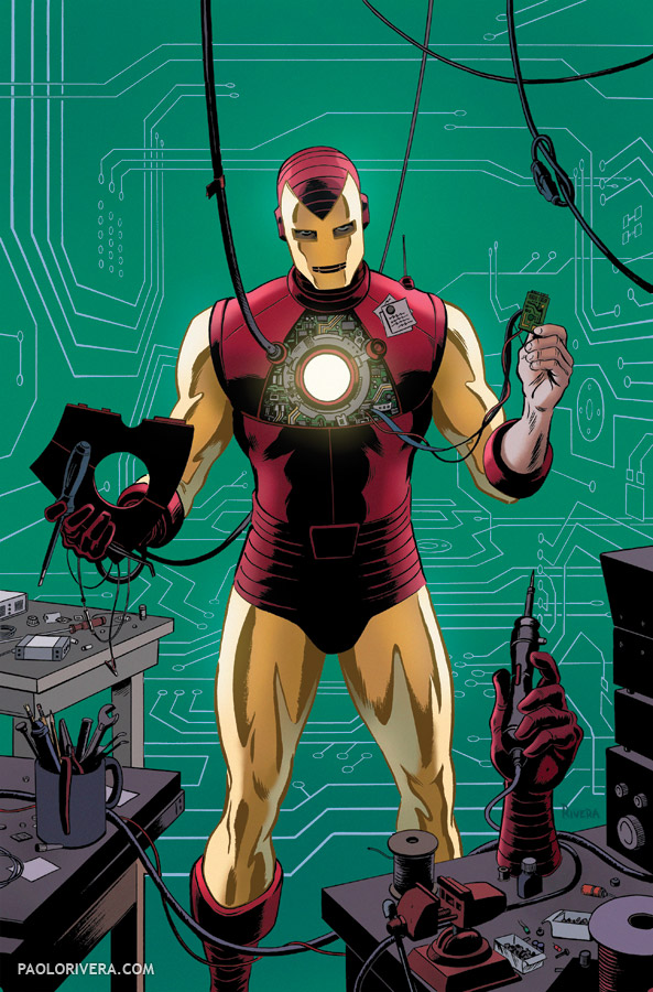
| Iron Man Variant Cover. 2012. Ink(ed by Joe Rivera) on Marvel board, 11 × 17.25″. |
Hope everyone is enjoying the long weekend. I’m taking a little break, myself. These 2 covers were just released in the latest Marvel solicitations, so I thought I’d share them here as well. The Iron Man variant is based on his second costume (I think) which introduced the world to the familiar red and gold color scheme. It also featured enlarged eyeholes to “provide a psychological advantage over his adversaries.” I’m paraphrasing, but it happens to be one of my favorite panels in Marvel history.
Spidey is pictured below (Superior Spidey, if you haven’t been following along) and faces a villainous threat from the land of dreams. Will he survive? Probably. But that’s comics. I’m really enjoying this run on Avenging Spider-Man. The book seems to have a little more fun with the character, and I hope it shows.
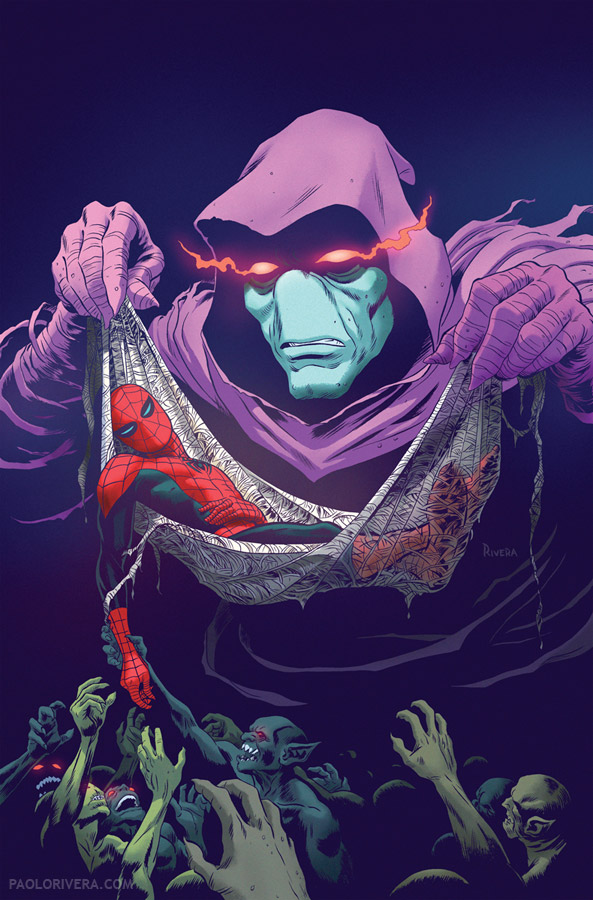 |
| Avenging Spider-Man #19 Cover. 2012. Ink(ed by Joe Rivera) on Marvel board, 11 × 17.25″. |

That Iron Man piece is killer, Paolo. The way you implied the sense of depth just by making those circuits in perspective is pretty brilliant.
I love that Spiderman cover Paolo! Nice work by you and your dad as usual 🙂
Thank you, gentlemen!
Is that Sleepwalker?! I had no idea that character was still around.
Great covers, young Paolo.
You know it. I didn't know he was around either. I wasn't even aware of the character, I'm afraid to say.
Who you calling young? I'm almost 32 now! (But thanks.)
Did you color the iron man piece? That is a great image by the way. And I 2nd what Dan said, that circuitry is a very nice touch.
Something about Spider-Man's legs just aren't right. Proportions? I like the rest of it though!
How does Iron Man move in that suit? Is the metal fabric? Would a super genius really keep parts in a coffee mug? Are those sticky notes on his chest? Just seems kind of cheesy.
Sure did, Matt. Thanks!
Yeah, Spidey's legs were bothering me as I drew them. His torso should really be more foreshortened, but I wanted the best of both worlds. Ended up just downplaying the feet with color so it would be less of an issue.
As for Iron Man, in the early days, his suit was described as a sort of microscopic chain mail. It's strong, but flexible… and doesn't actually exist, even 50 years hence (at least to my knowledge). The coffee mug is a nod to photo reference I found of electronics labs and work stations. Many had just such a set-up. Invention, like any heuristic pursuit, including art, often requires the benefits of caffeine.
Lastly, as my friends can attest, I'm sort of cheesy. And my Mom likes post-it notes.