In a few days, enrollment will close for my class at the SmART School. In order to encourage you to have a closer look, here’s a portion of the document I send to my new students before class begins, to get them off to a rolling start.
The focus of my class (and the name I give it if you ask) is “Narrative Illustration.”
What is Narrative Illustration? It’s what every book publisher, Role-Playing Game producer or Trading Card Game is looking for. It’s what makes a magazine illustration work for the client. It is any image that tells or augments the story in a product. Every book cover you ever responded to, every comic book cover, every evocative Magic or Warcraft card had a segment of story to tell.
What sets one illustration above another? Narrative.
Telling a good story requires forethought and planning, and that’s what my classes are all about. Staging. A good narrative illustration is choreographed, not spat out. It’s constructed, not thrown together. You don’t build a house from the roof down. Good illustration is a process that takes you from concept to expression, large shapes to details, idea to completion.
I’ve constructed my classes around ‘Process’. How do you get from the germ of a cool idea to a finished piece of art that draws the eye and commands attention? What makes a good painting work? Why does one painting catch your eye while you may look past another without even seeing it? It revolves around the science of seeing. It’s simple and elegant when you understand it.
What follows is the first document I give my students to introduce them to some of the core philosophies that make one painting stand above the others. The core assignment is simple—then, in class, I reinforce the concepts with paintovers and one-on-one critique. You’ll get to see your own ideas enhanced with principles that have stood the test of time— the visual building blocks refined by the centuries of artists who came before us.
If this sounds like what you’re looking for, please head over to the SmART School website and sign up.
Hey everybody!
Before our first class, I want to give you an assignment and some thoughts on process to get you off to what I hope will be a flying start.
What I want from each of you over the course of the season is at least one and possibly two finished paintings with the following prospectus:
Paint a human figure plus an animal (real or invented) interacting in a setting. I want to see action, not simple standing poses, though they can be doing whatever you like: fighting one another, tracking something, one riding the other, and so on. Be inventive. A girl and her Dragon or A boy and his Wolf are standard and fine, but consider something like An Armored Warrior and his Dinosaur, An Orc and a Unicorn.
If you want to add additional figures that’s up to you, but don’t get heroic immediately.
If you really want to challenge yourself, add water: a Dolphin and a Mermaid, or a nymph and a Hippopotamus. Otherwise, keep it dry. For the first class lets see thumbnails and possibly first sketches if you have a favorite.
What we’re really going to focus on over the course of our class is the architecture of a good painting. We’ll focus on COMPOSITION, ANATOMY, PERSPECTIVE, LIGHT and SHADOW, and NARRATIVE. Avoid details. Focus on the big masses.
I’m going to attach some links at the end of this email as well as some quick discussions of basic concepts, but first, an overview:
C O M P O S I T I ON :
We’re going to start with thumbnails. I want each of you to generate at least ten thumbnails exploring compositions and narrative ideas around the theme you choose. If one of them really strikes you, feel free to develop it a little larger, but keep to basic masses for now. Don’t get too invested in details at this stage.
A N A T O M Y :
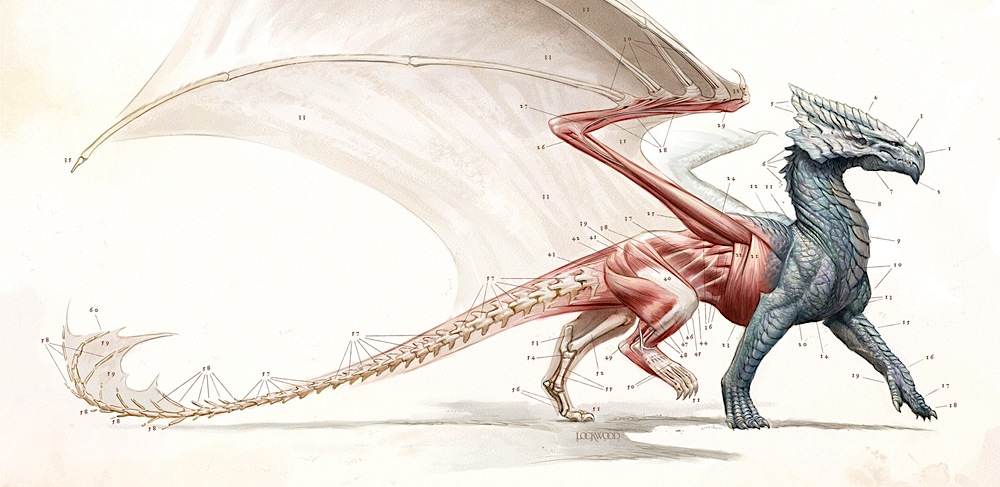
Everything has anatomy. People and animals obviously do, but so do trees, mountains, clouds, rivers, cloth. I expect everything to be referenced one way or another. No drawing out of your head, at least not for the important structures. There’s always room to invent in fantasy art, but you’ll make it more believable if you operate from the best base of knowledge. The pictures in your head aren’t as realistic as the real thing, so get used to the idea of gathering photos and especially of shooting your own reference.
P E R S P E C T I V E :
Perspective really, really matters, because every human being lives at the center of a universe full of converging and intersecting lines. I want you to think about perspective in your thumbnails. What is your Point Of View (POV)? Is your viewer laying on the ground looking up? Standing on a rock nearby? Hovering in the air above? Wide-angle or telephoto? Consider the way movies use cameras and think cinematically as best you can. This is an excellent way to challenge yourself, because it will force you to rely on reference you create yourself. We can talk about that more in class. For now, at the thumbnail stage, just imagine what you’ll choose.
If perspective gives you a hard time, then drawing from life is going to be that much more important. For those of you already comfortable with perspective, I’m going to bend your brain with one of the links below.
L I G H T & S H A D O W :
Obviously, sight depends on light. Understanding light is essential. Most of you
have a good grasp of light already, but I’m going to add a quick discussion of how
light works below just as a refresher. It may help some of you see it in a new way.
The importance of lighting to your composition can’t be stressed enough. It’s one of
the things that can put lie to your illusion fastest; few artists I know could draw their own mothers from memory, but even people who can’t draw stick figures know their own mothers when they see them. You can’t go into a painting with an arbitrary or simplified expression of light.
N A R R A T I V E :
This is what sets one painting above another. What is the story of the painting? How do you tell that story in an effective way? All the other disciplines above are the legs your narrative will stand on. They’re the architecture of the edifice that is your painting. You have to have a solid grasp of your story before you start. It may be tempting to start with a sketch of a face that you like, or an animal photo that inspires a feeling of movement, but if you try to build a painting around a thing that just wandered into your canvas,
you may paint yourself into a corner.
So let’s start with Narrative and Composition together. The one reinforces the other.
How to start?
I always start with this question: Who or What is the Star of the Painting?
It’s another way of deciding what the Focal Point is, or the Center of interest. Those are the terms we all got in art school, but when I started thinking if it in theatrical terms it started to really click for me. So:
T H E S T A R O F T H E P A I N T I N G :
Like any good Hollywood blockbuster, every successful painting has one
biggest, brightest Star.
Your painting is a story, a visual instant conveying circumstances. It has something to say, and identifying the Star can help you tell the tale. You have to know from inception Who or What the single most important thing in the painting is. Usually it’s a figure, but it can be almost anything—an object, location, color, shape, texture—even an emotion. When you know that, everything else will fall into place readily.
Contrast is the most important Star identifier. Place the greatest contrast of value, color, texture, scale, detail, angular movement, and polish on or near your Star, and it will gain importance. The one red apple in a bowl full of green apples will be the star. One red apple in a bowl full of green worms even more so! At the same time, every gradation of size or value should also lead you to, through, or past the Star. If the area surrounding the Star is more detailed than the periphery of the painting, the eye will be drawn there. Lines of movement should lead you through or to the Star.
There can be costars as well. The same rules are used to enhance them as are used to make the Star stand out, though you will want to pull back– there can be only one getting the most attention, only one in the spotlight.
That’s the Star.
This is psychology, really, based on the construction of the human eyeball and the way we perceive the information it gathers. The center of our field of vision contains the most detail, color, contrast, and depth. Our peripheral vision sees mostly movement (duck!). When you concentrate those qualities on the Star (and to a lesser degree the costars), you inform the viewer that the Star is what they’re looking at. Their eyes will go there first, because the psychology of seeing demands that they do so.
Understanding this dynamic can help you make other choices over the course of the painting, like where to invest detail, where to let it slide, how much value or gradation to apply, and so on. Those are things we’ll talk about in class.
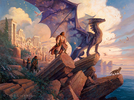
For example: In ‘Daybreaker’, below, the obvious Star is the dragon. But look a little deeper and you’ll see that it’s narrowed down more than that— the brightest section of sky is behind his head. That allows the viewer easy entry into the illusion. We’ve just used the psychology of seeing to inform her that she’s looking at the dragon’s head. The rest is peripheral, but the viewer can still look around. The idea is that the dragon’s head is the thing she was looking at the instant we captured this image out of her visual cortex. Make sense?

In this painting, ‘Wind‘, I use the same idea, but in a larger painting, with more going on. The dragon’s head is the Star again, but now there are costars as well. They get the same Star treatment of contrast and so forth, but to a lesser degree. I might honestly have improved this piece by moving the woman on the pillar further to the right, making her and her dragon friend a more unified element.
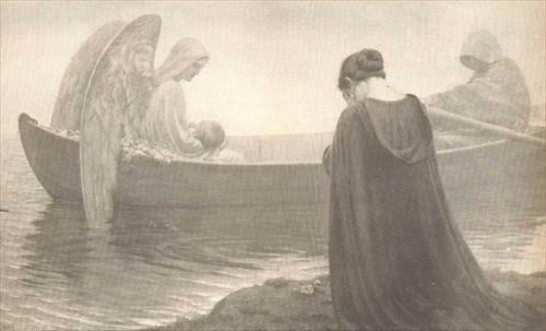
Now here’s a curveball: Who or what is the Star of ‘Mindshadows’?’ Is it the head of the woman holding the sword, due to contrast of value and color? Is it the tapestry image of the woman framed by the circular shape? You could make a case for either. But because their heads are so near each other at the convergence of so much movement and energy, you might argue that the Star is both of them together, or even something as abstract as their relationship!

And who’s the Star of this piece?
Hopefully now you’re thinking about narrative. Who is the Star in your painting? The animal or the figure? How will you set that up?
T H U M B N A I L S
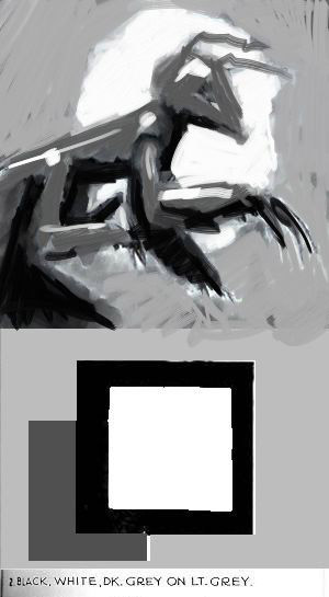
Your first explorations are tiny value studies that allow you to solve the big problems first. Andrew Loomis propounds a four-value theory for tackling thumbnails that is really valuable. Very simply, think only in terms of black, white, light gray and dark gray as you’re planning your composition. Almost any painting can be broken down that way.
As an example, this is a project another aspiring artist sent to me, asking for help. He allowed me to develop it into a lesson. His difficulty lay in finding a value scheme that made the read easy.

This could have been solved a number of ways, as seen in the four thumbnails below. One of them stands out as the best solution. Hooray! Big problem solved at the very beginning.

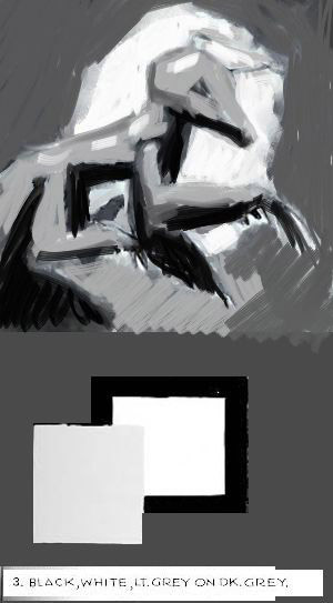
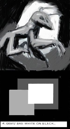
Here are some more examples of values considered in this way:

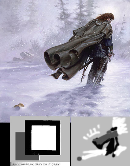
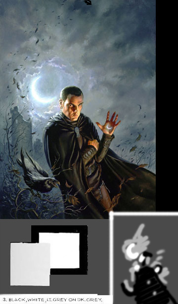
Note that in each case I saved the greatest contrast for the Star of the Painting. Your very first thumbnails could well look like the little diagrams in the lower right corners.
Very quickly now, a little tutorial on light. It’s fairly simple, but often overlooked in favor of an oversimplified internal routine for light that one has “gotten away with.” If you want to paint realistically, that’s a habit you must break. Understand how light works and you’ll not only understand your reference better, but down the road you’ll be able to “fake it” better at need. For now, though, I want as little “faking it” as possible.
Simply put, light acts like a billiard ball. A particle of light hits a surface and bounces off at a predictable angle, like a billiard ball banking off of a side-rail.

Where does the highlight belong with the light source directly overhead?

Observe two things: the light that bounces directly into your eye, as a highlight (solid lines), and the light that doesn’t, which is the ambient light (dashed lines). You can think of ANY surface as a mirror which bounces light back. That’s easy with a flat surface, because mirrors are flat. Round surfaces are otherwise no different. Light strikes the surface and bounces off most powerfully at an IDENTICAL, but OPPOSING angle. Just like a billiard ball. So, the light bouncing toward your eye– the only light you will see, obviously– will be strongest where it is coming off of that kind of bounce. It’s relative to the placement of the light source and the location of your eye, in space. A highlight IS NOT strongest where the surface is closest to the light source. It is strongest where the angle of that surface is MOST LIKELY to bounce the light straight toward your eye.

That is the red lines. The ambient light is the light that is bouncing off of irregularities in the surface, and it goes in every direction. There is light bouncing everywhere, all the time. We only perceive the light that happens to be bouncing to the exact spot where our pupils are. Some of it will bounce back toward another surface, then off of that second (or third) surface and into our eyes. That’s reflected light, or fill light (the solid purple line in the drawing of the ball).
There will be a tendency for a surface to appear brighter toward the light source, but that is different from the actual highlight. Look at the drawing of the brick to see what I mean. There is a point of demarcation on the corner edge of the brick where the highlight is most likely, but the light that strikes the face of the brick as it falls away from the light is doing so at an ever increasing angle. This will be especially true where the light source is close. The more extreme that angle becomes, the less likely it is that the surface irregularities will bounce some of that ambient light toward your eye, thus the light appears to “fall away.”
If you think of a surface as a mirror, the highlight will appear wherever that spot is that would have been a reflection of the light, were it an actual mirror. Make sense? Some surfaces are great at reflecting, like mirrors. Some aren’t, like walls. But walls are still flat enough that there will be a “hot spot.” Look at the walls where you are sitting right now and find the hot spot.
That’s all you need to know about how light works to start studying it. Everything you draw or paint is either a flat or curved surface, and the rules will apply. Even water works that way, though transparency is another issue. Your job as you draw is to see the light bouncing. The better you know the volume and construction of the forms of the objects, the more easily you will find the planes the light bounces off of to reach your eyes, so three-dimensional thinking is imperative.

Okay. I hope that gets you all inspired to start thinking about your projects!
I should probably note early on that I am a traditionally trained artist; everything I know about digital paint I’ve learned the hard way. I’ve had no formal training in any of it. That’s the main reason I use Painter over Photoshop when I paint digitally, and you’ll see me using it a lot in class. I’m not here to tell you which platform to use, but if you hope to get many Photoshop tips from me, you won’t. If you intend to use Painter, however, I can get you off to a flying start with some basic help.
Here are links to online step-by-step processions of some of my work:
http://www.tolo.biz/2008/12/12/pirate-king-from-sketch-to-finish-part-i/
http://www.tolo.biz/2008/12/12/pirate-king-from-sketch-to-finish-part-ii/
http://www.tolo.biz/2008/12/13/pirate-king-sketch-to-finish-part-iii/
http://www.tor.com/blogs/2008/09/todd-lockwoods-stormcaller
http://www.tor.com/blogs/2010/09/the-gathering-storm-ebook-cover-by-todd-lockwood
http://www.tolo.biz/2011/06/17/step-by-step-the-cover-for-intruder-by-cj-cherryh-from-daw-books/
http://www.tolo.biz/2011/06/17/step-by-step-the-cover-for-intruder-by-cj-cherryh-from-daw-books-part-ii/
http://www.tolo.biz/2011/06/17/step-by-step-the-cover-for-intruder-by-cj-cherryh-from-daw-books-part-iii/
http://www.tolo.biz/2013/01/15/step-by-step-the-cover-for-protector-by-cj-cherryh-from-daw-books/
http://www.tolo.biz/2013/01/20/step-by-step-the-cover-for-protector-by-cj-cherryh-from-daw-books-part-ii/
Here’s a video captured during a painting session:
http://www.tolo.biz/wp-content/uploads/2012/03/Corel-Painter-IXScreenSnapz001.mov
This is an oil painting:
https://www.facebook.com/media/set/?set=a.10150459099633446.391496.26235193445&type=3
This is the perspective brain bender:
http://muddycolors.blogspot.com/2011/06/todd-lockwood-curvilinear-perspective.html
http://muddycolors.blogspot.com/2011/06/todd-lockwood-curvilinear-perspective_03.html
What preceded is just the beginning. That’s what you get before the first day of class. And then the fun really starts.
I will do live demonstrations, especially paintovers of student work. Class sizes are very small—typically four to six students, so each gets plenty of one-on-one attention. Towards the end of the term, a guest Art Director or professional will visit the class to review special assignments they chose for our class—a sample of working as a professional with real deadlines, with an opportunity to apply what they’ve learned.
In addition, students may monitor the classes of every other instructor, offering a wealth of knowledge and experience. You really can’t go wrong.
We hope to see you there!
Sincerely,
Todd Lockwood & SmART School


One of MuddyColors best articles up to date (at least for me!).
I stepped into SmART's homepage to be greeted by one of “Dontato” Giancola's paintings. I dunno who he is, but my guess it must be Donato's evil twin brother 😉
This is an excellent article–I really look forward to one day being able to attend one of your classes!
GREAT article. I'm always impressed at what a great teacher Todd is. Students in this class are getting a screamin deal!
Ok, I'm sold! I've been thinking about taking a SmART school class of over a year now. Just signed up. Very excited 😀
Thank you Eva! We are going to have some fun. :o)
I should have mentioned IN the ARTICLE that classes are conducted via GoToMeeting, online, over your computer at home (or in the coffee shop or wherever); Tuesdays from noon to 3pm PST. :o)
And I should also have added that I have a YouTube Channel, though it's new and off to a slow start. But there's instructive stuff there, too. :o)
Man. I need a new day job so I can take classes like this…The handout alone is a wealth of knowledge though, so thank you for sharing it!
Really Great. thank you. 🙂
This is great stuff. I desperately wish I had the money to take this class. Got any new instructional books coming out soon?
That was a damn fine read Mr. Lockwood.