A recent trip to the Metropolitan Museum of Art found me thinking about color and how I use it, and see it in others work. I used to paint with very local color as I began my career in artistic endeavors. Simplifying a color scheme and choices does make it easier to concentrate on other issues within a work,such as that of design, anatomy, edges, values, complexity, patterns, etc… I needed all the help I could get in the beginning of my career, thus color was not a primary issue for me to tackle early on.
But lately I have been gravitating towards a very messy color surface, and have been seeking out other artist’s who likewise rely upon loads of optical blending in their paintings. It is not that one approach is better than another, but rather it is reflection of the changing needs I perceive in my work. Gone is the need to crisply define every shape as distinct, thus I have opened to door to greater harmonic blending/unifying of forms through color overlapping.
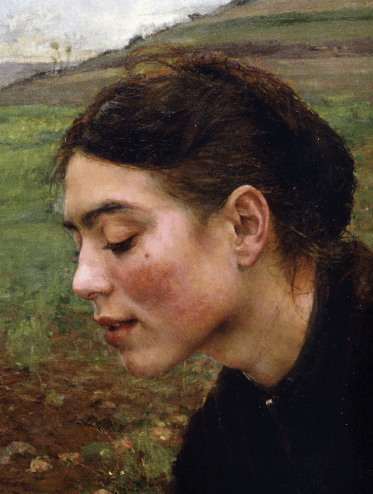
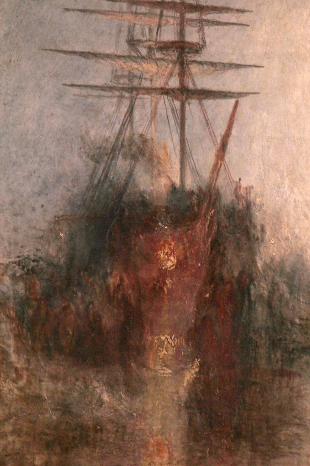
Jules Bastien-Lepage
Anything goes in this current marketplace of art. I see pure black and white works holding their own next to crazy saturated color plays. One of my favorite challenges I ttoss at myself during a project is to see what new color theme/scheme I will use to execute a commission. Will it be ultra limited color, highly desaturated, or hue shifted into a narrow band of chroma? Will I use a subtle complimentary structure? Will I seek out earth tones? Or choose bright, fairly saturated primaries? Will this be a ‘yellow’ painting? A dark, nighttime scene? The possibilities are endless, and exciting to contemplate.
I do not have much criticism to level at this issue, but rather just want to call attention to the fact that I love the use of color, in all its various permutations!
Kristine PooleonThe CallingHi Michael, Thanks so much for deciding to take a look and for sharing your thoughts! I also find it intriguing to get to wal…
Kristine PooleonThe CallingI am so pleased to read your words. When we "release" work into the world, we never know who might find it intriguing, engagi…
Kristine PooleonThe CallingThank you for sharing your thoughts. One of the things I love most about art is how it can communicate across time, cultures…
Sarah FinniganonInterior Illustrations – To Green Angel TowerI'd be curious to know how you tackled the signature pages, particularly the magic/edges of the magic meeting with the white…
HalloranonInterior Illustrations – To Green Angel TowerCan you talk more about the Pool of Three Depths? That image fascinates me and I haven't read the series (yet). What's the st…
It's no secret to anyone that's been following Muddy Colors awhile that I am really deeply interested in the psychology around why people become artists, and how becoming a "professional" "full-time" artist affects that. For example, I've written posts on the...
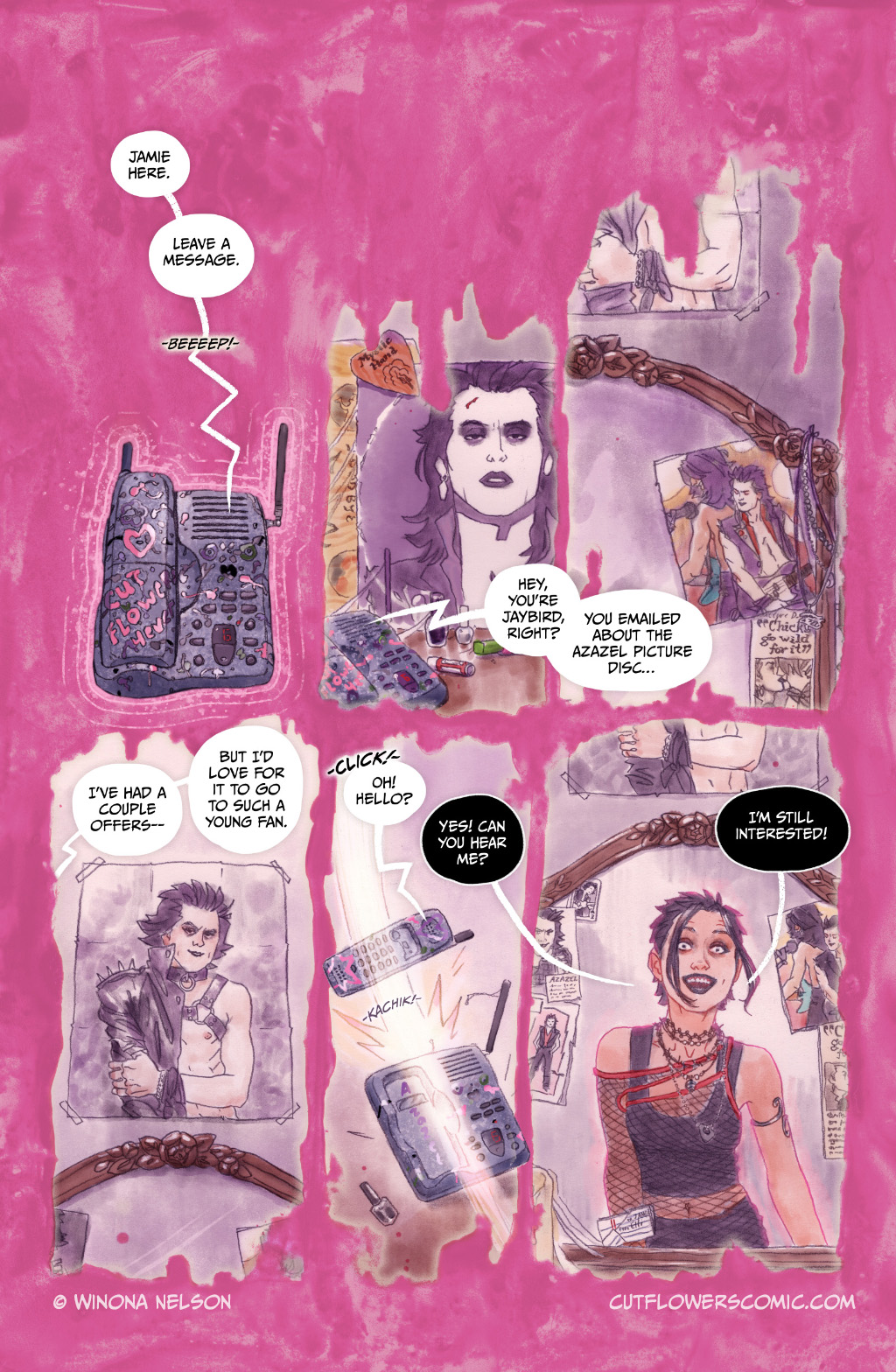
I've been working away at Chapter 3 of my comic Cut Flowers, but while that's cooking I did a 2-page prologue to give readers a little more about our ghost, Jamie. I hope you enjoy these!
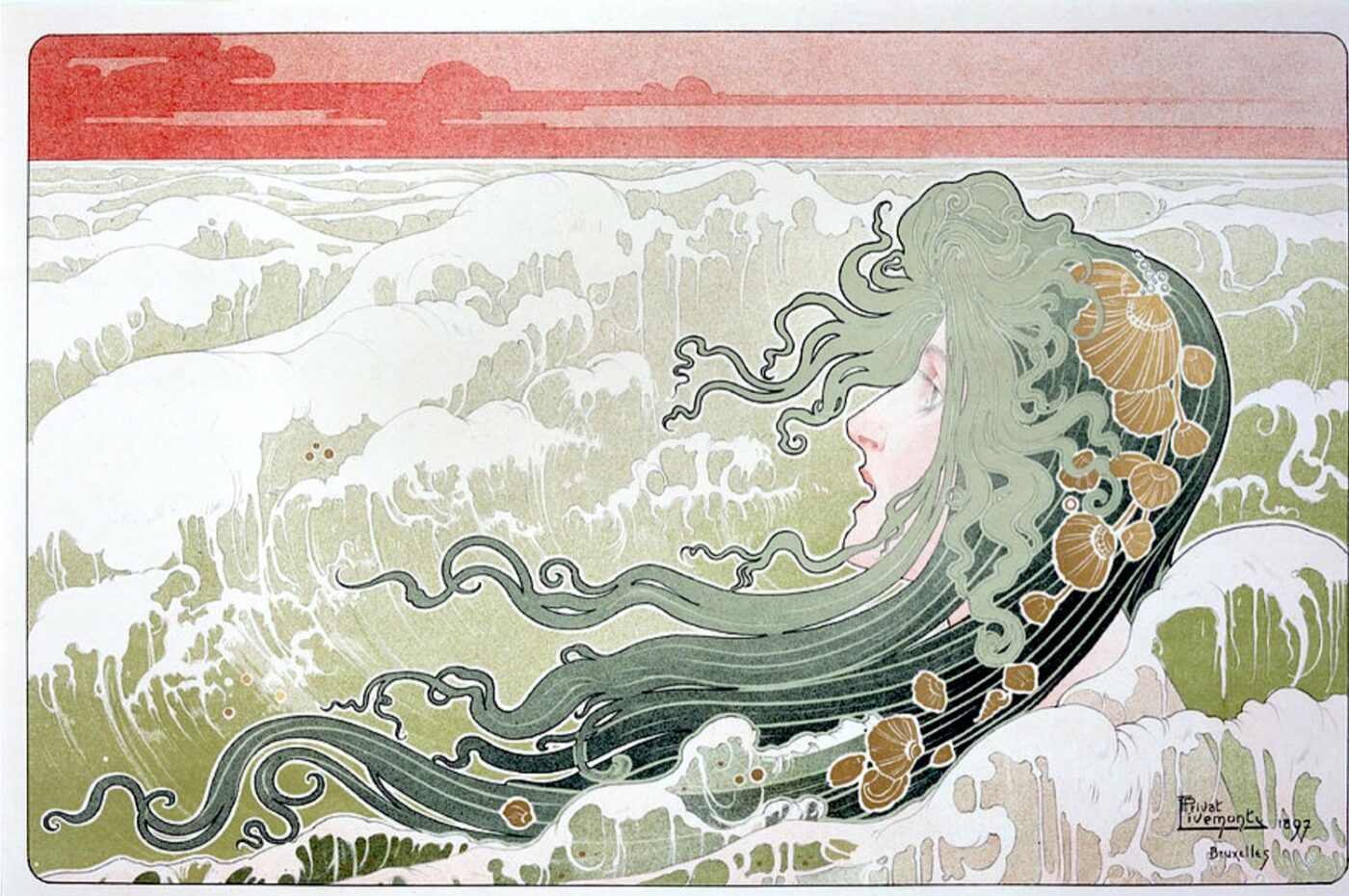
As folks that have met me in person (or seen my meat suit on instagram) know, I have a big upper-arm tattoo of an art nouveau piece. (Shoutout to Iris Compiet, I think this was from an Spectrum or IlluXcon convention before the pandemic) Many people comment on this...
Its amazing how important color can be, yet how the opposite can also be true. Same goes for value and any of the other aspects. Thinks its good to experiment with all of them, which includes ignoring one or the other completely and relying solely on what you have at your disposal afterwards.


Its amazing how important color can be, yet how the opposite can also be true. Same goes for value and any of the other aspects. Thinks its good to experiment with all of them, which includes ignoring one or the other completely and relying solely on what you have at your disposal afterwards.