I suspect many here have been watching Westworld lately. If you haven’t, you have definitely been missing out. Aside from being a really intriguing television show, the series boasts one of the most beautiful title sequences I’ve ever seen. Extravegant title sequences, like those found in Game of Thrones and Daredevil, have become increasing impressive and important in branding a new series. And although there is no shortage of truly remarkable intros out there, Westworld just might be one of my favorites.
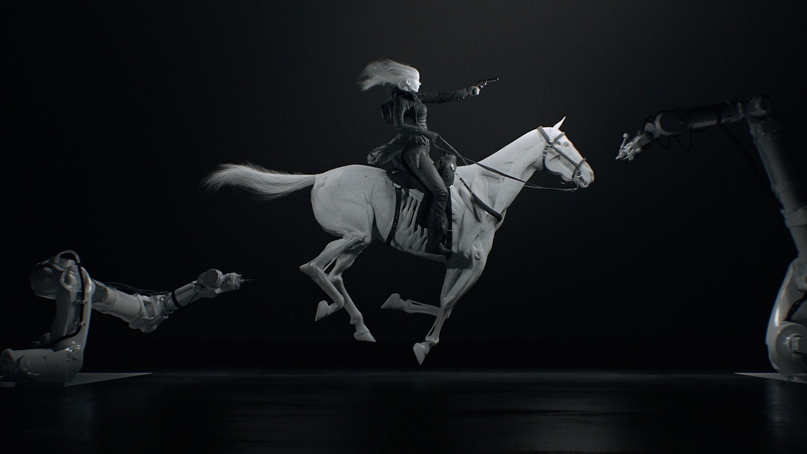
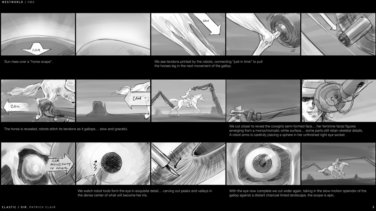
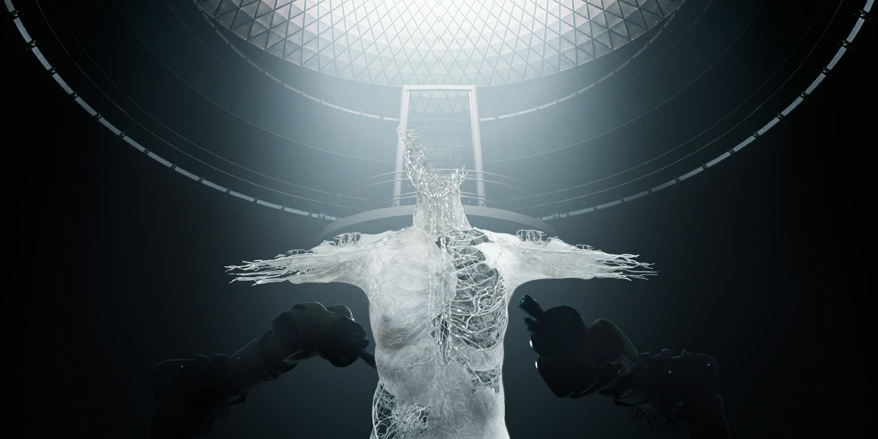
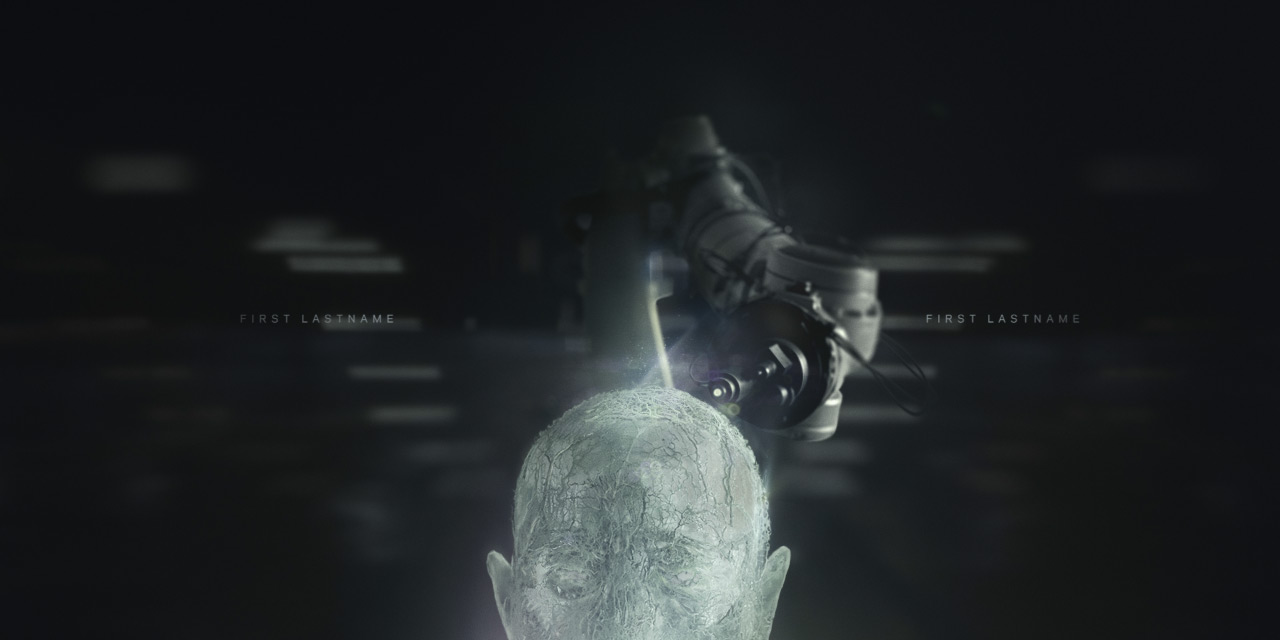
For me, what makes this particular intro so evocative is how plausible it all appears. With the advent of 3d printing, one could legitimately imagine a whole body being printed, cell by cell. Of course, I think this is a important aspect prevalent in a lot of good science fiction… depicting things that are just barely outside of our grasp, but still relatable.
You can watch the intro for yourself below:
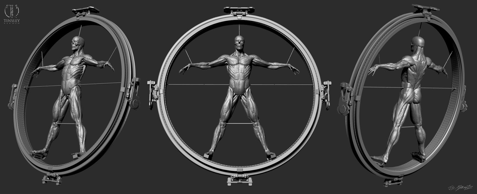
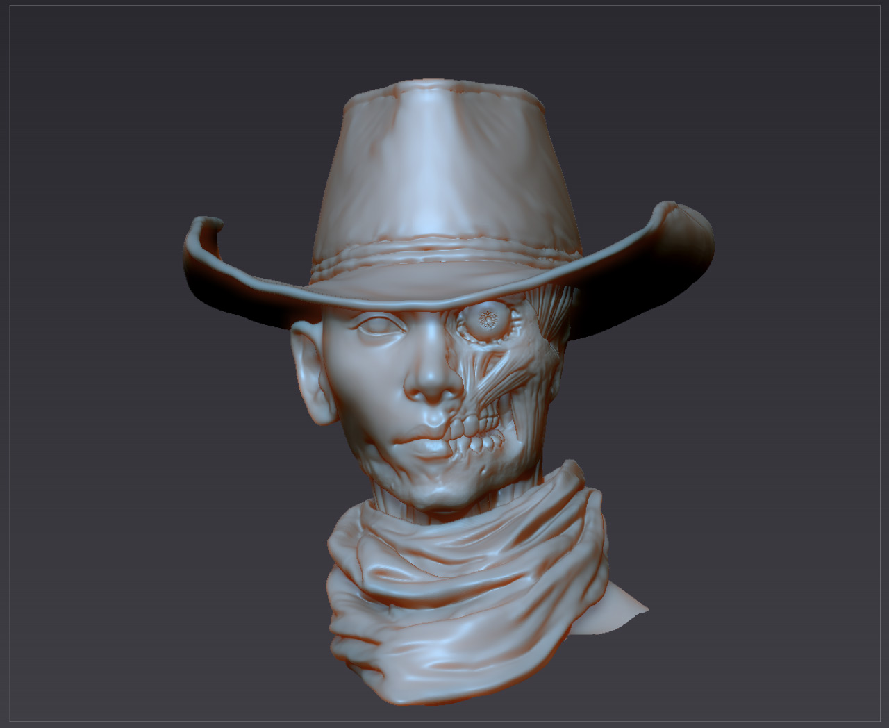
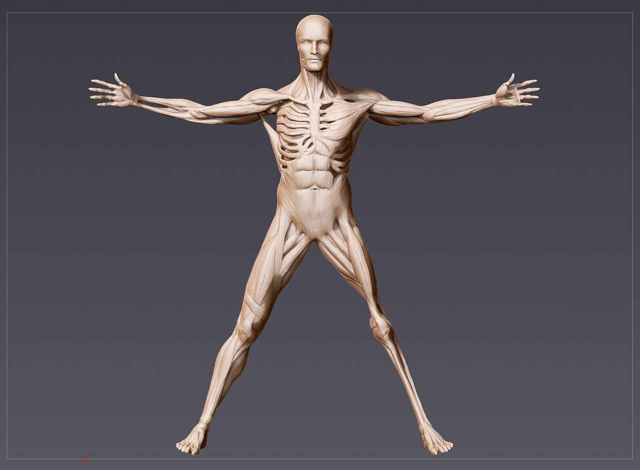
I recent stumbled across a really engaging interview with Patrick Clair, the Creative Director of Elastic, the company responsible for creating the intro. In this interview Patrick discusses a ton of ‘behind the scenes’ aspects to the project, including concept art, style frames, 3D models, and some other projects that inspired his work here.
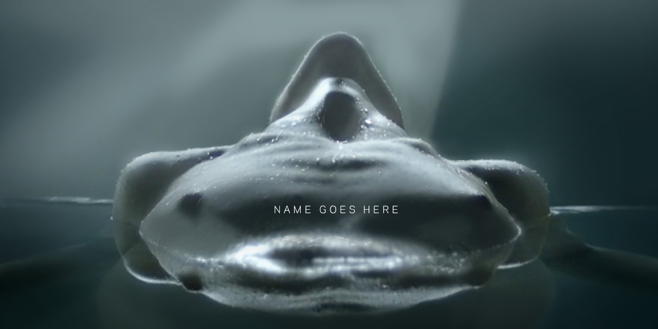
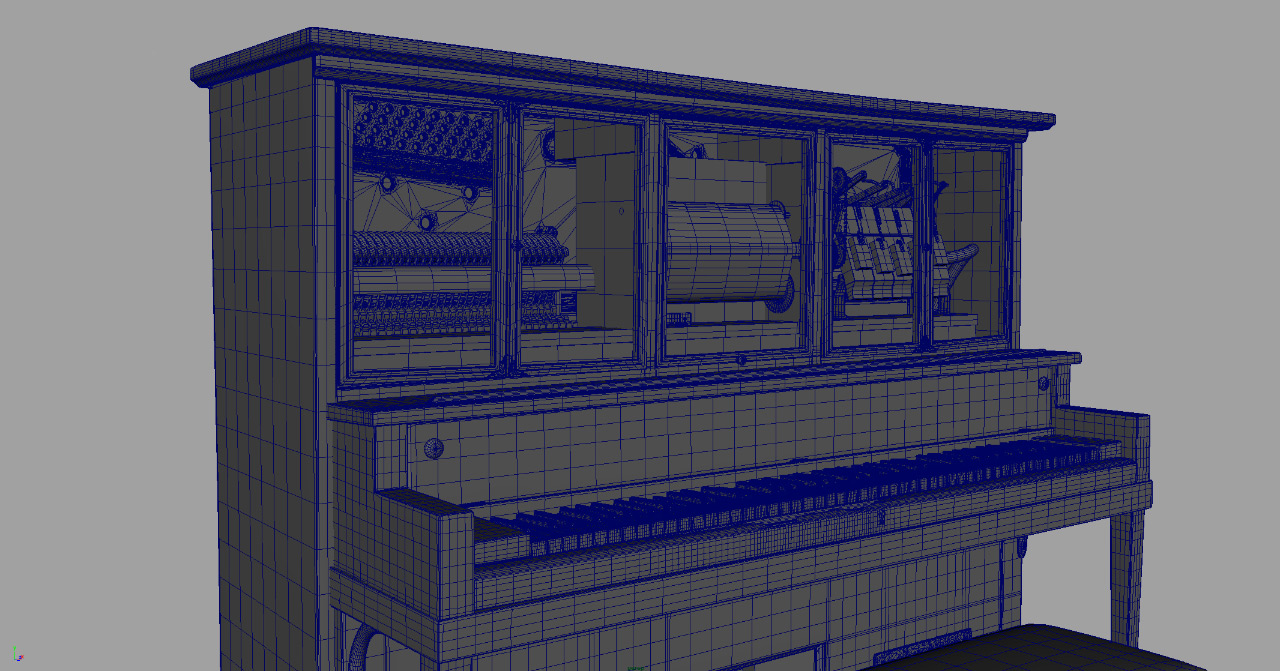
There is just an unbelievable amount of work that goes into making an intro like this, from the aesthetic, to the typography, to the original music. Obviously most of visual the elements are 3D models, but it’s impressive that even things you wouldn’t suspect are 3D, are, like the player piano for instance.
Watch the intro, read the interview, and enjoy this short sampling of some of the art used for the Westworld intro…


0 Comments