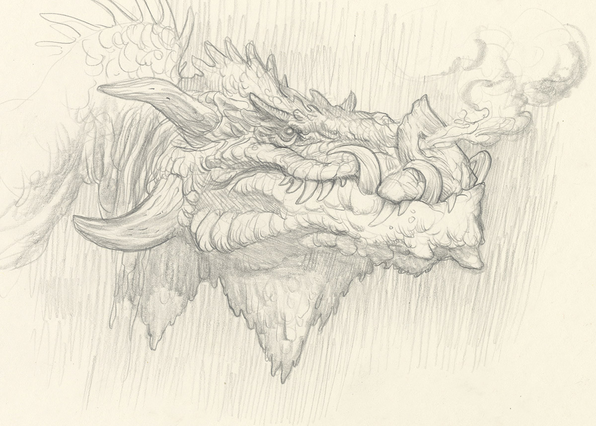
Sometimes, before I begin a painting, I will do a study of the subject from the painting just as a warm-up. Why? Because like most artists, I lost my mind a long, long time ago.
If I’m being positive about it, I tell myself that it’s like a color study, but with a portrait mixed in. If I’m being realistic with myself, I know it’s more like delayed adolescence; just another way of not actually getting started.
But today is not a day for being realistic with oneself! Let’s be honest: Nobody paints dragons to be realistic with ones self. You paint dragons to escape! You paint dragons to imagine a world filled with one great challenge, which while daunting, can be met and defeated, the outcome of which, is total victory over the forces of wickedness and entropy. That’s why we paint dragons!

The final product is quite small (4″ x 6″) but has gotten me really excited to begin the actual painting. I feel more grounded and confident knowing what colors I will be using to slay this beast. As I said before, we want a challenge that is daunting but that we know we can accomplish. That is what these studies are about. Ensuring victory through practice. (Well that and truly committing ourselves to madness)
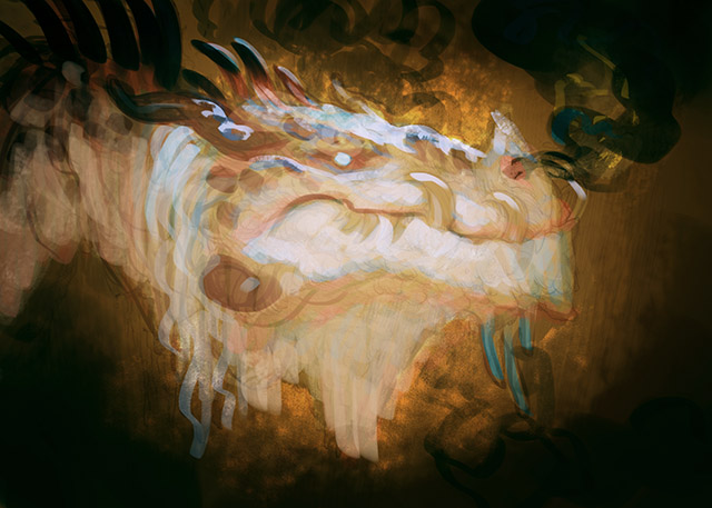
Next post: The actual painting! For now, here is a sneak peak of the color comp and drawing.


Thanks for sharing a bit of your process! I like the idea of a “warm-up” portrait, which helps give you the feel of the character–like a once-over before you start into the real thing. I'll consider trying this out in the future, which would probably save me time later mucking about in my actual painting, trying to remember my original vision for what my character is supposed to look like…
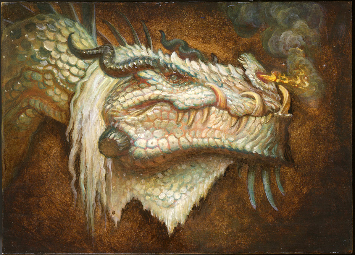
This is awesome. I am glad you you use open acrylics like I do. They are just so transparent to start a painting, so I use normal acrylics for building and Open acrylics for glazes so I have time to manipulate it. Cool stuff as always Justin. Haha Hey Jessica!
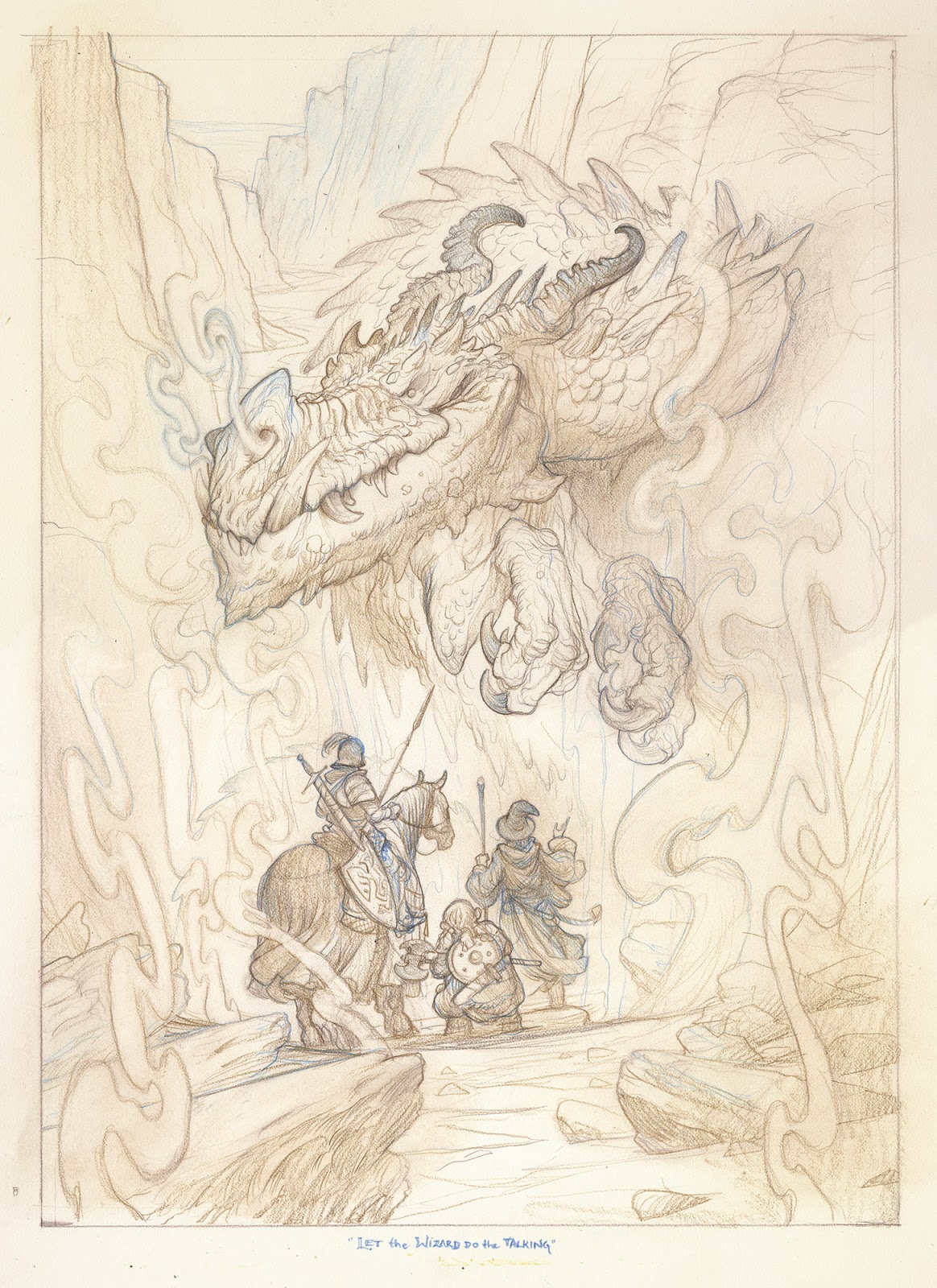
Oooh, this one is going to be nice to follow to completion. Love the demeanor of the dragon, comic-sinister … almost feel bad for the wizard having to step up to the front line. Exciting stuff!
*waves from across the country* 😀
I can't help but love these underpainting's that you and Annie do. They inspired me enough to pick up oils and attempt to learn how to go about doing them, They are pretty difficult I can't ever seem to get the values right. Which makes me want to respect it more! I would personally love to see how you got to that point, Oh well until then back to the easel.
I think better in light and dark than I do in color, so starting with a monochrome underpainting feels more natural to me. It also helps me figure out the meat of the image before having to venture out into the murky depths of a more full palette! Thomas Fluharty has a really solid demo on this that he did for Schoolism if you are interested in seeing something really in-depth on it.
Haha thanks Nicolay!
Beautiful!!