
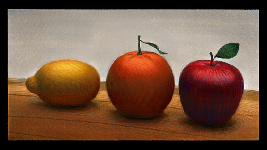
This is a Not so wonderful reproduction of an amazing painting by Sebastian Capella. Most of the real color is not present in this print.
Fruit? With all the cool art posted on this blog, you are demonstrating a point with a still life of -fruit?-
The fruit you see above and below are just a few of the many thousands of canvases with effortless brushwork slashed and carved into each by my former mentor, the late Sebastian Capella. To watch him paint was like watching an intense and playful dancer at the height of his/her game. “COLOR COLOR COLOR”…he would bark, “Everything is made with it but you have to Forget the Labels of Things so you can see their color uninterrupted” or, without a name to get in its way. He wanted us to see without disruptions of definitions that do not cater to the artist or artful mind. To look at something truthfully we must almost forget what it is so we can start from a new perspective.

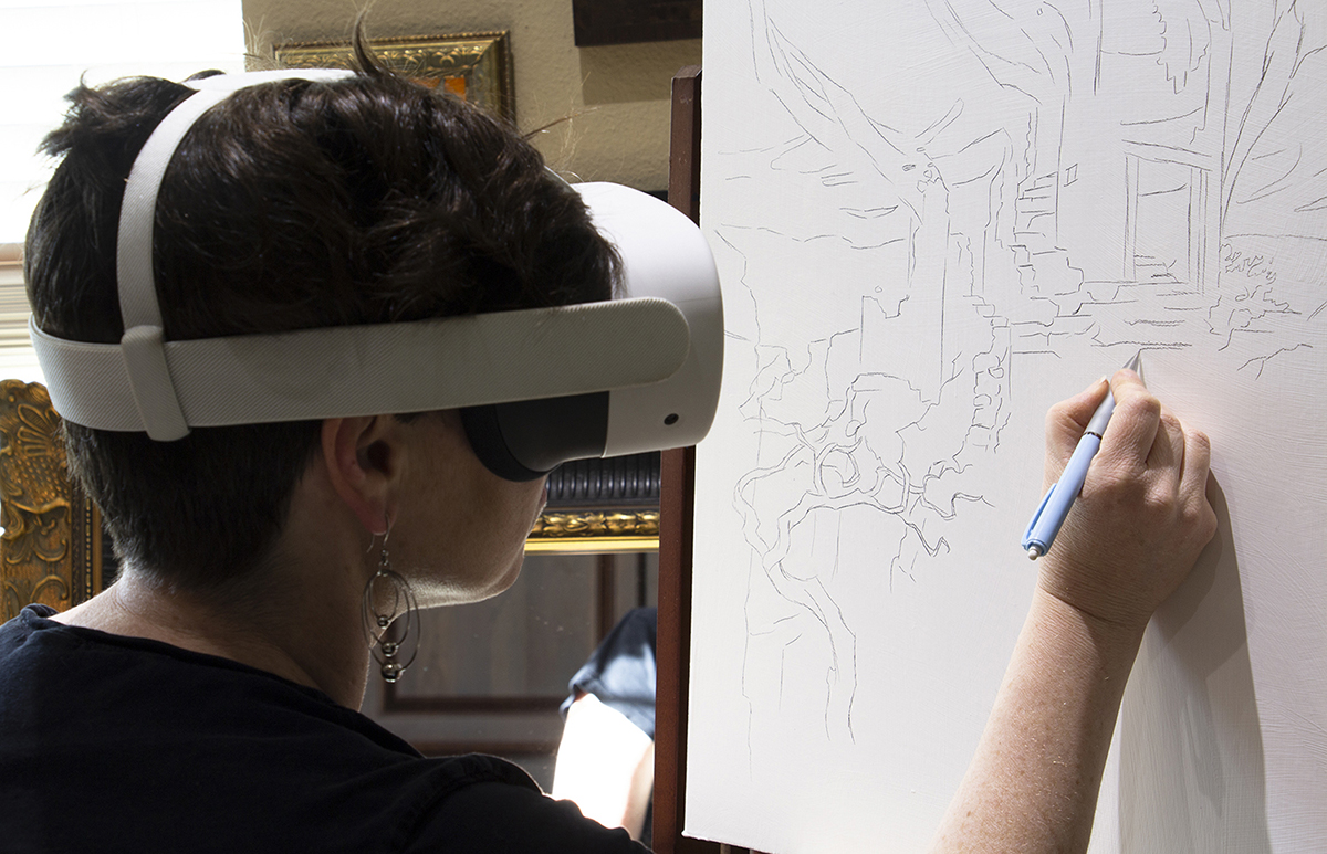
I don’t know why I thought a video might be more useful here, so together with that and some of the plates from it, I hope that you can gain some insight into better understanding the goal as a representational painter and how to better label the technical things you do.
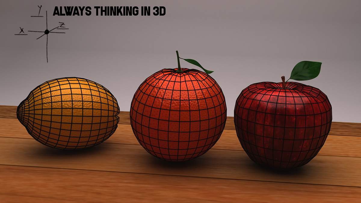
I hope that the video will give you more interactive insight into turning form than I can write up in an article. There are so many points to make when explaining the process of painting, but a good comparison I have been recently using is to describe it as it relates to 3D modeling and rendering, and relating the concept of polygon faces or facets with the tiles we use to paint with. Low poly is like Sargent or Wyeth and High Poly is like Rockwell or Bouguereau.
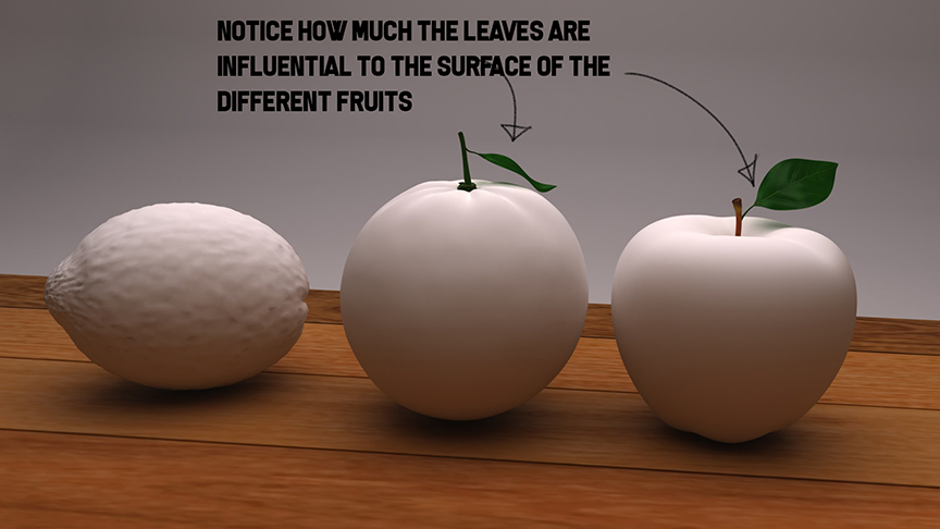
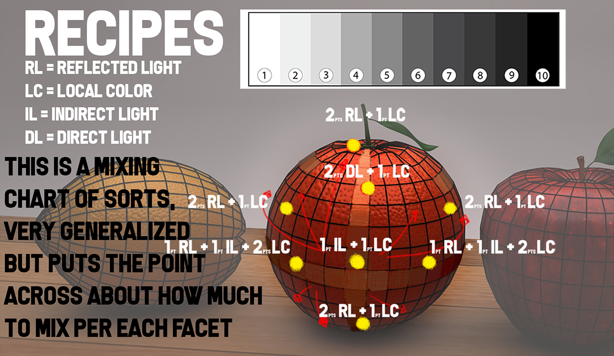
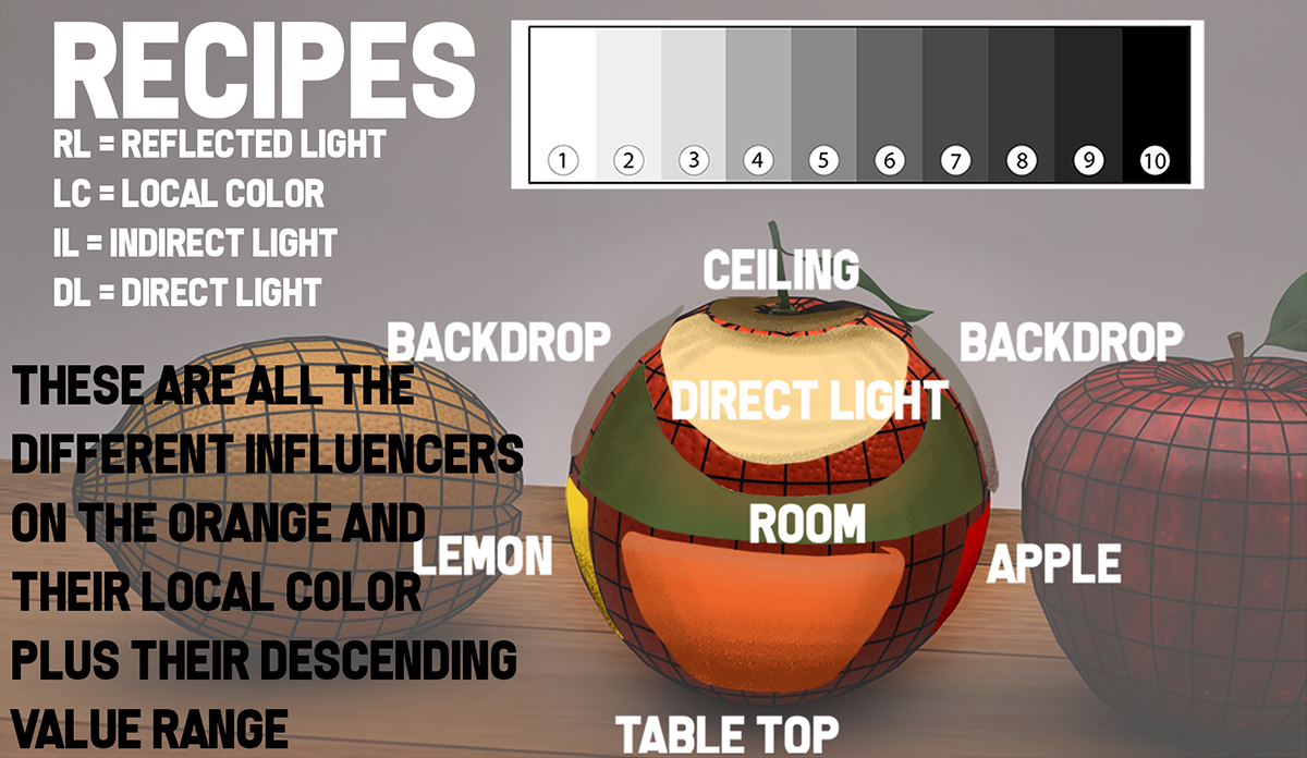
Below the video I have some of the content images showing close ups of the faceting and separation of forms along with some more write up descriptions to fill in any gaps the video might have caused.
THE VIDEO HERE.


Thank you Ron. You keep shaping the art classes I teach.
:), and thank you Steven.
The content is really good, but the amount of effects and distortion added to the video is sadly super distracting. The amount of information and the description is so good that i hope you add less effects in the future. great job.