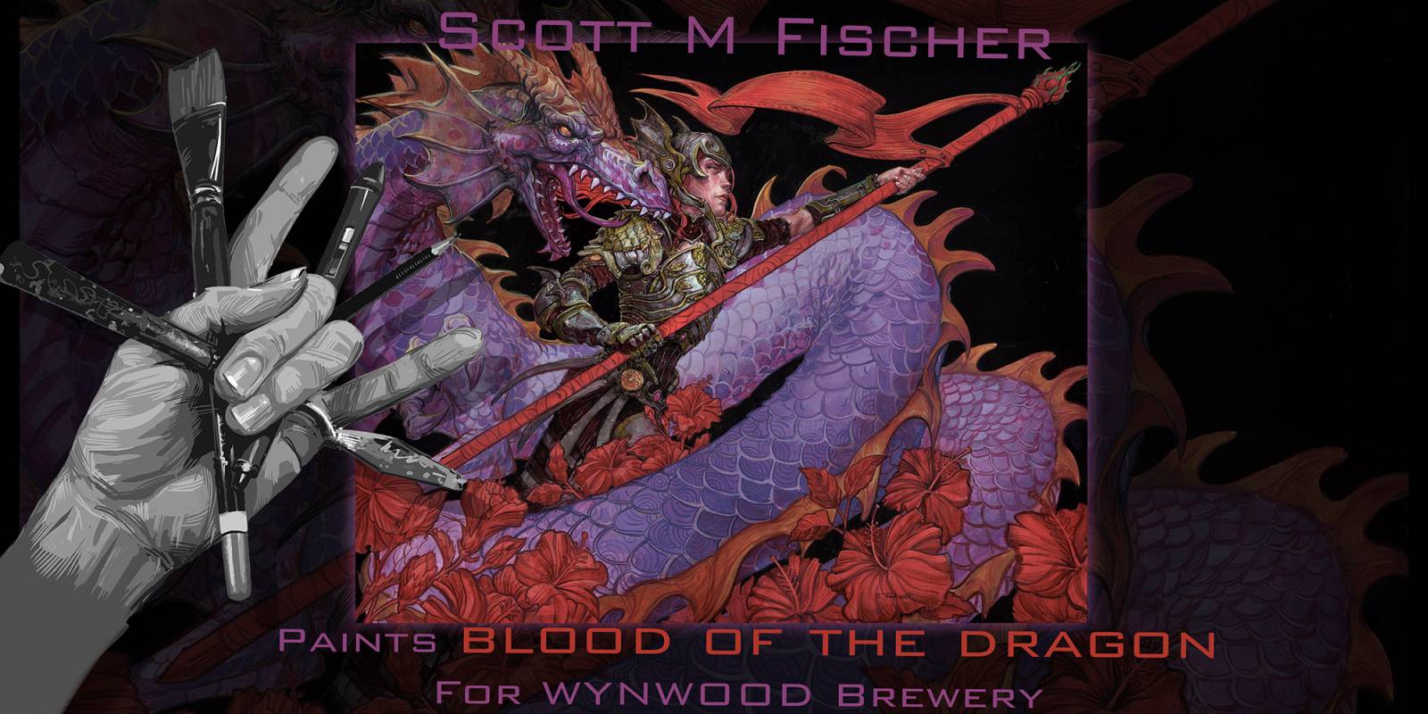
Woo-hoo I get to check a beer label off my bucket list of things to illustrate! But this goes beyond just creating a label my friends, the fine folks at Wynwood Brewery in Miami Fl also asked me to collaborate with the brewmaster on the taste of the beer! They do this for their ‘Artist Series’ of beers, and have worked with other artists, like Ron English who created a beautiful Delusion Ale.
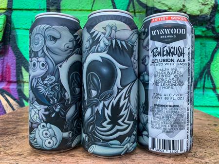
I knew I wanted to do something Fantasy art related, so I asked if they could put Dragon fruit and Blood Orange in a beer. They were like ‘Hellz yes!’ So ‘Blood of the Dragon’ was created. They took it a step further by adding Hibiscus to the brew for the red color, and went so far as to use Warrior Hops. To get any more fantasy, we have to add ground up 20 sided dice!
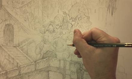
This video will take you through my process in creating it. I get to fly down to the brewery in Miami for the launch, where they will have some sweet posters of the art to sign. Can’t wait to crack one open! I will toast Muddy Colors!

Wow! Just WOW!! It’s a really great piece, but made spectacular by the inclusion of all the ingredients visualised in such an imaginative way. Always a treat Scott!
Congratulations Scott! What a fun project and collaboration! Another one off the bucket list! Can’t wait to pick up a few! Phenomenal work as always 🙂
Absolutely breathtaking work! The way you captured the raw power and ancient feel of ‘Blood of the Dragon’ is incredible. The depth in the colors and the detail in her armor are just stunning. A true masterpiece for a beer label!
Thank you for sharing your process! It’s so insightful to see how you moved from concept to grisaille and then to the final layers. The challenge of balancing detail with label readability is something I often struggle with. This post is incredibly helpful for aspiring artists!