Click here for Part 1 and Part 2 of this tutorial:
http://muddycolors.blogspot.com/2013/10/harry-dresden-part-1.html
http://muddycolors.blogspot.com/2013/10/harry-dresden-part-2.html
The last installment ended with me giving my client 3 different poses to choose from; the original pose, an action pose, and a more solemn pose. The client ultimately chose the latter, feeling like Harry should appear beaten down and exhausted after the battle. With all of that resolved, It really came down to just executing the final art.
The first thing I did was make a rudimentary Sketch-Up model to help me with the perspective of the piece. I knew there would be a lot of bricks in the image, and those are dead giveaways if your perspective is off.

Once I had a framework to work with, I then pasted all of photographic reference directly onto the perspective grid. This reference phase is arguable one of the most important aspects of realist painting, and so I take a lot of time in acquiring the best reference possible.
I actually built a model diaroma for the majority of the scene. The asphalt is torn foamcore and the trash can is aluminum foil. I used toy figurines as stand-ins for the two figures, and my kid’s ‘Doc Hudson’ toy for the car. Harry is an amalgam of a the toy model, about 4 different photos of myself, and some Photoshop wizardry. The demon is a model and some sloppy Sculpey work.
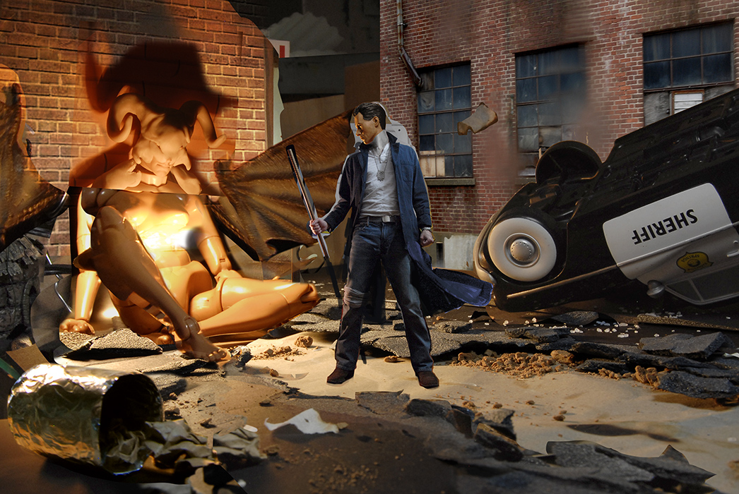
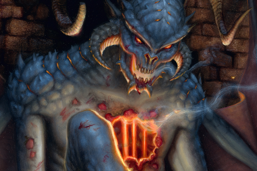
Once my reference is all compiled, I can transfer my image to the board. Some areas are exact to the photo comp, while others are just loosely roughed in so that I can modify them by hand. This is particularly noticeable in the demon, which mostly had to be made up.
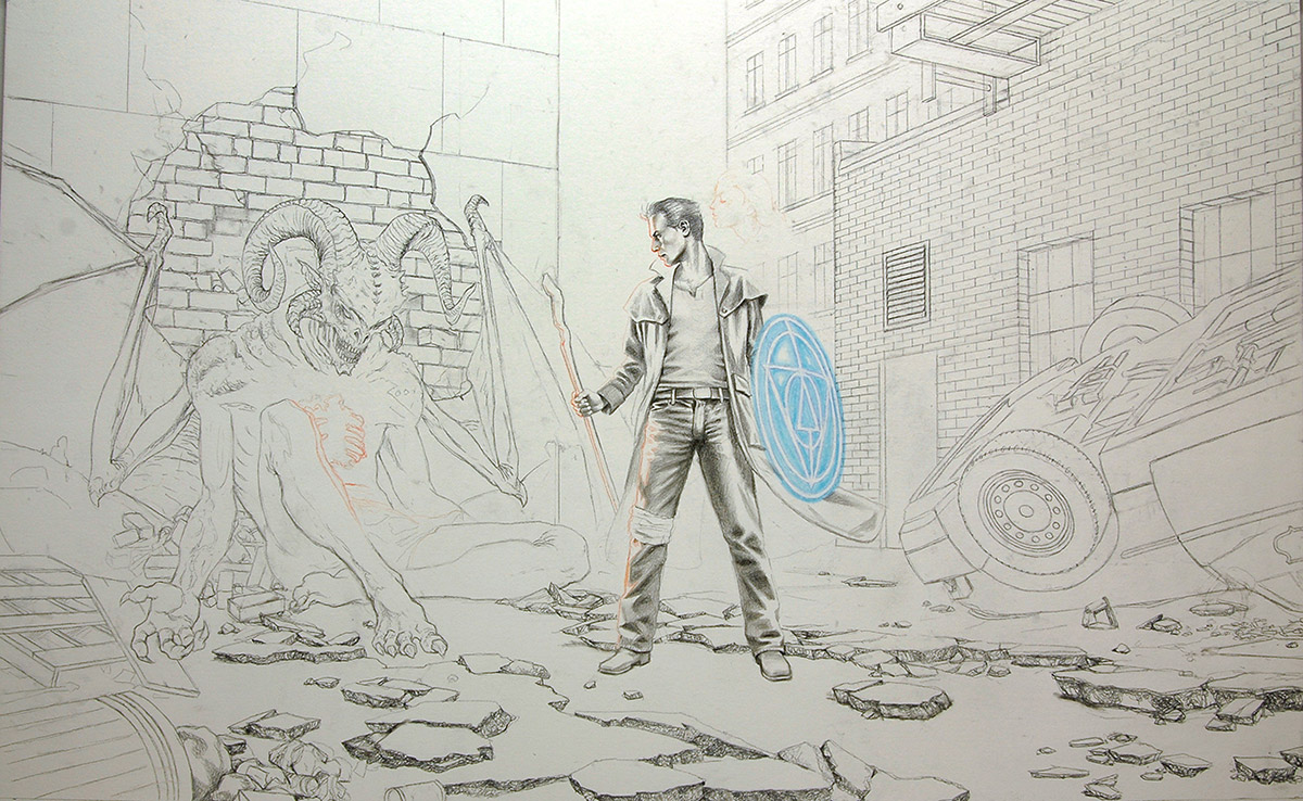
Once the underdrawing is completed, I spray fix the image, and give it a few washes of acrylic to establish some textures and basic values throughout the piece. The spotted texture was achieved with large brushes, sponges and a spray bottle.
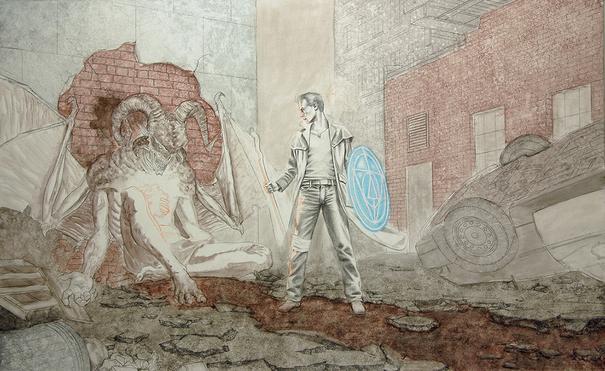
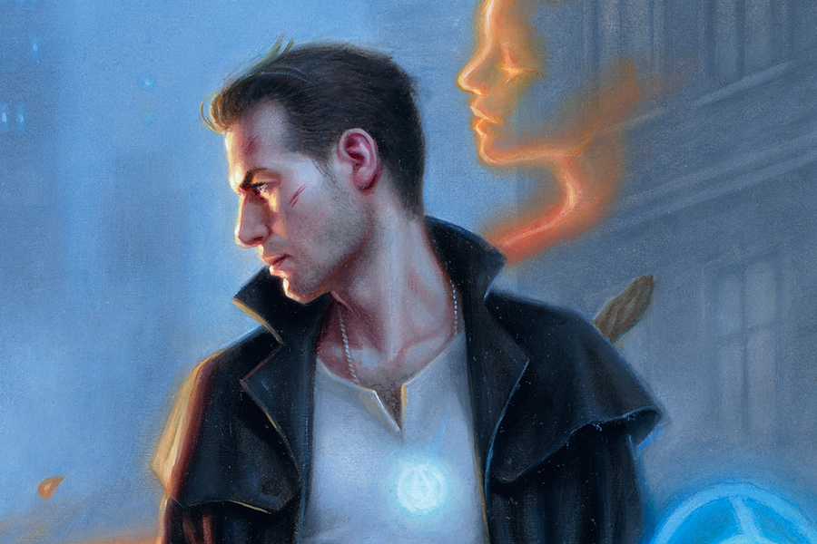
You can see below that I revised Harry’s arm and staff at this next stage. This is something I try my hardest avoid in the later stages, as it is much easier to revise early on. After that revision, the painting became very ‘paint-by-number’ to me. I just picked a spot (usually the background), and begin painting each area to finish using oil paints.

Of course, color relationships change drastically as I begin to paint more of the image, so I utilize a lot of oil glazing to better adjust the tint and value of certain areas after they are established.

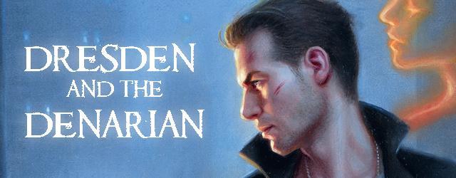
And lastly, here is the completed painting:
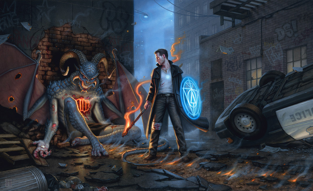 |
| ‘Dresden and the Denarian’, 25×40 inches, Oils on Board. |
After completing the image, gave my client the choice of seeing a scan of the image prior to my mailing it out. That way, if he had any revisions, I could attend to them now, prior to varnishing the piece. Putting faith in my abilities, he opted to forego that option, and instead asked me to ship it unseen, making the process of unveiling the original that much more fun for him. The packaging was a bit of a challenge, as the painting was quite large after being matted and framed (just over 50 inches wide). Luckily, I found a pre-made art box that fit it with an half inch to spare. The rest is history!


Awesome piece Dan! I love the demon and plethora of detail. As usual your inventive ways of creating reference are impressive.
Hollllyyyy cowwwww. I wish I could be there to see the client's face when he opened the package – the painting is amazing!
Thanks for showing all of your steps and explaining your use of reference. It's very helpful!
this is a real treat to see your process! Thanks for sharing, Dan! great work!
wow! great stuff Dan. Just a question, how long did you spend finding and setting up your reference(diorama)? Do you always set aside a fixed amount of time for every project to set this up?
I'm asking this from a digital workflow point of view and wondering how I can fit this in a tight deadline sort of situation because I feel this actually saves a lot of time in the long run.
CK,
I always set aside time for reference and comp studies, no matter how short the deadline is. Sometimes, it's as much as 50% of the deadline.
I love seeing your diorama/composite photo. There is so much creativity in the way you prepare for your painting. Thanks for sharing your process!
wow that is actually quite surprising to learn. It seems quite daunting for me to apply that myself but I'll try. Thanks Dan. I love seeing how you and the rest like Paolo and James Gurney go to lengths to make maquettes etc.
You'd be surprised how much time it saves in the long run. It takes a LOT of the guesswork out of the final painting. Plus, it's really fun to make models.
Thanks for the great series Dan. It's been extremely informative to get a better idea of your full process. All the best!
Dan, thanks for the informative posts. I find it very difficult to paint thin straight lines with oil paint (or any paint for that matter). How did you achieve such straight fine lines for the bricks on the buildings?