David Palumbo
I was happy to see so much positive response to my Re-Cover series! Here is a little bit more detail on the process:

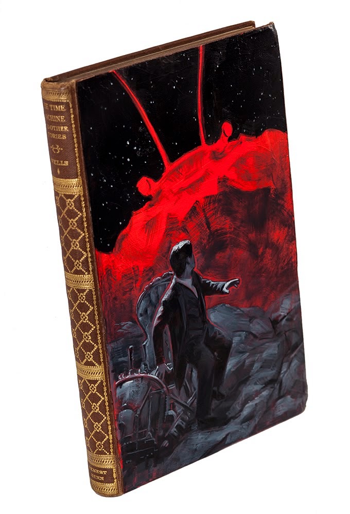
Whenever possible, I try to use a true vintage copy of the book as my surface. Some books are far too rare or expensive to use an actual first edition, but an affordable reprinting from a few years later has just as much history to me. In this case, I found a 1927 edition with a beautifully designed spine which suited me perfectly. This copy was slightly smaller than a typical hardcover at 4×7 inches (more common would be about 5.5 x 8.5). Here I am taping the edges to create a mask for the gesso and to keep the spine and edges clean while I work. (the Wyeth postcard just happened to be leaning there. I had to leave it in the shot as that specific painting is probably the single biggest influence on this series. If you had not already figured that out…)

Once taped up, I gesso the front cover using a large palette knife the same as I would with any other painting surface. Often the older editions have debossed designs or lettering which will get filled in as I prime.
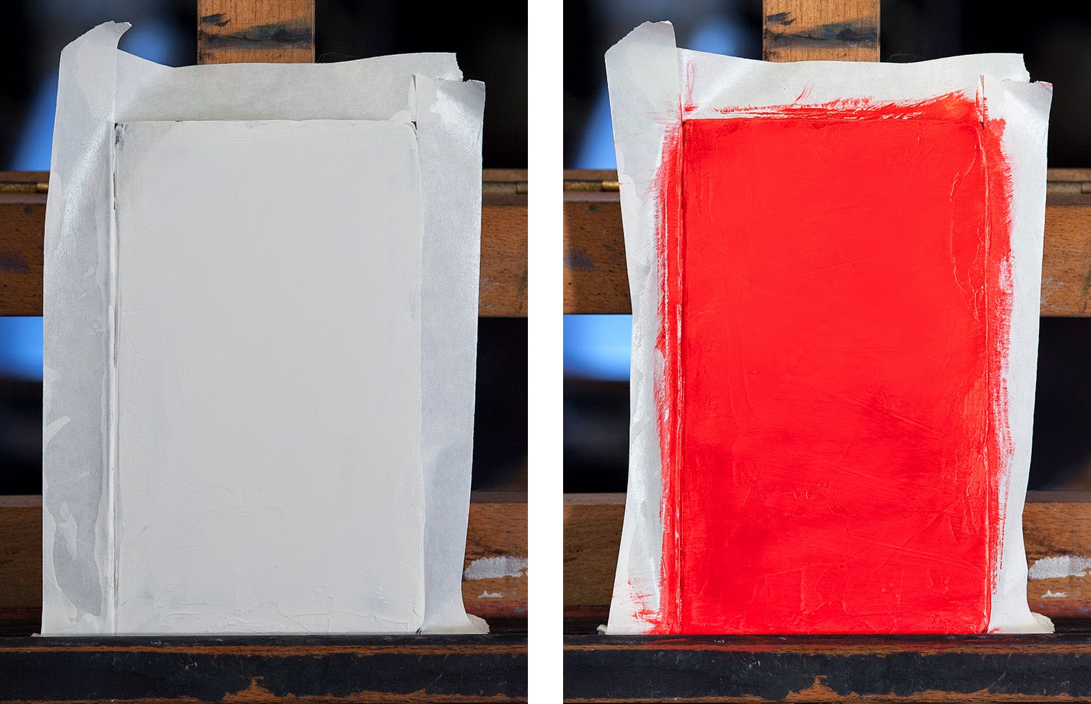
Once the surface is to my liking, I coat it in a solid acrylic color. This will be the “spot color” of the design.
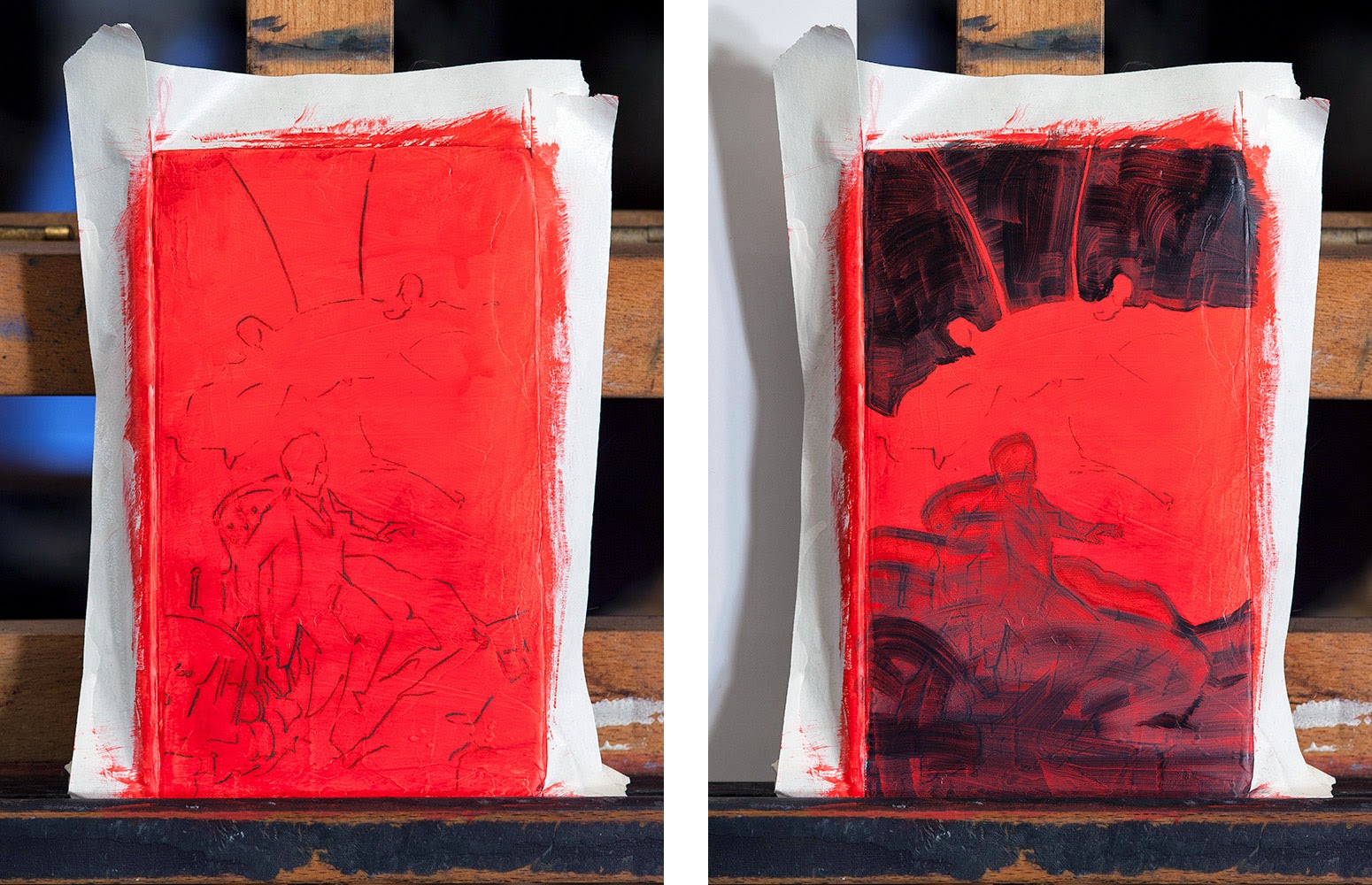
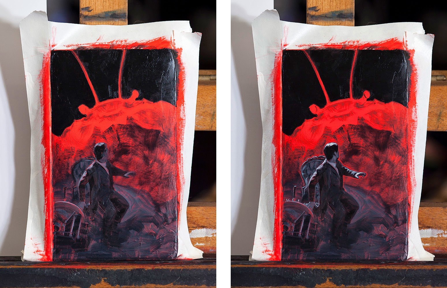
I then place my composition in pencil and seal the pencil with a glaze of acrylic. Once that has dried, I begin the oils with a fast, thin wash of gray over the areas to be painted. The monstrous crab is going to be left solid red with some dry brushing, so I leave that area alone.
From here I begin blocking in. With the red base underneath, I’m only using Titanium White and Lamp Black for my oils.
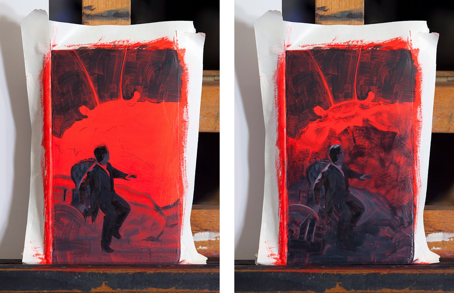
I’m now starting to refine the value structure and add detail starting with the focal areas.

Continuing to refine and add detail.
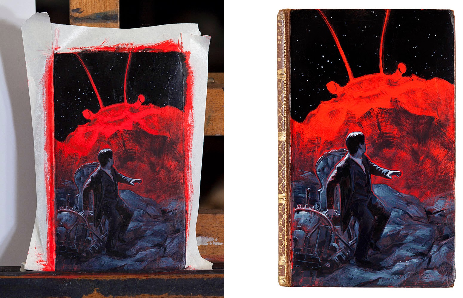
And finally adding the finishing touches before very carefully removing the taped border!
See the collection so far here: http://dvpalumbo.com/recover.html


Wow, I love it. What a fantastic idea. Thank you for showing your process… and for the link to the other books. ~Mike
This is amazing! A great idea, brilliantly executed- very inspiring. Thanks David
love it .I really curious about the card besides the ruler,which illustrates angry pepole carrying weapon.it is marvelous
Well done. An inspiration as always.
Tang Bing, it's the end paper for Treasure Island as painted by N.C. Wyeth. I saw it at the Brandywine Museum (where I guess it's in the permanent collection) I got that exact postcard there and keep it in my studio. It's one of my greatest influences as well.
that explained a lot,thank you for answering patiently
So great! Thanks for sharing!