-By Greg Ruth
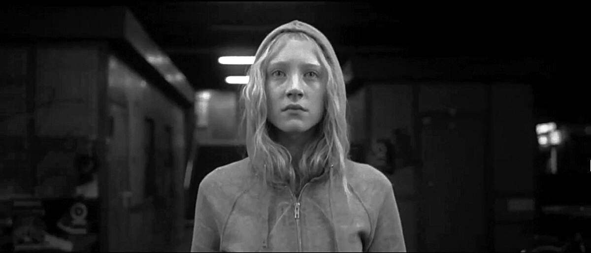 |
| Hannah |
Since many of us are taking time off this holiday season, and the hump of that occasion has now passed, it’s time to address how you are going spend the last days of this break. Tax preparation is too sad though an admiral exercise. Sorting one’s Hummel collection seems a bit much. Might I suggest Decoloring your favorite films?
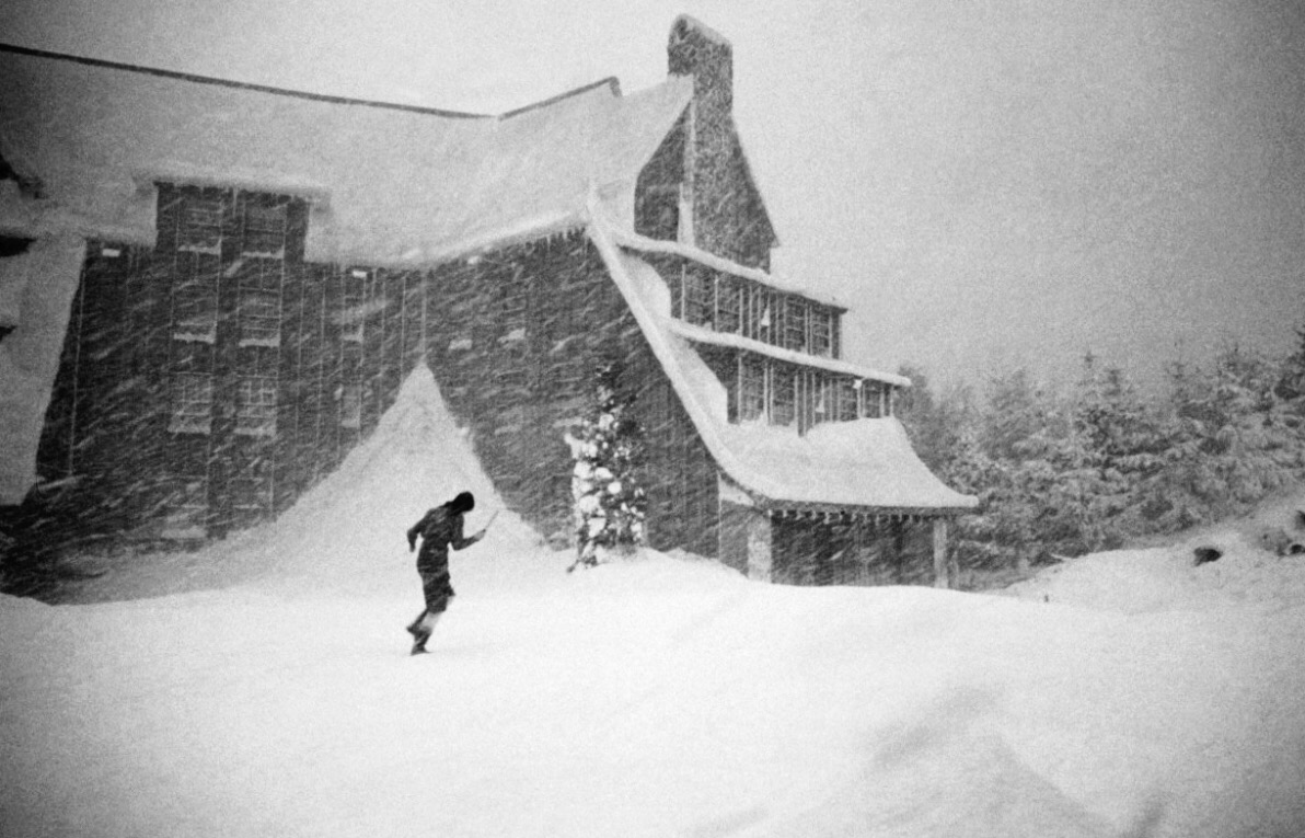 |
| The Shining |
What is Decoloring a film, you ask?
Basically it means removing all the color information from a movie you’re watching and see it fresh and tonally. Like as not you’ll need to do this on your tv settings and will forget to bring it back to normal which may infuriate your family, but trust me, it’s worth it. Not all films work for this, but the ones that were deftly filmed with a particular interest in setting and cinematography can transform the way you see them by doing this. Typically think of movies that exploit lighting and blocking and lean heavily on their photography. Aside from the obvious change in perspective decoloring brings, what I personally adore about it is how it highlights a visual narrative.
Black and white, perhaps being closer to how we present written language, is to me a more pure and foundational lodestone for narratives than color. Again, color is fine and often important, but its flamboyance and emotional overcoating can sometimes crowd out the really powerful bones the story has within it.
The list is pretty long, but here’s a primer below:
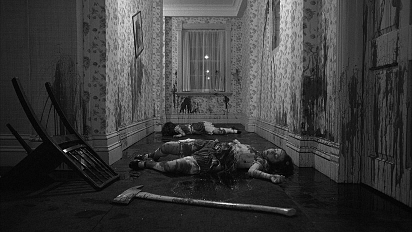 |
| The Shining |
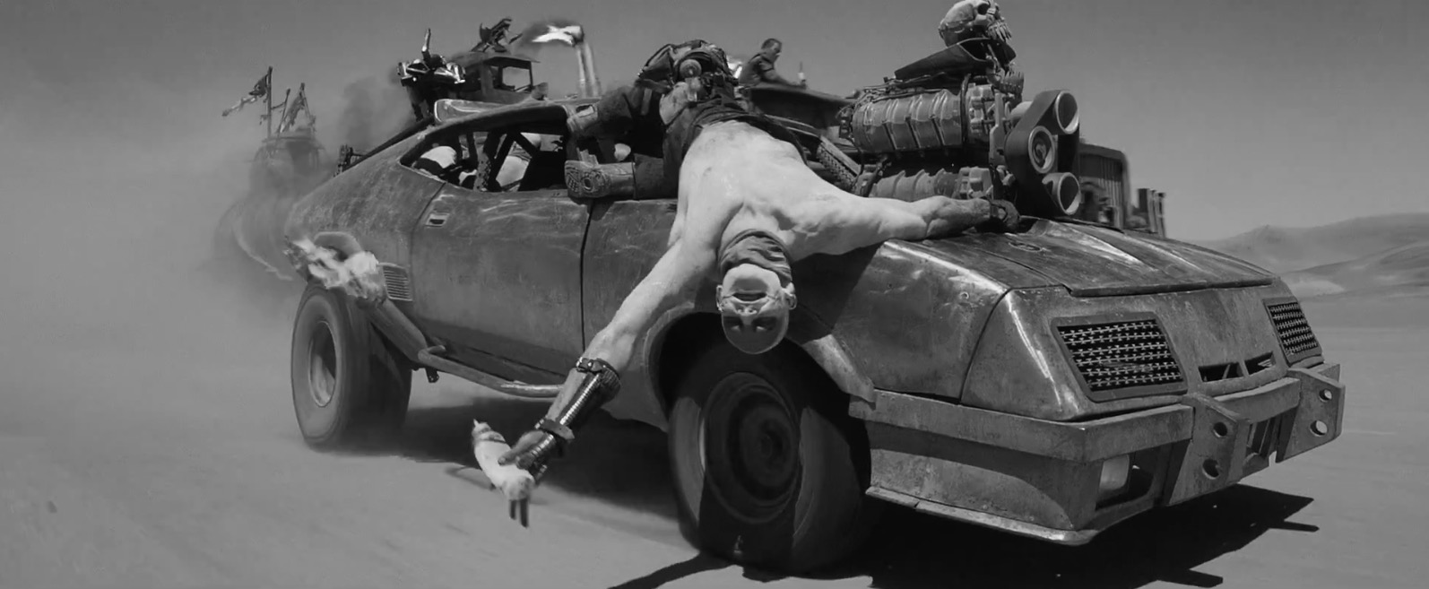 |
| Mad Max: Fury Road |
The first and most obvious candidate for decoloring is of course MAD MAX: FURY ROAD. Seriously a genius film made really incredible by decoloring. There’s always been talk about a theatrical release of the film this way, and we can most certainly look forward to a deluxe, if not Criterionesque blu ray with this feature. Simply removing the color on your screen is one thing, but if it’s done at the source, it is a whole different beast. HANNAH is wonderful, as is LEON THE PROFESSIONAL and ATONEMENT. LAWRENCE OF ARABIA is surprisingly amazing, as is another desert classic, DUNE- rendering even those muppet sandworts in a new and better light. The true Noiriness of BLUE VELVET, TWIN PEAKS and WILD AT HEART sing a pretty song too.
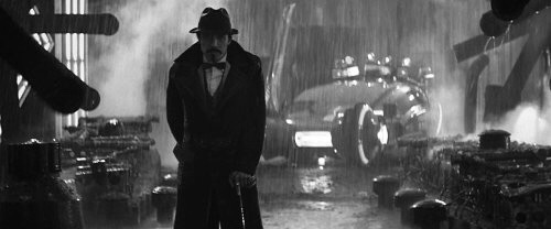 |
| Bladerunner |
Another masterpiece that looks so damned good s way is BLADE RUNNER. ALIEN too, and like as not just about any Ridley Scott film. A friend of mine took my suggestion to do this to his screener copy of THE MARTIAN and apparently it is stunning.
 |
| Bladerunner |
If nothing else Decoloring your films affords an opportunity to see them anew, to pick up details you missed before, to see them again as for the first time… more or less. It strips away the decorative veil of many of these and shows you how the cinematographer is laying out his positions, and narrative, and for story geeks this is pure gold.
 |
| The Martian |
MILLER’S CROSSING, and especially RAISING ARIZONA just kill it when decolored. Some films reveal themselves as tonal masterpieces you never thought were until doing this. There’s a tangible sense of detail that comes to life in this and most of the bros’ films as a result. BARTON FINK is especially fantastic, John Goodman showing you the life of the mind while blazing white flames rise around him…
 |
| Raising Arizona |
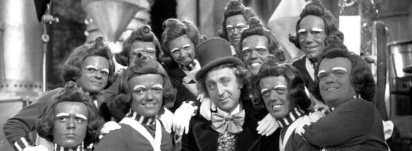 |
| Willy Wonka and the Chocolate Factory |
WILLY WONKA and THE CHOCOLATE FACTORY, (the Superior Gene Wilder version of course), KLUTE, John Carpenter’s THE THING, THE BIRDS, RAIDERS OF THE LOST ARK, E.T. (is particularly good in this way), 2001 A SPACE ODYSSEY, THE SHINING, THOR:THE DARK WORLD, IRON MAN, even Animations like AKIRA, HOWL’S MOVING CASTLE and Satoshi Kon’s brilliant Twin Peaks of Anime, PARANOIA AGENT look stunning… the list goes on and you can lose months to this. I’ve even heard from others some Xbox games are awesome like this. Which is not a terrible thing and I bet you can add terrifically to the list.
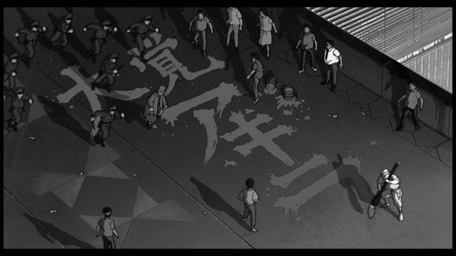 |
| Akira |
You may find a need to punch up contrast, light and shadows a bit on certain selections, depending on how much your screen allows, but it’s well worth it. Play with the highlights and stretch the means by which you can repurpose these films to the max. Other acolytes of this effort have found equal joys in sepia tone and minimal coloring as well. The point really is to see anew the old favorites and see again the new ones. And for the narrative nerds out there, you’ll find this an excellent trick for deciphering how a visual narrative is spun, and what you can learn towards your own work, be it film, photography, comics or single image work. There’s a mighty power in seeing black and white as a value rather than a lack of something. As a strength rather than a necessity of the past.
So let me know in the comments below your own successes or failures. I’d love to hear about them. So get out there and black and white your world before going back to work!

Very interesting.Most film magazines in the 70's and early 80's printed a lot of their movie stills in B&W , so it wasn't so odd seeing a monochrome image of Alien , Star Wars or Clockwork orange etc.Now looking at the Fury Road pic , it seems almost a shock!Good candidates for this treatment would be Tim Burton's more Gothic output{Batman Returns, Sleepy Hollow}The lord of the Rings/hobbit and Most Ridley Scott.I don't have time to check , but concerning Fury Road, When George Miller was talking about the B&W version it wasn't clear if he meant more of a Sin City treatment , with the explosions etc still in a vivid orange.
I'm curious about doing this. I already screencap my favorite shots for reference, but I've never decolored them. I may try this with my favorite films for their color to see how well the composition and values hold up.
I'm curious about doing this. I already screencap my favorite shots for reference, but I've never decolored them. I may try this with my favorite films for their color to see how well the composition and values hold up.
Better Call Saul.
http://i.imgur.com/zCU4giH.jpg
Fury Road again.
http://i.imgur.com/f1GMKBZ.jpg
Portal 2
http://i.imgur.com/uBxqVnM.jpg
Oh these are ACES, Lindsay- love the Portal one and especially Saul. What a perfectly composed picture that is. FURY ROAD is bonkers in black and white: a whole album of incredibly vivd stills.
I'm constantly telling my students to flip their reference to grayscale to more effectively see the tonal structure. I also push them to shoot their paintings in grayscale to see if their values are truly holding up. It's always a major surprise to them when they do it. They mistake Saturation/intensity For value all the time.
Me too! There's such a value to doing this, and is compositionally as important a trick to holding the piece up to a mirror. Sometimes the essential value is just knocking the artist out of a comfortable or lazy place. But the lesson of light and shadow and value in black and white work is unparalleled overall.
In the 80's, I was recording Beetlejuice off of Showtime. My VCR unexpectedly recorded it in black and white. A great visual movie in its own right, in black and white, it became a darker more sinister movie. I actually preferred watching it in black and white than in color. Tim Burton did some amazing lighting throughout the film (and others).
While I didn't think about it at the time, later as an artist who has picked up photography, lighting really does make so much of the feel of the scene.
When I use reference materials for my paintings, I always desaturate. This also gives me the freedom to use whatever colors I want without influence from the original images.
Good post, Greg!
http://31.media.tumblr.com/93cfd754332097ea56154ba804a9de51/tumblr_n1dcfmLg5N1t04x43o1_500.gif
Wyoming Gerry Spence made a book a couple years ago called esteem for none and the first Lima that arrives is no justice for anybody in an American Court and it’s absolutely generous there is no quality so why might you go where you go there to battle with your foes you don't go there for worth in the occasion that you're checking for .
http://t-rexmusclefacts.com/secret-millionaires-club-2016/