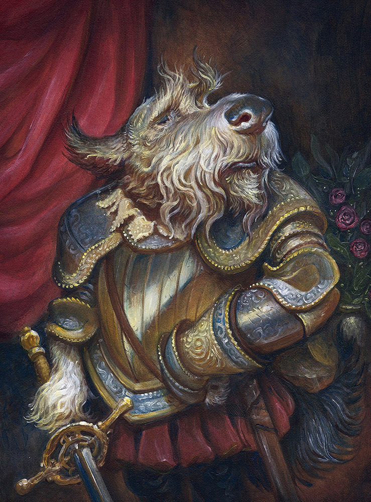
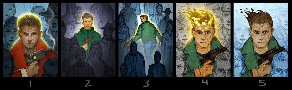
To begin with, I always start with pencils because that’s what I used when I was 6 and I see no reason to change that just because I’m 36. I love them and I’d paint with pencils if I could. Pencils make sense. Unlike paint, which has never made sense to me with how slippery and runny and unpredictable it can be.
Like indoor cats.
I mean, listen, that’s a feral animal you got there and you should probably just put it back where you found it. At the very least you shouldn’t trust it. It has zero respect for you and believes itself to be some kind of superior being; a vengeful ancient deity that you lowly pink peasants must offer sacrificial wet food and treats to else you must be punished with random swipes. And if you fail to clean his litterbox for even a day your couch will face such horrific atrocities that it would punishable as a war crime were it committed elsewhere in the civilized world.
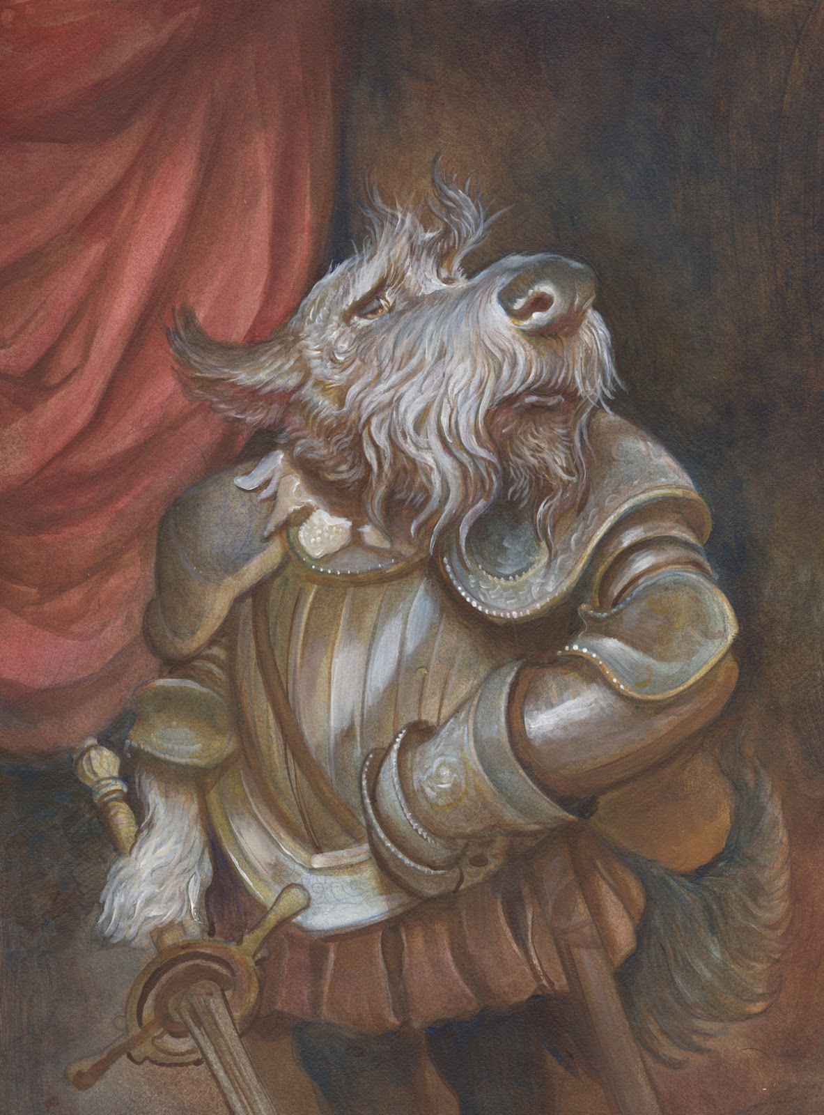
He would eat you were he only slightly larger.
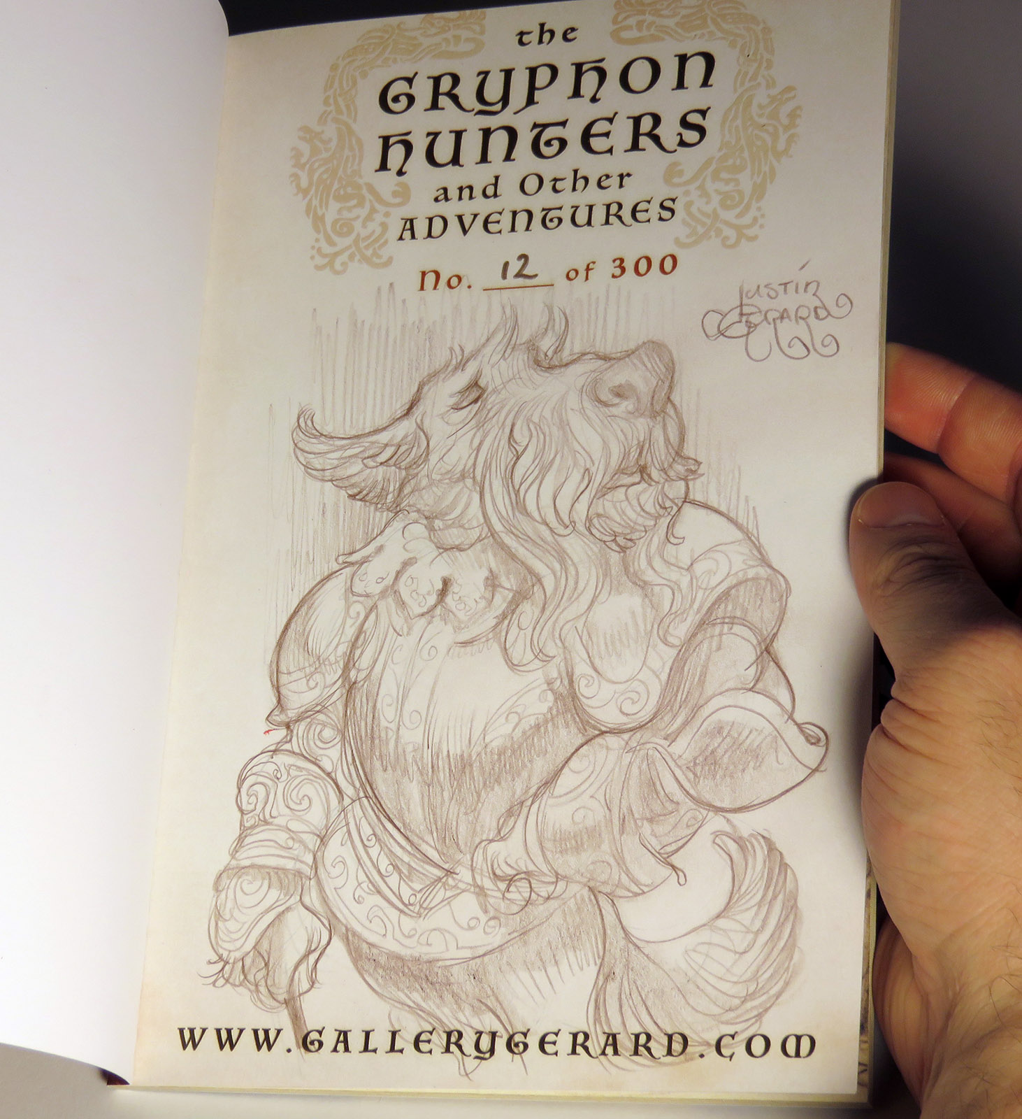
Anyway, back to pencils. I begin the painting in colored pencil, in this case on heavyweight bristol.

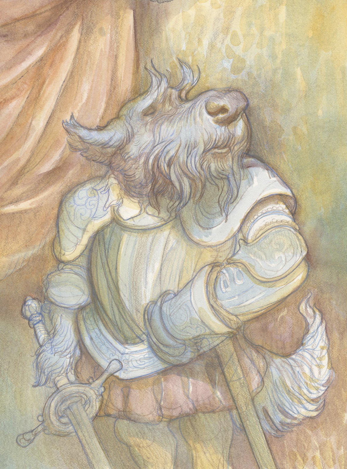
I draw in blue, then redraw in brown as this helps me find the right lines. This is great if you are #1 in too big a rush to do this the proper academic way, with several stages of tracing and re-tracing like you are supposed to do. And #2 if you aren’t really using reference that closely. Reference is important and it dramatically improves the quality of your material when you use it. But sometimes you just want to get in there and do something quick and fun from your imagination, and for me this is a simple solution that helps correct the image as I’m developing it.
While it generally allows you to get away with bad behavior it more importantly provides an excellent base for later stages of color. I also find that a good color pencils hang on even after multiple washes of paint and you won’t have to fight any desaturation as you would when using graphite.
Some of you may point out that I said I didn’t like paint. Well I don’t. I also don’t like cats either, but I still have them running around the house. Sometimes you just have to live in the world that is and not the one you wish it was.
So for this method I focused on using transparent shadow colors, the aforementioned Burnt Umber Light and Prussian Blue Hue in layers to first build up the darks. This offers a wonderful vibration of color in the shadows more consistent with oils or watercolors.
Once this is achieved I then carve back the highlights with opaque whites. (Highlights are where the opaque colors belong)
Finally, I glazed the various whites back with highly transparent oxides, giving a more textured surface to them. I just use water for the glaze. I know there are a million ingenious glazing liquids out there for acrylic enthusiasts, but water seems to work just fine as long as you are using very transparent, high chroma colors.

*Note: I give cats a hard time but I have to make an exception for our cat Jeremy. He looks like a magical, floppy pancake, but he eats spiders, scorpions and anything that slithers its way into our house. So he’s kind of a blue-collar working class cat, punching-in and punching-out every day, all year round and I can respect that. Here’s to you Jeremy.
What a fun post to read and am so glad you gave acrylics another chance. The way one can paint over it in 20 minutes, and not disturb the lower layers like watercolor (Grrr!), is really quite nice. High quality fluid acrylics can be amazing!
Raw Umber: Apply it as-is = warm muted brown, mix it with white = cool greys. Very fond of it myself.
Thanks for a wonderful post!
Shout out to Jeremy!
It's true! They are wonderful for how fast you can layer (especially if you've got a hair dryer nearby)
I've always had a love-hate relationship with them because of how plastic they feel when laid on heavy, but recently have found them to be quite fun to work with as long as they are kept really thin and transparent.
Hey Justin! Are you varnishing your watercolor underpainting first or glazing over the watercolor with the acrylic straightaway?
Also, I concur on raw umber. ��
Hey Kelly,
I didn't varnish or fix this painting before I started into the acrylic. I like how the acrylic interacts with the paper surface far more than after the paper has been sealed by acrylic buildup. So I didn't use anything but acrylic thinned heavily with water here.
I have sealed watercolors with workable fixative before when I really wanted to lock in lines or watercolor blossoms, but I don't tend to enjoy working on that surface as much. As for the varnishes, I've used them before for larger paintings, but have never really liked the final result as much as just layers of acrylic thinned with water.
Were the dogs of war… hounding you?
…I'll see myself out.
AHahaha!